Annie Pootoogook’s drawing entitled Man Abusing His Partner was selected as one of the best 100 artworks of the 21st century by ArtNews.
Kinngait (Cape Dorset), Nunavut – A drawing by late Inuit artist Annie Pootoogook, who died under suspicious circumstances in 2016, has been named as one of the best artworks of the 21st century by ArtNews, one of the most trusted sources for news about the global art world and art market.
Known for her drawings that depict contemporary Inuit life, her drawing entitled Man Abusing His Partner was selected as one of greatest artworks of the past 25 years.
Annie Pootoogook works on her art on July 10, 2013, in Ottawa. The investigation into her 2016 death has stalled, sources tell CBC News. (Alexei Kintero)
The work on paper illustrates a haunting personal memory from Annie’s life during the early 1990s, when she was in an abusive relationship with a man in Nunavik.
The artwork depicts a violent and threatening scene, with a male figure holding a piece of wood above his head, directed toward a woman who lies defenseless on a bed. Initially, like many women facing similar situations, Annie remained silent about her experiences, reflecting the broader social stigma and silence surrounding violence against women. However, as she found her voice, it became clear that Annie possessed immense courage. She began sharing her story of survival as an Inuit woman, using her artwork as a powerful medium to communicate struggles with addiction, mental health, and intimate partner abuse.
Sadly, on September 19, 2016, Annie’s body was found in the Rideau River in Ottawa. Police declared it a suspicious death, however no arrests were ever made. Annie’s story, which she often conveyed through her work, became a representation of the broader experiences of Inuit and Indigenous women, highlighting the ongoing impact of colonialism and patriarchy in their lives. Her drowning and the subsequent police investigation drew significant attention because of her status as an internationally renowned artist and Inuit woman.
“This significant recognition of Annie Pootoogook is a testament to her enduring importance as a contemporary creator,” said West Baffin Cooperative President Pauloosie Kowmageak. “As we remember her significant contributions we also have the opportunity to look forward, knowing that her personal resilience and artistic innovation is inspiring new generations.’
Pootoogook was an artist member of the West Baffin Cooperative, Canada’s oldest Inuit owned and led social enterprise.
She was the third youngest in a family of ten children and grew up surrounded by artists, including both of her parents, as well as her grandmother, the renowned artist Pitseolak Ashoona (c.1904–1983), and her uncle, Kananginak Pootoogook (1935–2010).
Influenced by them, Annie based her drawings on her personal experiences, including her struggles with addiction and domestic violence. Her work found fame in the larger art world and was showcased at the National Gallery of Canada, Art Gallery of Ontario, McMichael Canadian Art Collection, The Power Plant, Biennale de Montreal, Art Basel and Documenta 12, among other exhibitions.
Established in 1959, West Baffin Cooperative has enjoyed an international reputation for the exquisite prints, drawings and carvings created by its Inuit artist members. In addition to operation of the Kinngait Studios at the Kenojuak Cultural Centre in Kinngait, the cooperative maintains a Toronto marketing division office, Dorset Fine Arts, which is responsible for interfacing with galleries, museums, cultural professionals, Inuit art enthusiasts and the art market globally. The mandate of West Baffin Cooperative includes public relations, promotion, advocacy, government relations and special projects relating to Kinngait Inuit art. Governed by an all-Inuit Board of Directors, the organization also maintains a local retail grocery/hardware store, a restaurant, rental properties and various utility contracts. As a community owned organization, practically all Kinngait adults are shareholders, profits are distributed back to the community in the form of annual dividends.
Featured image- Annie Pootoogook, Man Abusing His Partner, 2002 Coloured pencil and ink on paper, 51 x 66.5 cm Collection of John and Joyce Price
The Colorado River Indian Tribes include four distinct Tribes – the Mohave, Chemehuevi, Hopi, and Navajo. The reservation stretches along the Colorado River on both the Arizona and California side. It includes approximately 300,000 acres of land, with the river serving as the focal point and lifeblood of the area.
River Art Created Uniquely
Art honoring the Colorado River and benefitting the Colorado River Indian Tribes (CRIT) will be envisioned and created live during Scottsdale Art Week March 19-22 at WestWorld of Scottsdale. Artist Ben Miller, a Montana-based painter best known for his Endangered Rivers series, will travel to the Colorado River Indian Tribes reservation to paint a depiction of the Colorado River at the Ahakhav Tribal Preserve which will be created and featured during Scottsdale Art Week. A portion of the proceeds from the artwork will benefit the Colorado River Indian Tribes (CRIT). This comes at a time when the life of the Colorado River is in danger because of drought and overuse.
Ben Miller, in association with Gary Snyder Fine Art, has spent the past eight years painting the endangered western rivers of Montana, Washington, Colorado and Wyoming, and more recently the rivers of Chicago, New Jersey, New York, and Miami. On the end of a fishing rod, Miller attaches what he calls Fly Brushes, designed from wool, cotton, rubber, nylon and other materials, soaked in paint and cast onto clear plexiglass.
Ben Miller/ Gary Snyder Fine ArtMiller will bring his artistic vision to life during the art fair. His team will travel to CRIT’s Ahakhav Tribal Preserve to photograph and video the portion of the river that runs through the Preserve. On March 19 as Scottsdale Art Week begins, Miller will be on site at Scottsdale Art Week to begin Fly Cast Painting on a six foot by eight foot by one inch block of plexiglass weighing 300 pounds that will be on a special easel. Those attending will see Miller create the artwork as the painting emerges on the other side of the plexiglass. On Friday March 20th the finished work will be on display. A portion of sales will go to CRIT. Recently, CRIT has taken the bold step to acknowledge personhood status for the Colorado River which protects it under Tribal Law.
Miller said, “This year I will bring my vision of the Colorado River to life as Scottsdale Art Week begins. It’s only fitting that we do this as CRIT considers the River to be a living being which is why they acknowledged its Personhood Status.” Now in its second year Scottsdale Art Week will feature contemporary and fine art from more than 120 galleries from 18 countries. It is America’s first art fair with an emphasis on indigenous expression. The event will also host cultural seminars and innovative programming, including live music and a fashion show. For more information or for tickets and tables go to www.ScottsdaleArtWeek.com.
About Scottsdale Art Week Presented by Scottsdale Ferrari:
Scottsdale Art Week presented by Scottsdale Ferrari (SAW) is situated at the historical and cultural crossroads of the American Southwest, which attracted such art historical greats as Georgia O’Keeffe, Frank Lloyd Wright and major stars of the land art movement of the 20th Century. The largest new American fair of art & design in decades, SAW features an exciting combination of historical and contemporary works, welcoming well over 120 galleries from across the U.S. and around the world while honoring its home in Arizona by highlighting contemporary Indigenous artists.
Maybe you watch all the TV shows, follow the blogs, and read all the magazines (or perhaps just look at the pretty pictures) and still wonder what Interior Design really is, what a Designer does, and if you would benefit from working with one? If so, then read on because here’s the nitty gritty on Interior Design and the passionate Designers working within it.
Interior Design is about providing “creative design solutions for interior environments and its clients. It is the combination of technical and analytical skills with an aesthetic vision to achieve spaces that are functional, support the health, safety and well-being of users, enhance the quality of life of the occupants, and are visually attractive.
Balancing Factors
Interior Design can cover a variety of disciplines, including residential, corporate/workplace, retail, healthcare, hospitality, public, and institutional design. Designers pay special attention to function, space planning, ergonomics, lighting, and of course the “pretty” surface elements such as colours and fabrics. Interior Designers can be thought of as an “interior architect” and are skilled in the aspects of spatial planning, preparing technical drawings and documents, and can help design and renovate interiors from drawing up the initial floor plans to placing the last decorative accent.
How does an Interior Designer gets to be a certified professional?
It begins with 3-4 years of schooling, followed by a minimum of 2-3 years of work experience, and then certified by rigorous examinations facilitated by the professional bodies of ARIDO and IDC. Designers are required to carry liability insurance, participate in ongoing professional development programs, and uphold a professional code of ethics and standards to maintain their credentials.
Interior Designers can be hired for remodels, renovations, redecorating, and new build projects. They often work with architects, trades, and other design professionals to achieve the clients’ goals while following safety standards and building codes. Designers are often involved with planning from the very beginning but can be brought in at any stage of the design and construction process.
The cost of hiring an Interior Designer may seem prohibitive for those on a tight budget, but the benefits are advantageous.
Those who don’t have the time or desire to plan, shop, select, and oversee their project will ultimately profit from hiring an expert. An Interior Designer can prevent clients from making costly mistakes; whether it is with project management, decision-making, or providing savings on products and materials purchased. Designers bring with them an array of professional contacts for trades, suppliers, custom fabricators, and favorite stores. Regardless of the project size and needs, clients often have the option to choose from a variety of services to suit their budget.
If you are considering hiring an Interior Designer know what you want by determining your needs beforehand, and define your style through design and architecture magazine clippings. You can find a Designer through word of mouth, web-based research, professional associations, or trade magazines.
Most of all- have fun.
Interview them to review their portfolio, determine that your personalities mesh, discuss your project scope as well as the designer’s fees and process. Most important of all, have fun with the process – your interiors will thank you, and you will have made an investment into the enjoyment and functionality of your space. For the Silo, Ramee Cyr/ R Design Studio.
Featured image- Colwood house is a perfect mid-century nod to a modern Canada home designed by Erica Colpitts Interior Design.
JUROR: LYLA RYE DESIGNER: ELIZA TRENT RENNICK FOREWORD BY ARNIE GUHA
Abstraction is not an absence. It is a decision.
To abstract is to strip away the familiar scaffolding of representation and ask a more difficult question: what remains when narrative recedes? What persists when image is released from obligation to describe?
The works gathered in ABSTRACTS, curated and juried by Lyla Rye, demonstrate that abstraction is not a single language but a constellation of methods. Across painting, digital media, photography, drawing, sculpture, and mixed media, the artists in this exhibition approach abstraction not as retreat, but as inquiry. Form becomes structure. Colour becomes an event. Gesture becomes argument.
Some works carve space. Some map pattern. Some lean into material process; others into digital construction. Some are quiet. Others declare themselves boldly. What binds them is not style, but intention, a commitment to exploring what visual language can do when it is freed from depiction.
In a moment saturated with image and immediacy, abstraction asks us to slow down. It resists instant readability. It rewards attention. It invites the viewer into a more active role: not decoding a message but participating in meaning.
Lyla Rye’s curatorial vision has brought together an expansive and diverse group of artists, each working from a distinct vantage point. The result is not a unified aesthetic, but a dynamic field of approaches; evidence that abstraction remains a vital and evolving force within contemporary practice.
This catalogue, designed with clarity and care by Eliza Trent-Rennick, extends the life of the exhibition beyond the gallery walls. It documents not only the works themselves, but the range of conversations that abstraction continues to generate.
The Aird Gallery exists to provide a platform for artists across Ontario to present rigorous, thoughtful work. ABSTRACTSreflect that mandate fully. It demonstrates that abstraction is not a historical chapter closed in the twentieth century, but an ongoing experiment — one that continues to expand, fracture, and renew itself.
On behalf of the Aird Board and our partner societies, I extend sincere thanks to Lyla Rye for her discernment and generosity in shaping this exhibition, and to all participating artists for the strength and depth of their contributions.
Abstraction endures because it asks us not simply to look, but to engage. Thank you for engaging with the Aird and with our shared commitment to the arts in Ontario.
Arnie Guha Executive Chair
ABSTRACTS 2025 ARTIST LIST
Doug Adams, Maria-Bida Albulet, Sandra Altwerger, Hadeel Alzoubi, Jarrod Barker, Peter Barron, Peggy Bell, Leslie Bertin, Ioana Bertrand, Ilija Blanusa, Monica Burnside, Mike Callaghan, Jeannie Catchpole, Emily Conlon, Anne-Marie Cosgrove, Damon Couto-Hill, Edward Donald, Holy Dunlop, Agata Dworzak-Subocz, Azar Ebrahimi, Jill Finney, Saremifar Firouzeh, Julie Florio, Elissa Gallander, Monica Gewurz, Kathy Granger Tucker, Arnie Guha, Diana Hamer, Katherine Hartel, Katharine Harvey, Janet Hendershot, Leighton Hern, Ted Karkut, Hyunryoung Kim, Rupen Kungus, Em LeightonHern, Maureen Lowry, Dimitrije Martinovic, Lisa Mason, Claudia McKnight, Carole Milon, Leah Oates, Ovidiu Petca, Ann Piche, Fraser Radford, Leena Raudvee, Dale M Reid, Heather Rigby, Liz Ruest, Colleen Schindler, Pearl Sequeira, Sara Shields, Nancy Simmons Smith, Shawn Skeir, Alayne Spafford, Marisa Swangha, Karen Taylor, Sarah Thompson, Lorraine Thorarinson Bretts, Terry Torra, Margaret Wasiuta, Holly Winters, and Anna Yuschuk.
Lyla Rye is a Toronto based artist who began her studies in architecture. She works in installation, sculpture, video and photography to explore our experience of architectural space. Rye studied at the University of Waterloo, York University and the San Francisco Art Institute. For over 30 years her work has been exhibited in galleries and screenings across Canada and internationally including New York, San Francisco, Adelaide, Auckland, Paris, and Berlin. She has exhibited at The Power Plant, The Whitney Museum of American Art, Prefix ICA, Southern Alberta Art Gallery, The Textile Museum of Canada and Olga Korper Gallery among others. She represented Canada at the Karachi Biennale, Pakistan in 2019. She has work in the public collections of the Art Gallery of Nova Scotia, York University, Cadillac Fairview Corporation, The Tom Thomson Art Gallery, The Robert McLaughlin Gallery and as part of Ways of Something at The Whitney Museum of American Art, NY.
Featured image- Liminal Space number 4 by Jarrod Barker.
Featuring over 120 works from more than 80 U.S. and international lenders, this exhibition marks the first major New York presentation of either artist’s work in over two decades—and their first at The Met.
Exhibition Dates: October 4, 2026–January 31, 2027 Exhibition Location: The Met Fifth Avenue, Gallery 899, The Tisch Galleries
(New York, February, 2026)—Krasner and Pollock: Past Continuous at The Metropolitan Museum of Artis a major exhibition that charts the full arc of the careers of Lee Krasner (1908–1984) and Jackson Pollock (1912–1956) in parallel, examining the distinct yet connected practices of these artistic peers and life partners. On view October 4, 2026, through January 31, 2027, it marks the first major New York presentation devoted to either artist in more than 20 years, introducing their work to a new generation while reassessing their enduring impacts on modern and contemporary art.
A meeting of two great artists
Krasner and Pollock were emerging artists in New York when they met on the occasion of being included in a 1942 exhibition organized by the artist John Graham. They married in 1945 and moved to Springs, Long Island, where they remained entwined personally, artistically, and professionally until Pollock’s death in 1956. Pollock’s life’s work had secured his legacy, while the nearly three decades that Krasner survived him marked some of the most transformative years of her career. Drawing its subtitle, Past Continuous, from a 1976 painting by Krasner, the exhibition traces parallel lives and practices, first forged by lived experience and then shadowed by memory. It foregrounds the range and art historical significance of Krasner’s work while offering a sustained examination of Pollock’s rich and complex practice.
Number 31. 1950. Jackson Pollock
Outstanding philanthropy
The exhibition is made possible by Kenneth C. Griffin and Griffin Catalyst, Marina Kellen French, and the Barrie A. and Deedee Wigmore Foundation. Additional support is provided Trevor and Alexis Traina, the Aaron I. Fleischman and Lin Lougheed Fund, The Huo Family Foundation, and Joyce Kwok.
Number 11. 1952. Jackson Pollock
A novel way of reexamining modern art
“With its distinctive premise and scope, Krasner and Pollock: Past Continuous exemplifies The Met’s commitment to reexamining modern art through rigorous scholarship and fresh perspectives,” said Max Hollein, Marina Kellen French Director and Chief Executive Officer of The Metropolitan Museum of Art. “By considering each artist on their own terms while also foregrounding their consequential relationship, the exhibition situates Krasner’s and Pollock’s work within a broader cultural and artistic context—an approach central to the mission of The Met’s Department of Modern and Contemporary Art and to the vision of the forthcoming Oscar L. Tang and H.M. Agnes Hsu-Tang Wing, opening in 2030. This project affirms Krasner and Pollock not only as defining figures of their moment, but as artists whose work continues to shape and inspire future generations.”
What makes an artist revolutionary?
“Krasner and Pollock: Past Continuous begins with the fundamental premise that these artists are equals, partners in life, giants in the history of art, and revolutionaries who defined what abstraction could be,” said David Breslin, Leonard A. Lauder Curator in Charge, Department of Modern and Contemporary Art, The Met. “Each found a partner who would insist on the primacy of art over life; and they both aspired to an art that was forged out of historical connections but that also promised freedom and radical possibility in a world forever changed by war. The exhibition concerns entwined lives but is also about how different artistic directions come from shared terrain.”
“Krasner and Pollock: Past Continuous approaches these artists not as a single story, but as two practices unfolding in proximity over time,” said Brinda Kumar, Associate Curator, Department of Modern and Contemporary Art, The Met. “The exhibition examines how Krasner and Pollock shared a commitment to testing the possibilities of abstraction—through shifts in scale, material, and form—and how those investigations continued to evolve along distinct trajectories.”
Krasner and Pollock: Past Continuous follows each artist’s life and work.
The exhibition highlights their differences as much as their interrelation, with some galleries that place the artists together and others where they are presented independently. Krasner and Pollock were shaped by their distinct upbringings and formative trainings. Krasner adopted and negotiated the tenets of the European avant-garde, particularly Pablo Picasso, Henri Matisse, and Piet Mondrian. Her training under Hans Hofmann was key to her development. Pollock’s network of broad influences included Thomas Hart Benton and American Regionalism, Mexican mural traditions, Surrealism, and even his own family of artists.
Their early paths unfold as complementary divergences, tracing distinct strands of American modernism that would ultimately converge in the rupture known as Abstract Expressionism. For Pollock, his breakthrough was the “drip” technique, a radical mode of painting that flourished in a condensed but prolific period from 1946 to 1951. Krasner’s varied practice was typified by ceaseless explorations of abstraction, often cued by her abiding interest in the possibilities of nature and color. This manifested in bold collages, gestural canvases and vividly hued hard-edge painting. Historically, Pollock’s reputation has eclipsed Krasner’s. LIFE Magazine asked in 1949 if Pollock was “the greatest living painter in the United States.” His early death and posthumous media attention further amplified his fame and eclipsed critical appraisal of Krasner’s contributions. Today, both artists’ practices are rightly recognized as key to the innovations of art from the mid-20th century onwards. This exhibition continues and amplifies this reevaluation.
Rarely loaned works
Combat. 1965. Lee Krasner
The exhibition draws on The Met collection and rarely loaned works from more than 80 U.S. and international lenders, bringing together over 120 paintings, works on paper, and ephemera to reconsider Krasner’s and Pollock’s careers—both on their own terms and in dynamic relation to each another and their shared artistic context. Major institutional lenders include Peggy Guggenheim Collection, MoMA, the Whitney Museum of American Art, Tate, National Gallery of Art, National Gallery of Victoria, Centre Pompidou, Buffalo AKG Art Museum, Dallas Museum of Art, The Art Institute of Chicago, and SFMoMA. The exhibition will also include several rarely seen works from important private collections.
Organized into 12 chapters that span each artist’s career and are punctuated by defining moments, Krasner and Pollock: Past Continuous unfolds from the 1930s through the postwar years to the end of their respective lives, moving between moments of convergence and difference. The exhibition’s design, informed in part by historic spaces and installations, enhances moments of exchange—across time and practices—while allowing for discrete encounters with works by each artist, from Krasner’s Little Images series and Pollock’s drip paintings of the late 1940s to his monumental canvases in the 1950s and Krasner’s Umber and Earth Green series. The exhibition charts ongoing dialogues—Pollock’s late return to earlier motifs in the mid-1950s and Krasner’s extended engagement through the 1960s and 1970s with artists such as Klee, Picasso, Mondrian, and Matisse. This presentation will reveal two artists in constant negotiation with each other, themselves, and the cultural, political, and aesthetic stakes of their time.
A constellation of landmark works anchor the exhibition’s exploration of both artists’ practices, including Lee Krasner’s Composition (1949), The Seasons (1957), TheEye is the First Circle (1960), and Combat (1965), along with Jackson Pollock’s Stenographic Figure (1942), Guardians of the Secret (1943), Number 1, 1950 (Lavender Mist) (1950), and The Deep (1953). Two earlier exhibitions, Krasner/Pollock: A Working Relationship (co-organized by Guild Hall and Grey Art Gallery, 1981) and Lee Krasner-Jackson Pollock: Kunstlerpaare Kunstlerfreunde (Kunstmuseum Bern, 1989–90), concentrated on the approximately 15-year overlap in the artists lives, from 1941, when they met, until Pollock’s death in 1956. Krasner and Pollock: Past Continuous is the first exhibition to consider both artists’ practices, in their full chronological sweep, together.
The Met has long been significant for both Krasner and Pollock.
Pollock first exhibited a painting at The Met in 1943 in an exhibition in support of World War II. By the end of the decade, he would be among the artists—The Irascibles—who mounted a notable critique of the Museum’s then-prevailing attitude to contemporary art. However, a short while after Pollock’s death, The Met acquired the landmark painting Autumn Rhythm (Number 30) (1950). The Met’s collection of works by Lee Krasner—from her earliest self-portraits to her late magnificent Rising Green (1972)—includes important gifts to the Museum by the artist during her lifetime. The Met was notably also the venue for Krasner’s memorial service in 1984. Krasner and Pollock: Past Continuous builds on this history, marking the Museum’s first major exhibition devoted to either artist. A focused survey, the exhibition traces the arcs of their artistic developments, offering fresh perspectives on two of the most influential figures of 20th-century art.
The exhibition also reflects The Met’s commitment to showcasing artists whose work continues to shape how art is made and understood today. Krasner’s and Pollock’s contributions to modernism and their serious engagement with the possibilities of painting continues to be significant for the work of contemporary artists. In advance of the opening of the Tang Wing for Modern and Contemporary Art, opening in 2030, Krasner and Pollock: Past Continuous models a curatorial approach that reexamines canonical narratives and connects 20th-century innovations to the concerns of today’s artists and audiences.
Palingenesis. 1971. Lee Krasner
Exhibition Catalogue
The exhibition’s accompanying catalogue, Krasner and Pollock: Past Continuous, expands the project’s central themes through newly commissioned texts. Featured essays by the exhibition’s curators as well as Johanna Fateman, Prudence Peiffer, and Matthew Holman consider a range of topics, including Krasner and Pollock’s intertwined creative lives as an artist couple, their strategies of abstraction in the 1950s, and the transatlantic reception of their work, while artist Amy Sillman offers a contemporary painter’s perspective on artistic breakthrough and legacy. The volume also includes an illustrated, interwoven chronology as well as reflections by leading contemporary artists, underscoring the enduring resonance of Krasner’s and Pollock’s work across generations.
The catalogue is made possible by the Pollock-Krasner Foundation.
Additional support is provided by the Aaron I. Fleischman and Lin Lougheed Fund, The Robert David Lion Gardiner Foundation, Karen and Sam Seymour, the Wyeth Foundation for American Art, Suzanne Deal Booth, and Kelly Williams and Andrew Forsyth.
For the Silo, Julie Niemi.
Credits and Related Content Krasner and Pollock: Past Continuous is curated by David Breslin, Leonard A. Lauder Curator in Charge, and Brinda Kumar, Associate Curator, with the assistance of CJ Salapare, Research Associate, all of the Department of Modern and Contemporary Art, The Met.
The Met will host a variety of exhibition-related programs, to be announced at a later date.
When I first walked into Stephen Bulger Gallery to see Joan Lyons’s retrospective exhibition, I exclaimed without much thought: These are so contemporary!
A truly inane statement on my part, for many reasons. First, Joan Lyons is a contemporary artist who continues to make work into her 80s. Secondly, the work I was referring to was made in 1973, not the 1700s. And lastly, why would something being “contemporary” necessarily be a compliment?
I guess what I meant is that there’s an enduring quality to the work.
Photography, at its best, can capture something fundamental about the human condition. This is exactly what Lyons does. I look at her photographs, and I see myself, despite the half-century of time between us. Whether a frustrating conversation with a male doctor, a jacket that I could see myself wearing, or the faces of a woman staring unwaveringly at the camera—there I am.
In “Xerox Transfer Drawings: Women’s Portrait Series,” which spanned from 1972-1980, Lyons set out to capture historical representations of women, by women. Through multiple transfers of the Xerox machine—I recall creating similar portraits as a young girl visiting my mom at work—a single image is constructed. “They are not naturalistic, but awkward in gesture, immobile and flattened—women frozen in their representations,” writes Lyons in the accompanying description of the work. “They countermand the idea of a photographic portrait as the record of a fleeting moment. In the 1970s, I was seeking to find myself as a woman within my culture and to locate my art practice within the history of artmaking.”
In these photographs, the image plane is skewed at an unnatural angle.
It’s like gravity doesn’t exist. The portraits feel close, as if the bodies are pressed up against the other side of the glass. The lack of any telling historical or geographic information in these images creates an artifact that exists outside of time.
Lyons writes that she was interested in “constructing,” rather than “taking,” a photograph. This construction of a photographic image is central to most, if not all, of Lyons’s work. Her exhibition at Stephen Bulger Gallery through February 28 feels like a journey through the history of photography.
Lyons wasn’t precious about what camera she used or pledged a relentless allegiance to one brand.
Instead, she used various techniques and equipment—including Xerography, screen-printing, Diazo paper, large-format Polaroids, digital cameras and pinhole photography—as a way to communicate. Through the quirks and features of each, Lyons leans into the medium’s uses and misuses, wielding the camera to best capture not only the reality of life but also its undercurrents of emotion.
Polaroids
About her series of large-scale Polaroids from 1980, Lyons writes: “ ‘Presences’ is an investigation of photographic portraiture. The images have a lot to do with multiple selves and with faces as masks. In these long exposures, bodies move, and backgrounds are stationary.” The images are jarring at times; my mind can’t compute how they were achieved. A face is slightly disfigured with motion or seemingly collaged together. In another, a woman in the foreground is oversaturated and blurry, whereas the background is crisply in focus and well saturated. The blend of abstraction and realism compresses time. These photographs are not snapshots meant to capture a single moment. By shunning this style of capture, they capture something more viscerally close to the unusual reality of life.
Me, reflected
I couldn’t help but photograph myself within the negative space of one of the Polaroid photographs, layering my face on top of the subjects. A mask on a mask. A photograph of a photograph. Another layer of history. For the Silo, Tatum Dooley/artforecast.
The path of pursuing a career in the arts for the last fifteen years has taught me that the journey is both as simple and as complex as you can imagine. Early on, I spent so much time wrestling with what to do, what to paint, later on what to post online, and who to reach out to. I was constantly hoping for some miraculous event that would finally put me on the path to my dream life.
I used to think that when someone finally noticed me, I would do the work. I thought that once the work sold, I’d paint bigger, or once I got the grant, I’d finally start that new body of work. But the reality is always the other way around.
The Science of Starting with Joy
We often think that success leads to happiness, but psychological research suggests the opposite is true. According to the “Broaden-and-Build” theory developed by Dr. Barbara Fredrickson, positive emotions like interest and love do more than just make us feel good in the moment. They actually broaden our sense of possibility and our ability to process information.
When you start from a place of doing what you love, your brain is chemically primed to see opportunities that a stressed or “discipline-only” mind would miss. This isn’t just fluffy advice. It is about how our biology responds to interest. Love and curiosity trigger the release of dopamine, which enhances creative problem-solving and cognitive flexibility. By starting with the thing you love, you are literally building the mental resources needed to sustain a career.
Moving Beyond the “When/Then” Trap
The real secret is that the vision must always come before the validation. We often wait for a sign to start, but devotion is required long before the proof arrives. It is not about a hardcore, drill-sergeant lifestyle of waking up at 4:00 AM. It is about really loving what you do and wanting to spend more time doing it. As a byproduct of that time, you get better. You articulate your vision more clearly, and people eventually respond to that.
Just this morning, I received a payment for paintings sold last month. While that feels normal to me now, it was once a burning hope for a younger version of myself who just wanted someone to want the things I loved creating. I’ve realized that I am only responsible for nurturing my own vision and falling in love with the process. People can sense when things are forced or formulaic, but they truly feel passion and love. When you resonate with your own work, the world eventually starts to resonate with it too.
Making the Day a Work of Art
Moving forward, my focus isn’t just on scaling a business or “growing my art career,” but on a deeper question: How can I make my day a work of art?When the path is enjoyable, you don’t have to force yourself to show up. It is kind of like how no one has to force you to get ice cream in the summer. You want that sweet, creamy, delicious dessert. If you are struggling with a creative or even business block, ask yourself if you are making the work for you or if you are following external pressure.
When you make something you are proud of, you naturally want to share it with the world. The social media and the newsletters happen on their own because they are just a byproduct of that excitement.
The Art of Clairtone: The Making of a Design Icon, 1958-1971 is a fully illustrated stylish look back at the stereo story behind a Canadian design icon. This handsome hardcover is by Nina Munk and Rachel Gotlieb and is available on Amazon.
For an entire decade, in the 1960s, Clairtone Sound Corporation captured the spirit of the times: sophisticated, cosmopolitan, liberated. From its modern oiled-walnut and teak stereos to its minimalist logos and promotional materials, Clairtone produced a powerful and enduring body of design work. Founded in 1958 by two young Canadians, Peter Munk and David Gilmour, Clairtone quickly became known for its iconic designs and masterful advertising campaigns.
Its acclaimed Project G stereo, with its space-age styling, epitomized the Swinging Sixties. Famously, Hugh Hefner owned a Project G. So did Frank Sinatra.
Oscar Peterson affirmed that his music sounded as good on a G as it did “live”. In 1967, suggesting how deeply Clairtone’s G series had come to be identified with popular culture, the G2 appeared in The Graduate with Dustin Hoffman and Anne Bancroft.
With 250 illustrations, including previously unpublished drawings, rare film stills, confidential memorandums, and original photography, The Art of Clairtone is a candid and in-depth look at the company’s skyrocketing success — and sensational collapse.
Through the recollections of those who knew Clairtone best, from its founders to its designers, engineers, and salesmen, and with comments from Karim Rashid, Douglas Coupland, Tyler Brûlé, and Bruce Mau, among others, this elegant book, published on the 50th anniversary of Clairtone’s launch, celebrates an iconoclastic company that once seemed to represent the promise of Canada. For the Silo, Jarrod Barker.
Because writing is generally a solitary activity, writers need to cultivate and maintain social contacts. For me the Cape Cod branch of the National League of American Pen Women serves as both a social and professional outlet. The following 1,000-word article was composed as the first in a series intended to deepen the connection between artists and writers who make up our organization.
A four-hour interview with photographer/writer Linda Ohlson Graham was the article’s basis. I think it is a good example of how the methodical collection of information serves a writer. Other than the correct spelling of her name, her town of residence and the general impression that she led an interesting life, I had no specific knowledge about Linda prior to our interview. I’ve conducted countless interviews (and will write about the process in future posts!), but, regardless of length, each one requires people to trust me with something that belongs to them.
A PROVINCETOWN ARTIST: LINDA OHLSON GRAHAM
Linda Ohlson Graham is a woman whose life and art have been defined by space and place. Her stunning photographs of sprawling, near shapeless coastal landscapes depict the glorious union of earth, sea and sky, a theme that has become the core of her writing as well as her photography. Her tiny 200-square-foot room on the ground level of a hilltop house behind Bradford Street in Provincetown, on the very tip of Cape Cod in Massachusetts, USA seems an anomaly until one learns she lived aboard a sailboat for five years and has survived three near-death experiences.
Born and raised in Worcester, Massachusetts, Graham moved to Provincetown at nineteen. Unhappy with the town’s in-season chaos, she decided to visit Detroit and stayed for six months, working in a restaurant and spending long, peaceful days in the presence of the grand frescoes of Diego Rivera in the Detroit Institution of Art. When she returned to Provincetown, she worked at several restaurants, but left again when the opportunity to go sailing arose.
EARTH OCEAN HEAVENS- with love. Photo- Linda Ohlson Graham.
She spent most of her late 20s and early 30s on several boats, exploring the Inland Waterway and covering 12,000 miles visiting ports in the Caribbean and Central and South America. Within these years she learned to meditate and chant, and cites an example of their benefit on a day the boat was becalmed and the engine “clanged and banged, then died,” says Graham. “We chanted for the wind and it came up.” In her travels she used a Canon Rebel with Fuji film to photograph people from diverse cultures and countries and has some particularly striking images of Haitians whom she describes having “joy in their hearts and a lilt in their voices.”
Graham also began developing a skyscape collection. “I always wanted the (shipboard) watches at sunrise and sunset because of the spectacularly gorgeous streams of color,’ she said. “Sunrises and sunsets are each so individual. The name “EARTH OCEAN HEAVENS came to me like a lightning bolt out on the open ocean, with the thought that I would publish a book some day by that title.”
After returning to Provincetown in the fall of 1978, she took a job cooking at the Café Edwige. She also crewed occasionally for the Hindu, a 65-foot, two-masted schooner that made cruises and day trips out of Provincetown. When she was 32, her mother encouraged her to come out to Colorado. In Denver she married Douglas Graham, twenty-three years her senior, who owned an extraordinary 1,000-piece collection of works by English Romantic landscape artist J. M. W. Turner. Together they opened his home as a Turner museum, and in it their daughter Isis was born. “I was proud of the museum and loved living in it,” Graham says. “We had popular concerts there once a month.”
PARADISE
She had not sought an explanation for her dizzy spells until she and her husband separated after nine years of marriage. A physician insisted she have a CAT scan immediately. It revealed a golf ball-sized cyst. She had brain surgery the next day. After surgery she began writing, a voluminous collection now titled “Notes from My Journal Immediately Following Brain Surgery.” She says that the writing simply flowed, and from it she began to pull out single lines or passages that particularly appealed to her. She has made framed work that incorporates both her photography and writings.
When she returned to the Cape in 1996, there was a rainbow over the Sagamore Bridge. Coming back to Provincetown “was heaven,” she says. “It was home in my heart. I know so many people here; I have so many longtime friends here. I’ve known one since he was fourteen. “
Photographs and Mementos
On a recent occasion she was heading back to Provincetown from an Upper Cape meeting on global peace. Her violet wool beret, plum-colored scarf, long black skirt, socks and clogs readily identified her as artistically inclined. She stepped aside to let a visitor enter her L-shaped room which contains a bed, two large chairs, four small chairs, two tables and an inestimable number of books whose titles reveal her interests and passions: Dead Sea Scrolls, the Gnostic Bible, Pablo Neurda, Milton, Discourses on Rumi. Photographs and mementos are everywhere. Colorful rugs cover the floor and a small bowl of dried leaves and silky white milkweed seeds serve as decoration, as do a collection of necklaces, horseshoes, and her daughter Isis’ artwork.
Inches, not feet, separate the components of her home.
A small refrigerator is a few steps away from her bed, table and chairs, and Graham says she does a lot of cooking on the diminutive stove nearby. Perhaps it is her Thoreauvian lack of material burdens that enables Graham to explore whatever interests her, whether Stonehenge monoliths and crop circles in England or Caribbean shores.
But for a free spirit, she has quiet ways. In conversation her dark chocolate brown eyes may glance mischievously for a listener’s response to some surprising revelation or turn aside to watch a distant idea take shape. She plays with her glasses as she recites a poem, one of many she has memorized. She has a soft speaking voice, but demonstration of a chant proves it to be surprisingly loud.
Graham has been a member of the Salt Winds Poets in Harwich and Gulf Gate Poets in Sarasota, Florida. Her art work has been displayed in solo exhibits at the Cape Cod Museum of Fine Art, Falmouth Library, and Cape Cod 5 Bank in Orleans, among others. Out of the majesty of her photographic images and the personal urgency of her prose writing has come a purpose, a mission: global peace.
She has worked on several peace initiatives and was named poet laureate of Colorado’s Department of Peace. Graham believes it is attainable through quieting the human mind. One of her favorite personal writings is “Please hold the thought with me that peace on earth and calm weather patterns can easily happen … in a moment or two of silence in enough of the collective mind.” She continues to write and photograph in hope that her vision of peace will find universal acceptance, if not today, perhaps tomorrow.
The formula for a life well lived might look something like this: Dive in head first > fail > repeat.
Life is a series of cycles.
There is of course the broad cycle, we are born, we live, we age, we die. But within this scope are countless other cycles for every part and parcel of our time on the planet. The cycle of making mistakes, of continually pouring your guts out to the world and enduring the consequences, is one of the most important there is for artists. From this process you learn the most about who you are, and how you fit in the world. There will be plenty of moments when you are a total mismatch, when you throw yourself into the deep end and struggle to stay afloat. Under no circumstances should these moments be viewed as set-backs or failure.
Salvador Dali once said, “Have no fear of perfection, you’ll never reach it.” Take a minute to consider that.
Really let it sink in. Let your mind internalize this notion and let it unleash a wave of relief through your whole body. What fantastic news this is, no matter what you do, no matter how long you live, you, I, we, not one of us, will ever be perfect. So how can you take this beautiful knowledge and use it to your own advantage? Once you are free from the restraints of perfection, how can this inform the way you continue on your path?
By adopting the formula above and not letting go no matter what.
You probably know stories about how mistakes have changed history for the better over and over again. The accidental discovery of Penicillin because scientists noticed that the mold on some forgotten fruit killed bacteria. Or the invention of silly putty (perhaps not on par with life-saving antibiotics when it comes to historic moments, but a great boon to childhood all the same) quite by accident in a military lab as scientists tried to create an inexpensive substitute for rubber. But have you ever really stopped to consider what these stories mean to an artist? How they can be freeing examples of the importance of making mistakes?
There is likely not a person out there who truly believes that perfection is attainable, but we are told far too often that we ought to strive for it. This leads to untold restraint, dissatisfaction, and who knows how many missed opportunities for glorious screw ups. Do not let this trap take hold of you. Throw your best and worst, craziest and most tame ideas out there for all the world to see. Who cares if you land flat on your face, as long as you’re still able to pick yourself up there’s no harm done.
As an artist you will be the recipient of rejection letters and emails.
Stacks of them. Count on it. In every creative field, there are piles and piles of rejections to be gone through. Walt Disney was once fired for what his editor deemed a lack of imagination. Countless famous artists throughout history were rejected in their lifetimes, some only achieving posthumous success. Van Gogh, Manet, Turner, they all have in common that they faced painful rejection in their lifetimes. They also have in common that they didn’t give up their unique perspective on the world nor did they allow something as insignificant as rejection stand in the way of their forward momentum.
Collect your rejection letters. Create a special binder for them. Own them with pride knowing that you earned each and every one of them by putting a piece of yourself out into the world. Begin to think of rejection as a victory in itself because it means you tried. The moment you receive a rejection letter, consider that at that same moment, had you not tried, there would be nothing at all. Not trying isn’t really a way of avoiding rejection, it is simply a way of hiding from the world. You will never get anywhere at all if you don’t reveal yourself.
Artists are perhaps particularly vulnerable when it comes to the consequences of baring their souls to the world. Art is highly personal and the thought of making a mistake when the stakes are so intimately high can be enough to frighten even the boldest spirit. Rejection can feel like a very personal affront and can make it difficult to want to try again. It comes down to a choice really, to stay safe and make no progress, or let it all hang out and learn from every single mistake.
Just like with everything else in life, you will become accustomed to accepting rejection and mistakes as par for the course. There will come a day when you will leaf through your binder of rejection letters with a wisdom that can only be gained through the repeated process of failing. For the Silo, Brainard Carey.
The Metropolitan Museum of Art Launches New Immersive Virtual Reality and Online Feature with Iconic Works from Its Collection The Temple of Dendur and works from the Arts of Oceania galleries have been transformed for virtual reality (VR) experience and on the web
The Met’s new features, created in collaboration with the platform Atopia, introduce a new way for cultural institutions around the world to build their own VR and online exhibitions(New York, November, 2025)— The Metropolitan Museum of Art has launched two new virtual reality (VR) features, Dendur Decoded and Oceania: A New Horizon of Space and Time, that explore the Museum’s beloved Temple of Dendur and monumental works from the Oceanic art collection in the newly reopening Michael C. Rockefeller Wing—such as the Ceremonial House Ceiling from the Kwoma people of Papua New Guinea, the Asmat bisj poles, and Atingting kon(slit gongs) from Vanuatu—in 3D. The experiences will allow global audiences to view these treasured galleries and works using a personal VR headset or on The Met’s website. Designed in collaboration with Atopia, a platform for immersive art and culture, The Met’s virtual experiences introduce a new way for art institutions to create and publish their own VR and web features, providing more digital access to VR innovations across the museum field.
The Met’s first VR experiences, Dendur Decoded and Oceania: A New Horizon of Space and Time were developed in close consultation with Met curators. They feature original, innovative storytelling and high-resolution 3D scans created by The Met’s Imaging team. This experience allows virtual visitors to delve into artworks through movement, sound, interaction, and play. From stepping inside the Temple of Dendur to bringing the 17-foot bisj poles to eye level, these virtual experiences offer a singular opportunity to explore these iconic works.
“The Met collection is enjoyed by millions of visitors a year, and by exploring the vast possibilities of virtual spaces, we can offer unparalleled cultural experiences to audiences no matter where they are located,” said Max Hollein, The Met’s Marina Kellen French Director and CEO. “These two new VR and web features foreground compelling storytelling and curatorial scholarship, and they provide immersive, participatory access to some of The Met’s remarkable works of art.”
Annabell Vacano, founder of Atopia, said, “Until now, immersive exhibitions were bespoke and expensive. We created Atopia so museums of all sizes could design, publish, and scale interactive storytelling so their collections can be accessed from anywhere in the world. The Met has been an incredible partner in designing Atopia’s storytelling tools, and it’s been an honor to work with their world-class teams.”
Dendur Decoded The Dendur DecodedVR and web experience is organized as a vividly detailed adventure arranged in four “acts” and includes over 150 newly presented pieces of content, including materials (images and video) from archives at The Met and UNESCO. The content was created in collaboration with Isabel Stünkel, Curator, Department of Egyptian Art, and Erin Peters, Assistant Professor, Art History & Visual Culture at Appalachian State University; with support from Diana Craig Patch, Lila Acheson Wallace Curator in Charge of Egyptian Art, and Janice Kamrin, Curator in Egyptian Art at The Met.
It begins with “Act I: Explore Dendur,” which introduces the Temple and helps visitors learn how to read aspects of the temple’s decoration, and continues with “Act II: Dendur in Nubia,” presenting a 3D and 360-degree film about the Temple of Dendur’s original location along the West bank of the Nile River and how it was dismantled as part of the international UNESCO Campaign to Save the Monuments of Nubia to protect it from being submerged beneath Lake Nasser and then awarded to the United States in 1967. “Act III: Reconstructing Dendur” invites visitors to virtually rebuild part of the temple and learn how The Met reassembled it in New York in a new gallery that was opened to the public on September 27, 1978. “Act IV: Reflection” showcases past MetLiveArts performances and the ways in which contemporary artists have been inspired by the Temple. There is also an optional opportunity to leave a personal contemplation or observation through a voice note.
Oceania: A New Horizon of Space and Time Oceania: A New Horizon of Space and Time celebrates the dazzling Oceanic works in the Museum’s newly reopened Michael C. Rockefeller Wing. Fifteen objects are contextualized with sound, story, and a spatial design inspired by an outdoor environment that evokes the Pacific Islands. Within the space, these objects are accompanied by illuminating content such as immersive original audio and Pacific storytelling, archival imagery, 360-degree video, and high-resolution 3D models. Featuring works from across The Met collection of Oceanic art, highlights in the VR and web experience include The Met’s impressive Ceremonial House Ceiling, which evokes the polychrome interior of a men’s ceremonial house in the Sepik River region of Papua New Guinea five soaring upright spirit poles (bisj) from the Asmat people of Western New Guinea; and the 14-foot-tall Atingting kon (slit gong) from Vanuatu.
In this exploratory environment there is a lush virtual gallery populated by the 3D-scanned objects and immersive soundscapes. Examples include the Sawos Ancestor Figure, which invites close looking through a compelling audio story about a battle in which the ancestral figure came to life, paired with an interactive 3D model. The Ceremonial House Ceiling includes a game where visitors discover motifs across the 270 pangal (painted panels), including crocodiles, insects, and cassowaries. The Body Mask, created by an Asmat artist, includes contemporary photography by Joshua Irwandi, a documentary photographer based in Jakarta, Indonesia, showing how these masks are made and worn by the Asmat people of southwest New Guinea. For the Silo, Jarrod Barker.
Developed along with Maia Nuku, The Met’s Evelyn A. J. Hall and John A. Friede Curator for Arts of Oceania, and Sylvia Cockburn, Senior Research Associate for Arts of Oceania, the experience will be animated with voices from across the Pacific Islands, including a greeting by Michael Mel (PhD, performance artist, lecturer, curator, and teacher and currently Senior Lecturer and Head of Expressive Arts Department at the University of Goroka), and a concluding sunset ceremony by Che Wilson (Ngāti Rangi-Whanganui, Tūwharetoa, Mōkai Pātea, Ngāti Apa, Ngā Raurua), a Māori leader with a career that spans cultural advocacy, governance, and leadership.
VR and Online Innovations for the Cultural Sector For The Met’s virtual experiences, the Museum’s Emerging Technology and Digital department worked collaboratively with Atopia to develop a feature that will enable museums of all sizes to design and publish similar immersive exhibitions in-house. Through a “no-code” editor available on the platform, museum curators and designers can drag and drop images, 3D scans, and didactic information from their collections into virtual spaces. These can then be launched on the platform, becoming instantly available on the web and in VR.
Access and Availability The two immersive exhibitions are available now for free on The Met’s website and on Meta Quest 2/3/3s Audio across the experience is closed caption.
Atopia is compatible with both standard web browsers on a desktop and laptop and on personal VR headsets. It also supports both individual and invite-only multiplayer visits.
Related Programs These VR and web features will also be activated through several events, including Met Expert Talks. These talks include the opportunity for Museum visitors to interact with the virtual experiences on headsets provided by The Met for a deeper and more contextualized viewing. There will also be VR pop-ups at Teens Take The Met on May 15, 2026, as well as during an upcoming Teen Friday Career Labs, where teens can hear directly from the VR creative team. For homebound audiences unable to visit the new Arts of Oceania galleries in person, special Collection Tours will be offered for Oceania: A New Horizon of Space and Time via headsets provided by the Museum. More details and VR events at The Met will be announced.
Credits Dendur Decoded and Oceania: A New Horizon of Space and Time were created with a cross-disciplinary team from across The Met, led by Brett Renfer, Senior Project Manager of Emerging Technologies, along with Curatorial, Education, Imaging, and Digital.
This project is made possible by the Director’s Fund.
About The Metropolitan Museum of Art The Met presents art from around the world and across time for everyone to experience and enjoy. The Museum lives in two iconic sites in New York City—The Met Fifth Avenue and The Met Cloisters. Millions of people also take part in The Met experience online. Since it was founded in 1870, The Met has always aspired to be more than a treasury of rare and beautiful objects. Every day, art comes alive in the Museum’s galleries and through its exhibitions and events, revealing both new ideas and unexpected connections across time and across cultures. Discover more at metmuseum.org.
About Atopia Atopia is a new way to experience culture online. From any web browser or VR headset, audiences can step inside immersive exhibitions designed by leading museums worldwide. Our no-code platform empowers cultural institutions to create and share virtual experiences at scale—bringing exhibitions to global audiences beyond physical walls. Our mission: to open access to culture everywhere. Discover more at https://atopia.space
A few years ago, Keiran and I were visiting antique stores in Connecticut when we came across an American flag that had fallen from its flagpole and was lying on the steps to a manor house, which doubled as an antique store.
We looked at each other in horror. This was one of those All-American towns where flags flew proudly and the anthem played on the radio. The store owner probably played quarterback in high school. What would his reaction be to learn his flag had been desecrated?
Flags aren’t such a big thing in Canada, so I’m not entirely sure of the rules.
But I’m fascinated by the strict set of protocols for displaying and respecting flags, an inanimate object. Can you wear them? What happens if you accidentally fly one upside down? How do you store one? What spell do you have to cast if it accidentally falls on the ground? And most pressing: why?
The artist Carla Edwards is also interested in the state-issued protocols for handling the American flag, and sets out to upend said formal rules by dismantling, dyeing, and reconfiguring standard-issue American flags in her Flag Series. The work becomes unrecognizable from its origin, transformed into patterned tapestries with abstractions that harken to the domestic activity of quilting.
Edwards’s sculptural work, made from rope configured in gravity-dying shapes that come to take on human-like qualities, continues her pursuit of shifting materials through rigorous process. Just like a flag, it seems like ropes and knots come with their own set of rules: how to tie them properly, and the practical roles they play.
I think about all the metaphors we have for ropes and knots: walking a tightrope, enough rope to hang oneself, tied up in knots, tying the knot.
Another inanimate object takes on outsized proportions.
Edwards takes it even further, imbuing pieces with energy and anthropomorphic qualities that make the viewer think for a beat longer about what these objects mean—and, most importantly, why.
Below is a look inside Carla Edwards’s studio in Brooklyn, NY. The artist will have work at Art Basel Miami with Night Gallery.
Carla Edwards (b. Illinois) received her MFA in Sculpture from the Rhode Island School of Design, Providence, RI. She has exhibited her work nationally and internationally, including at the Studio Museum in Harlem, New York, NY; Louisiana State University Museum of Art, Baton Rouge, LA; Crystal Bridges Museum of American Art, Bentonville, AR; Paula Cooper, New York, NY; Nuit Blanche Toronto, Canada; Volta5, Basel, Switzerland; Night Gallery, Los Angeles, CA; and Lyles & King, New York, NY, among other venues. She has exhibited public sculpture at the Socrates Sculpture Park in Queens, NY and at Lighthouse Works, NY. The artist is an alumna of Skowhegan School of Painting and Sculpture and was a studio fellow in the Whitney Independent Study Program. Her works are included in numerous private collections and the public collections of Crystal Bridges Museum, Bentonville, AR; Institute of Contemporary Art, Miami, FL; Vera Institute of Justice, Brooklyn, NY; and JP Morgan Chase. She lives and works in Brooklyn, NY.
The Golden Eagle is one of the best known and largest birds of prey in North America. The adult birds are dark brown in color with golden-brown feathers on the back of their head, neck and upper wings.
Golden Eagles use their strength, agility and powerful talons to snatch up prey including mice, rabbits, squirrels and even fox and young deer.
They are very swift and can reach speeds over 240 km per hour while diving in on their target. <240 km/h is about 150 mp/h- the top cruising speed of the American Commuter Acela- 1 express train by the way. Watch the video below and note at the 1m 8s mark as the Acela passes the station at about the same speed that the Golden Eagle achieves in a dive. Wow!
Golden eagles usually mate for life.
They build huge nests in high places including cliffs, trees, or even telephone poles and may return to this same nest for several breeding years.
The Golden Eagle is listed under Ontario’s Endangered Species Act, 2007, which protects it from being killed, harmed, possessed, collected or sold, and protects the habitat from damage or destruction. For the Silo, Dixie Greenwood.
Installation view of Man Ray: When Objects Dream, on view September 14,2025–February 1, 2026at The Metropolitan Museum of Art. Photo by Anna-Marie Kellen, Courtesy of our friends at The Met.
American artist Man Ray (1890–1976) was a visionary known for his radical experiments that pushed the limits of photography, painting, sculpture, and film. In the winter of 1921, he pioneered the rayograph, a new twist on a technique used to make photographs without a camera. By placing objects on or near a sheet of light-sensitive paper, which he exposed to light and developed, Man Ray turned recognizable subjects into wonderfully mysterious compositions.
Introduced in the period between Dada and Surrealism, the rayographs’ transformative, magical qualities led the poet Tristan Tzara to describe them as capturing the moments “when objects dream.”
The exhibition will be the first to situate this signature accomplishment in relation to Man Ray’s larger body of work of the 1910s and 1920s. Drawing from the collections of The Met and more than 50 U.S. and international lenders, the exhibition will feature approximately 60 rayographs and 100 paintings, objects, prints, drawings, films, and photographs—including some of the artist’s most iconic works—to highlight the central role of the rayograph in Man Ray’s boundary-breaking practice.
“Before my eyes an image began to form, not quite a simple silhouette of the objects as in a straight photograph, but distorted and refracted … In the morning I examined the results, pinning a couple of the Rayographs—as I decided to call them—on the wall. They looked startlingly new and mysterious.” — Man Ray
The exhibition is made possible by the Barrie A. and Deedee Wigmore Foundation.
Major funding is provided by Linda Macklowe, the Horace W. Goldsmith Foundation, The Daniel and Estrellita Brodsky Foundation, The International Council of The Metropolitan Museum of Art, Andrea Krantz and Harvey Sawikin, and Schiaparelli.
Additional support is provided by the Vanguard Council.
The catalogue is made possible by the Mellon Foundation.
Additional support is provided by James Park, the Carol Shuster-Polakoff Family Foundation, and Sharon Wee and Tracy Fu.
Exhibition Catalog
Man Ray: When Objects Dream
This volume is the first in-depth study of Man Ray’s groundbreaking rayographs of the 1920s and their interconnections with his Dada and Surrealist works.
American Federation of Arts Announces New Season of Touring Exhibitions for Fall 2025 through 2027 ‒ Museums in over 11 cities will headline art exhibitions created by the American Federation of Arts, with more cities to come ‒
The American Federation of Arts (AFA), the leader in traveling exhibitions worldwide since its founding in 1909, proudly announces the new season for the fall of 2025 through 2027. So far, museums in over 11 cities will headline several art exhibitions created by the AFA and its partners, with more cities to come. Throughout its celebrated 116-year history, the nonprofit institution has helped to spearhead the course of art for generations by enriching the public’s experience and understanding of the visual arts.
Pauline Forlenza at the 2024 AFA Gala in New York (Photo by Alycia Kravitz)
“The AFA’s expansive panorama of new exhibitions demonstrates the importance of listening to the input of visual arts leaders nationwide, focusing on what audiences want to see, and continuing our legacy of shining a light on new artists and trends,” says Pauline Forlenza, the Director and CEO of the American Federation of Arts. “Our longstanding commitment to touring art exhibitions, publishing exhibition catalogues with scholarly research, and developing educational programs is vital – now more than ever.”
These traveling museum shows will open doors to creativity for the next sixteen months to museumgoers. Some of the shows include:
Abstract Expressionists: The Women • Alex Katz: Theater and Dance Civic Virtue in Rembrandt’s Amsterdam: 17th-Century Group Portraits from the Amsterdam Museum • Presence: The Photography Collection of Judy Glickman Lauder • Making American Artists: Stories from the Pennsylvania Academy of the Fine Arts, 1776–1976 • Experimental Ground: Modernist Printmaking in Paris & New York at Atelier 17
Making Their Mark: Works from the Shah Garg Collection, and more. Links to all of the AFA’s 2025 through 2027 exhibition tours may be viewed at: current shows and upcoming tours. Pauline Forlenza at the 2024 AFA Gala in New York (Photo by Alycia Kravitz)
Some of the museums across the country include: National Museum of Women in the Arts, Wichita Art Museum, Muscarelle Museum of Art, Southampton Arts Center, The Gibbes Museum of Art, Taubman Museum of Art, Peabody Essex Museum, Indianapolis Museum of Art, New Orleans Museum of Art, Mobile Museum of Art, and the Museum of Contemporary Art San Diego, among others.
Since 1909, the AFA has toured more than 3,500 exhibitions that have been viewed by millions of people in museums in every U.S. state, and in Canada, Latin America, Europe, Asia, and Africa. From the Smithsonian – “A vital part of American art history, the AFA was one of the first organizations to develop successfully the concept of traveling art exhibitions on a national and international level. Many arts organizations and museums have followed the AFA’s precedent. This national nonprofit museum service organization is recognized for striving to unite American art institutions, collectors, artists, and museums.”
“Through the years, the AFA has also had an impact on patronage in the arts. During its 116-year history, the Federation’s exhibitions of contemporary art provided collectors with knowledge of new artists and avant-garde art forms, creating a broader demand and market for this type of work. Museums and collectors began purchasing work by new or obscure American artists whom they learned about through AFA exhibitions and programs. The AFA also recognizes the importance of the exchange of cultural ideas.”
“Throughout its history, the organization has concentrated on its founding principle of broadening the audiences for contemporary American art, breaking down barriers of distance and language to expand the knowledge and appreciation of art. The touring exhibitions have brought before the public contemporary American artists and craftspeople, genres, and artistic forms of experimentation – exposing viewers to new ways of thinking and expression.”
Highlights from the New Season
View the full list of tours at: amfedarts.org/exhibitions/current and amfedarts.org/exhibitions/upcoming-exhibitions/. The complete lists of current and upcoming touring museum shows are updated regularly, as new exhibitions and new museum dates are added. Following are highlights of eight of the AFA exhibitions that will be touring during the fall of 2025 through 2027.
Abstract Expressionists: The Women
Explores the vital, under-acknowledged innovation of women artists in the Abstract Expressionist movement, the first internationally renowned artistic movement to originate in the U.S. • Featuring 47 works from The Levett Collection, by more than 30 women artists who worked in New York, California, and Paris from the early 1940s through the 1970s.
“Too often, the canon of art history has relegated women artists to supporting roles in major art movements,” says Pauline Forlenza, the Director and CEO of the AFA. “This exhibition upends that narrative, asserting that women painters were critical contributors to the formulation of Abstract Expressionism from the very beginning.
Equally talented and visionary, the female artists featured in this show helped put American art on the map,” adds Forlenza. The exhibition is organized by the American Federation of Arts from the Christian Levett Collection and FAMM (Female Artists of the Mougins Museum), France. This exhibition is curated by Ellen G. Landau, PhD, Andrew W. Mellon Professor Emerita of the Humanities at Case Western Reserve University.
17th-Century Group Portraits from the Amsterdam Museum
The large group portraits in this exhibition have rarely left Amsterdam since they were commissioned in the 1600s, and have never traveled in the U.S. as a group. • The show traces how life in the largest and most important city of Holland was based on the collective responsibility of the burghers, who combined their mercantile wealth with political power. • Amsterdam’s economic success, however, was the result of ruthless trade wars within Europe, colonization and enslavement overseas. • Artists include Adriaen van Nieulandt, Gerrit Berckheyde, Ludolf Bakhuizen, Frederik Jansz, Dirck Santvoort, Ferdinand Bol, Bartholomeus van der Helst, Nicolaes Eliasz Pickenoy, Jan Victors, and of course, Rembrandt van Rijn. • By governing and guarding the city, by organizing and managing a social safety net for the poor and needy, and by stimulating scientific and industrial developments, the burghers contributed to making Amsterdam the most prosperous city in Europe.
The Osteology Lesson of Dr. Sebastiaen Egbertsz, artist unknown (1619). Oil.
Presence: The Photography Collection of Judy Glickman Lauder 100 photographs by 70 artists. • Explores the concept of presence through the tenderness of portraits, the awe within landscapes, the clarity of reportage, and the spontaneity of cityscapes. • Works by Merry Alpern, Diane Arbus, Richard Avedon, Irving Bennett Ellis, Nan Goldin, Dorothea Lange, Danny Lyon, Sally Mann, Susan Meiselas, Helmut Newton, Ruth Orkin, Gordon Parks, Edward Steichen, Joyce Tenneson, James Van Der Zee, Todd Webb, Edward Weston, and more. • Photographs can be imprinted with the totality of human experiences, and this exhibition embraces that totality, examining the deeply humanistic history of photography.
Robert Mapplethorpe and Patti Smith, New York, by Norman Seeff (1969). Archival pigment print. Portland Museum of Art, promised gift from the Judy Glickman Lauder Collection.
Making American Artists: Stories from the Pennsylvania Academy of the Fine Arts, 1776–1976
Presenting more than 100 of the most acclaimed and recognizable works of American art. • New narratives of the history of American art, embracing stories about women artists, LGBTQ+ artists, and artists of color, alongside iconic works traditionally associated with PAFA. • Women artists participated in PAFA’s exhibitions as early as 1811, and this show includes paintings by Sarah Miriam Peale, Mary Cassatt, Cecilia Beaux, Alice Neel, and May Howard Jackson (the first African American woman to receive a scholarship to attend PAFA, in 1895). • By 1900, PAFA acquired its first work by a Black artist, Henry O. Tanner. PAFA educated African American artists and acquired their works throughout the twentieth century, and this show features works by Joshua Johnson (one of the first professional Black artists in America), Dox Thrash, Laura Wheeler Waring, Edward Loper, and Barkley L. Hendricks.
Curated by Anna O. Marley, PhD., a scholar of American art and material culture from the colonial era to today.
The first comprehensive museum presentation of Katzʼs highly collaborative and playful work with choreographers, dancers, and members of avant-garde theater ensembles over six decades. • Showcases Katz’s deep and lasting influence on the history of the American performing arts. • Rare archival materials, major sets and paintings, and previously unexhibited sketches from more than two dozen productions. • Spotlights fifteen productions that Katz produced with Paul Taylor, exploring their creative partnership that generated some of the most significant postmodern dance and art of the twentieth century. • Artworks from the show are drawn from the Alex Katz holdings at the Colby College Museum of Art (home to a collection of nearly 900 works by the artist), from Paul Taylor Dance Archives, and from the artist’s studio.
• Provides an innovative kind of retrospective: that of an artistic sensibility. • Attesting to the intertwined histories of painting and stage design in Katzʼs works. • Curated by Levi Prombaum, former Katz Consulting Curator, Colby College Museum of Art.
Willie Birch: Stories to Tell
Chronicles Birch’s unique vision of the Black American experience and examines the interconnected nature of global art forms. • The first ever career retrospective brings together groundbreaking works from the early 1970s to the present.
Throughout his career, the artist has explored how African traditions have been retained in music, art, and culture in America and beyond. • Birch was raised in New Orleans and trained in Europe, Baltimore, and New York. • His work as an artist, community organizer, and cultural provocateur questions why certain things are retained and not others, unearthing uncomfortable truths about American identity, but also offering possibilities for greater cultural awareness.
Left to-right: Memories of the 60’s, by Willie Birch (1992). Papier mâché, mixed media. Courtesy of Arthur Roger Gallery, New Orleans. • Uptown Memories (A Day in the Life of the Magnolia Project), by Willie Birch (1995). Painted papier-mâché and mixed media. New Orleans Museum of Art, Gift of Frederick R. Weisman. Image Copyright of New Orleans Museum of Art / Photo: Roman Alokhin.
Making Their Mark: Works from the Shah Garg Collection
Reveals the intergenerational relationships fostered among women artists over the last eight decades, assembling over 70 works made by 60 women artists between 1946 and today. • Sculpture, painting, installation, textiles, pottery, and mixed media works all converge. • Pioneering examples of post-war abstraction —including early works by Janet Sobel, Judy Chicago, and Mary Corse — are shown alongside compositions by leading contemporary artists such as Julie Mehretu, Lorna Simpson, and Aria Dean. • Paintings and mixed media works by Christina Quarles, Tschabalala Self, and Firelei Báez blur the boundaries between abstraction and figuration. • Connections between the handmade and digital emerge in the various forms of piecework employed in Faith Ringgold’s quilts, Howardena Pindell’s collages, and the pixelated, hypermediated canvases made by Jacqueline Humphries and Anicka Yi.
Works by the Freedom Quilting Bee, Françoise Grossen, and Sheila Hicks explore irregular geometries and eccentric abstractions via fabric and fiber. • Curated by Cecilia Alemani of High Line Arts in New York City. Sisters, by Tschabalala Self (2021). Velvet, felt, tulle, marbleized cotton, craft paper, fabric, and digitally printed, hand-printed, and painted canvas on canvas. Collection of the Shah Garg Foundation. Crisscross, by Sarah Sze (2021). Oil, acrylic, acrylic polymer, and ink on composite aluminum panel, with wood support. Collection of the Shah Garg Foundation. Counterculture B, by Rose B. Simpson (2022). Carved New Mexico pine, twine, clay and acrylic. Collection of the Shah Garg Foundation.
Experimental Ground: Modernist Printmaking
In Paris & New York at Atelier 17 The first large-scale survey of original prints made at Atelier 17 to tour the U.S. in 50 years. • This revolutionary printmaking workshop (1927 to 1988) was famous for its impact on the development of modern art.
Kaleidoscopic Organism, by Fred Becker (1946). Softground etching. Courtesy of O’Brien Art Project Foundation.
It served as a hub of artistic and intellectual exchange — first for Surrealists in interwar Paris, and after World War II for the exploration of abstraction and other modernist styles. • Commemorates 100 years since the founding of the studio. • Presents works by notable artists who gained formative skills at Atelier 17, such as Joan Miró, Yves Tanguy, Louise Bourgeois, Franz Kline, Jackson Pollock, Louise Nevelson, and Krishna Reddy, among many other artists who participated in intense collaborations at the studio. • Atelier 17 attracted hundreds of international artists, drawn to the radical vision of printmaking as a mode for experimentation rather than reproduction.
About the American Federation of Arts
The American Federation of Arts (AFA) is the leader in traveling exhibitions in the U.S. and worldwide. One of the first to successfully tour art exhibitions on a national and international level, the organization unites American art institutions, collectors, artists, and museums. The AFA has toured more than 3,500 exhibitions that have been viewed by millions of people in museums in every U.S. state, and in Canada, Latin America, Europe, Asia, and Africa.
A nonprofit organization founded in 1909, AFA is dedicated to enriching the public’s experience and understanding of the visual arts through organizing and touring art exhibitions for presentation in museums around the world, publishing exhibition catalogues featuring important scholarly research, and developing educational programs.
Abstract Expressionists: The Women is organized by the American Federation of Arts from the Christian Levett Collection and FAMM (Female Artists of the Mougins Museum), France. The exhibition is curated by Dr. Ellen G. Landau. It is generously supported by Berry Campbell Gallery, Betsy Shack Barbanell, Monique Schoen Warshaw, Christian Levett, and Clare McKeon and the Clare McKeon Charitable Trust. Additional support has been provided by the Pollock-Krasner Foundation and the Every Page Foundation.
Making Art, Making History: 200 Years of American Stories from the Pennsylvania Academy of the Fine Arts is co-organized by the American Federation of Arts and the Pennsylvania Academy of the Fine Arts. Lead support was provided to PAFA by the William Penn Foundation, with additional support from the Richard C. von Hess Foundation and donors to PAFA’s Special Exhibitions Fund. In-Kind support is provided by Christie’s and Gill & Lagodich Fine Period Frames, New York. This exhibition is supported by an indemnity from the Federal Council on the Arts and the Humanities.
Alex Katz: Theater and Dance is organized by the American Federation of Arts and Colby College Museum of Art. This exhibition is curated by Levi Prombaum, former Katz Consulting Curator, Colby College Museum of Art. The 2022 presentation of Alex Katz: Theater and Dance was organized by the Colby Museum with curatorial guidance from Robert Storr.
Willie Birch: Stories to Tell is co-organized by the American Federation of Arts and the New Orleans Museum of Art. Major support for the exhibition and catalogue is provided by the Andy Warhol Foundation for the Visual Arts, the Henry Luce Foundation, Wyeth Foundation for American Arts, and the Terra Foundation for American Art.
Making Their Mark: Works from the Shah Garg Collection is organized by the American Federation of Arts and the Shah Garg Foundation. The exhibition is curated by Cecilia Alemani, the Donald R. Mullen, Jr. Director and Chief Curator of High Line Arts in New York City.
Experimental Ground: Modernist Printmaking in Paris & New York at Atelier 17 is organized by the American Federation of Arts. This exhibition is curated by Ann Shafer and Christina Weyl. Civic Virtue in Rembrandt’s Amsterdam: 17th-Century Group Portraits from the Amsterdam Museum is organized by the American Federation of Arts.
Presence: The Photography Collection of Judy Glickman Lauder is co-organized by the Portland Museum of Art, Maine, and the American Federation of Arts.
Untitled. abstract expressionism- oil on canvas Jarrod Barker 2021
It may be hard for you to believe, but a very passionate group of game players are still contesting video game records, new and old, and vying to become champion in their particular game of skill in order to be immortalized in the on-line video game record bible “Twin Galaxies”.
Go check it out.
Maybe it’s time to limber up those fingers and go for the record. Every great wrestling match is predicated on a simple concept that holds for the ages: A ‘babyface’ (good guy’) with a seemingly overwhelming challenge vs. a ‘heel’ (bad guy), who has the cards stacked, usually unfairly, in his favor. As humans, we have an innate need to create an emotional investment in our favorite character, which in turn makes the outcome of the contest be something that we care about seeing.
That tried and true formula is fully rendered in a great documentary that I regularly watch called “The King of Kong: Fistful of Quarters”. Instead of wrestlers though, we’re dealing with elite-level, arcade-version Donkey Kong players facing off for the world record. As well, and unlike a wrestling match, our outcome is not predetermined and this reality adds oh-so deliciously to the drama as it unfolds.
Now, bring in the chief combatants in our story: social pushover Steve Wiebe, a stuck in second place, life-long loser that just can’t seem to get a break in life vs. chicken-wing sauce kingpin Billy Mitchell; he of the hypnotizing mullet and Charlie Sheen-type zeal.
Here we’ve got classic good guy vs. bad guy at its finest!
Watch how Wiebe finds great difficulty becoming accepted into the ranks of high level players even though his skill and scores are right up there with the best of the best. Billy Mitchell and his team of disciples manage to cheapen and disrespect Wiebe throughout, holding him back, and in turn making the viewer desperate for a little ass-kicking payback. Can Wiebe come through? The answer will surprise you. The climax is better than any made for Hollywood movie, and will keep you on the edge of your seats.
It doesn’t matter if you like video games or not, the emotional pull of this story cannot be denied, and I guarantee that you will dig it. “King of Kong” gets my five silo rating. There’s the full movie up above but the DVD has some great extras that get right to the root of some true video game nerd-dom. For the Silo, John McIntosh.
Inuit artist Shuvinai Ashoona, recently received the King Charles Award III Coronation Medal for her long-standing contributions to the arts, which has brought international attention to Canada’s northern landscapes and contemporary Inuit art.
She is the first Inuit artist from West Baffin Cooperative to receive the prestigious award, and adds to her international acclaim as one of Canada’s preeminent visual artists. She previously was awarded a Governor General Award in Visual and Media Arts in 2024 and the prestigious Gershon Iskowitz Prize in 2018
West Baffin Cooperative. Established in 1959.
“It’s something like a strange thing to get an award from the King of England,” said Shuvinai Ashoona, who works from her home studio in Kinngait, Nunavut. “He probably hasn’t seen my drawings, but I hope that someday, he’ll get to know what my art is all about.”
Photo: William Ritchie
Never content to follow rules and expectations, Ashoona’s unconventional artistic vision has successfully challenged and revolutionized how the public perceives Inuit art and contemporary Indigenous art more generally, helping to create a new space for expression and artistic freedom.
SHUVINAI ASHOONA UNTITLED,2009 Graphite,Coloured Pencil 56 x 76 cm
Her artwork has been showcased across Canada and around the world including at the National Gallery of Canada, the Institute of Contemporary Art Miami, and the 59th International Art Exhibition, also known as the Venice Biennale. In September 2025, Ashoona’s artwork will be featured in Brazil at the 36th São Paulo Biennial. For the Silo, Paul Clarke.
JG O’Donoghue imagines a ‘versus’ scenario to demonstrate the struggle of ‘languages at risk’
There is a mass decline in linguistic diversity happening all over the planet and in places geographically far apart and I think that if things don’t change, the loss of language diversity will be immense.
In the book, Irish in the globalcontext, Suzanne Romaine mentions that linguists believe 50 to 90 % of the world’s estimated 6,900 languages will simply vanish over next 100 years.
At this moment in time, 85% of the world’s languages have fewer than 100,000 speakers and over half of the world’s remaining languages are spoken by just .2 % of the world’s population. These facts have informed my work and have become the wider subject of my illustrations, specifically the linguistic decline of the Irish language.
In some ways the battle between the Irish and the English languages is one of the defining features in modern Irish culture, but it is Irish which defines this island more, and the Irish language tells the entire history of Ireland in its influences and in its form.
Ruairí Ó hUiginn said in his book The Irish language: you have influences of Latin from the Christianization of Ireland in ecclesiastical words, influences from Viking invasions in words for “seafaring, fishing and trade”, influences from the militaristic Normans [ French CP] in words for “architecture, administration and warfare”, and from English colonialism you get English in every day words.
“To create my intended mood, the english words are given a general typography while the Irish words are given a distinctive script reminiscent of Geoffrey Keating’s book Foras Feasa ar Eirinn”
Each influence shows an aspect of Irish culture. What people forget to realize is that a language is much more than something spoken to express oneself. Ancient peoples created language in an attempt to describe the world around them and the world within them, in other words their worldview.
An example in Irish is- you don’t say ‘I’m angry’, you say ‘tá fearg orm’, which means ‘I have an anger on me’.
Nevertheless, Irish is important internationally too, and Irish is the third oldest written language in Europe, after Latin and Greek, and as a spoken language it may even be older than both.
How should an artist illustrate a language? And more specifically the struggle of one language with another? I choose nature as my metaphor, from the ancient forests of Ireland, mostly gone now, to Islands which stand for thousands of years but are slowly worn away by the tide. The words that make up these landscapes are either ‘for’ or ‘against’.
My illustrations therefore visualize the real life drama of ancient language versus modern language.
I imagine a “versus” scenario. On the “against” side I chose English words plucked from peoples statements in online forums and in letters to newspapers. On the “for” side I chose Irish words, and they were chosen from recent investigations into the creation of the ancient Irish language. Irish words in my illustrations such as “dúchas (heritage), tír (country), litríocht(literature), and stair(history)” reflect the Irish language’s cultural importance, while “Todhchaí(future), féinmhuinín(self-confidence), beatha(life), and anam(soul)” reflect its importance in a metaphysical way to Ireland.
The Irish language forest- An Coill Teanga Gaeilge
The english ‘against’ words can range from the practical benefits of english within subjects such as “tourism, movies, business, and comics,” to words that reflect the interaction of English speakers with Irish. To illustrate the concept, I chose words like “conform, bend, harass, and adapt”.
To create my intended mood, the english words are given a general indistinctive typography reflecting uniform mono-linguilism, while the Irish words are given a distinctive Irish manuscript/Gaelic script reminiscent of Geoffrey Keating’s 17th century book- Foras Feasa ar Éirinn/History of Ireland.
The core message in my illustrations is a positive one, the sun is rising for a new day as the Irish language holds on, like a lot of minority languages. It is diminished but not beyond hope. I believe it can make a comeback, and this is exactly what is happening all over this country today, because of the work of people far more dedicated than myself. I hope my work can help reinforce linguistic diversity as well as all forms of heritage. I have the will to preserve these for future generations, so they too can live in a world full of diversity spending their lives discovering and exploring it in all its beautiful variety.
We’ve touched on the symbiotic relationship between film and art in the past, such as our comparison between Blade Runner and Barry Lyndon. Let’s take a look at a few other examples. Hope you enjoy the article below and as always, if we have missed any please comment at the bottom of the page.
Art and cinema, two powerful forms of creative expression, often intersect in fascinating ways. Many of the most visually stunning movies, like the examples below, take their cinematographic style from the world of fine art. While fine artworks are only single frames, they are able to convey a sense of movement and story through their composition, perspective, form, color, and style.
For example, dynamic brushwork and lines can create a sense of energy and movement, while color and contrast can evoke emotion and progression in the narrative. Those same creative techniques are used by cinematographers to create unique cinematic experiences that resonate with audiences. And in some cases, a film’s visual inspiration is taken directly from specific fine art pieces rather than an overarching fine art visual style.
For artists, examining how filmmakers have drawn from fine art can help gain insights into how visual elements impact storytelling, convey emotions, and engage audiences, offering a wealth of inspiration and new approaches to consider in their own work.
The Exorcist – A Surreal Dance of Light and Darkness
“The Exorcist,” directed by William Friedkin, is a seminal horror film that tells the chilling tale of a young girl possessed by a demonic entity. This film’s stark and realistic visual style heightens the horror of the supernatural events unfolding on screen. There’s a scene in the film where Father Merrin, played by Max von Sydow, stands in front of the MacNeil residence, a street lamp casting an eerie glow in the foggy night.
Scene from “The Exorcist”: The eerie glow of the streetlamp mirrors Magritte’s paradoxical day and night, setting the stage for a chilling tale of good versus evil.
This iconic scene (also used for the movie poster) pays homage to René Magritte’s “Empire of Light” series. In Empire of Light, each painting in the series features a paradoxical scene where it is simultaneously day and night – the sky is bright and clear as if it’s daytime, while the landscape below is shrouded in the darkness of night, often with a single-lit street lamp. This juxtaposition creates an eerie, dreamlike atmosphere that challenges the viewer’s perception of reality.
Magritte’s signature surrealism style often embodied contrasts and contradictions, combining ordinary objects to create a sense of mystery and intrigue. In “The Exorcist,” the same visual concept was used to create a sense of dread and foreboding, using the bright light from the windows above against the lone streetlamp lit on the dark, desolate street. The use of this visual reference amplifies the film’s underlying theme of the clash between good and evil, light and darkness.
Empire of Light” by René Magritte: A surreal dance of light and darkness that challenges our perception of reality.
William Friedkin, director of the film, commented on that scene during an interview. He said:
“I chose the house to match the Magritte painting. . . I saw [this painting] in the Museum of Modern Art in New York, it’s called Empire of Light by Rene Magritte. I had that in mind, and I chose the house to match the Magritte painting… the streetlamp…the shaft of light.”
Using the same style of juxtaposition as Magritte’s painting helped Friedkin create tension and foreboding seen throughout this film. Whether it’s the contrast of light and dark, old and new, natural and artificial, or any other disparate elements, this technique can be a powerful tool for creating compelling and provocative art.
Also, by referencing a well-known piece of art, “The Exorcist” connects with the audience, adding depth to the film’s visual storytelling. Incorporating references to other works of art can be a way to engage the audience, create a dialogue with other artists, and contributes to the ongoing conversation that is art history.
Inception – A Labyrinth of Dreams and Reality in Visually Stunning Movies
Christopher Nolan’s “Inception” is a mind-bending exploration of dreams and reality. This visually stunning movie is characterized by its complex, surreal architecture and mind-bending visuals that defy the laws of physics. The scene where the dream architects fold the city onto itself is a clear homage to M.C. Escher.
Scene from “Inception”: The city folds onto itself, creating a multi-dimensional dreamscape that echoes the impossible spaces of Escher’s work.
Escher’s work is renowned for exploring impossible spaces and optical illusions, often playing with perspective and gravity to create mind-bending visual paradoxes. “Relativity” is a prime example of this, featuring a labyrinthine structure where staircases ascend and descend in various directions, defying the laws of gravity and normal spatial orientation.
“Relativity” by M.C. Escher: A mind-bending labyrinth of staircases that defy the laws of gravity and spatial orientation.
In Inception, Nolan employs similar visual trickery. The cityscape folds and twists in impossible ways, creating a multi-dimensional space that simultaneously feels possible and impossible. The scene is difficult for our minds to comprehend, much like the world depicted in Relativity. The scene is a visual spectacle and serves the narrative by symbolizing the boundless possibilities within the dream world.
In an interview with “Wired,” Nolan spoke about the influence of paradoxical architecture on the film and stated, “In trying to write a team-based creative process, I wrote the one I know.” Noting that he and his team “liked the idea of exploring paradoxical architecture,” the concept became a key element in the film. The visual correlation between Escher’s “Relativity” and the dream architecture in “Inception” is unmistakable.
For fine artists, the “Inception” and “Relativity” examples offer valuable insights into the power of perspective and the manipulation of space. By referencing “Relativity,” “Inception” brings these impossible spaces to life, creating a visual spectacle that serves the film’s narrative about the malleability of dreams.
Although these surrealist works go to the extreme in manipulating perspective and space, the same idea can be used in non-surrealist works to provide unusual viewpoints, adding a sense of intrigue and dynamism to other traditional art styles.
The impossible, labyrinthine architecture also serves as a visual metaphor for the complexity and unpredictability of the human mind. Artists should consider how visual elements can provide more than aesthetic value or overt narrative context. They can also convey deeper meanings, alternate themes, or subtexts, making the artwork more interesting and evocative.
There Will Be Blood – The Struggle of Man and Nature
Paul Thomas Anderson’s “There Will Be Blood” is a captivating film that delves into the ruthless world of oil drilling in the early 20th century. This beautiful movie’s visual style is stark and gritty, reflecting the harsh realities of its setting and pays homage to the works of Charles Marion Russell.
“Jerked Down” by Charles Marion Russell: A dramatic depiction of the struggle between man and nature in the American West.
Russell’s work often captures the dramatic tension and struggle between man and nature in the American West as exemplified in works like “Jerked Down,” depicting a cowboy being thrown off his horse amidst a thunderstorm – a powerful representation of this struggle. In There Will Be Blood, the scene where an oil derrick catches fire and creates a towering inferno against the barren landscape is reminiscent of Russell’s painting both in style and content.
Scene from “There Will Be Blood”: The towering inferno of the oil derrick, a stark symbol of man’s destructive ambition, mirrors the tension and drama of Russell’s painting.
Both works use light and shadow to heighten the tension and drama of their respective scenes. In “Jerked Down,” Russell uses stark contrasts between the dark stormy sky and the lightning-lit foreground to create a sense of impending danger. Similarly, in “There Will Be Blood,” the scene of the burning oil derrick is dramatically lit, with the fiery glow of the inferno starkly contrasted against the dark, barren landscape. This creates a visually striking image that underscores the danger and destruction caused by something uncontrollable.
Additionally, both works use composition to emphasize the scale and power of nature compared to man. In “Jerked Down,” the cowboy is depicted as small and vulnerable against the vast, stormy landscape, emphasizing the power of the natural elements he is up against. Similarly, in “There Will Be Blood,” the oil derrick, while man-made, is dwarfed by the towering inferno, symbolizing nature’s overwhelming response to man’s intrusion.
These similarities in the use of light, shadow, and composition create a visual link between the two works, suggesting a stylistic influence or at least a shared visual language in their depiction of man’s struggle against nature.
The visual elements create drama and a sense of tension but, more importantly, have a huge impact on the narrative. Depicting a struggle between opposing forces can add a sense of dynamism and narrative to an artwork.
Imagine the same scene in Anderson’s film, but instead of the character being small compared to the fiery event, the main character was in the full frame looking up at the fiery plume, which from that perspective, would be far above in the background of the shot. Such a change would remove the idea of a struggle between forces and minimize the metaphor of the oil derrick representing the protagonist’s destructive ambition.
Melancholia – a Psychological Masterpiece of Beauty and Despair
Lars von Trier’s “Melancholia” explores its characters’ psychological and emotional turmoil against the backdrop of an impending planetary collision. This beautiful movie’s visual style is lush and dreamlike, reflecting the inner worlds of its characters. One of the film’s most memorable scenes is directly inspired by John Everett Millais’ “Ophelia,” a painting that depicts the tragic heroine from Shakespeare’s “Hamlet” floating in a stream before her death.
“Ophelia” by John Everett Millais: A serene yet tragic scene that captures the beauty and despair of its titular character.
The painting is renowned for its detailed and emotive depiction of the famous character and for its lush, vibrant colors, intricate details, and sense of serene despair. In Melancholia, von Trier captures a similar mood in the scene where Justine, played by Kirsten Dunst, also floats in a stream surrounded by flowers and foliage. Justine’s floating figure, the serene water, and the surrounding nature all mirror the composition and mood of “Ophelia.” The scene is visually striking and serves the narrative by symbolizing Justine’s despair and resignation in the face of the impending planetary collision.
Scene from “Melancholia”: Justine floats in a stream, her despair and resignation in the face of impending doom mirroring the tragic serenity of Millais’ Ophelia.
The Pre-Raphaelite style that Millais helped pioneer, characterized by its vibrant colors, attention to detail, and emphasis on emotion, is apparent throughout the film, and the visual correlation between this particular scene and the painting is unmistakable.
By referencing Ophelia, Melancholia brings the beauty and tragedy of Earth’s impending doom to life, creating a visual spectacle that serves the film’s narrative about the psychological impact of the event.
The Whispering Wheat Fields of “Days of Heaven”
In the world of beautiful movies, Terrence Malick’s “Days of Heaven” stands as a testament to the power of visual poetry. The film’s imagery, a symphony of natural light and earthy tones, seems to whisper stories of the American heartland, echoing the quiet intensity of Andrew Wyeth’s painting “Christina’s World.”
“Christina’s World” by Andrew Wyeth: A quiet yet intense depiction of solitude and longing in the vast, open landscape.
“Days of Heaven” is a cinematic canvas where the characters are painted against the vast, open landscapes, much like the solitary figure in Wyeth’s work. The characters, dwarfed by their surroundings, become part of the landscape, their stories intertwined with the whispering wheat fields and the ever-changing sky, where humans are but a small part of the larger natural world.
Just as Wyeth captured the subtle play of light and shadow on the grass and Christina’s dress, Malick uses the soft, diffused light of dawn and dusk to paint his scenes, lending them an ethereal, almost dreamlike quality. This masterful use of light enhances the film’s visual appeal and adds depth to its narrative, reflecting the characters’ hopes, dreams, and inevitable disillusionments.
Scene from “Days of Heaven”: The characters, dwarfed by their surroundings, become part of the landscape, their stories whispered by the wheat fields and the ever-changing sky, echoing the quiet intensity of Wyeth’s painting.
The visual language of “Days of Heaven” speaks volumes about its influences. While Malick is a man of few words, letting his films speak for themselves, the cinematographer Nestor Almendros once mentioned that Malick wanted the film to resemble an “old family album.” This desire to capture the past’s fleeting, ephemeral moments resonates strongly with the nostalgic undertones of Wyeth’s work, suggesting a shared artistic vision.
So, what can fine artists glean from this? First, the power of light. Just as Malick and Wyeth used light to infuse their work with a certain mood, artists can experiment with light in their own work to create a specific atmosphere or to highlight certain aspects of their subject. Second, the importance of the environment. “Days of Heaven” and “Christina’s World” shows how the setting can become a character in its own right, influencing the work’s narrative and emotional tone. Artists can think about how the environment interacts with their subjects and how it can be used to convey deeper meanings and themes.
The Enduring Dialogue Between Cinema and Fine Art
The intersection of cinema and fine art is a fascinating exchange that enriches both mediums. As we’ve seen in these examples, beautiful movies like “The Exorcist,” “Inception,” “There Will Be Blood,” “Melancholia,” and “Days of Heaven” have drawn inspiration from fine art masterpieces, creating visually captivating films that audiences will enjoy for decades.
These films demonstrate how the language of fine art – its techniques, motifs, and themes – or its basic principles – such as composition, color, light, and symbolism – can be applied to other mediums to convey emotion, tell stories, and engage audiences.
Ultimately, the dialogue between cinema and fine art is a testament to the power of creativity and the endless possibilities of artistic expression. Whether you’re a filmmaker, a fine artist, or simply an art lover, there’s much to learn and appreciate in this fascinating intersection of art and cinema. For the Silo, Steve Schlackman/artrepreneur.
DECEMBER, 2024– Scottsdale, Ariz.Diné Artist, Dealer, Curator and Antiques Roadshow Appraiser Tony Abeyta to Curate Special Exhibition, “Desert Modernism,” at Scottsdale Ferrari Art WeekExhibition to Showcase Rare Works by Fritz Scholder, Charles Loloma, Lloyd Kiva New, Frank Lloyd Wright, Phillip Curtis and Paolo Soleri.
Scottsdale Ferrari Art Week Fair is pleased to announce that Diné artist, dealer, curator and Antiques Roadshow Appraiser, Tony Abeyta, will curate a special exhibition, “Desert Modernism,” which will show the convergence and progression of Phoenix artists of Native, Anglo and Hispanic descent, from approximately 1930-1980. The exhibition will feature rare and hard-to-find works by artists, architects and designers such as Fritz Scholder, Charles Loloma, Lloyd Kiva New, Frank Lloyd Wright, Phillip Curtis and Paolo Soleri.
Abeyta is also serving as an Advisory Committee member for the Fair. The Scottsdale Ferrari Art Week Fair is a unique event at the historical and cultural crossroads of the American Southwest. Set in one of the country’s fastest-growing cities with an ascendent contemporary Indigenous culture, the fair will showcase over a hundred leading international galleries at Westworld, March 20-23, 2025.”We are absolutely thrilled to have Tony participate in Scottsdale Art Week,” says Trey Brennen, co-owner of the inaugural Fair.
“We are set to become the leading art fair in the West and that requires a strong Indigenous representation among our dealers and curators. Tony approaches art and art history with a deep understanding of the region and the contemporary work being produced at this moment. He has worked at many of the major museums in the area and has a wonderful reputation across the Southwest.”About his curation of a special for sale exhibition at the inaugural Fair, Abeyta says, “This has given me a chance to do a deep dive into one of my favorite subjects, the evolution of Modernism through the disparate art communities that converged in the Phoenix/Scottsdale area in the middle portions of the twentieth century. I’ve long been fascinated by the work Native artists were doing in the area and I want to show how they worked, showed and created alongside great artists such as Frank Lloyd Wright, Phillip Curtis and Paolo Soleri.”
Preston Singletary, “A Canoe Entered a Dream” – courtesy of Blue Rain Gallery
As a curator, Abeyta co-organized the exhibition New Terrains: Contemporary Native Art which was held at Phillips Auctions January 5-23, 2024. The watershed selling exhibition explored the influences of modernism, post-war and pop influences on work by 50 contemporary Indigenous artists including Fritz Scholder, Preston Singletary, TC Cannon, Cara Romero, Diego Romero, Jaune Quick-to-See-Smith, Virgil Ortiz, Jamie Okuma, Kent Monkman, Michael Kabotie, Oscar Howe, Allan Houser, Cannupa Hanska Luger and others.
The recently closed show, Abeyta\ To’Hajiilee K’e’, at the Wheelwright Museum in Santa Fe, featured the paintings of Tony and his father, Narciso Abeyta (Ha-So-De), and the ceramic works of his sisters, Pablita and Elizabeth. Abeyta is represented by Owings Gallery in Santa Fe, New Mexico. For more information, please visit www.scottsdaleartweek.com. For the Silo, Jennifer Parks-Sturgeon.
About Scottsdale Ferrari Art Week Scottsdale Art Week (SAW) is situated at the historical and cultural crossroads of the American Southwest. It is a reflection of today’s more dynamic and contemporary community, but is rooted in our unique landscape and history. Visionary art figures from Georgia O’Keeffe to Max Ernst and James Turrell were so inspired by the local landscape that they either settled here or created monumental land art. Today the art of the Indigenous Navajo, Apache and Hopi tribes who first occupied this land to Spanish colonialism and centuries of settlement is recognized alongside them. SAW is an exciting combination of historical American Art, contemporary art and design, with a special focus on contemporary art from Indigenous and Latinx, who often blur the lines between what constitutes art and design.
About ASU, SAW Gala Benefit Partner ASU Art Museum centers art and artists in the service of community well-being and social good. The Museum is a learning-centered teaching institution, providing interdisciplinary learning opportunities for students from across the university ranging from the sciences, humanities, journalism, sociology and schools of arts and design. A teaching museum, much like a teaching hospital, is responsible for training the next generation of arts professionals and are the frontrunners in research in art history and museum studies while delivering the highest possible level of artistic standards through collection teaching, exhibition making, research and audience engagement. The museum is different from other non-profit art museums in the region because of its unique ability to leverage the resources of the largest public research university in the country for community good. ASUAM fulfills ASU’s Design Principles by serving as a bridge connecting the breadth and scope of scholarly research and learning to the experience, knowledge and needs of our local communities, thereby co-creating and creating arts and culture opportunities available for all.
Article featured image- Horseworld, 1989 by Snellen Johnson (gift of Howard E. Kleim). This bronze sculpture, signaling the entrance to Westworld, shows a group of three horses which represent an Arabian, Thoroughbred, and a Quarter Horse each representing a different behavior: the Quarter Horse is cutting, the Thoroughbred is racing, and the Arabian is showing. Snell Johnson, a self-taught artist and his sculptures are known world-wide including the MGM Lion in Las Vegas and Caesar in Johannesburg, South Africa.
With over 100 galleries displaying a curated selection of fine art and design, guests will also enjoy cultural performances, fashion shows, pop-up displays and immersive experience throughout each day.
Fashion
Daily fashion shows will be produced by Phoenix Fashion Week. All clothing is provided by select Phoenix Fashion Week designers and boutiques.
“Our ultimate mission is to garner global exposure to Arizona’s fashion industry, and this event is the perfect way to do so,” said Brian Hill, Executive Director of Phoenix Fashion Week. “It’s a great, innovative way to find emerging models while showcasing top brands and fashion in Arizona.”
From utility to showpiece, cars are a unique art form. Guests can celebrate clean lines and smooth curves while enjoying our extensive display of luxury and collector automobiles. Enjoy a special Ferrari showcase onsite at the event. Check out their entire inventory here >
Performances
Set in one of the country’s fastest growing cities with an ascendant contemporary Indigenous art culture, the fair will showcase over a hundred leading galleries at the scenic Westworld alongside cultural performances, sculptural installations, and innovative programming including collaborations with institutions, galleries, artists, and prominent collectors.
Special Events
Guests looking to explore the best the city has to offer can attend their choice of multiple off-site events during the week. From guided tours to VIP invite-only receptions. There is something for everyone at the event and throughout this great city.
Poetry, an art form rooted in tradition and centuries of human expression, is experiencing a renaissance in the digital age. Thanks to innovative platforms like Mecella, poetry is no longer confined to printed anthologies or academic journals. Mecella is bridging the gap between technology and tradition, creating a dynamic space where poets and readers connect, share, and celebrate the transformative power of words.
Founded by poet and U.S. Army veteran Brandon Mecella Carey Walker, Mecella was born from a desire to make poetry accessible to everyone. Walker’s journey as a writer and his experiences with traditional publishing inspired him to create a platform that embraced inclusivity and innovation. He envisioned a space where poetry could thrive in the modern world, unburdened by the constraints of outdated systems.
At its core, Mecella is a digital anthology with a groundbreaking mission: to publish one million poems. This ambitious goal reflects the platform’s dedication to fostering a diverse and inclusive community. Every poem added to Mecella enriches a living archive of human expression, showcasing the breadth of emotions, cultures, and perspectives from across the globe.
What sets Mecella apart is its seamless integration of technology into the poetry experience. The platform offers features like multimedia enhancements, allowing poets to pair their work with visuals, music, or voice recordings.
These tools provide new dimensions to traditional poetry, making it more engaging and accessible to contemporary audiences. Readers, in turn, can explore poems interactively, deepening their appreciation for the art form.
Mecella’s commitment to accessibility extends beyond its technological features. The platform’s open submission process ensures that poets of all levels, from novices to professionals, can share their work without fear of rejection or gatekeeping. By removing financial and logistical barriers, Mecella empowers creators to focus on what truly matters: their words.
As poetry becomes more accessible through digital platforms, Mecella is fostering a global community of poets and readers. It’s a space where individuals can connect over shared experiences, discover new voices, and engage in meaningful dialogue. This emphasis on connection reflects Mecella’s belief that poetry has the power to unite people, transcending borders, languages, and cultural differences.
Mecella also serves as a hub for innovation within the poetry world. By embracing experimental forms, hybrid styles, and nontraditional themes, the platform challenges conventional notions of poetry. This openness encourages poets to push boundaries and explore new ways of storytelling, ensuring that the art form remains vibrant and relevant.
Education and outreach are integral to Mecella’s mission. Through workshops, partnerships with schools, and community initiatives, the platform introduces poetry to new audiences, inspiring a love for language and creativity. By reaching younger generations, Mecella ensures that poetry continues to thrive as a vital part of human expression.
Looking ahead, Mecella’s journey is one of continuous growth and transformation. Its goal to publish one million poems is not just a milestone but a movement—an ongoing effort to make poetry a central part of everyday life. As the platform evolves, it remains steadfast in its commitment to accessibility, diversity, and innovation.
In a world where technology often accelerates communication at the expense of depth, Mecella reminds us of the enduring power of poetry to slow us down, make us reflect, and connect us with our shared humanity. By blending the timeless art of poetry with the possibilities of modern technology, Mecella is not only preserving tradition but also redefining it for future generations.
Mecella is proof that poetry is far from a dying art—it is alive, evolving, and more accessible than ever. Whether you’re a poet, a reader, or someone discovering the magic of poetry for the first time, Mecella invites you to join its mission. Together, we can celebrate the beauty of words and create a world where every voice is heard, one poem at a time. For the Silo, Kat Fleischman.
Installation view of Torkwase Dyson, Errantry, 2024, at Art Basel Unlimited. Image courtesy Gary Yeh / ArtDrunk.
Chicago Gallery
GRAY is pleased to present Torkwase Dyson: Of Line and Memory, the artist’s first solo exhibition in GRAY’s Chicago gallery. Installed over three distinct spaces, the exhibition debuts a monumental sculpture in steel and painted wood, an immersive installation of new paintings, and new cast glass and wood constructions. Of Line and Memory opens at GRAY Chicago with a public reception for the artist on November 8 and remains on view through January 25, 2025.
Dyson works across the disciplines of painting, drawing, installation, and sculpture, distilling the spatial and affective residues of diasporic histories to envision new modes of environmental liberation. Through an improvisational process of mindful abstraction, which she calls “Black Compositional Thought,” Dyson seeks to create work that is fluid, abstract, poetic, and open to possibility. “If there is systemic oppression, there must be systemic liberation,” says the artist, “and I am in that zone… trying to condition myself in this relationship of a transhistorical liberation practice.”1
Of Line and Memory draws from years of research and Dyson’s own spatial memory of navigating the waterways and urban architecture of Chicago. Using the South Shore Cultural Center, a lakeshore landmark with rich historical and architectural significance, as a point of departure, Dyson extracts, reduces, and refines architectural and visual cues into geometric shapes and painterly abstractions. According to the artist, “Of Line and Memory asks, as we move through dramatic and ever-changing geographies, what memories are stored in these new and improvisational choreographies?”
Down-down, 2018 Exhibited inTorkwase Dyson, 2021-22 Hall Art Foundation Schloss Derneberg Museum, Holle, Germany
An immersive, dynamic interplay of materials emerges throughout the exhibition. The Clearing, a cantilevered steel, wood, and graphite sculpture in two parts, balances monumental, curved shapes upon the weight of rectangular steel bases. Dyson’s new paintings unlock a sense of “state change” between thinly poured layers of deep blues and reds, opaque blacks, and the shapes and lines of geometric abstraction. Likewise, her Hypershape constructions in glass and graphite-coated wood balance the solidity of wood and graphite with the translucence of cast glass.
Of Line and Memory underscores Torkwase Dyson’s deep commitment to transforming complex histories of diasporic and urban landscapes into powerful abstractions. The artist states: “the topography echoes familiar and enigmatic ecologies in my consciousness without the promise of stability. Embracing this indeterminacy, I think through how the transhistorical ethos of infrastructure space, both visible and invisible, resonates in liberation and world-building.”
ABOUT TORKWASE DYSON
American interdisciplinary artist Torkwase Dyson (b. 1973 Chicago) combines expressive mark-making and geometric abstraction to explore the continuity between ecology, infrastructure, and architecture. Working across the disciplines of painting, sculpture and architecture, Dyson deconstructs, distills, and interrogates the built environment, exploring how individuals, particularly black and brown people, negotiate, negate, and transform systems and spatial order. Throughout her work and research, Dyson confronts issues of environmental liberation and envisions a path toward a more equitable future.
One of today’s most innovative artists, Dyson’s work has been the focus of solo exhibitions at ‘T’ Space Rhinebeck, New York; Mildred Lane Kemper Art Museum, St. Louis, Missouri; New Orleans Museum of Art, Louisiana; Colby College Museum of Art, Maine; Graham Foundation for Advanced Studies in the Fine Arts, Chicago, Illinois; Schuylkill Center for Environmental Education, Philadelphia, Pennsylvania; Suzanne Lemberg Usdan Gallery, Bennington, Vermont; Hall Art Foundation, Derneburg, Germany; and Serpentine Galleries, London, UK.
Group exhibitions and biennials include the Liverpool Biennial, Liverpool, UK; Bienal de São Paulo, Brazil; Desert X, California; California African American Museum, Los Angeles; The Museum of Modern Art, New York; Studio Museum in Harlem, New York; Whitney Museum of American Art, New York; The Drawing Center, New York; Corcoran School of the Arts and Design, Washington DC; Smithsonian National Museum of African Art, Washington, DC; and Wexner Center for the Arts, Columbus, Ohio, among others. Her architectural sculpture Liquid Shadows, Solid Dreams (A Monastic Playground), commissioned for the 2024 Whitney Biennial, is on view at the Whitney Museum of American Art’s fifth floor terrace through February 9, 2025. Torkwase Dyson will create the conceptual design for The Costume Institute’s Spring 2025 exhibition, Superfine: Tailoring Black Style, at The Metropolitan Museum of Art.
Public collections include the Art Institute of Chicago, Illinois; Hall Art Foundation, Reading, Vermont; Hirshhorn Museum and Sculpture Garden, Washington, DC; The Long Museum, Shanghai, China; Mead Art Museum, Amherst College, Massachusetts; Mildred Lane Kemper Art Museum, St. Louis, Missouri; Smith College Museum of Art, Northampton, Massachusetts; Smithsonian National Museum of African American History & Culture, Washington, DC; Studio Museum in Harlem, New York; and Williams College Museum of Art, Massachusetts. Dyson studied sociology and social work at Tougaloo College, Mississippi, and received a Bachelor of Fine Arts in Painting from Virginia Commonwealth University and a Master of Fine Arts in Painting from Yale School of Art. Dyson lives and works in Beacon, New York.
PUBLICATION The exhibition will be accompanied by a fully illustrated catalogue, to be published in 2025.
ABOUT GRAY
GRAY is a globally recognized team of art professionals devoted to fostering the development of historically important artists’ careers and to building outstanding art collections. Founded in 1963, GRAY has established its reputation as a resource for Modern, Postwar, and Contemporary art with prominent private and institutional clients worldwide. Known for producing critically acclaimed exhibitions and programming from its galleries in Chicago and New York, GRAY represents a roster of internationally recognized artists such as McArthur Binion, Torkwase Dyson, Theaster Gates, David Hockney, Rashid Johnson, Alex Katz, Ellen Lanyon, Jaume Plensa, Leon Polk Smith, and Evelyn Statsinger.
1 Torkwase Dyson, lecture, SAIC Visiting Artists Program, School of the Art Institute of Chicago, March 7, 2023.
Featured image- Tuning (Hypershape, 311-520), 2018, exhibited in Torkwase Dyson 2022 Hall Art Foundation, Schloss Derneberg Museum, Holle, Germany
President Biden awards National Medal of Arts to Alex Katz
Alex Katz has been awarded the 2023 National Medal of Arts. Katz received the award from President Joseph Biden in a private ceremony at the White House.
For a good Canadian analogy- The National Medal of Arts is to art what the President’s Trophy is to NHL hockey teams- it is the highest award given to artists and arts patrons by the American federal government. It is awarded by the President of the United States to individuals or groups who are deserving of special recognition by reason of their outstanding contributions to the excellence, growth, support, and availability of the arts in the United States.
Red Hat (Renee), 2013
Oil on linen
84 x 60 inches
213.4 x 152.4 cm
Past recipients of the National Medal of Arts include Mark Bradford, Ken Burns, Spike Lee, Steven Spielberg, Carrie Mae Weems, and Ruth Asawa.
Alex Katz (American, b.1927) is one of the most recognized and widely-exhibited artists of his generation.
Coming of age between Abstract Expressionism and Pop Art, Katz began exhibiting his work in 1954, and since that time he has produced a celebrated body of work that includes paintings, drawings, sculpture, and prints. His earliest work took inspiration from various aspects of mid-century American culture and society, including television, film, and advertising, and over the past five and a half decades he has established himself as a preeminent painter of modern life, whose distinctive portraits and lyrical landscapes bear a flattened surface and consistent economy of line. Utilizing characteristically wide brushstrokes, large swathes of color, and refined compositions, Katz created what art historian Robert Storr called “a new and distinctive type of realism in American art which combines aspects of both abstraction and representation.”
Tracy, 2008 Oil on linen 48 x 66 inches 121.92 x 167.6 cm
Since the 1950s, Alex Katz’s work has been the subject of more than 200 solo exhibitions and nearly 500 group exhibitions around the world.
Katz early student work included a series of drawings made on his subway commute from Queen’s to his downtown art classes. These drawings were later painted and have been acclaimed as being proto proto pop art.
His work can be found in nearly 100 public collections worldwide, including the Art Institute of Chicago; the Hirshhorn Museum and Sculpture Garden at the Smithsonian Institution, Washington, DC; the Metropolitan Museum of Art, New York; Centre Georges Pompidou, Paris; Museo Nacional Centro de Arte Reina Sofía, Madrid; the Museum of Fine Arts, Boston; the Museum of Modern Art, New York; the National Gallery of Art, Washington, DC; the National Museum of American Art, Smithsonian Institute, Washington, DC; the Philadelphia Museum of Art; The Tate Gallery, London; and the Whitney Museum of American Art, New York, among many others. This story courtesy of friends at the Richard Gray Gallery.
Kirsty Harris depicts the most iconic man-made event that might take place in a landscape: the detonation of the atom bomb.
Often working at scale, Harris confronts her audience with a vision of awe and beauty. Mushroom clouds hang over desolate expanses of the Nevada desert, provoking contemplation at the intersection of humanity, brutality, technology and nature.
Harris’s practice is steadfast; her paintings are informed by deep research, and this arduous process is echoed in depictions of a split-second event painted over a period of several months.
– Zavier Ellis for the Saatchi exhibition 2023
Buster Jangle, Easy, 50 x 60 inches, 2016
CBP: Your paintings reconstruct photographic documents of the atomic bomb tests, often in the Nevada desert, in a range of exhibition display formats. Can you introduce the core themes of your work?
KH: I am interested in the way these events from history disrupt and scar those barren landscapes. These swirling, bubbling apparitions are like curses or spells that we’ve cast on ourselves, so violent.
My work might feel confrontational, maybe abrupt at first, then hopefully unravelling into something more. I am also drawn in by the stories and myths that run alongside the scientific nature of the subject. We all know that beauty doesn’t have a moral duty to be inherently good. It’s something I think about, the push and pull of awe. The tests made in the desert are so fascinating, the photographs are very rich, colourful, and vivid, due to the way the light refracts and the type of film used. These practice runs at annihilation are so beautiful – it’s unreal. It’s dark.
Georg, oil on un-stretched linen, 59 x 79 inches, 2023
CBP: You talk about early memories and family history in attending CND rallies as a child. Can you discuss this influence on the subject of your painting today?
KH: As I was becoming more and more interested in landscape painting I noticed they all have something occurring, could be farmers, the sun setting, a stormy sky, a battle, a tiny stream. Alone at Tate Modern I was looking at a painting of a single cloud by Richter and then suddenly something clicked in my head. I was walking around, eyes wide with a slack jaw, thinking “oh wow this is what I must do. Paint mushroom clouds.”
The anticipation of piling onto a coach and ending up somewhere waving my homemade banner and singing and chanting at CND protests are evocative memories from my childhood. In our doorway at home, visitors were welcomed by a massive poster of Thatcher & Reagan parodied in a Gone With The Wind movie-style poster, complete with a billowing mushroom cloud in the background. We collected protest badges and leaflets and the atmosphere was potent and thrilling, but I didn’t catch on to what we were shouting about until later. So it was always there in me. A weird relationship with the subject matter.
Plowshare, oil on linen, 80cm x 60cm, 2024
CBP: Many years ago I visited a small museum in the National Museum of Nuclear Science & History, Albuquerque, New Mexico near the atomic bomb test sites. The original photographs of the test bombs were shown alongside reportage photographs of the real bombs and their impact (I think). Also displayed was a fascinating comic book type narrative depicting the daily life of the factory workers who built the bomb and their families. I recall being quietly absorbed by the experience, though I questioned what it was I was looking at, in terms of archive material, as a museum display, and how it made me feel.
When you research and paint your subject, how do you negotiate what you feel about the source material and its transition into you what you are painting? Has it changed over time?
KH: It feels like science fiction.
Through the extensive documentation of nuclear detonations, I can view how these expansive entities change millisecond to millisecond, from the fireball to the pure white cloud left hanging at the end. In my publication, Completely er, unfolding itself (2019), I transcribed the first live official television broadcast of an atomic explosion – given the code name ‘Charlie’ – in 1942. The reporters struggle, grasping for the language to describe the mushroom cloud in front of them – and I get where they were coming from.
We are in such close proximity right now to digital versions of war. Scrolling through instagram you have temu trying to sell you some shitty plastic drawers and then 1 second later a mother holding her tiny dead child wrapped in tarpaulin, and worse. It’s so brutal.
I keep thinking how can we be doing that to ourselves, can they never see themselves in the faces of the people they kill and torture. Nothing is worth this brutality.
I guess my brain is always negotiating how much to watch in order to feel informed but not go reeling into despair, like all of us.
Blue Danube, Oil paint on lightbox tondo, 80cm x 80cm x 11cm, 2023
CBP: In 2007 Mark Wallinger created ‘State Britain’, for the Tate, a meticulous recreation of real-life antiwar demonstrator Brian Haw’s banned protest camp outside the Houses of Parliament. Rather than importing elements of the real camp as a readymade, Wallinger chose to painstakingly recreate it as a painted facsimile. This solitary studio activity would have given him time to reflect on its impact, the life sacrifice Brian Haw made, and what he as an artist was recreating.
How does time and the meticulous process of painting your subject impact on the meaning of the work for you?
KH: Like the women at Greenham Common, Brian Haw was the artwork, the awesome spectacle. Inconvenient clutter. The resilience is truly remarkable. Wallinger’s piece pays tribute to this but, a little like the fake Lascaux caves. Good if you can never see the real thing, but there’s no point looking up close. I found the political implications of it very interesting.
Large paintings take me such a long time, it’s ridiculous.
I have to continually change my vantage point. If it’s possible I turn the painting upside down, take photos of it and desaturate it. Stand up painting, sit down painting. Up the ladder, sat on the floor. I always imagine the next one will be more straightforward but in 25 years, that has never happened, so why would it now? But while there is much anxiety balled up in the action of painting, it is also a hypnotic and calming process. Studying a millisecond of time for so long. I don’t know if it matters to anyone else how long I’ve looked at the painting or the source material, but the act of looking is so important to me. Displaying a painting on your wall at home, you might not realise it but with so much flashing and moving imagery invading our lives (with invitation) a semi-permanent, static, image has a big impact. I love it when there are different layers of meaning to dive into, even if they are not explicit your subconscious will identify them. Looking at an artwork every day builds up a special relationship and enriches the way my mind moves.
Buster Dog,oil on glass, 25cm x 20cm x 4cm, 2021
CBP: Scale feels important both in terms of the impact of your subject for the viewer and your immersion into it when painting it. Can you talk about this aspect of the work?
KH: When you start a painting, there are near unlimited decisions to make. One I used to have trouble with was how big it should be. So I started to use data to construct systems that help me decide. In my paintings, often each square inch (or centimetre) of linen represents a certain number of tons of TNT. This in turn is the unit of measurement chosen, by the military, to denote the yield of the detonation.
These hidden codes might reward an inquisitive viewer.
Really, what I want to do is make paintings so vast that that’s all they see and think about for a moment.
Investigating ideas of scale in a different way: Since 2013 I have been adding to and updating an audio composition entitled How I Learned to Stop Worrying (1945-2024). It is a musical account of every officially recorded nuclear explosion detonated between 1945 and the present day: each different instrument represents a country that partook; each month in history lasts a second on the recording; each note played depicts a single bomb. Eight musicians contributed to the piece and it was quite an epic translation of data to plot out the notes.
Grapple, oil paint on glass, table, 75cm x 50cm x 60cm, 2023
CBP: Can you reveal some of the mark making techniques and tools you use in your painting.
KH: On my larger paintings I staple the linen flat to the wall and then prime it with clear primer. This enables me to really push on the canvas without worrying if I will hit the crossbar. I would love to be laying down decisive, thick, final brush marks, but what comes out is me dabbing layers and layers of thin oil paint, leaving it to evaporate and then repeating the process. My paintings are usually very matt which somehow feels right given that I’m painting dust clouds and sand half the time.
I painted a lot of small paintings on glass during lockdown.
There was something comforting about the contained nature of those pieces. It is quite a different process but still I am basically dabbing on paint until it gets thick enough to create some depth. In a development from these smaller pieces I created a much larger light box piece, Blue Danube, 2023. It plays with the notions of nuclear tourism, emitting its own light in a kind of perverse advert.
Nevada, oil on board, 30cm x 40cm, 2024
CBP: Your titles are short but ranging from factual to enigmatic, how do title your work?
KH: Hard to explain how some titles come to me. A lot of the detonations use people’s names for code names, a bit like cyclones.
Some of my favourites:
“The instrument is not the Music” is the title of a tapestry where the image is a female scientist inspecting and testing a metal instrument. A still from a British documentary it shows the intricate process in a factory where workers unknowingly fabricate the components that will eventually be assembled to create an atomic bomb. tbf my boyfriend came up with that one. He is great at titles if I get stuck.
“Blue Danube” I liked because it is a river (starting in the Black Forest and ending in the Black Sea) a piece of classical music and a bomb. All the Bs, the Beautiful Blue Danube.
Always noting potential titles down in my phone notes, I also dedicate time to skim reading when I need quite a few titles at once. They always come!
Installation shot at Saatchi Gallery 2023, Charlie, oil on un-stretched linen, 112 x 69 inches, 2017
CBP: Can you talk about your studio practice routine when carrying out archival research?
KH: There is the National Archives (UK) and Internet archives (USA) which I find very useful. I trawl through images via the normal channels and in addition watch out for vintage postcards on ebay, old photographs that people have sent me from their Uncle or Grandad’s collection. Declassified documents made into pdfs. We have a decent projector at home now so it’s great to watch documentaries on a large screen. Sometimes I take screenshots from military footage so the freeze-frame I choose may not have been studied widely. It’s interesting how in some images, due to the way the camera has responded, the sky looks black and the clouds are bright white. I have some exciting opportunities coming up, some top secret documents that someone is going to let me look through. And I’d like to work out ways to access small archives. There is one in particular in Germany that looks amazing.
At the moment I’m looking for glow.
Teapot HA, oil on un-stretched linen, 64cm x 51cm, 2019
CBP: What projects are you working on at the moment?
KH: I have time to settle into the studio right now and test out some things I have been thinking through. Last year was a busy one with a solo show at Studio KIND and a big group show at Saatchi Gallery. I am looking forward to a group show in London with some top painters (heroes) next year. Plus a possible group show in New York, just waiting to find out. I also have a soft focus vision of a show in the UK in a massive derelict space. It will be nice to hibernate like a little bear in my studio this winter and come back with new energies.
Sanctuary II, oil on un-stretched linen, 302cm x 217cm, 2018
Kirsty Harris b. 1978 Raised in Yorkshire, artist and curator based in east London.
Co-founder of Come Quick Disaster and on the steering committee for Mental Health Arts organisation – Broken Grey Wires.
Recent solo and 2 person shows include; 2023 THAT LETHAL CLOUD, StudioKIND, Braunton, Devon, UK., HEAVY WEATHER, Splice, Perseverance Works, London, UK. 2022 INTERVENTION, DIY performances during the 59th Venice Biennale, Venice, Italy.
Recent group exhibitions include; 2024 LATRINE’S HAUS OF ART, Vane Gallery, Gateshead, UK. SEX SELLS – BEYOND THE HISTORICAL MATRIX, Semjon Contemporary, Berlin, Germany, HOW LONG IS FOREVER, Galerie 37, Schöneberg, Berlin, Germany. BEYOND THE GAZE – RECLAIMING THE LANDSCAPE, Saatchi Gallery, London, UK. Curated by Zavier Ellis. 2023 A GENEROUS SPACE 3, Huddersfield Art Gallery, Yorkshire, UK. Invited by Karl Bielik, TWO PLUS TWO MAKES FOUR, Auxiliary Warehouse, Middlesbrough, UK. Curated by Broken Grey Wires, THE SUBVERSIVE LANDSCAPE, Tremenheere Gallery, Cornwall, UK. Curated by Hugh Mendes. X – Contemporary British Painting, Newcastle Contemporary Art, UK. Curated by Narbi Price. 2022 ROYAL ACADEMY SUMMER EXHIBITION, Royal Academy, London, UK.
This exhibition explores the imagery of the Himalayan Buddhist devotional art through over 100 paintings, sculptures, textiles, instruments, and an array of ritual objects, mostly dating between the 12th and 15th centuries.
“Tibetan Dharma drum, one of the eight dharma instruments of Tibetan Buddhism, is one of the dharma instruments in Tibetan Buddhism. There are many kinds of dharma instruments, such as big drum, bronze drum, waist drum, crank drum, jie drum and gapala drum. Mainly used in buddhist celebrations, religious festivals, living Buddha sitting on the bed, kaiguang ceremony and other major festive activities. The drum hammer of a crank drum is bent, like a bow.
The drum is about one meter in diameter. When chanting, the lama holds the drum handle in his left hand and hits the accompaniment with a crank drum hammer in his right hand. Kala drum, also known as “zama ru” in Tibetan, is made of wood, ivory and human skulls. The falbala is played with the diamond bell.” rugrabbit.com
This dazzling visual experience provides a roadmap for understanding Himalayan Buddhist worship through early masterworks, juxtaposed with a newly commissioned contemporary installation by Tibetan artist Tenzing Rigdol.
From emmanuelgallery.org- “Tenzing Rigdol’s imposing buddha silhouettes greet the viewer in their recognizable cross-legged seated positions—a posture often associated with meditation and peace—and with a stunning visual effect enhanced by the use of silks and fire imagery. The work brings vivid colors and interesting patterns to the eye, but the fires seemingly emerging from the bodies of the buddhas are also direct acknowledgements of the 155 Tibetans who have self-immolated since February 27, 2009.
In an ultimate act of sacrifice, these Tibetans set themselves on fire with the hope of bringing attention to the oppression currently faced by their society under the laws of the Chinese government. And yet, the buddhas seem peaceful, even welcoming in their balanced postures, their calming presences perfectly harmonized by an artist well-versed in representing both destruction and construction.
The contradictions on display are meant to challenge the viewer. They are simultaneously safe and subversive: beautiful to look at, devastating to comprehend. They are emblematic of this ambitious imagery created by Tenzing Rigdol, a Tibetan artist who has never set foot in Tibet.”
The Met exhibition is made possible by the Placido Arango Fund and Lilly Endowment Inc.
Additional support is provided by the Florence and Herbert Irving Fund for Asian Art Exhibitions and the E. Rhodes and Leona B. Carpenter Foundation.
Art is, or it should be, about more than simply making marks on a surface or manipulating materials into pleasing–or indeed displeasing–shapes…. perhaps the avant-garde or kitsch. A true artist benefits immeasurably by knowing about the history that has created the universe they traverse.
Ever wonder what all that academic talk is that curators like to use so much? Do you find it pretentious or worse?
Art Theory informs in so many ways, tracing the paths that have led to a particular moment or movement. A foundational understanding of the schools of thought, the histories, the thinkers who have wrought the ground you stand on as an artist today enriches not only your own mind but your work as well.
One such thinker who made a significant impact on the art world in the 1940s was Clement Greenberg. In 1939, Greenberg published one of his seminal works Avant-Garde and Kitsch. The essay not only launched Greenberg to nearly overnight notoriety, it also sparked a major development in the art world as a whole.
The essay begins with the following statement:
“One and the same civilization produces simultaneously two such different things as a poem by T.S. Eliot, and a Tin Pan Alley song, or a painting by Braque and a Saturday Evening Post cover. “
Click on the following scan to open the full essay in PDF form-
Click me to read full essay.
Greenberg goes on to classify Avant-Garde as those things that are untouched by the decline of taste and meaning in a society (a poem by T.S. Eliot or a painting by Braque) while Kitsch is the title bestowed on the rest of the clutter that appeals to the masses and asks nothing in return other than their money (a Tin Pan Alley song or a Saturday Evening Post cover).
The Portuguese-Georges Braque-1911.
For Greenberg, Avant-Garde situated itself outside the influences of both capitalist and communist influences that were gradually dampening society’s ability to appreciate any depth of meaning.
Greenberg wrote several other important essays over the course of his life and career. He was a strong proponent of Modernism being the last best hope for the preservation of integrity in art. Jackson Pollock and Willem de Kooning were among those he deemed the saviors of art in their time.
Understanding who Clement Greenberg was and why his influence matters is just one piece of the complex puzzle of being a well-rounded artist. There are libraries worth of books out there that will break down every bit of art theory and history you ever need to know.
Of course, who has time to read all that? How can you know where to begin? Who and what are some of the most important influences that have shaped the art world as it stands today and how are you meant to sort them out from the crowd? For the Silo, Brainard Carey.
Six Inuit and three Korean artists have been selected to share their drawings as part of a Canadian pavilion during the 15th annual Gwangju Biennale in Korea. It’s the first Canada-Korea collaboration of its kind and is a feature of the 2024-2025 Year of Cultural Exchanges between the two nations.
It’s the second time Inuit artists from West Baffin Cooperative have shared their artwork at the biennale, and builds on the growing relationship between Kinngait Studios and its counterparts in Gwangju, Korea.
Kinngait Studios
Earlier this year, West Baffin Cooperative hosted two Korean cultural delegations in Toronto, Ottawa, Iqaluit, and Kinngait. During the visits they learned more about each other’s cultural practices and found a genuine fascination about the places in which each other respectively live.
Those preliminary cross-cultural exchanges served to inform this year’s pavilion, which ultimately led to the exhibition’s main theme that explores definitions of home.
In some cases, interactions between the artists were observational, about landscape, climate, or traditional attire. Other conversations were more nuanced, about linguistics and speculations around ancient Asia-Arctic migration. There were also intimate moments between the two groups, including demonstrations of identity through cuisine; exchanges of maktaaq and kimchi, palauga, and soju.
Maktaaq- a traditional food of Inuit and other circumpolar peoples, consisting of whale skin and blubber.
There were also political discussions about the still complex and often strained relationship between the government of Canada and Inuit people and those paralleled histories in Korea.
The exhibit features a set of six framed drawings taken from the 2023 pavilion, as a nod to the previous exhibition and a collaborative lithography commissioned for this project.
The six Kinngait artists include: Saimaiyu Akesuk, Shuvinai Ashoona, Qavavau Manumie, Pitseolak Qimirpik, Ooloosie Saila and Ningiukulu Teevee. The three participating Korean artists are Sae-woong Ju, Joheum Lee and Seol-a Kim. For the Silo, Paul Clarke. Featured image- 핏설악 퀴미르픽, 무제(고향과 또 다른 장소들), 2024, 종이에 잉크 Pitseolak Qimirpik, Untitled (Home and Other Places) 2024, ink on paper.
All of modern life is a spectacle. Much of what contemporary man experiences in Western society is a false social construct mediated by images.
These mediated images create desires that can never be fulfilled; they create false needs that can never be met. “Many of our daily decisions are governed by motivations over which we have no control and of which we are quite unaware” (Berger 41). The constant spector of the mediated image creates an endless cycle of desire, consumption, and disinterest, fueling a banality in life that feeds the commodification of life.
Increasingly life itself becomes a commodity and the image more important than the reality it represents. This commodification infiltrates every aspect of human production, including the arts, and finds its pinnacle expression in the work of Damien Hirst. Hirst has carefully crafted a brand identity that has far surpassed the value of his art work in importance and worth. Working in tandem with former advertising executive turned art dealer Charles Saatchi, the spectacle of the Hirst image becomes the commodity. “Reality unfolds in a new generality as a pseudo-world apart, solely as an object of contemplation. The tendency towards the specialization of images-of-the-world finds its highest expression in the world of the autonomous image, where deceit deceives itself” (Debord 143).
No longer is the work of art itself a commodity, but rather the image of the artist (his/her/cis brand) that becomes the commodity.
It is this spectacle that drives the consumer to identify with a particular artist or brand. “The astronomical growth in the wealth and cultural influence of multi-national corporations over the last fifteen years can arguably be traced back to a single, seemingly innocuous idea developed by management theorists in the mid-1980s: that successful corporations must primarily produce brands, as opposed to products” (Klein 4). The image has increasingly infiltrated and dominated the culture and the whole of society and has become “an immense accumulation of spectacles” (Debord 142).
Butterfly by Damien Hirst
Where once the products of labor were the commodity, now it is the spectacle that has become the commodity.
A prime example of this spectacle is Damien Hirst’s sculpture, “For the Love of God.” The sculpture consists of a platinum skull covered with 8,601 diamonds. The sculpture valued at over $100 million usd/ $129.361,000 cad [exchange rate at time of publication] is clearly out of the reach of almost any collector. The sculpture itself is not the art product, rather it is the spectacle that is the product. “Mr. Hirst is a shining symbol of our times, a man who perhaps more than any artist since Andy Warhol has used marketing to turn his fertile imagination into an extraordinary business” (Riding, nytimes.com). Acknowledging that the sculpture is out of reach for the majority of collectors, Hirst offered screen prints costing $2000 usd/ $2,587 cad to $20,000 usd/ $25,870 cad ; the most expensive prints were sold with a sprinkling of diamond dust.
Karl Marx argued that the value of the commodity arose from its relationship with other commodities; its ability to be exchanged for other commodities. Marx used the the production of a table to illustrate his thesis: “…by his activity, man changes the materials of nature in such a way as to make them useful to him. The form of wood, for instance, is altered if a table is made out of it. Nevertheless the table continues to be wood, an ordinary, sensuous thing. But as soon as it emerges as a commodity, it changes into a thing which transcends sensuousness.” (Marx 122)
Hirst’s diamond encrusted skull remains mere diamonds, valuable yes, but still diamonds. However, when coupled with the spectacle of Damien Hirst’s identity, the skull becomes a fetishized commodity capable of selling screen-prints valued in the thousands. The argument can be made that diamonds on their own carry value, and could be commodities themselves, however that doesn’t account for the fact the Hirst was able to sell prints of the skull for over $2000 usd/ $2,587 cad. Nor do the diamonds alone account for the spectacle surrounding the art work; it is Hirst’s brand, his image that creates the spectacle.
“The mystical character of the commodity does not therefore arise from its use-value. Just as little does it proceed from the nature of the determinants of value” (Marx 123). The value of a commodity arises from its spectacle, its ability to be desired. In Marx’s day that desire was its ability to be traded for other commodities; today that value is derived from its association to a brand, an identity, a spectacle. “Art reflects the illusory way in which society sees itself, it reflects the bourgeoisie’s aesthetic ideas as if they were universal” (Osborne 79).
The spectacle feeds itself through the mediating of the image to create desire for status and recognition, through associations.
“The ends are nothing and development is all – though the only thing into which the spectacle plans to develop is itself” (Debord 144). The spectacle’s main objective is self perpetuation. Its aim is totality. It must be noted that Hirst himself did not even create the work of art, but rather employed a studio full of jewelers to execute the sculpture, and printers to produce the prints.
Hirst exemplifies the bourgeoisie capitalist employer who retains ownership over the fruit of the employees’ labor. He is in many ways more akin to a captain of industry than he is to the romantic notion of an artist. “In the early twenties, the legendary adman Bruce Barton turned General Motors into a metaphor for the American family, something personal, warm and human” (Klein 7). Hirst has also turned himself into a metaphor, however, metaphors aren’t always true. This falsehod is at the heart of the issue. The spectacle isn’t concerned with what is true, rather it is concerned with what can be made to appear true. It is this appearance of truth that makes a commodity valuable. This fetishism of the commodity is why gold and silver have value, it is because people gave them value. It is the reason Damien Hirst, or any other brand, has value, because people gave it value.
Damien Hirst cannot be blamed for commodifying art, he is simply following a long tradition of turning objects and products into commodities. The fact that his commodity is his own image doesn’t seem to matter. “Hirst is just playing the game. It is a game played by collectors and dealers at art fairs throughout the year; it is a game finessed as never before by Sotheby’s and Christie’s; it is a game in which, in the words of Nick Cohen, a rare British journalist to trash Mr. Hirst’s publicity coup, ‘the price tag is the art’ ” (Riding .nytimes.com).
That final statement beautifully summarizes the commodification of art, ‘the price tag is the art.’ The fact that the art is obscenely priced, and out of the reach for the majority of collectors, the fact that it is made of diamonds, a precious stone known as the blood stone because of its association with brutal and oppressive regimes, merely adds to its allure, to its spectacle. Damien Hirst is merely playing the game, like many before him. He is a part of the growing culture industry that sells image. Images are the new commodity fetish. Images are the new mysterious commodities exchanged for more the more durable and enduring commodities. The bourgiousie sell their images, which have no real value, to the public which consumes them, in exchange for goods of real value.
“The $200 billion usd/ $270 billion cad culture industry – now North America’s biggest export – needs an every-changing, uninterrupted supply of street styles, edgy music videos and rainbows of colors. And the radical critics of the media clamoring to be ‘represented’ in the early nineties virtually handed over their colorful identities to the brand masters to be shrink-wrapped.” (Klein 115)
Nick Cohen said of Hirst, “[he] isn’t criticizing the excess, not even ironically … but rolling in it and loving it. The sooner he goes out of fashion, the better.” What Cohen fails to realize is that the spectacle is a fashion. And when one image goes out of fashion, another takes its place. Hirst may indeed go out of fashion, but another art brand will take his place, perpetuating the commodification of the arts in increasingly bombastic ways.
Perhaps art has always been a commodity?
In the past patrons would hire artists to paint them into scenes from the gospels. Patrons could be seen on the outskirts of paintings piously praying, thus creating an image of themselves as good and pious Christians. By association with the sacred art, the patron was creating a mediated image. Rulers did this all the time. The Equestrian Statue of Marcus Aurelius is a perfect example. Its a mediating image that communicates power and authority.
But none of these examples reach the level of spectacle and fetishism that is Damien Hirst. While art may have been a commodity in the past, it was never commodified. In other words, while the art itself may have been exchanged for other goods, the artist himself was not treated as a commodity. The art of the past may have served a purpose, it may have contained a mediated message, but it was still a product, and it was the product that was valued, not its brand identity.
The commodification of art creates a unique problem in history. If it is the spectacle that matters, and the artist’s identity that has value, then what value is left in the art itself?
What then separates art from ordinary objects? Is there any aesthetic emotion that remains in the work of art itself, or does the aesthetic emotion dwell completely within the spectacle? These are questions that cannot easily be answered, and ultimately will require the lens of history to answer completely. But they are a pressing concern, for when art is commodified, it may cease to be art and instead become celebrity, product, or worse, advertising. For the Silo, Vasilios Avramidis
Works Cited Berger, Arthur Asa. Seeing is Believing: An Introduction to Visual Communication. New York, NY: McGraw Hill, 2008. Print. Debor, Guy. “Showing Seeing: A Critique of Visual Culture.” The Visual Culture Reader. Ed.Nicholas Mirzoeff. New York, NY: Routelage, 1998. 142-144. Print. Klein, Naomi. No Logo, No Space, No Choice, No Jobs. New York, NY: Picador, 2000. Print. Marx, Karl. “Showing Seeing: A Critique of Visual Culture.” The Visual Culture Reader. Ed.Nicholas Mirzoeff. New York, NY: Routelage, 1998. 122-123. Print. Riding, Alan. Alas, Poor Art Market: ‘A Multimillion Dollar Headcase.’ The New York Times. June 2007, Damien Hirst and the Commodification of Art http://www.visual-studies.com/interviews/moxey.htm
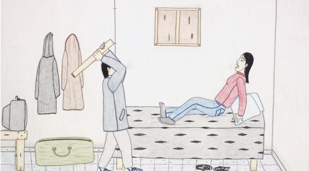

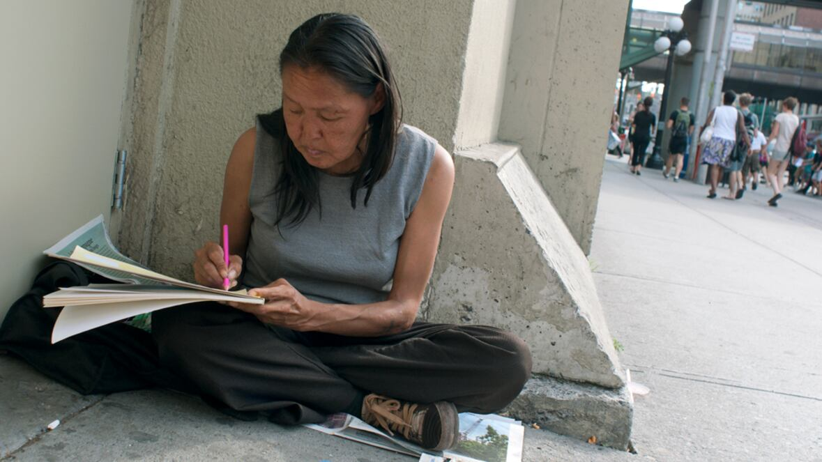
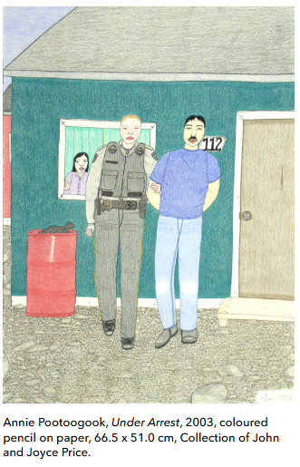
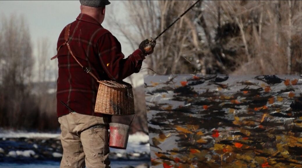

 Ben Miller/ Gary Snyder Fine ArtMiller will bring his artistic vision to life during the art fair. His team will travel to CRIT’s Ahakhav Tribal Preserve to photograph and video the portion of the river that runs through the Preserve. On March 19 as Scottsdale Art Week begins, Miller will be on site at Scottsdale Art Week to begin Fly Cast Painting on a six foot by eight foot by one inch block of plexiglass weighing 300 pounds that will be on a special easel. Those attending will see Miller create the artwork as the painting emerges on the other side of the plexiglass. On Friday March 20th the finished work will be on display. A portion of sales will go to CRIT. Recently, CRIT has taken the bold step to acknowledge personhood status for the Colorado River which protects it under Tribal Law.


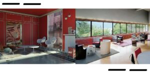
 architectural magazine clippings")

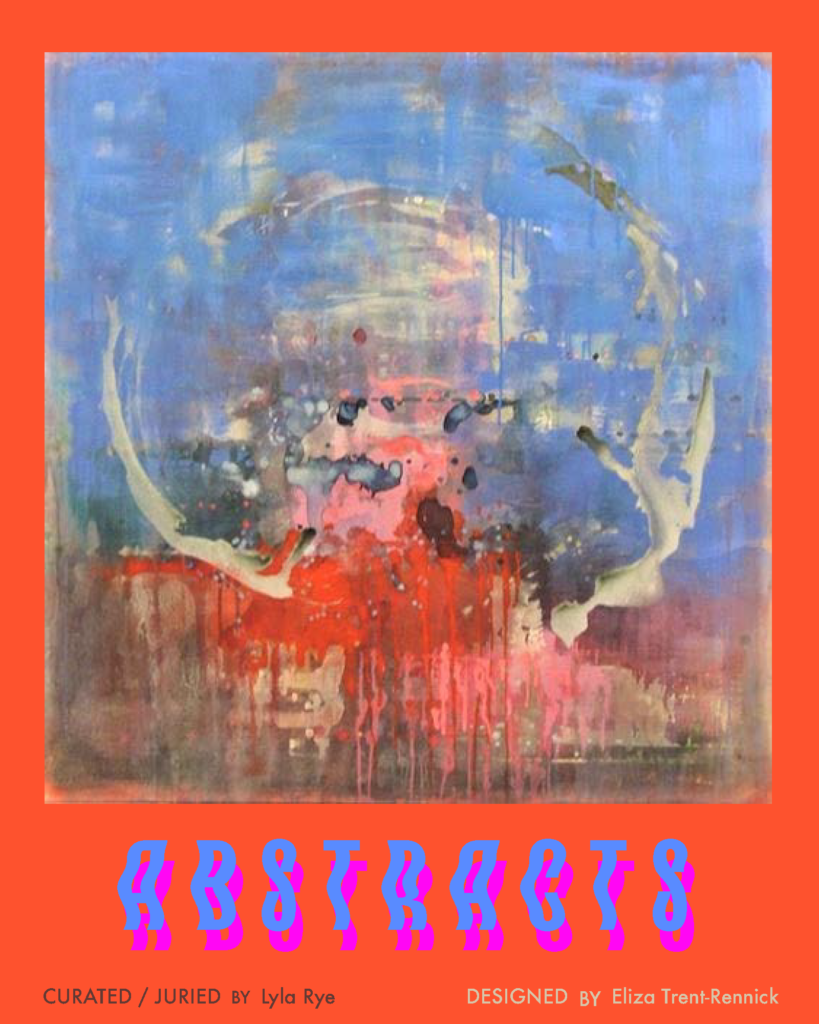
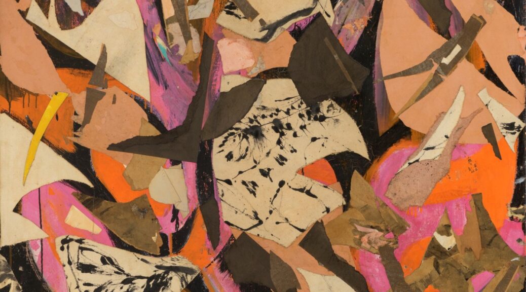
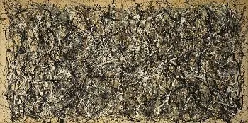

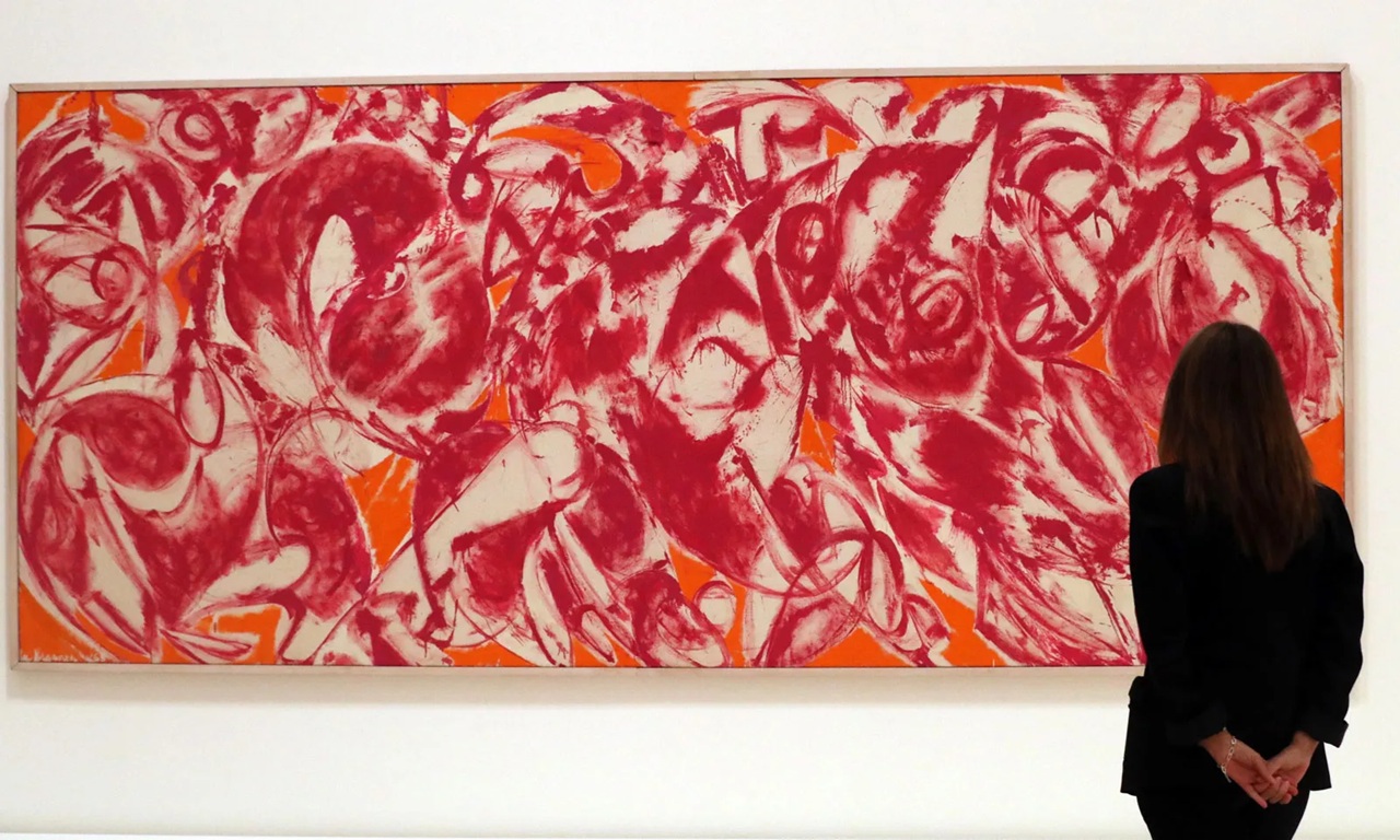
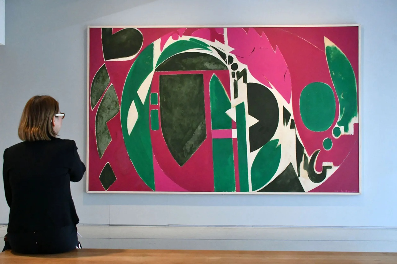
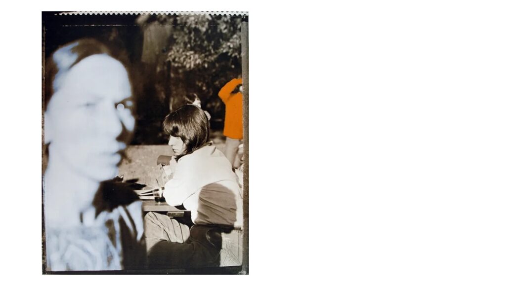
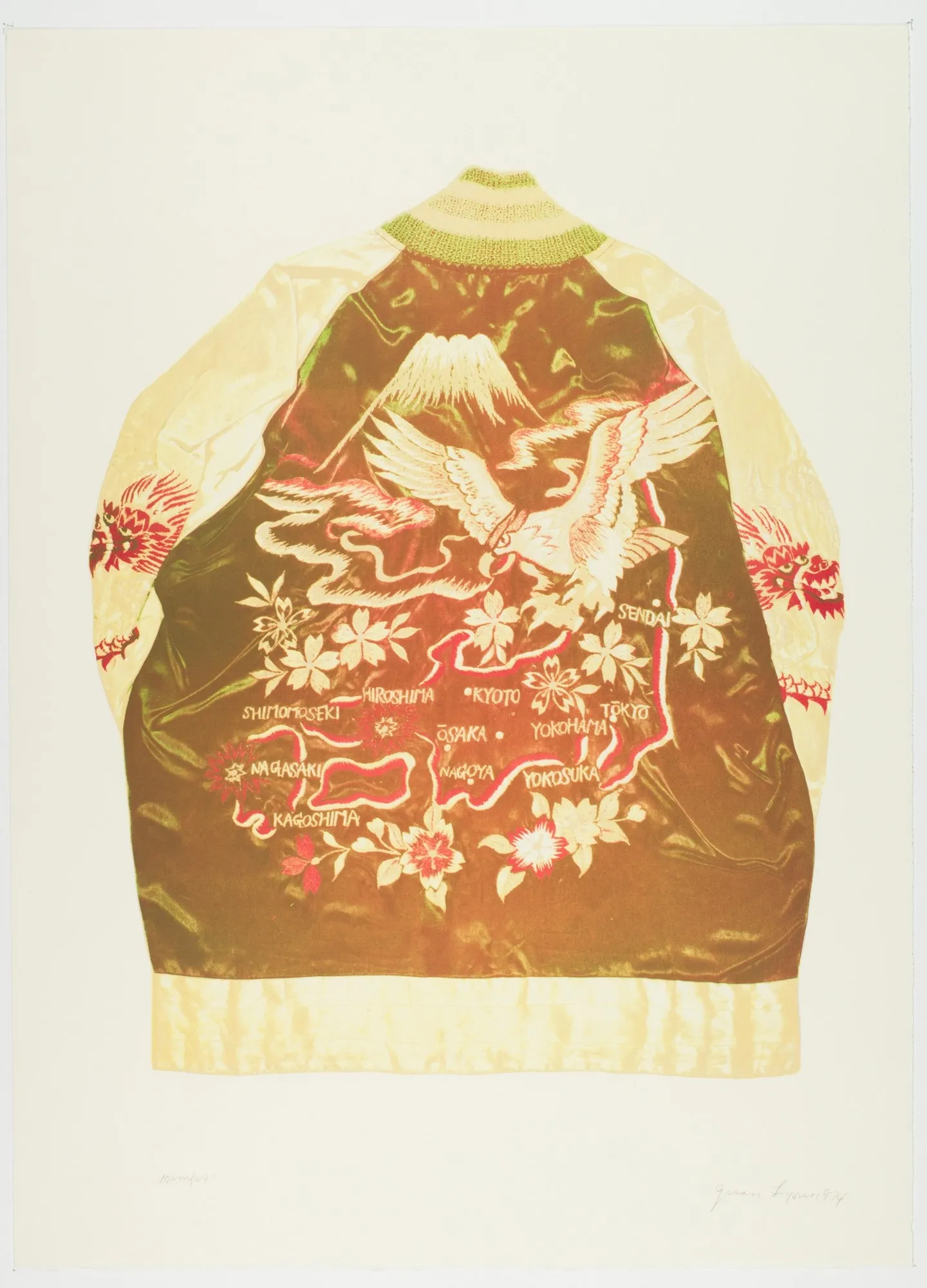
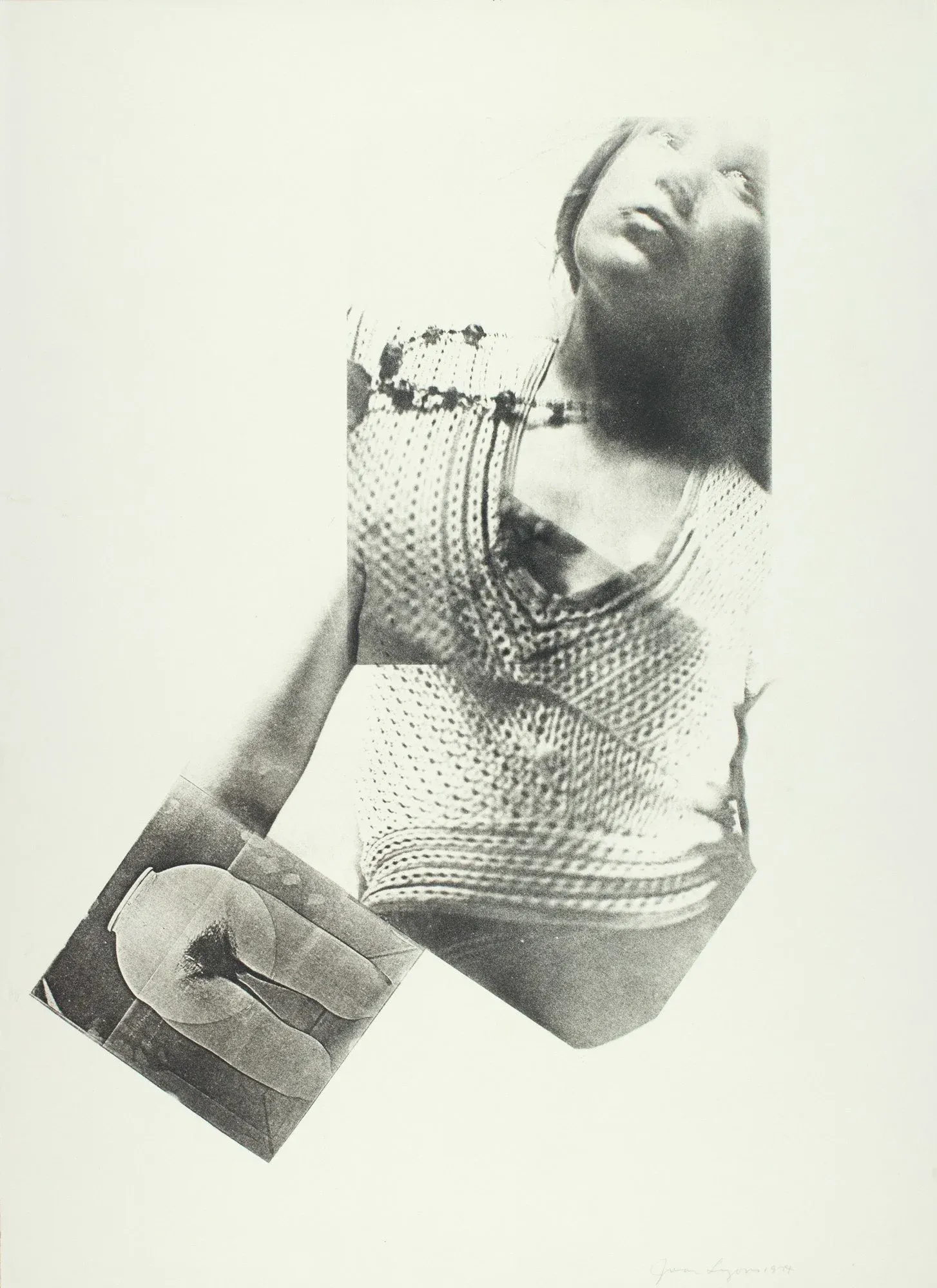
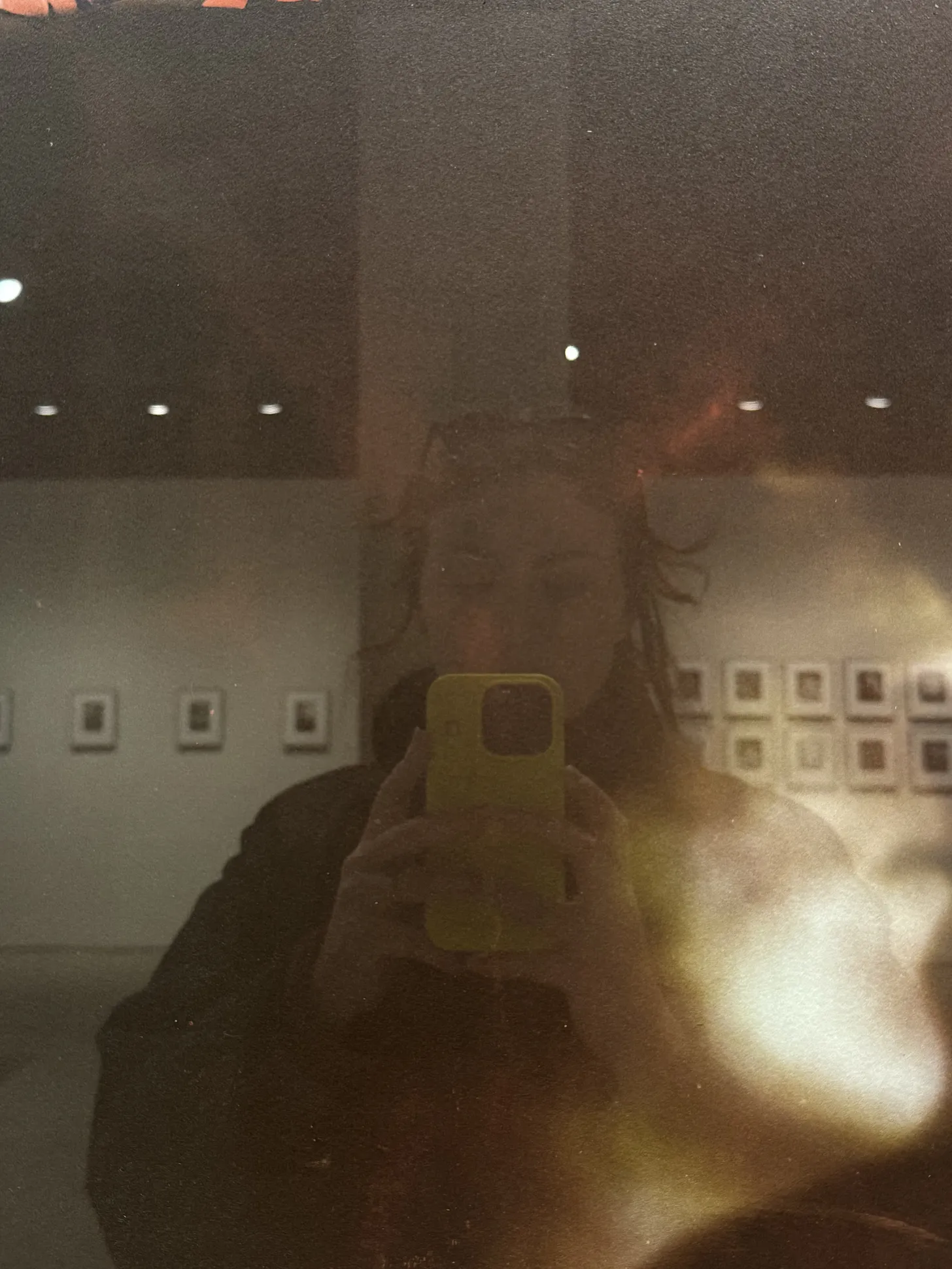


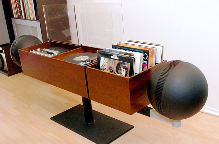


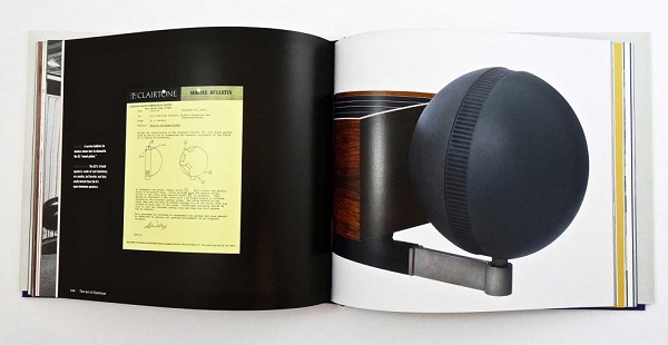


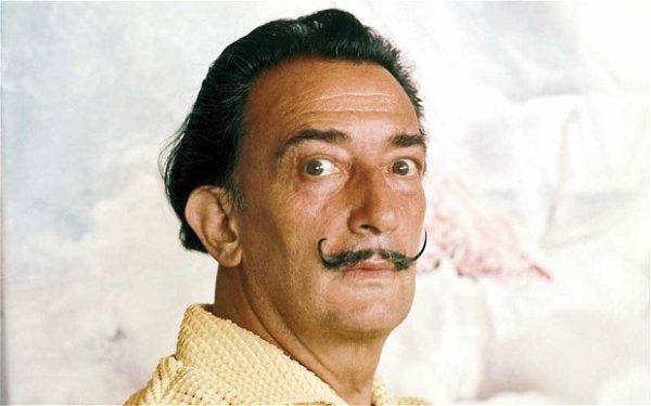

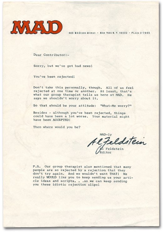 As an artist you will be the recipient of rejection letters and emails.

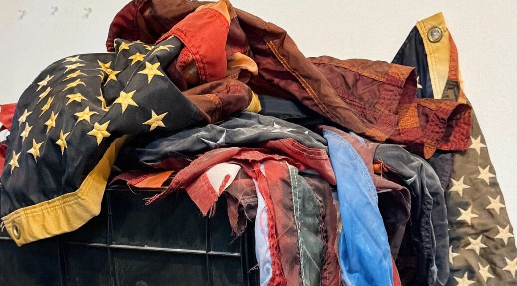
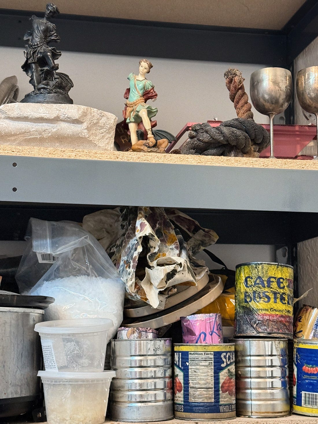
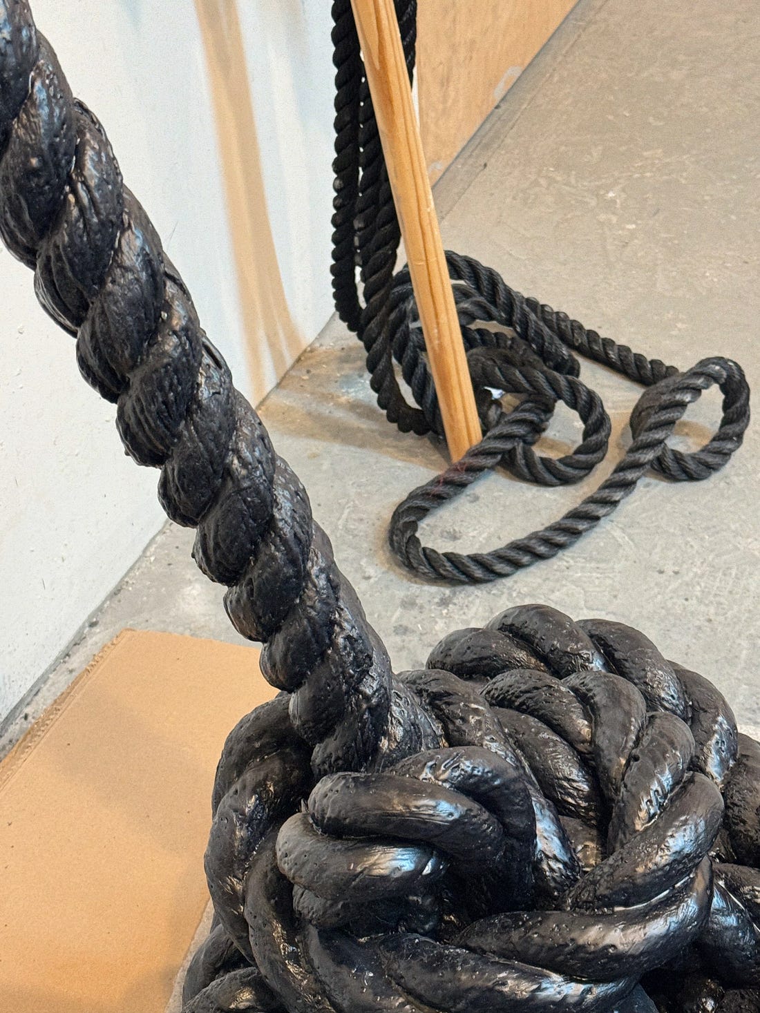
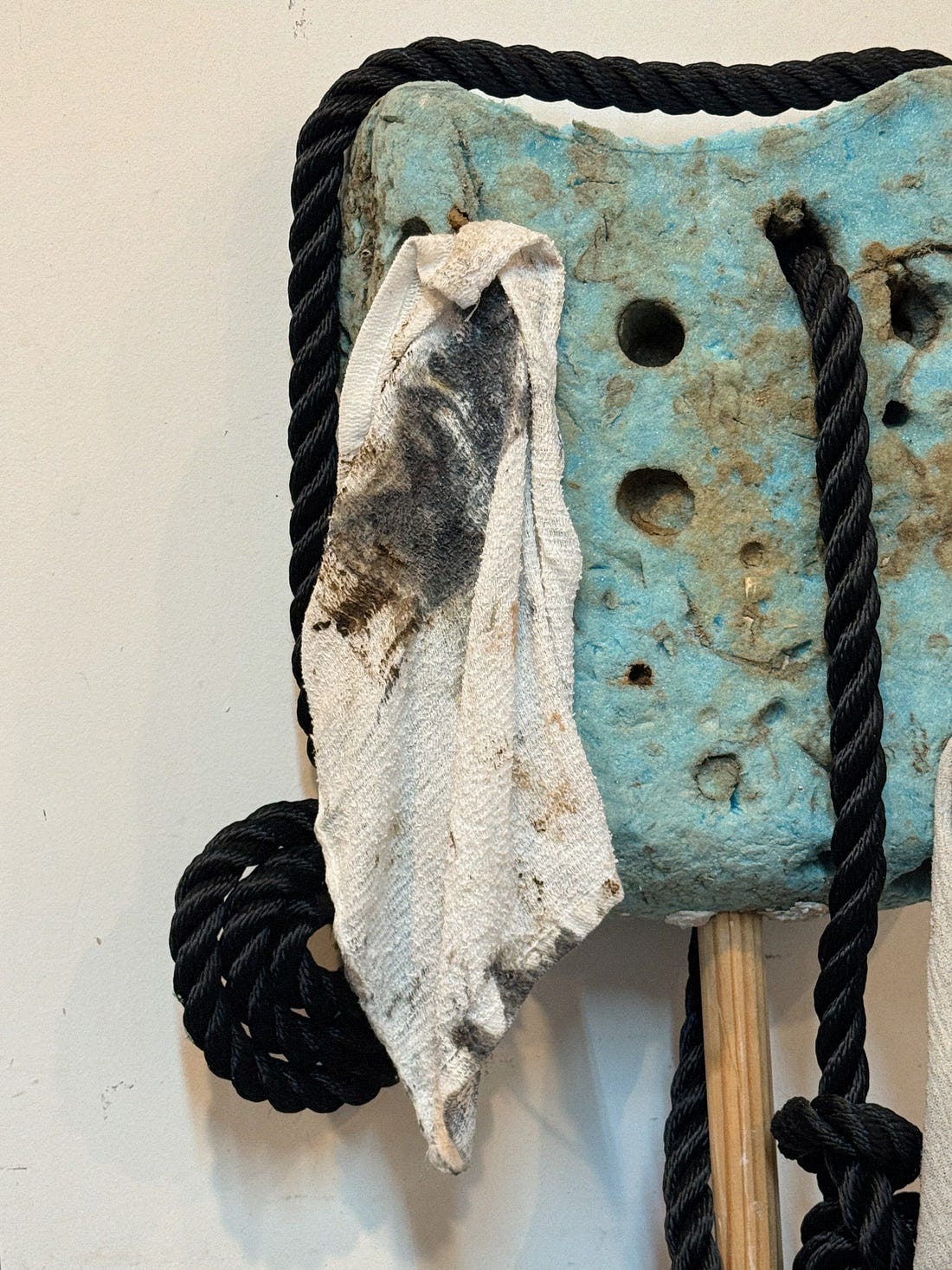
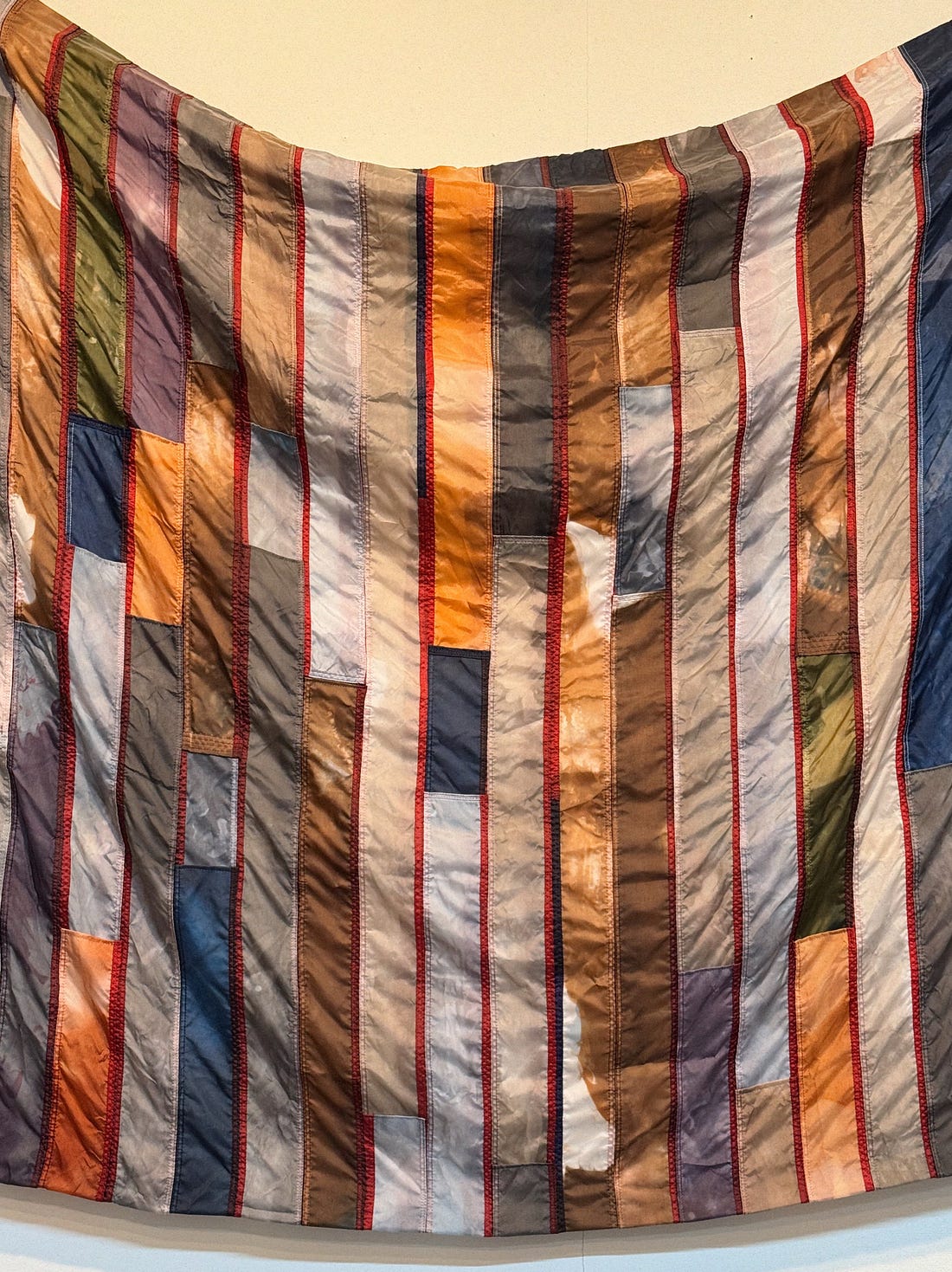
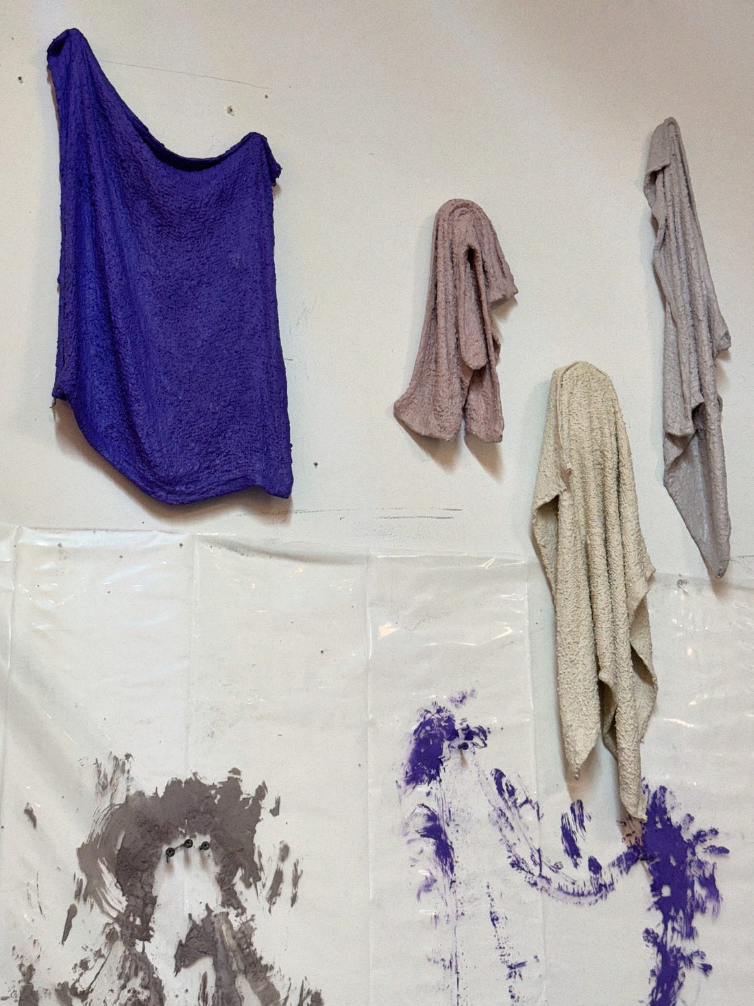
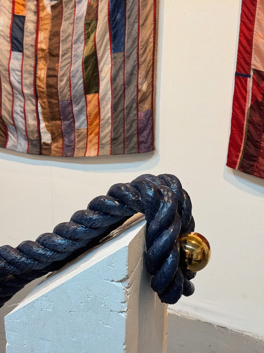
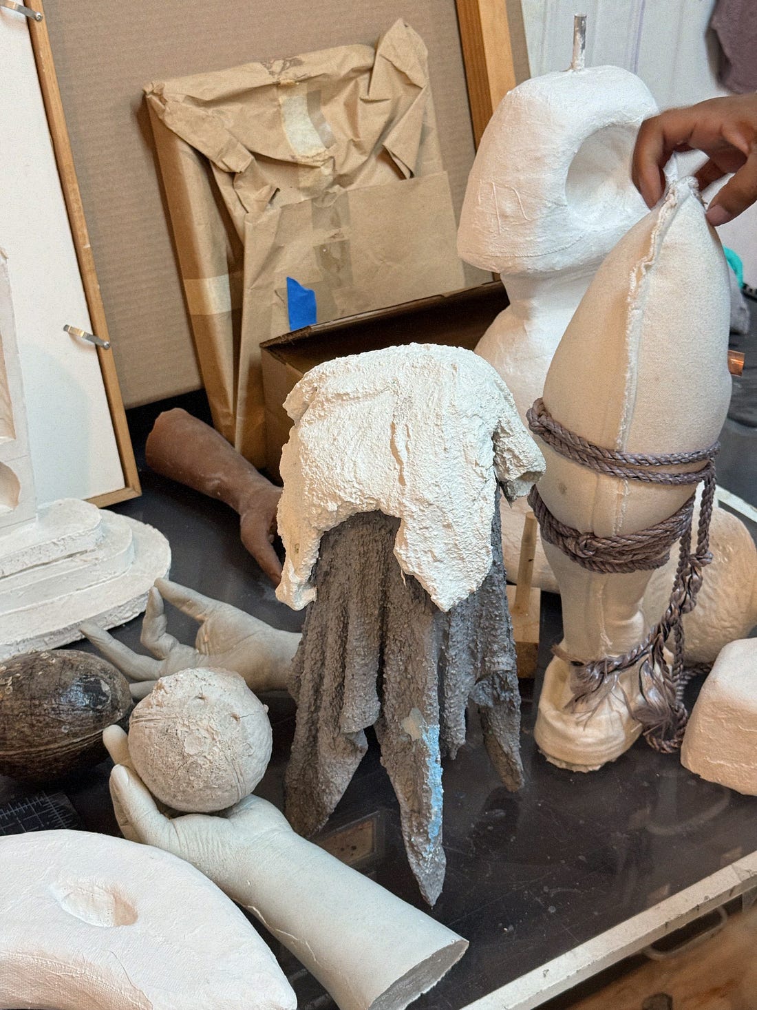
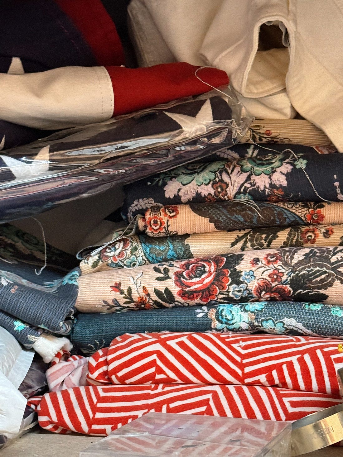
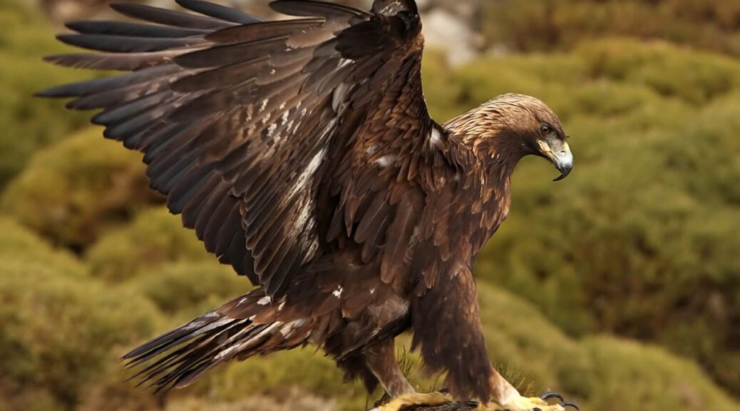

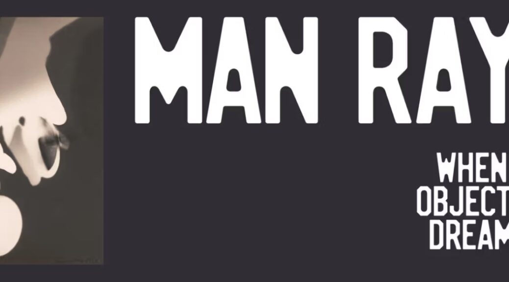
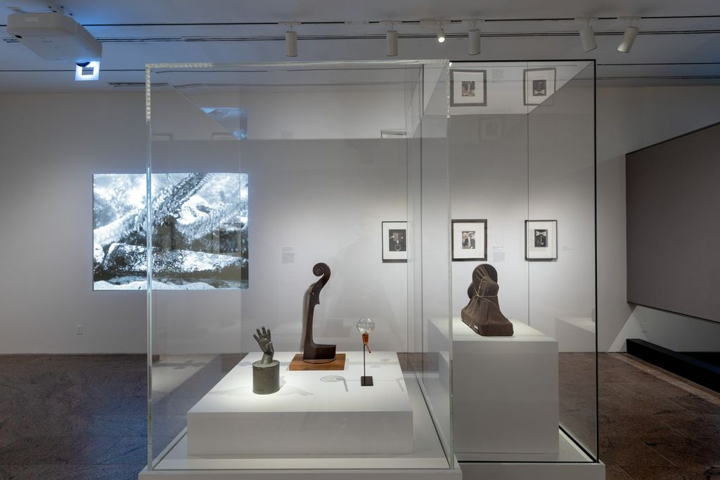
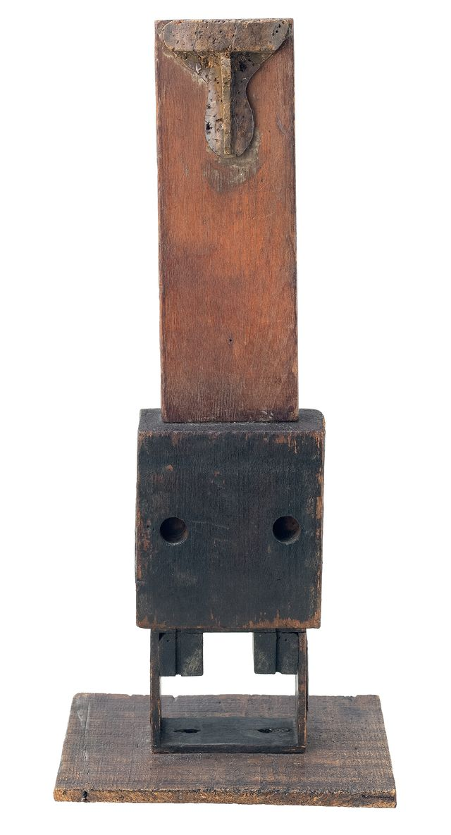
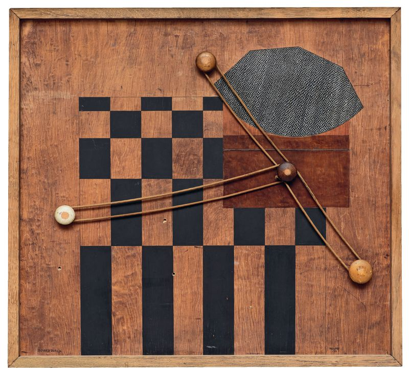
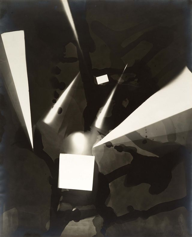
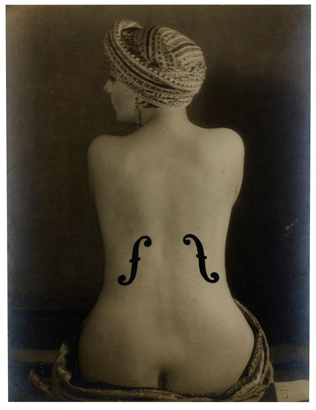
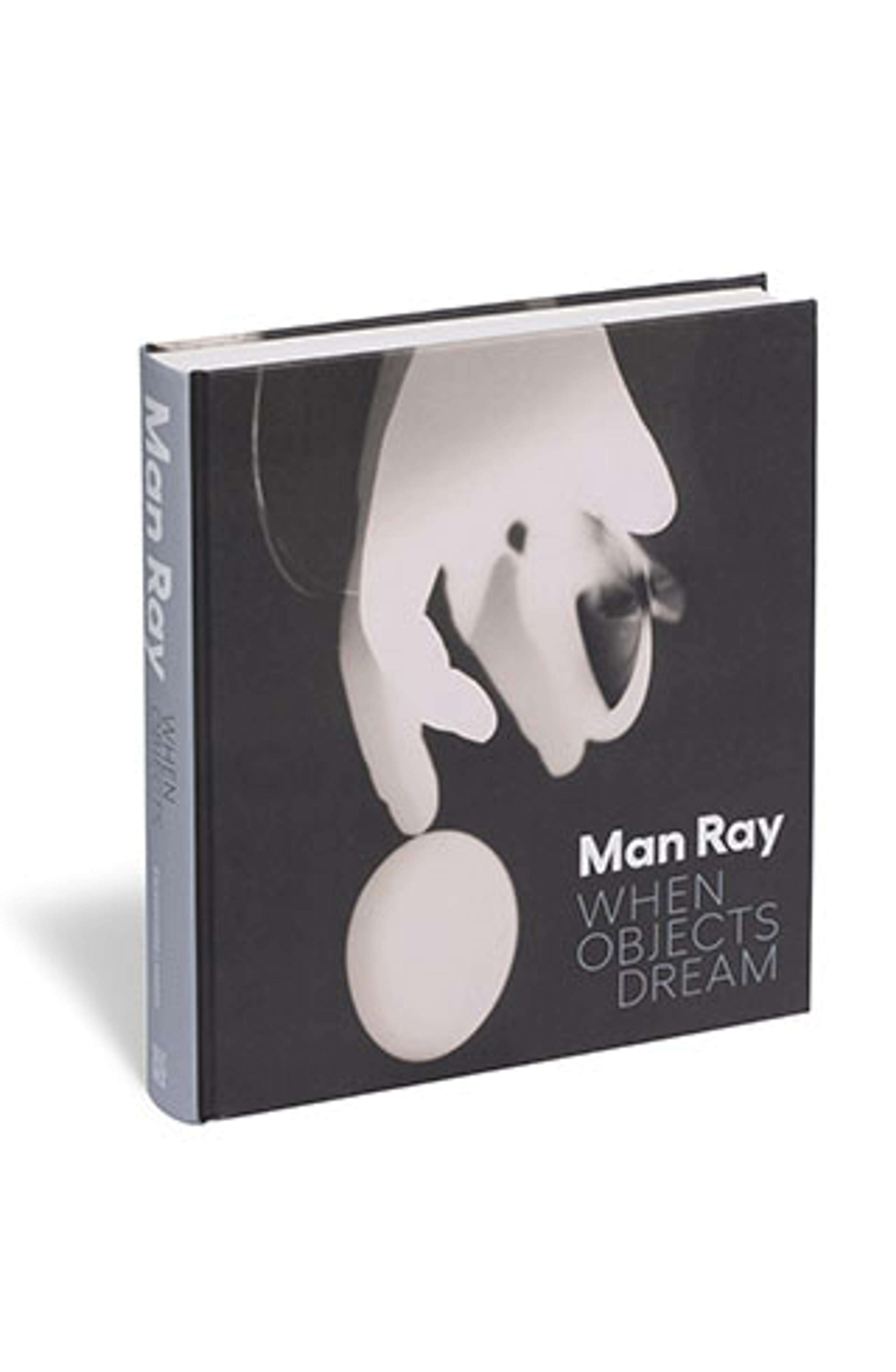
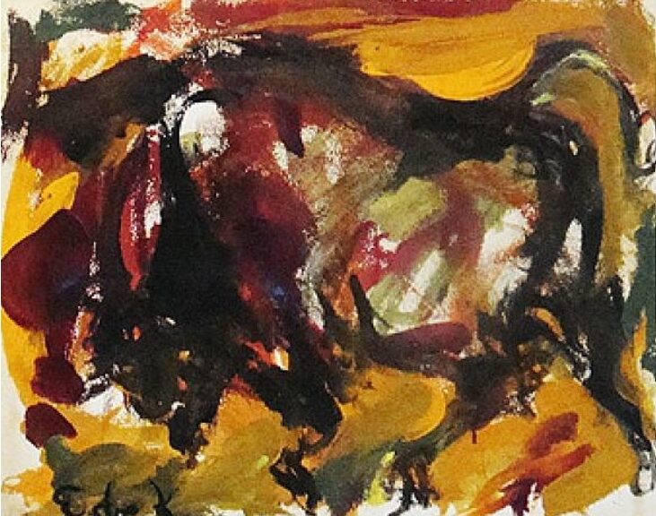
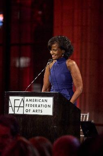
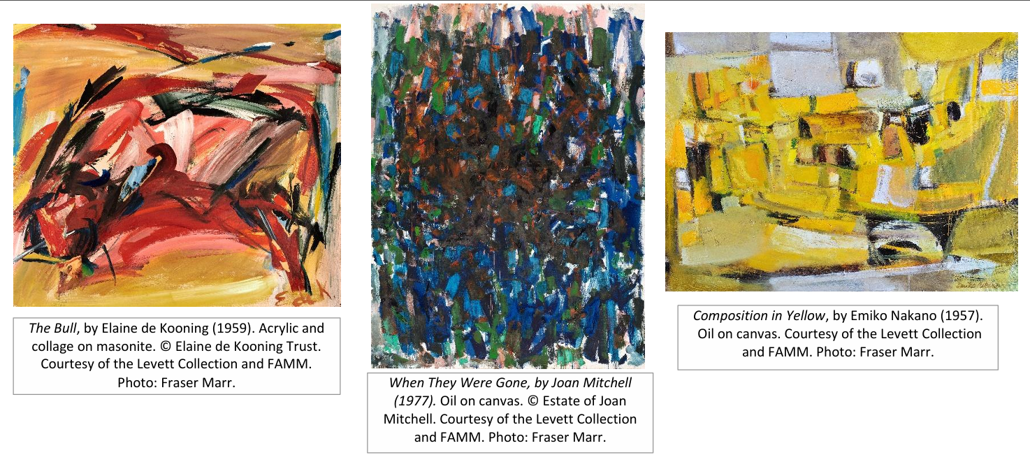
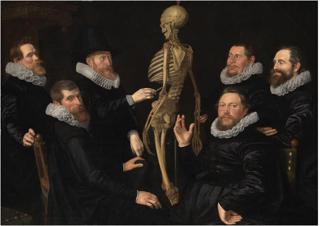
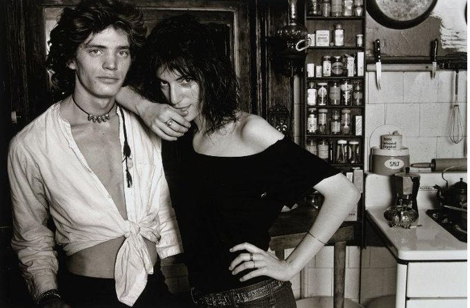
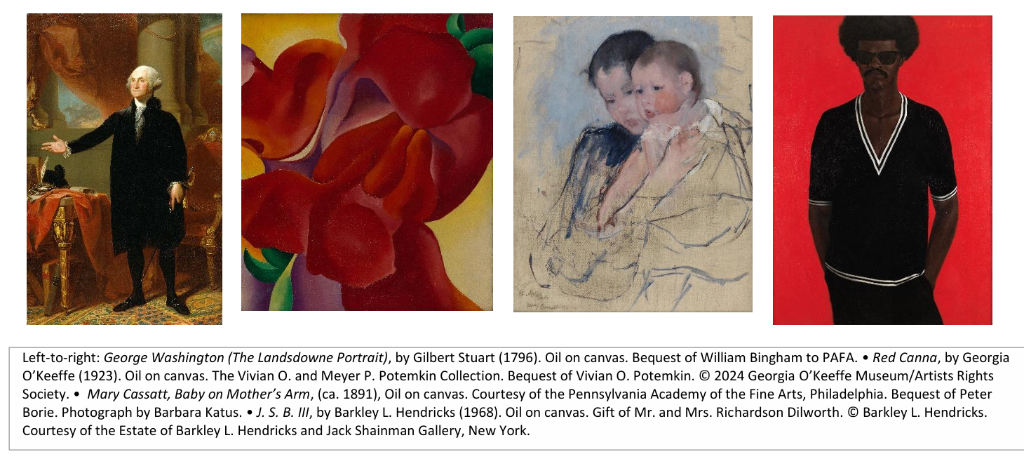
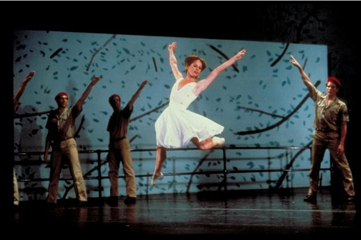
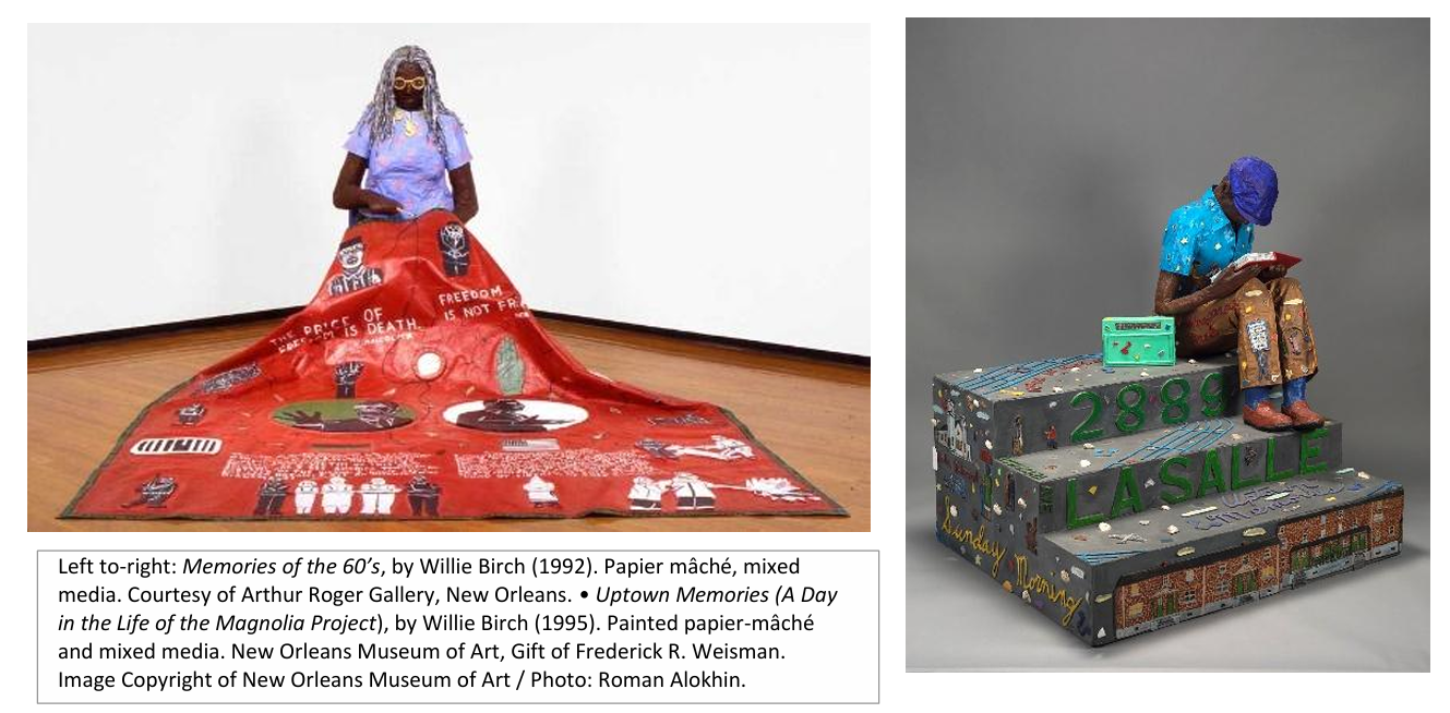
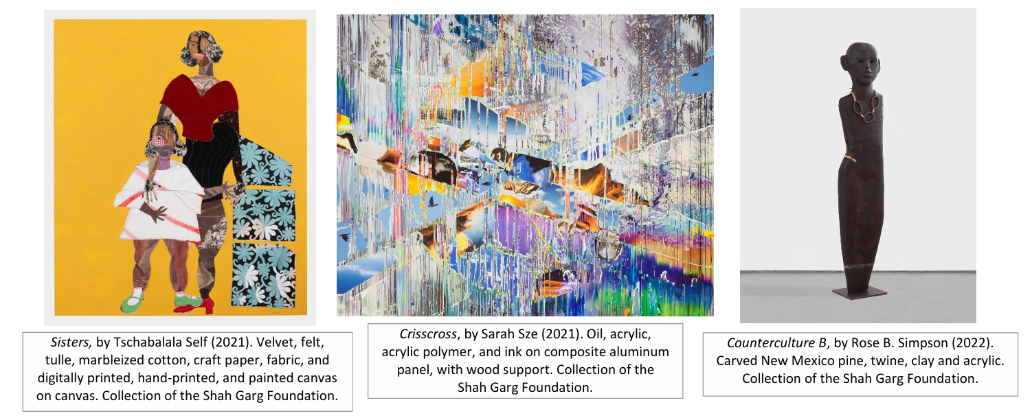
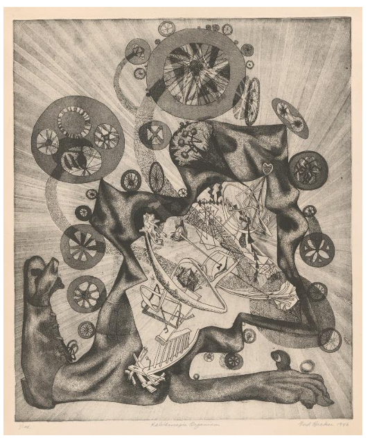
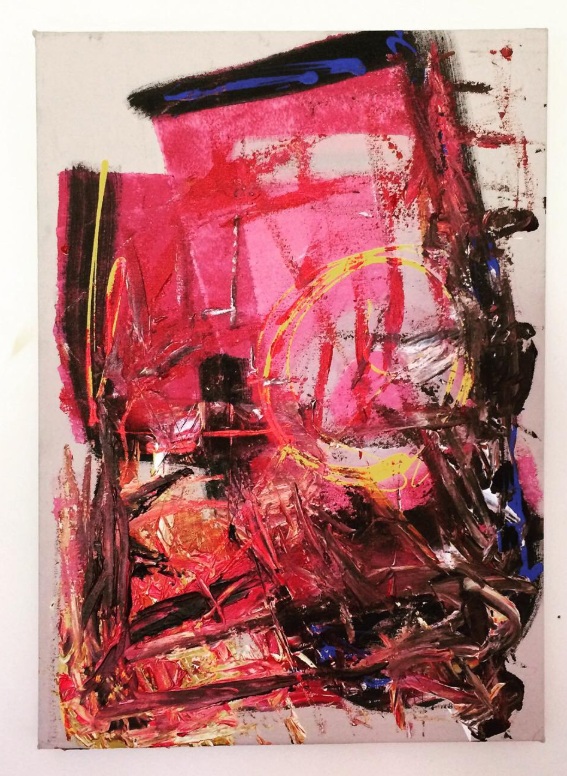


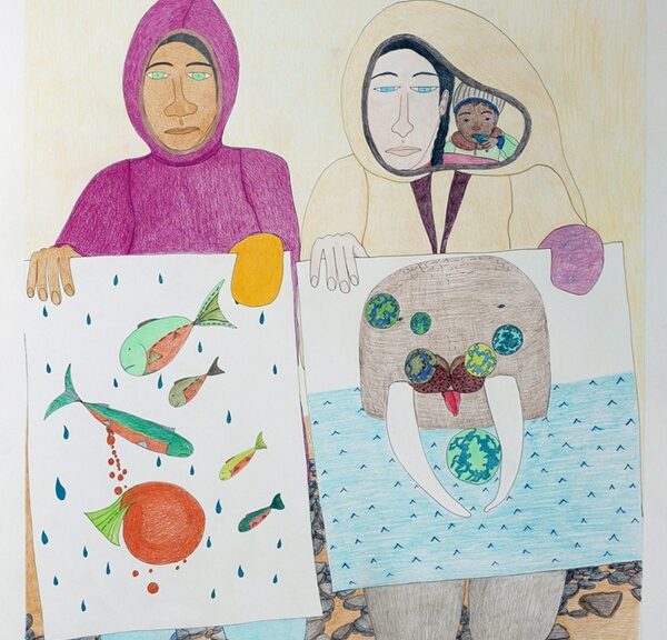
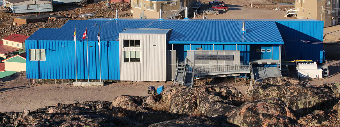
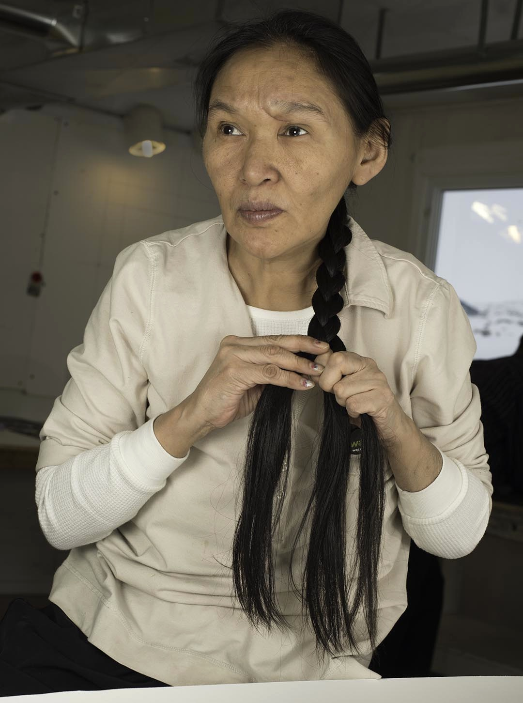
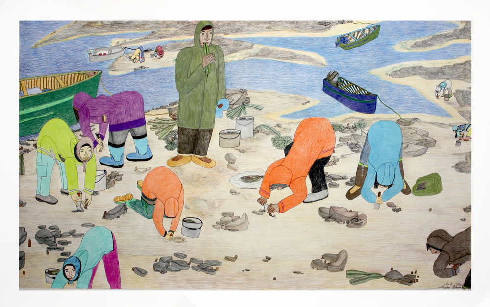


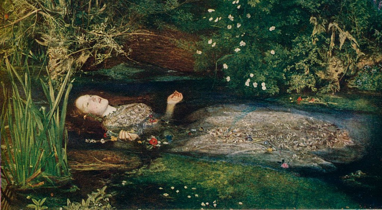
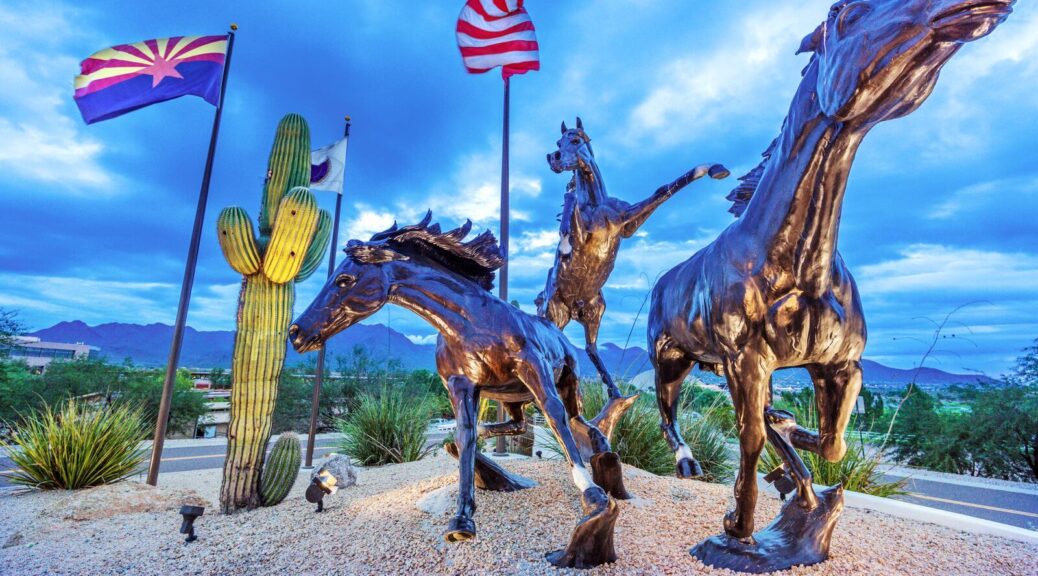


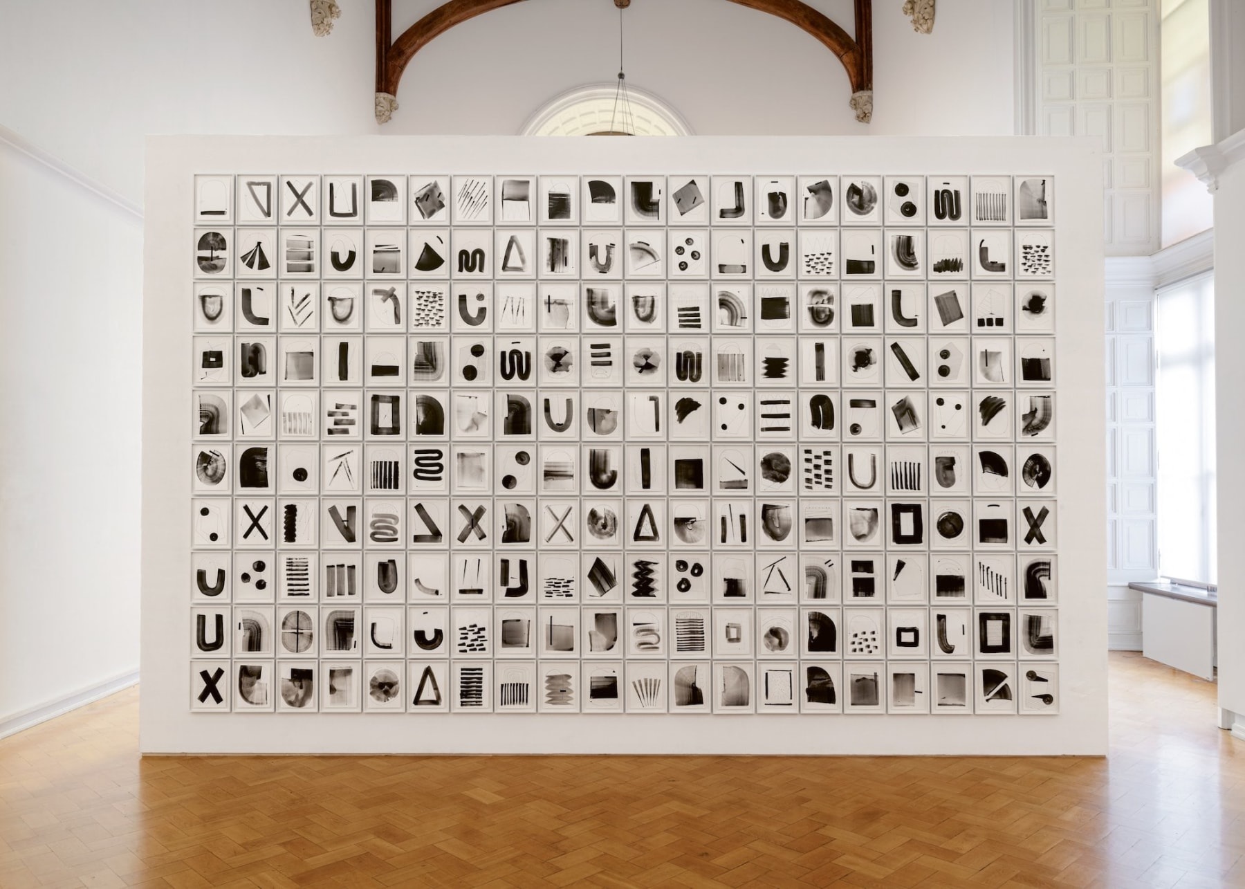


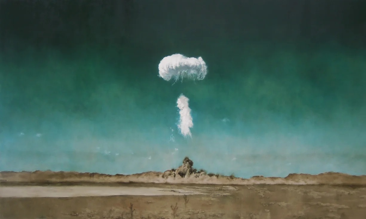
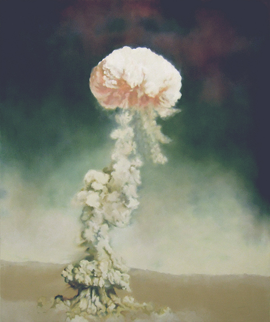
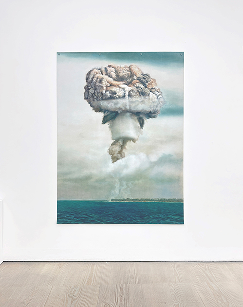
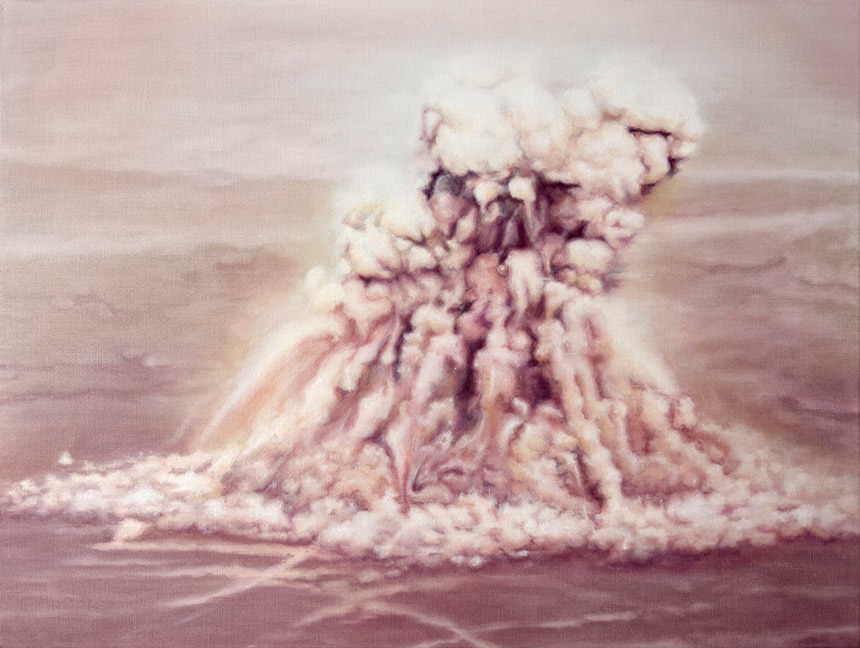
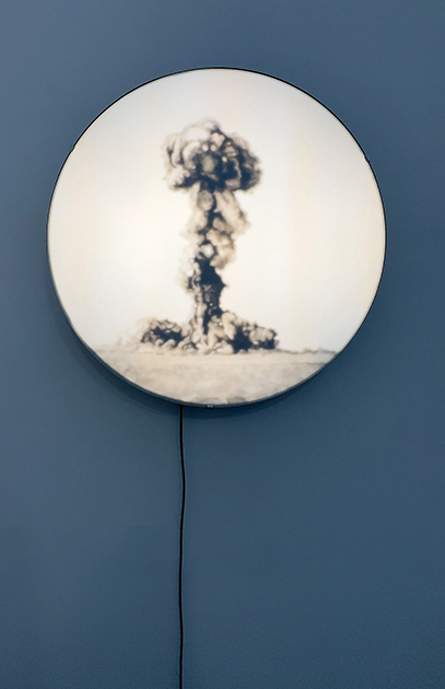
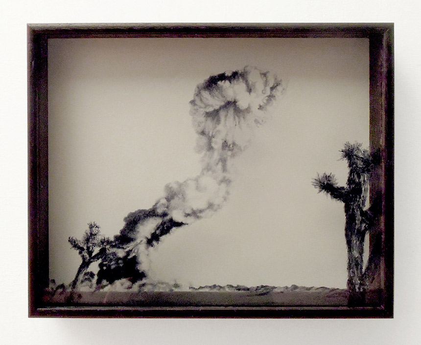
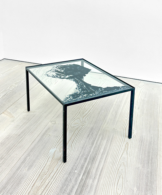
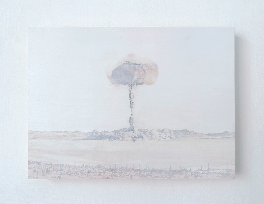
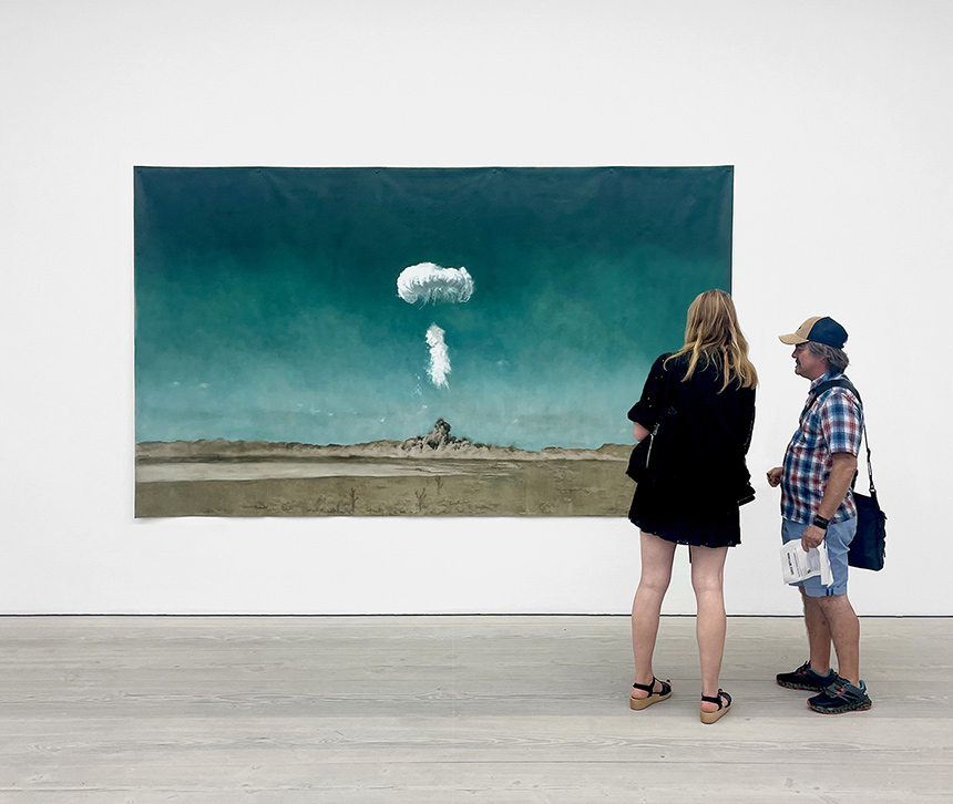
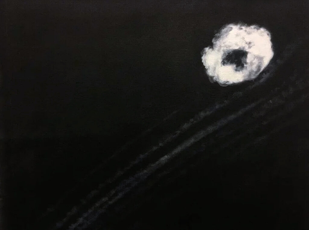
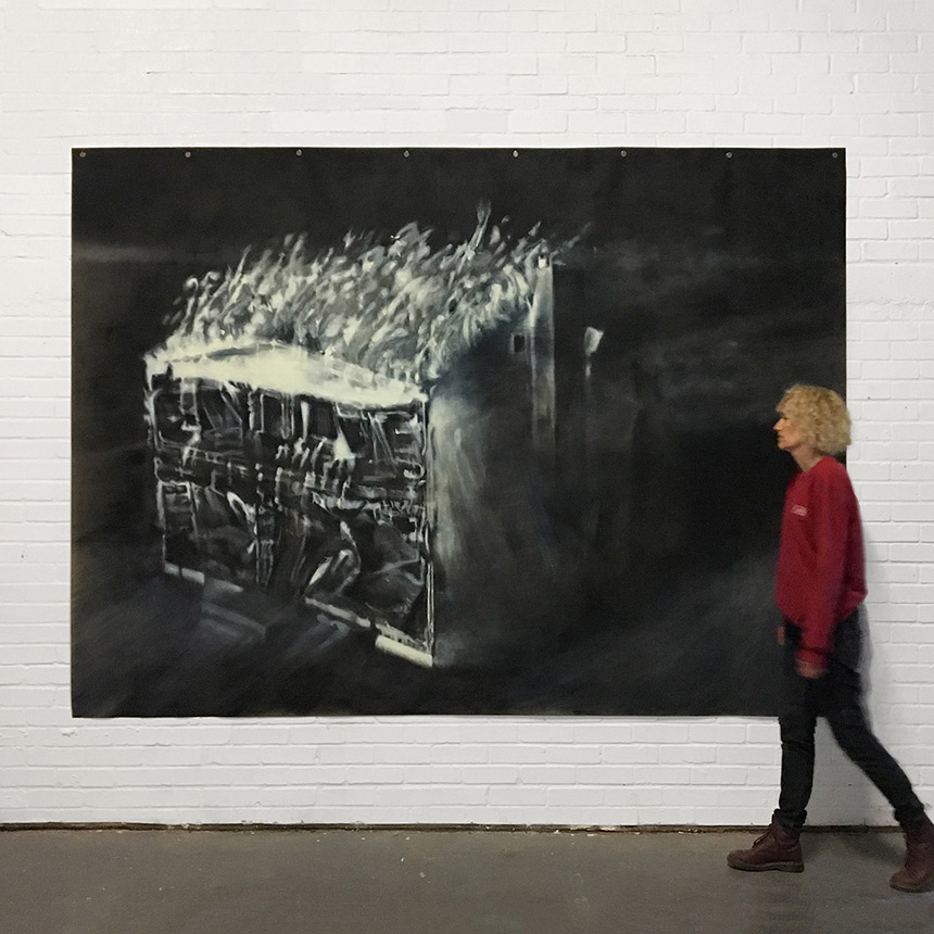
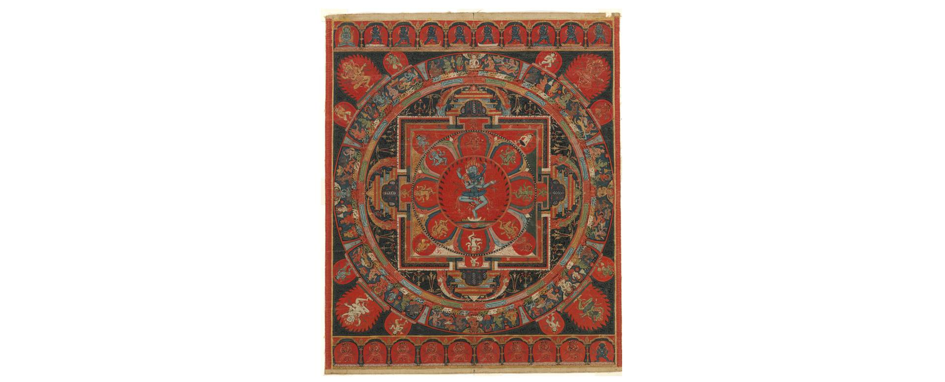

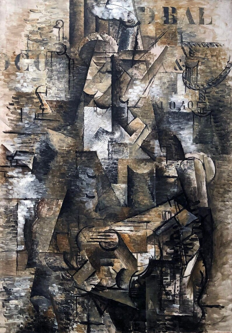


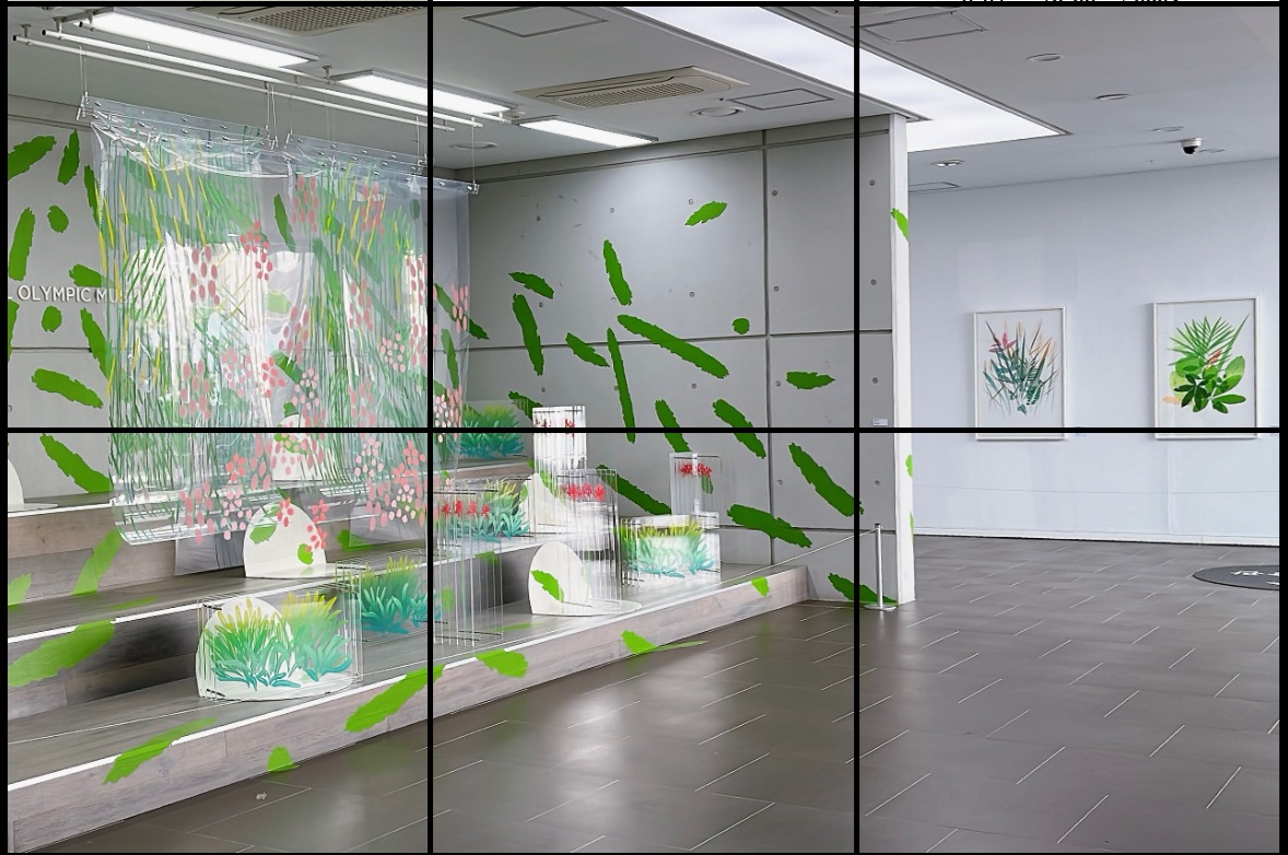
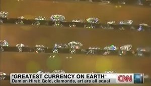