Since the collapse of the Berlin wall in 1989, the countries of eastern European have exploded in a painful big-bang that has changed the geography of Europe and Asia drastically. The new Russia was born, now being part of the Community of Independent States (CIS) that replaces the former USSR. The guitar fraternity in Russia has been living for more than 70 years in total isolation, prevented from being in touch with the West. The presence of many types of the instrument that we call “guitar” has been a constant one in Russian music life in all periods, having very old origins. But only recently has this guitar world started opening to western Europe, and we still know far too little about Russian composers for guitar and Russian guitarists. It was quite difficult for me to get information about some Russian guitarists, due both to the ever-present difficulties in communication (it is still difficult just to send a fax to Moscow during the day time)and to the problems of language comprehension.
The Guitar of the Czars- a new English summary redaction
In the past, references to the Soviet guitar world in Western music literature were always very scarce, and only in recent years has a subtle breath from that guitar world started blowing beyond the Urals. I wish to thank especially the guitarists Mikhail Goldort from Novosibirsk (central Siberia)and Piero Bonaguri, teacher at the Conservatory of Rovigo (Italy) as well as the composer Umberto Bombardelli, who helped me in collecting more information.
At the beginning there was the domra
The guitar was not the only known plucked instrument in Russia; two other instruments at least are worthy of mention: the domra and the balalaika. The domra is nowadays known in two variants with three or four metallic strings and in different sizes. It has a triangular shape, is tuned by fourths,and is played by means of a plectrum.
It is the most ancient plucked instrument, having been imported by the Mongols during the 13th century. Its tremolo is similar to the one of the Neapolitan mandolin and its range is large, due to its having 16 frets up to the junction of the neck. It is now employed both as a solo instrument and in an orchestra,together with the balalaika .
The balalaika has a peculiar triangular shape and three strings, among which two are tuned in unison and the other a fourth up. It appeared first during the 17th century. It was able to oust the domra in popularity, thanks to the preference of the Czars. It is played both by fingers and with the plectrum; from the last years of the Nineteenth Century it has existed in different sizes which cover all the frequency spectrum of the orchestra.
The guitar appeared in Russia during the 18th century, in a society far behind the European one in development. However, at the first half of the 19th century it was already known as a national instrument: the Russian guitar. Its own peculiarities were the tuning by thirds on the notes of the G scale, and having seven strings. It is known by the tender-sounding name of “semistrunaia” (a composite noun made from
“sem’ ” =seven and “struny” = strings).
Its popularity grew among the people of all ranks, both middle and upper class, as described by many Russian poets and writers. There are also many variants of this main type, in number of strings and dimensions. By studying the surviving photos of Russian guitarists of the last century, re-published in the volume Guitar in Russia and USSR (see photo in the full PDF article linked below), we see that the guitar with 7 strings on the neck and 4 strings outside of the neck was very popular. The famous photograph of Valerian Rusanov, one of the first Russian guitar historians, with his 11-string guitar is significant in this respect. This instrument shared favor with the six string guitar (the so-called “shestistrunaia“, from “shest,” which means “six” ) tuned as in the West, and many other types. Continue reading full article PDF by clicking here. For the Silo, Marco Bazzotti.
Roughly once a month, I visit an artist’s studio for the ongoing series Studio Visits. I take iPhone photos of the corners and nooks of their studio, offering a more intimate look into a practice that usually takes place behind closed doors. I’ve said it before, and I’ll say it again: it’s such a gift to be invited into an artist’s studio, which often doubles as a kind of sanctuary for them.I don’t often visit photographers’ studios.
This changed a couple of weeks ago when I was invited to visit Suzy Lake at her studio in Toronto. I’m a huge fan of Lake, and I might have said as much a few times in our email correspondence, no doubt coming across as a crazed fan girl. But I’m a fan for good reason! An American-Canadian artist, Lake has been seminal in both countries for the last five decades. Her photographs combine self-portraiture and performance to comment on larger themes: political justice, the role of an artist, feminism, and aging.
She played a foundational role in shaping Conceptualism in Canada. There’s so much to admire in Lake’s career, and the work itself is equally compelling. So here I am, at Lake’s studio, one of the foremost photographers in Canada, and I am taking pictures. As you can imagine, I am very self-conscious. I start clicking away on my iPhone, no doubt diminishing the medium with my lack of artistic ability. (Of course, this series isn’t about the photos themselves, but a desire to document and archive important artist practices.)
For Lake, the act of photographing is important. The images are complex and layered. The photograph doesn’t happen the moment the shutter clicks, but in the process, creation, and performance that spans the duration of the photograph.For example, in her seminal series, Extended Breathing (2008-14) [see image below], Lake stands still for long enough to be picked up by the long exposure—at least 30 minutes. These photographs become touchstones for how we are remembered, the self as a constant, as life moves around us. Lake is asserting agency over the medium, conveying a powerful message through process.
Artist Bio: Suzy Lake is an American-Canadian artist based in Toronto, Canada. Lake’s work explores the politics of body and identity through performance, video and photography. Her later work addresses the ageing body, questioning structures of power politically and poetically. Lake’s work has been presented extensively across Canada and internationally at the Centre Pompidou-Metz, Museum of Modern Art (New York), Metropolitan Museum of Art (New York), National Gallery of Canada (Ottawa), Brandhorst Museum (Munich), Montreal Museum of Fine Arts, Vancouver Art Gallery, Hayward Gallery (London), Santa Monica Museum of Art, Los Angeles Museum of Contemporary Art, the Musée d’art contemporain de Montréal, and the Art Gallery of Windsor.
For the Silo, Tatum Dooley.
Featured image- Suzy-Lake_1983_Pre-Resolution_Using-the-Ordinances-at-Hand
Installation view of Man Ray: When Objects Dream, on view September 14,2025–February 1, 2026at The Metropolitan Museum of Art. Photo by Anna-Marie Kellen, Courtesy of our friends at The Met.
American artist Man Ray (1890–1976) was a visionary known for his radical experiments that pushed the limits of photography, painting, sculpture, and film. In the winter of 1921, he pioneered the rayograph, a new twist on a technique used to make photographs without a camera. By placing objects on or near a sheet of light-sensitive paper, which he exposed to light and developed, Man Ray turned recognizable subjects into wonderfully mysterious compositions.
Introduced in the period between Dada and Surrealism, the rayographs’ transformative, magical qualities led the poet Tristan Tzara to describe them as capturing the moments “when objects dream.”
The exhibition will be the first to situate this signature accomplishment in relation to Man Ray’s larger body of work of the 1910s and 1920s. Drawing from the collections of The Met and more than 50 U.S. and international lenders, the exhibition will feature approximately 60 rayographs and 100 paintings, objects, prints, drawings, films, and photographs—including some of the artist’s most iconic works—to highlight the central role of the rayograph in Man Ray’s boundary-breaking practice.
“Before my eyes an image began to form, not quite a simple silhouette of the objects as in a straight photograph, but distorted and refracted … In the morning I examined the results, pinning a couple of the Rayographs—as I decided to call them—on the wall. They looked startlingly new and mysterious.” — Man Ray
The exhibition is made possible by the Barrie A. and Deedee Wigmore Foundation.
Major funding is provided by Linda Macklowe, the Horace W. Goldsmith Foundation, The Daniel and Estrellita Brodsky Foundation, The International Council of The Metropolitan Museum of Art, Andrea Krantz and Harvey Sawikin, and Schiaparelli.
Additional support is provided by the Vanguard Council.
The catalogue is made possible by the Mellon Foundation.
Additional support is provided by James Park, the Carol Shuster-Polakoff Family Foundation, and Sharon Wee and Tracy Fu.
Exhibition Catalog
Man Ray: When Objects Dream
This volume is the first in-depth study of Man Ray’s groundbreaking rayographs of the 1920s and their interconnections with his Dada and Surrealist works.
American Federation of Arts Announces New Season of Touring Exhibitions for Fall 2025 through 2027 ‒ Museums in over 11 cities will headline art exhibitions created by the American Federation of Arts, with more cities to come ‒
The American Federation of Arts (AFA), the leader in traveling exhibitions worldwide since its founding in 1909, proudly announces the new season for the fall of 2025 through 2027. So far, museums in over 11 cities will headline several art exhibitions created by the AFA and its partners, with more cities to come. Throughout its celebrated 116-year history, the nonprofit institution has helped to spearhead the course of art for generations by enriching the public’s experience and understanding of the visual arts.
Pauline Forlenza at the 2024 AFA Gala in New York (Photo by Alycia Kravitz)
“The AFA’s expansive panorama of new exhibitions demonstrates the importance of listening to the input of visual arts leaders nationwide, focusing on what audiences want to see, and continuing our legacy of shining a light on new artists and trends,” says Pauline Forlenza, the Director and CEO of the American Federation of Arts. “Our longstanding commitment to touring art exhibitions, publishing exhibition catalogues with scholarly research, and developing educational programs is vital – now more than ever.”
These traveling museum shows will open doors to creativity for the next sixteen months to museumgoers. Some of the shows include:
Abstract Expressionists: The Women • Alex Katz: Theater and Dance Civic Virtue in Rembrandt’s Amsterdam: 17th-Century Group Portraits from the Amsterdam Museum • Presence: The Photography Collection of Judy Glickman Lauder • Making American Artists: Stories from the Pennsylvania Academy of the Fine Arts, 1776–1976 • Experimental Ground: Modernist Printmaking in Paris & New York at Atelier 17
Making Their Mark: Works from the Shah Garg Collection, and more. Links to all of the AFA’s 2025 through 2027 exhibition tours may be viewed at: current shows and upcoming tours. Pauline Forlenza at the 2024 AFA Gala in New York (Photo by Alycia Kravitz)
Some of the museums across the country include: National Museum of Women in the Arts, Wichita Art Museum, Muscarelle Museum of Art, Southampton Arts Center, The Gibbes Museum of Art, Taubman Museum of Art, Peabody Essex Museum, Indianapolis Museum of Art, New Orleans Museum of Art, Mobile Museum of Art, and the Museum of Contemporary Art San Diego, among others.
Since 1909, the AFA has toured more than 3,500 exhibitions that have been viewed by millions of people in museums in every U.S. state, and in Canada, Latin America, Europe, Asia, and Africa. From the Smithsonian – “A vital part of American art history, the AFA was one of the first organizations to develop successfully the concept of traveling art exhibitions on a national and international level. Many arts organizations and museums have followed the AFA’s precedent. This national nonprofit museum service organization is recognized for striving to unite American art institutions, collectors, artists, and museums.”
“Through the years, the AFA has also had an impact on patronage in the arts. During its 116-year history, the Federation’s exhibitions of contemporary art provided collectors with knowledge of new artists and avant-garde art forms, creating a broader demand and market for this type of work. Museums and collectors began purchasing work by new or obscure American artists whom they learned about through AFA exhibitions and programs. The AFA also recognizes the importance of the exchange of cultural ideas.”
“Throughout its history, the organization has concentrated on its founding principle of broadening the audiences for contemporary American art, breaking down barriers of distance and language to expand the knowledge and appreciation of art. The touring exhibitions have brought before the public contemporary American artists and craftspeople, genres, and artistic forms of experimentation – exposing viewers to new ways of thinking and expression.”
Highlights from the New Season
View the full list of tours at: amfedarts.org/exhibitions/current and amfedarts.org/exhibitions/upcoming-exhibitions/. The complete lists of current and upcoming touring museum shows are updated regularly, as new exhibitions and new museum dates are added. Following are highlights of eight of the AFA exhibitions that will be touring during the fall of 2025 through 2027.
Abstract Expressionists: The Women
Explores the vital, under-acknowledged innovation of women artists in the Abstract Expressionist movement, the first internationally renowned artistic movement to originate in the U.S. • Featuring 47 works from The Levett Collection, by more than 30 women artists who worked in New York, California, and Paris from the early 1940s through the 1970s.
“Too often, the canon of art history has relegated women artists to supporting roles in major art movements,” says Pauline Forlenza, the Director and CEO of the AFA. “This exhibition upends that narrative, asserting that women painters were critical contributors to the formulation of Abstract Expressionism from the very beginning.
Equally talented and visionary, the female artists featured in this show helped put American art on the map,” adds Forlenza. The exhibition is organized by the American Federation of Arts from the Christian Levett Collection and FAMM (Female Artists of the Mougins Museum), France. This exhibition is curated by Ellen G. Landau, PhD, Andrew W. Mellon Professor Emerita of the Humanities at Case Western Reserve University.
17th-Century Group Portraits from the Amsterdam Museum
The large group portraits in this exhibition have rarely left Amsterdam since they were commissioned in the 1600s, and have never traveled in the U.S. as a group. • The show traces how life in the largest and most important city of Holland was based on the collective responsibility of the burghers, who combined their mercantile wealth with political power. • Amsterdam’s economic success, however, was the result of ruthless trade wars within Europe, colonization and enslavement overseas. • Artists include Adriaen van Nieulandt, Gerrit Berckheyde, Ludolf Bakhuizen, Frederik Jansz, Dirck Santvoort, Ferdinand Bol, Bartholomeus van der Helst, Nicolaes Eliasz Pickenoy, Jan Victors, and of course, Rembrandt van Rijn. • By governing and guarding the city, by organizing and managing a social safety net for the poor and needy, and by stimulating scientific and industrial developments, the burghers contributed to making Amsterdam the most prosperous city in Europe.
The Osteology Lesson of Dr. Sebastiaen Egbertsz, artist unknown (1619). Oil.
Presence: The Photography Collection of Judy Glickman Lauder 100 photographs by 70 artists. • Explores the concept of presence through the tenderness of portraits, the awe within landscapes, the clarity of reportage, and the spontaneity of cityscapes. • Works by Merry Alpern, Diane Arbus, Richard Avedon, Irving Bennett Ellis, Nan Goldin, Dorothea Lange, Danny Lyon, Sally Mann, Susan Meiselas, Helmut Newton, Ruth Orkin, Gordon Parks, Edward Steichen, Joyce Tenneson, James Van Der Zee, Todd Webb, Edward Weston, and more. • Photographs can be imprinted with the totality of human experiences, and this exhibition embraces that totality, examining the deeply humanistic history of photography.
Robert Mapplethorpe and Patti Smith, New York, by Norman Seeff (1969). Archival pigment print. Portland Museum of Art, promised gift from the Judy Glickman Lauder Collection.
Making American Artists: Stories from the Pennsylvania Academy of the Fine Arts, 1776–1976
Presenting more than 100 of the most acclaimed and recognizable works of American art. • New narratives of the history of American art, embracing stories about women artists, LGBTQ+ artists, and artists of color, alongside iconic works traditionally associated with PAFA. • Women artists participated in PAFA’s exhibitions as early as 1811, and this show includes paintings by Sarah Miriam Peale, Mary Cassatt, Cecilia Beaux, Alice Neel, and May Howard Jackson (the first African American woman to receive a scholarship to attend PAFA, in 1895). • By 1900, PAFA acquired its first work by a Black artist, Henry O. Tanner. PAFA educated African American artists and acquired their works throughout the twentieth century, and this show features works by Joshua Johnson (one of the first professional Black artists in America), Dox Thrash, Laura Wheeler Waring, Edward Loper, and Barkley L. Hendricks.
Curated by Anna O. Marley, PhD., a scholar of American art and material culture from the colonial era to today.
The first comprehensive museum presentation of Katzʼs highly collaborative and playful work with choreographers, dancers, and members of avant-garde theater ensembles over six decades. • Showcases Katz’s deep and lasting influence on the history of the American performing arts. • Rare archival materials, major sets and paintings, and previously unexhibited sketches from more than two dozen productions. • Spotlights fifteen productions that Katz produced with Paul Taylor, exploring their creative partnership that generated some of the most significant postmodern dance and art of the twentieth century. • Artworks from the show are drawn from the Alex Katz holdings at the Colby College Museum of Art (home to a collection of nearly 900 works by the artist), from Paul Taylor Dance Archives, and from the artist’s studio.
• Provides an innovative kind of retrospective: that of an artistic sensibility. • Attesting to the intertwined histories of painting and stage design in Katzʼs works. • Curated by Levi Prombaum, former Katz Consulting Curator, Colby College Museum of Art.
Willie Birch: Stories to Tell
Chronicles Birch’s unique vision of the Black American experience and examines the interconnected nature of global art forms. • The first ever career retrospective brings together groundbreaking works from the early 1970s to the present.
Throughout his career, the artist has explored how African traditions have been retained in music, art, and culture in America and beyond. • Birch was raised in New Orleans and trained in Europe, Baltimore, and New York. • His work as an artist, community organizer, and cultural provocateur questions why certain things are retained and not others, unearthing uncomfortable truths about American identity, but also offering possibilities for greater cultural awareness.
Left to-right: Memories of the 60’s, by Willie Birch (1992). Papier mâché, mixed media. Courtesy of Arthur Roger Gallery, New Orleans. • Uptown Memories (A Day in the Life of the Magnolia Project), by Willie Birch (1995). Painted papier-mâché and mixed media. New Orleans Museum of Art, Gift of Frederick R. Weisman. Image Copyright of New Orleans Museum of Art / Photo: Roman Alokhin.
Making Their Mark: Works from the Shah Garg Collection
Reveals the intergenerational relationships fostered among women artists over the last eight decades, assembling over 70 works made by 60 women artists between 1946 and today. • Sculpture, painting, installation, textiles, pottery, and mixed media works all converge. • Pioneering examples of post-war abstraction —including early works by Janet Sobel, Judy Chicago, and Mary Corse — are shown alongside compositions by leading contemporary artists such as Julie Mehretu, Lorna Simpson, and Aria Dean. • Paintings and mixed media works by Christina Quarles, Tschabalala Self, and Firelei Báez blur the boundaries between abstraction and figuration. • Connections between the handmade and digital emerge in the various forms of piecework employed in Faith Ringgold’s quilts, Howardena Pindell’s collages, and the pixelated, hypermediated canvases made by Jacqueline Humphries and Anicka Yi.
Works by the Freedom Quilting Bee, Françoise Grossen, and Sheila Hicks explore irregular geometries and eccentric abstractions via fabric and fiber. • Curated by Cecilia Alemani of High Line Arts in New York City. Sisters, by Tschabalala Self (2021). Velvet, felt, tulle, marbleized cotton, craft paper, fabric, and digitally printed, hand-printed, and painted canvas on canvas. Collection of the Shah Garg Foundation. Crisscross, by Sarah Sze (2021). Oil, acrylic, acrylic polymer, and ink on composite aluminum panel, with wood support. Collection of the Shah Garg Foundation. Counterculture B, by Rose B. Simpson (2022). Carved New Mexico pine, twine, clay and acrylic. Collection of the Shah Garg Foundation.
Experimental Ground: Modernist Printmaking
In Paris & New York at Atelier 17 The first large-scale survey of original prints made at Atelier 17 to tour the U.S. in 50 years. • This revolutionary printmaking workshop (1927 to 1988) was famous for its impact on the development of modern art.
Kaleidoscopic Organism, by Fred Becker (1946). Softground etching. Courtesy of O’Brien Art Project Foundation.
It served as a hub of artistic and intellectual exchange — first for Surrealists in interwar Paris, and after World War II for the exploration of abstraction and other modernist styles. • Commemorates 100 years since the founding of the studio. • Presents works by notable artists who gained formative skills at Atelier 17, such as Joan Miró, Yves Tanguy, Louise Bourgeois, Franz Kline, Jackson Pollock, Louise Nevelson, and Krishna Reddy, among many other artists who participated in intense collaborations at the studio. • Atelier 17 attracted hundreds of international artists, drawn to the radical vision of printmaking as a mode for experimentation rather than reproduction.
About the American Federation of Arts
The American Federation of Arts (AFA) is the leader in traveling exhibitions in the U.S. and worldwide. One of the first to successfully tour art exhibitions on a national and international level, the organization unites American art institutions, collectors, artists, and museums. The AFA has toured more than 3,500 exhibitions that have been viewed by millions of people in museums in every U.S. state, and in Canada, Latin America, Europe, Asia, and Africa.
A nonprofit organization founded in 1909, AFA is dedicated to enriching the public’s experience and understanding of the visual arts through organizing and touring art exhibitions for presentation in museums around the world, publishing exhibition catalogues featuring important scholarly research, and developing educational programs.
Abstract Expressionists: The Women is organized by the American Federation of Arts from the Christian Levett Collection and FAMM (Female Artists of the Mougins Museum), France. The exhibition is curated by Dr. Ellen G. Landau. It is generously supported by Berry Campbell Gallery, Betsy Shack Barbanell, Monique Schoen Warshaw, Christian Levett, and Clare McKeon and the Clare McKeon Charitable Trust. Additional support has been provided by the Pollock-Krasner Foundation and the Every Page Foundation.
Making Art, Making History: 200 Years of American Stories from the Pennsylvania Academy of the Fine Arts is co-organized by the American Federation of Arts and the Pennsylvania Academy of the Fine Arts. Lead support was provided to PAFA by the William Penn Foundation, with additional support from the Richard C. von Hess Foundation and donors to PAFA’s Special Exhibitions Fund. In-Kind support is provided by Christie’s and Gill & Lagodich Fine Period Frames, New York. This exhibition is supported by an indemnity from the Federal Council on the Arts and the Humanities.
Alex Katz: Theater and Dance is organized by the American Federation of Arts and Colby College Museum of Art. This exhibition is curated by Levi Prombaum, former Katz Consulting Curator, Colby College Museum of Art. The 2022 presentation of Alex Katz: Theater and Dance was organized by the Colby Museum with curatorial guidance from Robert Storr.
Willie Birch: Stories to Tell is co-organized by the American Federation of Arts and the New Orleans Museum of Art. Major support for the exhibition and catalogue is provided by the Andy Warhol Foundation for the Visual Arts, the Henry Luce Foundation, Wyeth Foundation for American Arts, and the Terra Foundation for American Art.
Making Their Mark: Works from the Shah Garg Collection is organized by the American Federation of Arts and the Shah Garg Foundation. The exhibition is curated by Cecilia Alemani, the Donald R. Mullen, Jr. Director and Chief Curator of High Line Arts in New York City.
Experimental Ground: Modernist Printmaking in Paris & New York at Atelier 17 is organized by the American Federation of Arts. This exhibition is curated by Ann Shafer and Christina Weyl. Civic Virtue in Rembrandt’s Amsterdam: 17th-Century Group Portraits from the Amsterdam Museum is organized by the American Federation of Arts.
Presence: The Photography Collection of Judy Glickman Lauder is co-organized by the Portland Museum of Art, Maine, and the American Federation of Arts.
Untitled. abstract expressionism- oil on canvas Jarrod Barker 2021
New Landmark Exhibition at The Met to Explore Powerful Imagery of the Gods of Ancient Egypt
Over 200 stunning works on view together for the first time will reveal how ancient Egypt’s important gods were believed to manifest themselves through extraordinary imagery and depictions. Exhibition Dates: Oct 12, 2025–Jan 19, 2026 Location: The Met Fifth Avenue, The Tisch Galleries, Gallery 899, 2nd floor
(New York, July, 2025)—Divine Egypt at The Metropolitan Museum of Art—the first major exhibition of Egyptian art at the Museum in over a decade—will explore how images of gods in ancient Egypt were experienced not merely as spiritual depictions in temples, shrines, and tombs but were the instruments that brought the gods to life for daily worship, offering ancient Egyptians a vital connection between the human and divine worlds. Opening on October 12, the exhibition will bring together over 200 spectacular works of art to examine the imagery associated with the most important deities in ancient Egypt’s complex and always-expanding constellation of gods.
Over more than 3,000 years, the Egyptian people’s belief system grew to include more than 1,500 gods with many overlapping forms and traits. Divine Egypt will feature impressive works of art, ranging from monumental statues to small elegant figurines in gleaming gold and silver and brilliant blue faience, that represent 25 of ancient Egypt’s principal deities, including the stately falcon-headed Horus, the potentially dangerous lion-headed Sakhmet, the great creator-god Re, and the serene mummiform Osiris. The exhibition will reveal the ways in which subtle visual cues, like what a figure wore, how they posed, or the symbols they carried, helped identify them and their roles.
The exhibition is made possible by The John A. Moran Charitable Trust.
Additional support is provided by the Kelekian Fund, Alaina and Stirling Larkin, and Norby Anderson.
“Divine Egypt will immerse visitors in the breathtaking imagery of the most formidable ancient deities and expansive universe of the Egyptian gods,” said Max Hollein, The Met’s Marina Kellen French Director and Chief Executive Officer. “The Museum’s galleries for Egyptian art are among the most beloved by our millions of yearly visitors, and this dazzling exhibition brings together some of our most exquisite works with loans from leading global institutions for an exceptional, once-in-a-lifetime exhibition of ancient Egyptian art.”
The exhibition will include magnificent works of ancient Egyptian art that have never been exhibited together before, many of them on loan from institutions such as the Museum of Fine Arts, Boston; the Musée du Louvre, Paris; and the Ny Carlsberg Glyptotek, Copenhagen. There will also be over 140 works from The Met’s own iconic Egyptian art collection. Highlights range from impressive sculpture to a striking pectoral in gold and lapis (the substances that the bodies of gods were believed to be made of) to detailed metal and wood sculptures. A solid gold statue of the god Amun will adorn a re-creation of a divine barque, a type of boat that held the principal deity of a temple and would be paraded through the streets during festivals so that people could commune directly with the god. Each section of the exhibition will provide an immersive opportunity to examine the ways in which the kings and people of ancient Egypt recognized and interacted with their gods.
“The ways in which the ancient Egyptian gods were depicted are vastly different from the divine beings in contemporary religions and therefore are intriguing to modern audiences,” said Diana Craig Patch, Lila Acheson Wallace Curator in Charge of Egyptian Art. “The identity of an ancient Egyptian god may at first seem easy to recognize but looks can be deceiving, as one form can be shared by many deities. Across more than 3,000 years of history, gods, attributes, roles, and myths were rarely dropped from use, yet the Egyptians of the time had no difficulty understanding and accepting the resulting multiplicity. Through hundreds of spectacular objects, Divine Egypt will allow visitors to understand the complex nature of these deities and help translate the images that were needed to make the inhabitants of the celestial realm available to ancient Egyptians.”
By focusing on the imagery associated with many of the most important and powerful deities in ancient Egypt, the exhibition will reveal the multifaceted nature of ancient Egyptian religion as well as the ease with which ancient Egyptians connected with their complicated divine landscapes. Some deities deceptively employed the same imagery with the result that one form could be shared by many gods, while in other cases the roles of deities would expand or change over ancient Egypt’s long history, with one god taking on many forms. The evolution of this landscape over time created deities with numerous roles often having a different representation for each manifestation. Hathor, for example, can appear as a cow, a woman wearing a headdress of horns protecting a sun disk, or a human-headed snake, while some gods maintained consistent forms over thousands of years, like Ptah, who is almost always mummiform and wears a cap.
Divine Egypt will also look at how two categories of society interacted differently with the gods: the Pharaoh and high priests had access to the gods in daily temple rituals, while non-royal Egyptians were not permitted to enter the inner sanctuaries of the great temples where the deities came to Earth and inhabited their images. Through objects of private devotion, including donations to offering tables and shrines in temples and images of deities found in homes and villages, the people of Egypt could find support from their gods daily.
The exhibition will conclude with artifacts relating to the transition to the next life—a reality shared by Egyptians of all rank—with depictions of the gods who together oversaw each person’s passage from this world to the next: chief god of the underworld, Osiris, supported by his sisters, Isis and Nephthys, and Anubis, the canid-headed god who supervises the embalming process.
Credits and Related Content
Divine Egyptis curated by Diana Craig Patch, Lila Acheson Wallace Curator in Charge of Egyptian Art at The Met, with Brendon Hainline, Research Associate, Department of Egyptian Art.
A fully illustrated catalogue will accompany the exhibition and be available for purchase from The Met Store.
The catalogue is made possible by the Kelekian Fund.
Additional support is provided by Patricia A. Cotti.
The Met will host a variety of exhibition-related educational and public programs, including “Sunday at The Met” on Sunday, October 19; Met Expert Talks; an afternoon of scholarly presentations on Thursday, December 4; a film screening; and art-making workshops at both the Museum and offsite with community partners. More details will be announced at a later date.
Education programs are made possible in part by the CORA Foundation.
The exhibition is featured on The Met website, as well as on social media.
Inuit artist Shuvinai Ashoona, recently received the King Charles Award III Coronation Medal for her long-standing contributions to the arts, which has brought international attention to Canada’s northern landscapes and contemporary Inuit art.
She is the first Inuit artist from West Baffin Cooperative to receive the prestigious award, and adds to her international acclaim as one of Canada’s preeminent visual artists. She previously was awarded a Governor General Award in Visual and Media Arts in 2024 and the prestigious Gershon Iskowitz Prize in 2018
West Baffin Cooperative. Established in 1959.
“It’s something like a strange thing to get an award from the King of England,” said Shuvinai Ashoona, who works from her home studio in Kinngait, Nunavut. “He probably hasn’t seen my drawings, but I hope that someday, he’ll get to know what my art is all about.”
Photo: William Ritchie
Never content to follow rules and expectations, Ashoona’s unconventional artistic vision has successfully challenged and revolutionized how the public perceives Inuit art and contemporary Indigenous art more generally, helping to create a new space for expression and artistic freedom.
SHUVINAI ASHOONA UNTITLED,2009 Graphite,Coloured Pencil 56 x 76 cm
Her artwork has been showcased across Canada and around the world including at the National Gallery of Canada, the Institute of Contemporary Art Miami, and the 59th International Art Exhibition, also known as the Venice Biennale. In September 2025, Ashoona’s artwork will be featured in Brazil at the 36th São Paulo Biennial. For the Silo, Paul Clarke.
The Met Receives Landmark Gift of More Than 500 of the Finest Guitars from the Golden Age of American Guitar Making With this collection, the Museum will become an epicenter for the celebration and study of this iconic instrument
(New York, May, 2025)—The Metropolitan Museum of Art announced today that it has received a landmark gift of more than 500 of the finest guitars from the golden age of American guitar making, spanning the years 1920 to 1970. This new collection of the most important guitars, anchored by a major gift from collector Dirk Ziff, will showcase the profound impact this celebrated instrument has had on popular music, culture, society, politics, and religion in America—and then resonated around the world. The collection displays the diversity of the guitar in all its forms—including electric, acoustic, archtop, bass, resonator, and lap steel—as well as related stringed instruments and amplifiers.
“This is truly a trailblazing and transformative gift, positioning the Museum to be the epicenter for the appreciation and study of the American guitar,” said Max Hollein, The Met’s Marina Kellen French Director and Chief Executive Officer. “We are immensely grateful to Dirk and his longtime advisor, Perry Margouleff, for their extraordinary commitment to assembling this world-class, one-of-a-kind collection over the course of decades. The guitar has been of singular importance to popular music of the past century and was used by musicians across geographic, racial, and economic backgrounds. This seminal American object of our time has had a profound impact on global culture, art, and society. These guitars are examples of outstanding artistry and craftsmanship as well as visually powerful tools of expression and distinction. This gift celebrates the innovators, inventors, and manufacturers who created many different forms of the guitar to meet the needs of individual musicians, while also telling the stories of American music through the 20th century.”
The collection includes a wide range of iconic examples, such as: Leo Fender’s first guitar, made in 1948; a Gibson 1955 J-50 acoustic guitar used by Delta blues musician Mississippi John Hurt; the 1941 Epiphone “Clunker,” an experimental prototype modified by Les Paul that was used in recordings and broadcasts by guitarist and vocalist Mary Ford and that is one of several guitars from Les Paul’s personal collection; the 1959 sunburst Les Paul guitar used by Keith Richards during The Rolling Stones’ first appearance on The Ed Sullivan Show in 1964, which ignited interest in this legendary model; the “Futura” guitar owned by blues guitarist Ponty Gonzalez around 1956 that led the Gibson company to create the futuristic Explorer model in 1958; and the Martin OM-45 guitar made by the C. F. Martin guitar company in 1930 that was the primary instrument of cowboy musician Roy Rogers. Some of the guitars included in this gift were featured in The Met’s widely popular and well-received special exhibition Play It Loud: Instruments of Rock & Roll (2019).
The donors and The Met have agreed that these carefully preserved instruments must remain alive and accessible. Almost all continue to be in prime playable condition and will be used frequently for special performances, recordings, and educational programs, including study by contemporary guitar builders. A number of the guitars will be on temporary display in the current Musical Instruments galleries prior to going on view in the new gallery dedicated to celebrating the American guitar.
Mr. Ziff said, “Since embarking on this journey with Perry in 1987, our objective has been to assemble a comprehensive collection of American guitars, many of them historic and culturally significant, and preserve them for the benefit of future generations. We always saw ourselves as custodians, not owners. It is genuinely thrilling to see our vision validated at the greatest cultural institution in the world. As someone who grew up in New York City and has been going to The Met since childhood, I am honored to help play a role in broadening the Museum’s reach and impact by making these great instruments accessible to legions of guitar lovers from all over the world.”
The collection exemplifies the visual design history of the guitar in the 20th century and how the instrument’s aesthetics evolved from small “parlor” guitars with Victorian-era decoration, to art deco–inspired archtop guitars, to the mid-century designs of the electric guitar informed by the major influence of the automobile and the fascination with the television age and space exploration—hence the legendary 1950s Fender model names “Telecaster” and “Stratocaster.” The collection is a celebration of industrial art, demonstrating innovative engineering, outstanding craftsmanship, and timeless 20th-century design aesthetics that, in many cases, remain entirely unchanged since their introduction and are as modern and relevant today as when they were first conceived. To this day, they remain the aspirational working instruments of choice for the finest guitar players around the world.
Jayson Kerr Dobney, Frederick P. Rose Curator in Charge of the Department of Musical Instruments at The Met said, “This is not just a once-in-lifetime gift; it is a once-in-a-century opportunity for the Museum—a visionary, comprehensive collection of American guitars, unparalleled in both its breadth and variety. The guitar was the driving force of 20th-century popular music. It changed culture and it changed the world. Now that Dirk and Perry have entrusted us with this amazing collection, we will work to create a unique and immersive permanent experience for our visitors that showcases these instruments and tells the powerful story of their evolution.”
The Met’s collection of musical instruments—which demonstrates the technical and social importance of instruments while also presenting them, with their visual and tonal beauty, as art objects themselves—includes approximately 5,000 examples from 300 BC to the present, representing six continents and the Pacific Islands. The Department of Musical Instruments currently has an outstanding collection of European guitars from the 17th to the 19th century and includes a famed collection of classical guitars.
STATEMENT FROM JIMMY PAGE
“When it first came on the horizon that The Metropolitan Museum of Art would have a feature exhibit celebrating the instruments of Rock & Roll, I was more than happy to loan a number of my most important guitars, amplifiers, effects, and even costumes. I was particularly excited to display my Telecaster—which I had hand-painted myself. As a student in art college, I never would have imagined that one of my paintings would find its way into one of the most prestigious art museums in the world!
My hope was that, by loaning my instruments, others would join in this celebration and lend their instruments as well. As it turned out, everyone was inspired and loaned an incredible array of musical instruments for this exhibition, which would become known as Play It Loud: Instruments of Rock &Roll.
The exhibit exceeded everyone’s expectations in terms of attendance as people traveled from around the world to enjoy this unique experience. This was a true win-win situation for everybody, including the guitars in general.
As a result of this incredible exhibition, I have now been made aware that The Met is building a permanent gallery to celebrate the American guitar. To know that there is so much passion behind this project is thrilling. I would like to take my hat off to the people who have been behind this—and to The Met for its dedication to construct something that is going to be of such great importance for generations to come. An inspirational arena for people old and young alike.
I am most curious to see how the young people are going to expand the guitar in the future. This gallery will truly be an epicenter and inspiration for the celebration of the guitar.” For the Silo,Meryl Cates, Ann Bailis.
Featured image– Jimmy Page reproduction via Fender of his original hand painted Telecaster.
Yale School of Architecture’s Dean, Deborah Berke, is an accomplished and decorated architect. The founder of the TenBerke firm, she is responsible for such notable projects as the Residential Colleges at Princeton University, the Cummins Indy Distribution Headquarters, the Rockefeller Arts Center at SUNY Fredonia, the Yale School of Art in New Haven, Connecticut, and the 21c Museum Hotels across the South and Midwest. She is the winner of the Topaz Medallion, the highest honor for architectural education, the Berkeley-Rupp Prize at the University of California at Berkeley, which is given to an architect who has advanced the position of women in the profession, and the AIA Gold Medal Award for a lasting impact on the theory and practice of architecture. In 2014, the venerable architect completed a bespoke renovation of a stunning mid-century-modern home in Rye, NY, winning the 2015 Hudson Valley Design Award. That home has now hit the market for $4.95 million usd/ $6.89 million cad.
Originally built in 1969 by notable architect Milton Klein, the 6,500-square-foot residence is a classic California-style modern with the walls of glass, steel-frame construction, stark lines, and an open floor plan characteristic of the coveted aesthetic. As described in her book, House Rules: An Architect’s Guide to Modern Life, Berke was primarily inspired by nature in her home renovation, a philosophy in keeping with the ethos of the modern design movement. She chose materials like warm mahogany to act as a deep contrast to the concrete and stucco features.
She designed a sanctuary for herself. Unfortunately, it turned out to be a modern masterpiece. E.1027 Eileen Gray and the House by the Sea
Opens May 16 at the IFC Center in New York City & May 23 at Laemmle Theatres in Los Angeles
Director Beatrice Minger will attend the New York and Los Angeles premieres and is available for interviews.
In 1929, Irish designer Eileen Gray created E.1027 on the sun-soaked Côte d’Azur – a bold and hidden gem of avant-garde architecture. This striking house was meant to be a personal refuge.
But when the legendary architect Le Corbusier stumbled upon it, fascination turned to obsession. He covered its walls with his murals, completely disregarding Gray’s wishes and her vision. His defiant act ignited a battle for creative control, with Gray demanding restitution for the destruction of her work, He ignored her wishes and instead built his famous Cabanon house directly behind E.1027.
E.1027 – Eileen Gray and the House By the Sea is an unusual hybrid docu-fiction film that tells a story about the power of one woman’s creative expression and a man’s desire to control it.
“Eileen Gray was a creative genius and the first woman to conquer the world of architecture at a time when men controlled it all. This new film reflects on Gray’s impressive career and her stunning modernist house on the Cote d’Azur.” – Meredith Taylor, Finito World
“The directors put architecture in dialogue with cinema in order to bring to life the sensibility of a woman who was a visionary yet is too rarely celebrated. Elegant and well thought-out, the film uses the cinematic medium to enrich a discourse.” – Giorgia Del Don, Cineuropa
“Based on the memoirs of Eileen Gray, this meticulously crafted docu-drama, where poetry slips into frames, angles and tones, almost feels like a hallucination.”– Le Monde
“As more women have the opportunity to make films, a distinct form of female narrative based on a particular female gaze and female sensitivity is being developed.” – Melita Zajc, Modern TImes Review
A First Run Features / Architecture & Design Film Festival Release E.1027 – Eileen Gray and the House By the Sea Written & Directed by Beatrice Minger Co-Directed by Christoph Schaub With Natalie Radmall-Quirke, Axel Moustache & Charles Morillon 90 minutes, color, 2024 | English & French w/English subtitles
The Metropolitan Museum of Art to Receive Major Gift of Relief Prints by renowned Inuit printmakers from René Balcer and Carolyn Hsu-Balcer.
(New York, March, 2025)—The Metropolitan Museum of Art announced today the landmark gift of the René Balcer and Carolyn Hsu-Balcer Inuit Print Collection, which features over 500 relief prints by renowned Inuit printmakers from multiple regions across Nunavut and Nunavik, the semiautonomous Arctic homeland of Canada’s Inuit population. This important collection, gifted to The Met by René Balcer and Carolyn Hsu-Balcer, is among the strongest examples of Inuit graphic art in the United States. With works ranging from the mid-1940s to the present day, it includes major works by some of the most influential Indigenous women artists in history and will significantly enhance The Met’s collections of Inuit objects. The Balcer Collection represents diverse Inuit printmaking methods, including sealskin and paper stencils; monoprints; and carved stone, or stone-cuts, on paper, and features imagery of birds, animals, Inuit peoples, transformative figures, dreams, cosmologies, and hunting scenes.
Kenojuak Ashevak’s drawings and prints feature fantastical creatures and bold colors and forms. This captivating image of an arctic owl was among the first prints produced by the West Baffin Eskimo Cooperative. It quickly became a Canadian icon, and in 1970 the print was chosen for the country’s commemorative stamp.
“We are deeply grateful to René Balcer and Carolyn Hsu-Balcer for this extraordinary gift, which is a leading collection of Inuit masterworks in a U.S. museum,” said Max Hollein, The Met’s Marina Kellen French Director and Chief Executive Officer. “Mr. and Mrs. Balcer’s dedication to the support of Inuit artists is evident in this magnificent and comprehensive collection that celebrates the remarkable artistry of Native and Indigenous individuals and communities, and we are thrilled to be able to share these prints with visitors in our American Wing galleries.”
René Balcer began collecting Inuit art in Montreal, Canada, in the late 1970s. The René Balcer and Carolyn Hsu-Balcer Inuit Print Collection highlights the famous artists’ collective and printmaking studio at Baffin Island’s Cape Dorset, the source of Inuit printmaking that was established in the 1950s. The original artists working at Cape Dorset collectively identified as the West Baffin Eskimo Co-operative, and in 1960 they released their first official catalogued collection of 41 prints to great critical acclaim. The René Balcer and Carolyn Hsu-Balcer Inuit Print Collection includes some of the most celebrated Inuit artists associated with the collective, such as Jessie Oonark (1906–1985) and Kenojuak Ashevak (1927–2013), whose print The Enchanted Owl (1960) was featured on a commemorative Canadian postal stamp in 1970 and was on view in The Met exhibition A Decade on Paper: Recent Acquisitions, 2014–2024(August 26, 2024–February 23, 2025). Looking ahead, select works in the Balcer Collection will be included as part of ongoing annual rotations in the Art of Native America installation in the Museum’s American Wing.
“This is an aesthetically and culturally significant gift, and it has been an absolute pleasure to work with René Balcer and Carolyn Hsu-Balcer in our mutual goal to more strongly represent Inuit artists in The Met collection,” said Patricia Marroquin Norby (P’ urhépecha), Associate Curator of Native American Art in the American Wing. “The arrival of this beautifully curated collection aligns with our departmental vision to prioritize previously underrepresented artists and the presence, voices, and experiences of peoples and communities who have contributed greatly to our cultural and national identities. We look forward to collaborating with Inuit communities and individual artists to highlight these works in our galleries and programming.”
René Balcer and Carolyn Hsu-Balcer said, “One of the greatest challenges the Inuit face vis-à-vis the southern world is invisibility. At best, the Inuit and their brethren in the Circumpolar region are an abstraction to the rest of the world, glimpsed mostly through the distorted lens of pop history. At worst, the reaction the Inuit get when meeting non-Indigenous people is, ‘Oh, I thought you all died off years ago.’ It is our modest hope that this collection will demonstrate that the Inuit and their culture are very much alive and very much engaged in the modern world (to wit, see the following image of Annie Pootoogook’s Watching Jerry Springer from 2003). My wife, Carolyn, and I are very grateful to The Met for accepting the collection and committing its vast resources and reach to showcase to the world the creative brilliance, wisdom, and humor of Inuit artists.”
About René Balcer and Carolyn Hsu-Balcer
René Balcer is an Emmy-winning writer, producer, and creator of critically acclaimed TV series and documentaries. René’s engagement with the Canadian North began as a teenager working in lumber mills, hydro projects, and construction on airstrips in remote communities, often alongside First Nations and Inuit coworkers.
Among other artistic endeavors across North America and Asia, René and Carolyn recently organized and participated in a multiyear artist’s residency with Chinese artist Wu Jian’an and Inuit artists at the Uqqurmiut Centre for Arts and Crafts in Pangnirtung, Nunavut, and with renowned artists Shuvinai Ashoona, Ningiukulu Teevee, and Qavavau Manumie at Kinngait Studios (Cape Dorset). René’s poignant photographs of the Arctic have been featured in gallery exhibitions in New York and appear in his recently published portfolio, Seeing As (ACC Art Books UK). For the Silo, Meryl Cates/ The Metropolitan Museum of Art.
(above) Sample pages from Rene’s “Seeing As” Artbook
About The Met
The Metropolitan Museum of Art was founded in 1870 by a group of American citizens—businessmen and financiers as well as leading artists and thinkers of the day—who wanted to create a museum to bring art and art education to the American people. Today, The Met displays tens of thousands of objects covering 5,000 years of art from around the world for everyone to experience and enjoy. The Museum lives in two iconic sites in New York City—The Met Fifth Avenue and The Met Cloisters. Millions of people also take part in The Met experience online. Since its founding, The Met has always aspired to be more than a treasury of rare and beautiful objects. Every day, art comes alive in the Museum’s galleries and through its exhibitions and events, revealing both new ideas and unexpected connections across time and across cultures.
Feature Image: Kenojuak Ashevak. “Untitled (red woman/birds/wings/feet),”Drawing, pencil and ink 10x14in, 25.4×35.6 cm. Waddington, 9/18/20. René Balcer and Carolyn Hsu-Balcer Collection, Gift of René Balcer and Carolyn Hsu-Balcer, 2024 Kenojuak Ashevak. “Untitled (red woman/birds/wings/feet),”Drawing, pencil and ink 10x14in, 25.4×35.6 cm. Waddington, 9/18/20. René Balcer and Carolyn Hsu-Balcer Collection, Gift of René Balcer and Carolyn Hsu-Balcer, 2024
ArtyA unveils an avant-garde horological creation:
“Purity Wavy HMS Mirror” A fully in-house caliber reimagined through masterful handcraftsmanship. The perfect union of design and comfort, encased in the groundbreaking Wavy case, crafted from titanium with a transparent protective DLC coating. The first-ever mirror casebackStairway To Heaven: The Movement At the heart of this exceptional timepiece, ArtyA’s latest in-house caliber: Stairway To Heaven HMS. This manual-winding movement embodies the Manufacture’s dedication to both visual spectacle and horological excellence: • Microbead-frosted and hand-chamfered minute wheel train and balance bridges. • Pulsing at 4 Hz, the spectacularly “starified” escapement is positioned like a podium centerpiece, suspended in mid-air. • Traditional fine regulation – a hallmark of haute horlogerie that ensures optimal precision. This process involves meticulously adjusting the balance wheel’s inertia using peripheral weights (inertia blocks) to maintain the hairspring’s steady and consistent oscillation. The result: optimized caliber performance and lasting chronometric stability. • Twin barrels, working in parallel, equipped with longer, finer mainsprings for a more stable and linear energy release. The polished barrel blade reduces friction for improved efficiency. The redesigned drum barrels, with fluid, curving lines, seamlessly integrate with the bold bridge architecture of the movement. Proudly bearing the manufacture’s name and caliber designation, this subtle detail completes the movement’s refined aesthetic. Wavy Titanium Case A bold evolution in the Wavy collection, this is the first case crafted from grade 5 titanium, a material prized for its strength and lightness. • Ultra-light yet incredibly strong, titanium embodies both modernity and innovation, delivering exceptional comfort without compromising durability. • The matte finish results from meticulous hand polishing, followed by microbead frosting for a refined texture. • A transparent DLC coating boosts resistance to scratches, shocks, and fingerprints. For comparison, stainless steel has a Vickers hardness of 200 HV, titanium 400 HV, and transparent DLC-treated titanium an impressive 1,200 HV (1,800 HV for the black DLC version). • A mirror-polished lug-to-lug contour adds a discreet yet sophisticated touch, enhancing the timepiece’s elegance without diluting its avant-garde appeal. This meticulous finish – exceptionally complex to achieve on titanium – creates a striking contrast with the case’s matte surface, balancing power with refinement. • Designed by Jérémie Arpa, son of Yvan Arpa, the case embodies independent, family-driven watchmaking at its finest. Its flowing, organic contours evoke the power of ocean waves, an effect heightened by titanium’s natural opacity – delivering a case design unlike anything seen before in haute horlogerie.
Mirror Effects The Wavy Titanium’s mirror caseback introduces an unprecedented innovation, a world first in watchmaking: • A fully reflective surface that offers a striking new way to experience the movement. • From the front, seeing through to the mirrored bottom creates the illusion of depth, with the movement seemingly floating in space, enhancing the ethereal purity of the skeletonized caliber’s aesthetic. • From the back, the one-way mirror effect teases the complexity of the movement without fully revealing it complexity, adding an element of mystery and sophistication.
Limited Edition of 99 pieces Case Grade 5 titanium, satin-finished, mirror-polished lug-to-lug contour Transparent or black DLC protective coating Diameter40 mm Thickness13 mm Water resistance50 meters Caseback Screw-in, engraved, fitted with a one-way mirror Crystal Sapphire, triple ant-reflective coating, laser-engraved chapter ring Hands Brushed and diamond-polished Crown Engraved with the ArtyA signet Caliber ArtyA Purity Stairway To Heaven HMS in-house movement Winding Manual Indications Hours, minutes, and central seconds Power reserve Minimum 72 hours, thanks to twin parallel barrels Frequency 4 Hz (28,800 vph) Finishes Fine regulation through precision adjustment of inertia blocks on the balance wheelMicrobead-frosted minute wheel train and balance bridgesHand-chamfered edgesPolished mainsprings to optimize friction in the barrel assemblies Strap Alligator or grey nubuck leather Buckle ArtyA pin buckle, available with or without black DLC coating Swiss Made Entirely designed and crafted between Geneva and the Swiss Jura Price (excluding VAT)Titanium & Black Titanium CHF 25,900 (reference price) EUR 27,900 (subject to exchange rate) USD 29,900 (subject to exchange rate) CAD 42,754 Also available with transparent, hued or NanoSaphir case From CHF 44,900 (reference price) From EUR 47,900 (subject to exchange rate) From USD 50,900 (subject to exchange rate) VERSION FRANÇAISE
JG O’Donoghue imagines a ‘versus’ scenario to demonstrate the struggle of ‘languages at risk’
There is a mass decline in linguistic diversity happening all over the planet and in places geographically far apart and I think that if things don’t change, the loss of language diversity will be immense.
In the book, Irish in the globalcontext, Suzanne Romaine mentions that linguists believe 50 to 90 % of the world’s estimated 6,900 languages will simply vanish over next 100 years.
At this moment in time, 85% of the world’s languages have fewer than 100,000 speakers and over half of the world’s remaining languages are spoken by just .2 % of the world’s population. These facts have informed my work and have become the wider subject of my illustrations, specifically the linguistic decline of the Irish language.
In some ways the battle between the Irish and the English languages is one of the defining features in modern Irish culture, but it is Irish which defines this island more, and the Irish language tells the entire history of Ireland in its influences and in its form.
Ruairí Ó hUiginn said in his book The Irish language: you have influences of Latin from the Christianization of Ireland in ecclesiastical words, influences from Viking invasions in words for “seafaring, fishing and trade”, influences from the militaristic Normans [ French CP] in words for “architecture, administration and warfare”, and from English colonialism you get English in every day words.
“To create my intended mood, the english words are given a general typography while the Irish words are given a distinctive script reminiscent of Geoffrey Keating’s book Foras Feasa ar Eirinn”
Each influence shows an aspect of Irish culture. What people forget to realize is that a language is much more than something spoken to express oneself. Ancient peoples created language in an attempt to describe the world around them and the world within them, in other words their worldview.
An example in Irish is- you don’t say ‘I’m angry’, you say ‘tá fearg orm’, which means ‘I have an anger on me’.
Nevertheless, Irish is important internationally too, and Irish is the third oldest written language in Europe, after Latin and Greek, and as a spoken language it may even be older than both.
How should an artist illustrate a language? And more specifically the struggle of one language with another? I choose nature as my metaphor, from the ancient forests of Ireland, mostly gone now, to Islands which stand for thousands of years but are slowly worn away by the tide. The words that make up these landscapes are either ‘for’ or ‘against’.
My illustrations therefore visualize the real life drama of ancient language versus modern language.
I imagine a “versus” scenario. On the “against” side I chose English words plucked from peoples statements in online forums and in letters to newspapers. On the “for” side I chose Irish words, and they were chosen from recent investigations into the creation of the ancient Irish language. Irish words in my illustrations such as “dúchas (heritage), tír (country), litríocht(literature), and stair(history)” reflect the Irish language’s cultural importance, while “Todhchaí(future), féinmhuinín(self-confidence), beatha(life), and anam(soul)” reflect its importance in a metaphysical way to Ireland.
The Irish language forest- An Coill Teanga Gaeilge
The english ‘against’ words can range from the practical benefits of english within subjects such as “tourism, movies, business, and comics,” to words that reflect the interaction of English speakers with Irish. To illustrate the concept, I chose words like “conform, bend, harass, and adapt”.
To create my intended mood, the english words are given a general indistinctive typography reflecting uniform mono-linguilism, while the Irish words are given a distinctive Irish manuscript/Gaelic script reminiscent of Geoffrey Keating’s 17th century book- Foras Feasa ar Éirinn/History of Ireland.
The core message in my illustrations is a positive one, the sun is rising for a new day as the Irish language holds on, like a lot of minority languages. It is diminished but not beyond hope. I believe it can make a comeback, and this is exactly what is happening all over this country today, because of the work of people far more dedicated than myself. I hope my work can help reinforce linguistic diversity as well as all forms of heritage. I have the will to preserve these for future generations, so they too can live in a world full of diversity spending their lives discovering and exploring it in all its beautiful variety.
LANDSCAPES 2025 is an impressive online survey exhibition adjudicated by the notable public art gallery programmer Krista Young and the celebrated artist Clint Griffin. The John B. Aird Gallery is proud to presentitsfirst large group project organized around the Landscape Genre, a genre of art practiced for centuries around the world.
Broadly defined, a landscape practice is a migratory representation of an artist’s creativity within the fluid realms of two- or three-dimensional art, whether representational or non-representational.
This intentionally broad definition allows for a diverse range of artworks, reflecting the variety of contemporary art techniques and practices today.
LANDSCAPES features new work by fifty-five artists inclusive of John Abrams, Rhonda Abrams, Sue Archibald, Joe Atikian, Phill Atwood, Jarrod Barker, Ioana Bertrand, Matthew Brown, J. Lynn Campbell, Alyson Champ, Ava P Christl, Frances Cordero de Bolaños, Glen Cumming, Grace Dam, Fanny Desroches, Jennifer Dobinson, Edward M. Donald, Janice Evans, Tanya Fenkell, Marie Finkelstein, Julie Florio, Robert Fogel, Anna & Richelle Gaby-Trotz & Forsey, Elena Gaevskaya, Arnie Guha, Stev’nn Hall, Michael Hannan, Emily Honderich, Carol Hughes, Connie Ivany, Marlene Klassen, Lisa Litowitz, Ramona Marquez-Ramraj, Claudia McKnight, Susan Munderich, Mahnez Nezarati, Allan O’Marra, Sherry Park, Karen Perlmutter, Piera Pugliese, Jackie Rancourt, Katie Rodgers, Lynne Ryall, Kaija Savinainen, Lee Schnaiberg, Wendy Skog, Carolynn Smallwood, Margaret Stawicki, Kate Taylor, Robert Teteruck, Steph Thompson, Joanna Turlej, Dejana Veljko, Victoria Wallace and Don Woodiwiss.
The landscape work of these artists spans various themes, from expansive vistas and sophisticated gardens to untamed wilderness.
These pieces engage with the dialogue between traditional art history and contemporary interpretations. Some explore the connections between mythologies and landscapes, investigating the relationship between spirituality and nature, which may lead to more abstract representations. Conversely, other works critically examine the impacts of the railroad, displacement, and extraction industries, illustrating the lasting scars these forces leave on the land.
JURORS BIOGRAPHY
Clint Griffin lives and works in Toronto. His work has been widely shown in Canada and the United States. Celebrated in both the contemporary and folk art worlds, Griffin’s work can be found in many private and public collections including the Art Gallery of Ontario, Bank of Montreal and Canada Council Art Bank. Clint currently owns and operates a fine art services business providing service to galleries, artists, collectors and institutions throughout Ontario.
Krista Young has held roles in both administrative and programming capacities at public art galleries in Northern and Northeastern Ontario. Krista has assisted in the development of programming, publications and touring exhibitions. Now based in Toronto, Krista is a small business owner and mother of three.
We’ve touched on the symbiotic relationship between film and art in the past, such as our comparison between Blade Runner and Barry Lyndon. Let’s take a look at a few other examples. Hope you enjoy the article below and as always, if we have missed any please comment at the bottom of the page.
Art and cinema, two powerful forms of creative expression, often intersect in fascinating ways. Many of the most visually stunning movies, like the examples below, take their cinematographic style from the world of fine art. While fine artworks are only single frames, they are able to convey a sense of movement and story through their composition, perspective, form, color, and style.
For example, dynamic brushwork and lines can create a sense of energy and movement, while color and contrast can evoke emotion and progression in the narrative. Those same creative techniques are used by cinematographers to create unique cinematic experiences that resonate with audiences. And in some cases, a film’s visual inspiration is taken directly from specific fine art pieces rather than an overarching fine art visual style.
For artists, examining how filmmakers have drawn from fine art can help gain insights into how visual elements impact storytelling, convey emotions, and engage audiences, offering a wealth of inspiration and new approaches to consider in their own work.
The Exorcist – A Surreal Dance of Light and Darkness
“The Exorcist,” directed by William Friedkin, is a seminal horror film that tells the chilling tale of a young girl possessed by a demonic entity. This film’s stark and realistic visual style heightens the horror of the supernatural events unfolding on screen. There’s a scene in the film where Father Merrin, played by Max von Sydow, stands in front of the MacNeil residence, a street lamp casting an eerie glow in the foggy night.
Scene from “The Exorcist”: The eerie glow of the streetlamp mirrors Magritte’s paradoxical day and night, setting the stage for a chilling tale of good versus evil.
This iconic scene (also used for the movie poster) pays homage to René Magritte’s “Empire of Light” series. In Empire of Light, each painting in the series features a paradoxical scene where it is simultaneously day and night – the sky is bright and clear as if it’s daytime, while the landscape below is shrouded in the darkness of night, often with a single-lit street lamp. This juxtaposition creates an eerie, dreamlike atmosphere that challenges the viewer’s perception of reality.
Magritte’s signature surrealism style often embodied contrasts and contradictions, combining ordinary objects to create a sense of mystery and intrigue. In “The Exorcist,” the same visual concept was used to create a sense of dread and foreboding, using the bright light from the windows above against the lone streetlamp lit on the dark, desolate street. The use of this visual reference amplifies the film’s underlying theme of the clash between good and evil, light and darkness.
Empire of Light” by René Magritte: A surreal dance of light and darkness that challenges our perception of reality.
William Friedkin, director of the film, commented on that scene during an interview. He said:
“I chose the house to match the Magritte painting. . . I saw [this painting] in the Museum of Modern Art in New York, it’s called Empire of Light by Rene Magritte. I had that in mind, and I chose the house to match the Magritte painting… the streetlamp…the shaft of light.”
Using the same style of juxtaposition as Magritte’s painting helped Friedkin create tension and foreboding seen throughout this film. Whether it’s the contrast of light and dark, old and new, natural and artificial, or any other disparate elements, this technique can be a powerful tool for creating compelling and provocative art.
Also, by referencing a well-known piece of art, “The Exorcist” connects with the audience, adding depth to the film’s visual storytelling. Incorporating references to other works of art can be a way to engage the audience, create a dialogue with other artists, and contributes to the ongoing conversation that is art history.
Inception – A Labyrinth of Dreams and Reality in Visually Stunning Movies
Christopher Nolan’s “Inception” is a mind-bending exploration of dreams and reality. This visually stunning movie is characterized by its complex, surreal architecture and mind-bending visuals that defy the laws of physics. The scene where the dream architects fold the city onto itself is a clear homage to M.C. Escher.
Scene from “Inception”: The city folds onto itself, creating a multi-dimensional dreamscape that echoes the impossible spaces of Escher’s work.
Escher’s work is renowned for exploring impossible spaces and optical illusions, often playing with perspective and gravity to create mind-bending visual paradoxes. “Relativity” is a prime example of this, featuring a labyrinthine structure where staircases ascend and descend in various directions, defying the laws of gravity and normal spatial orientation.
“Relativity” by M.C. Escher: A mind-bending labyrinth of staircases that defy the laws of gravity and spatial orientation.
In Inception, Nolan employs similar visual trickery. The cityscape folds and twists in impossible ways, creating a multi-dimensional space that simultaneously feels possible and impossible. The scene is difficult for our minds to comprehend, much like the world depicted in Relativity. The scene is a visual spectacle and serves the narrative by symbolizing the boundless possibilities within the dream world.
In an interview with “Wired,” Nolan spoke about the influence of paradoxical architecture on the film and stated, “In trying to write a team-based creative process, I wrote the one I know.” Noting that he and his team “liked the idea of exploring paradoxical architecture,” the concept became a key element in the film. The visual correlation between Escher’s “Relativity” and the dream architecture in “Inception” is unmistakable.
For fine artists, the “Inception” and “Relativity” examples offer valuable insights into the power of perspective and the manipulation of space. By referencing “Relativity,” “Inception” brings these impossible spaces to life, creating a visual spectacle that serves the film’s narrative about the malleability of dreams.
Although these surrealist works go to the extreme in manipulating perspective and space, the same idea can be used in non-surrealist works to provide unusual viewpoints, adding a sense of intrigue and dynamism to other traditional art styles.
The impossible, labyrinthine architecture also serves as a visual metaphor for the complexity and unpredictability of the human mind. Artists should consider how visual elements can provide more than aesthetic value or overt narrative context. They can also convey deeper meanings, alternate themes, or subtexts, making the artwork more interesting and evocative.
There Will Be Blood – The Struggle of Man and Nature
Paul Thomas Anderson’s “There Will Be Blood” is a captivating film that delves into the ruthless world of oil drilling in the early 20th century. This beautiful movie’s visual style is stark and gritty, reflecting the harsh realities of its setting and pays homage to the works of Charles Marion Russell.
“Jerked Down” by Charles Marion Russell: A dramatic depiction of the struggle between man and nature in the American West.
Russell’s work often captures the dramatic tension and struggle between man and nature in the American West as exemplified in works like “Jerked Down,” depicting a cowboy being thrown off his horse amidst a thunderstorm – a powerful representation of this struggle. In There Will Be Blood, the scene where an oil derrick catches fire and creates a towering inferno against the barren landscape is reminiscent of Russell’s painting both in style and content.
Scene from “There Will Be Blood”: The towering inferno of the oil derrick, a stark symbol of man’s destructive ambition, mirrors the tension and drama of Russell’s painting.
Both works use light and shadow to heighten the tension and drama of their respective scenes. In “Jerked Down,” Russell uses stark contrasts between the dark stormy sky and the lightning-lit foreground to create a sense of impending danger. Similarly, in “There Will Be Blood,” the scene of the burning oil derrick is dramatically lit, with the fiery glow of the inferno starkly contrasted against the dark, barren landscape. This creates a visually striking image that underscores the danger and destruction caused by something uncontrollable.
Additionally, both works use composition to emphasize the scale and power of nature compared to man. In “Jerked Down,” the cowboy is depicted as small and vulnerable against the vast, stormy landscape, emphasizing the power of the natural elements he is up against. Similarly, in “There Will Be Blood,” the oil derrick, while man-made, is dwarfed by the towering inferno, symbolizing nature’s overwhelming response to man’s intrusion.
These similarities in the use of light, shadow, and composition create a visual link between the two works, suggesting a stylistic influence or at least a shared visual language in their depiction of man’s struggle against nature.
The visual elements create drama and a sense of tension but, more importantly, have a huge impact on the narrative. Depicting a struggle between opposing forces can add a sense of dynamism and narrative to an artwork.
Imagine the same scene in Anderson’s film, but instead of the character being small compared to the fiery event, the main character was in the full frame looking up at the fiery plume, which from that perspective, would be far above in the background of the shot. Such a change would remove the idea of a struggle between forces and minimize the metaphor of the oil derrick representing the protagonist’s destructive ambition.
Melancholia – a Psychological Masterpiece of Beauty and Despair
Lars von Trier’s “Melancholia” explores its characters’ psychological and emotional turmoil against the backdrop of an impending planetary collision. This beautiful movie’s visual style is lush and dreamlike, reflecting the inner worlds of its characters. One of the film’s most memorable scenes is directly inspired by John Everett Millais’ “Ophelia,” a painting that depicts the tragic heroine from Shakespeare’s “Hamlet” floating in a stream before her death.
“Ophelia” by John Everett Millais: A serene yet tragic scene that captures the beauty and despair of its titular character.
The painting is renowned for its detailed and emotive depiction of the famous character and for its lush, vibrant colors, intricate details, and sense of serene despair. In Melancholia, von Trier captures a similar mood in the scene where Justine, played by Kirsten Dunst, also floats in a stream surrounded by flowers and foliage. Justine’s floating figure, the serene water, and the surrounding nature all mirror the composition and mood of “Ophelia.” The scene is visually striking and serves the narrative by symbolizing Justine’s despair and resignation in the face of the impending planetary collision.
Scene from “Melancholia”: Justine floats in a stream, her despair and resignation in the face of impending doom mirroring the tragic serenity of Millais’ Ophelia.
The Pre-Raphaelite style that Millais helped pioneer, characterized by its vibrant colors, attention to detail, and emphasis on emotion, is apparent throughout the film, and the visual correlation between this particular scene and the painting is unmistakable.
By referencing Ophelia, Melancholia brings the beauty and tragedy of Earth’s impending doom to life, creating a visual spectacle that serves the film’s narrative about the psychological impact of the event.
The Whispering Wheat Fields of “Days of Heaven”
In the world of beautiful movies, Terrence Malick’s “Days of Heaven” stands as a testament to the power of visual poetry. The film’s imagery, a symphony of natural light and earthy tones, seems to whisper stories of the American heartland, echoing the quiet intensity of Andrew Wyeth’s painting “Christina’s World.”
“Christina’s World” by Andrew Wyeth: A quiet yet intense depiction of solitude and longing in the vast, open landscape.
“Days of Heaven” is a cinematic canvas where the characters are painted against the vast, open landscapes, much like the solitary figure in Wyeth’s work. The characters, dwarfed by their surroundings, become part of the landscape, their stories intertwined with the whispering wheat fields and the ever-changing sky, where humans are but a small part of the larger natural world.
Just as Wyeth captured the subtle play of light and shadow on the grass and Christina’s dress, Malick uses the soft, diffused light of dawn and dusk to paint his scenes, lending them an ethereal, almost dreamlike quality. This masterful use of light enhances the film’s visual appeal and adds depth to its narrative, reflecting the characters’ hopes, dreams, and inevitable disillusionments.
Scene from “Days of Heaven”: The characters, dwarfed by their surroundings, become part of the landscape, their stories whispered by the wheat fields and the ever-changing sky, echoing the quiet intensity of Wyeth’s painting.
The visual language of “Days of Heaven” speaks volumes about its influences. While Malick is a man of few words, letting his films speak for themselves, the cinematographer Nestor Almendros once mentioned that Malick wanted the film to resemble an “old family album.” This desire to capture the past’s fleeting, ephemeral moments resonates strongly with the nostalgic undertones of Wyeth’s work, suggesting a shared artistic vision.
So, what can fine artists glean from this? First, the power of light. Just as Malick and Wyeth used light to infuse their work with a certain mood, artists can experiment with light in their own work to create a specific atmosphere or to highlight certain aspects of their subject. Second, the importance of the environment. “Days of Heaven” and “Christina’s World” shows how the setting can become a character in its own right, influencing the work’s narrative and emotional tone. Artists can think about how the environment interacts with their subjects and how it can be used to convey deeper meanings and themes.
The Enduring Dialogue Between Cinema and Fine Art
The intersection of cinema and fine art is a fascinating exchange that enriches both mediums. As we’ve seen in these examples, beautiful movies like “The Exorcist,” “Inception,” “There Will Be Blood,” “Melancholia,” and “Days of Heaven” have drawn inspiration from fine art masterpieces, creating visually captivating films that audiences will enjoy for decades.
These films demonstrate how the language of fine art – its techniques, motifs, and themes – or its basic principles – such as composition, color, light, and symbolism – can be applied to other mediums to convey emotion, tell stories, and engage audiences.
Ultimately, the dialogue between cinema and fine art is a testament to the power of creativity and the endless possibilities of artistic expression. Whether you’re a filmmaker, a fine artist, or simply an art lover, there’s much to learn and appreciate in this fascinating intersection of art and cinema. For the Silo, Steve Schlackman/artrepreneur.
The Gibbes Museum of Art presents the world premiere of Statement Pieces: Contemporary Fashion Design and the Gibbes Collection (January 31‒April 27), featuring designer treasures from Barrett Barrera Projects’ acclaimed fashion collection alongside works of art from the Museum’s permanent collection.
Exquisitely designed garments are curated with select artworks spanning from the 1770s to the 2020s. The exhibition is the centerpiece of this year’s Art Charleston, the city’s annual visual arts festival (April 23‒27). Statement Pieces shines a light on extraordinary fashions by Alexander McQueen, Charlie le Mindu, Comme des Garcons, Dapper Dan, Gucci, Molly Goddard, Pam Hogg, Richard Quinn, and Serena Gili.
Their designer looks are paired with artworks by Joan Mitchell, Romare Bearden, Jasper Johns, Barkley Hendricks, Gilbert Stuart, Sir Martin Archer Shee, and Utagawa Hiroshige, plus nationally renowned Southern artists Merton Daniel Simpson, Donté K. Hayes, and Edward Rice, among other artists in the museum show.
Pictured above is Molly Goddard’s green tulle dress with embroidered flowers, from the Autumn/Winter 2017 Collection. The garment is paired with Joan Mitchell’s 1966 painting, titled Series: July 25 I, oil on canvas. In celebration of the artist’s centennial year, the Gibbes Museum is one of eleven American institutions awarded a grant by the Joan Mitchell Foundation. (Fashion photo by Jonas Gustavsson)
S t a t e m e n t P i e c e s
The exhibition is co-curated by Sara Arnold (Director of Curatorial Affairs at the Gibbes Museum of Art), and Kelly Peck (Chief Curator/Vice President of Barrett Barrera Projects). The gallery settings and staging for these one-of-a-kind pairings were designed by Nic Cherry (Director/Barrett Barrera Projects). Portraits by American and European masters from the eighteenth and nineteenth centuries showcase historical figures who were so confidently fashion-forward, they boldly hold their own when positioned next to the high glamour of current fashions.
Their sense of style continues to influence present day fashion designers, centuries later. Abstract mid-twentieth century paintings, and contemporary artworks of today, signal how art and fashion always influenced each other ‒ a theme clearly evident when viewed through this fashion lens.
Pictured above is the 1804 portrait by Gilbert Stuart of Charleston-born General John R. Fenwick (1780-1842), oil on canvas, exhibited alongside Alexander McQueen’s blue velvet embroidered coat with tulle replica dress, from the Autumn/Winter 2008 Collection. (Fashion photo above by Giovanni Giannoni) Pictured below is the red dress from the Comme des Garcons Spring/Summer 2015 Collection, paired with Sanctuary, the stoneware sculpture created by Donté K. Hayes in 2020.
(Fashion photos below by Jonas Gustavsson)
Above: the Museum exhibition pairs Harlem-inspired streetwear by Dapper Dan (pictured left) from his wildly successful 2018 collaboration with Gucci, and the 1972 painting on the right by the late artist Barkley Hendricks, titled Ms. Johnson (Estelle), oil and acrylic on linen canvas.
The Museum purchased this painting with funds provided by the National Endowment for the Arts. During his career, Hendricks influenced Black portraiture and conceptualism, and was known for his life-sized portraits of Black Americans. “The Gibbes Museum of Art is thrilled to kick off the new season by celebrating the many ways art and fashion are forever intertwined in our culture,” says Angela Mack, the President and CEO of the Gibbes Museum. “The dialogues between each artwork and garment create a striking visual courtship between the two art forms.
By pairing these works from our Museum’s permanent collection with the fashions from Barrett Barrera Projects, together we are taking the phrase Statement Pieces to a whole new level,” adds Angela Mack. Pictured below: the 1823 portrait by Thomas Sully of Sarah Reeve Ladson, oil on canvas, with Alexander McQueen’s two-piece floral ensemble with brown leather corset, Spring/Summer 2009 Collection.
(Fashion photos below by Jonas Gustavsson) The curators emphasize a dramatic focus on form, line, shape, texture, and color, creating fresh explorations of the Gibbes Museum’s collection through fashion. Traditional portraits by prominent American and European painters are re-contextualized with modern takes on power-dressing. The longstanding interplay between fine art and contemporary fashion design is showcased by combinations that examine technique, materiality, memory, identity, and style between each of the coupled fashions and artworks.
Pictured below: The 1770 painting by Benjamin West depicts Charleston-born Thomas Middleton, oil on canvas, presented with Gucci’s gold dress with feather embellishments from the Spring/Summer 2011 Collection.
The style of sumptuous costume was often used in 18th Century paintings to create an air of pageantry and elegance ‒ a nod to the garment’s assertive provocation of glamour.
(Fashion photo by Jonas Gustavsson)
Fashion designer Richard Quinn’s sequin embellished floral dress, from his Autumn/Winter 2019 Collection, is shown with Childe Hassam’s 1920 painting, April (The Green Gown), oil on canvas. This painting is unique among the American artist’s work because of its personal subject matter, recreating a moment from the artist’s past ‒ the artwork is believed to be a portrayal of Hassam’s mother in 1859 while she was pregnant with her son. Quinn describes his fashions as being “designed with the most meaningful moments of our lives in mind, inextricably linked with time, place and memory.”
(Fashion photo by Jonas Gustavsson) Several of the artists in this exhibition use their depictions of dress and fashion to emphasize the personal style of their subjects. The artists also used this emphasis as an expression of their own aesthetic sensibilities. This creativity and flair are comparable to the way modern day stylists and art directors work at fashion shoots today.
Above: The red tartan plaid pleated dress from the Comme des Garcons Spring/Summer 2017 collection is presented alongside the 1820 portrait titled Mrs. George Hall (Jane Ross), by Sir Martin Archer Shee, oil on canvas. Fashion designer Rei Kawakubo’s clothing designs are known for exploring volume and shape, with amplified proportions. In the painting, the artist Martin Archer Shee likely included tartan to denote his subject’s Scottish heritage.
(Fashion photo by Giovanni Giannoni)
Above: The winged figure rising in the center of the 2015 mixed media work They Combined Beauty, by Stephen L. Hayes Jr, calls out to the gold embroidered wings on the black sheath dress by Alexander McQueen, Spring/Summer 2008 collection.
The many layers of found objects in Hayes’ artwork convey the resilience and strength of the African American community, despite centuries of adversity ‒ from symbols referencing the transatlantic slave passage, to the fight for legal civil rights.
(Fashion photo by Jonas Gustavsson)
Pictured above: a rare 1800s Japanese color woodblock print by Katsushika Hokusai titled South Wind, Clear Dawn (Gaifu kaisei), with Alexander McQueen’s silk ombre kimono dress, Spring/Summer 2008 Collection. McQueen was fascinated with Japanese culture and dress. The visually pronounced gradations in McQueen’s fabric marry well with the color technique effects in Hokusai’s artwork.
(Fashion photo by Jonas Gustavsson)
Pictured above: visitors to the museum will be able to view one of Romare Bearden’s rarely seen mid-century abstract paintings. Untitled (Green), ca. 1950s, (oil, casein, and colored pencil on canvas, that has been cut and mounted on painted board), is juxtaposed with fashion designer Serena Gili’s golden fiberglass skirt and cashmere beaded top.
Gili’s acclaimed 2012 Collection earned rave reviews. Bearden’s abstract paintings are not usually exhibited to the public, and are heralded as some of his best work by the art critic Roberta Smith.
(Fashion photo by Saga Sig, courtesy of Serena Gili)
Pictured above: Pam Hogg’s “Black Dress #4” from the Spring/Summer 2013 Collection, paired with the 1919 painting Mrs. Asher D. Cohen, by Martha Simkins, oil on canvas. Hogg’s collection was titled “Save Our Souls” when it debuted at London Fashion Week, emphasizing the punk aesthetic and London club scene looks that Hogg is known for. During the historical period when this painting was made, it was common for women to have their portraits painted while in mourning. (Fashion photo courtesy of Pam Hogg)
Above: Merton Daniel Simpson’s 1991 painting titled Grand Dance, oil and Mali hunting cloth, paired with the Alexander McQueen moth print silk dress from the fashion house’s Spring/Summer 2010 Collection. The decade-defining collection was one of the first to feature 3-D printing techniques.
Simpson was born in Charleston in 1928, and was influential in bringing African art into mainstream culture when he opened his art gallery in New York in the 1950s, introducing tribal and African art to museums and collectors. He worked for social justice, incorporating political themes into his art. (Fashion photo by Jonas Gustavsson) For the Silo, Jarrod Barker. @jarrod_barker_
Exhibition Events and Programming
The exhibition comes to life through a series of events and programming from January 31 through April 27. Visit gibbesmuseum.org/programs-events for updated events information.
About Art Charleston 2025
Art Charleston (April 23-27) is the city’s annual visual arts festival, presented by the Gibbes Museum of Art. The five-day celebration features signature events, exhibition tours led by experts, artist lectures, panel discussions, gallery walks, professional workshops, and more. Read the full festival event guide at the link above. The centerpiece of this year’s festival is the Museum’s exhibition Statement Pieces: Contemporary Fashion Design and the Gibbes Collection.
About Barrett Barrera Projects
Barrett Barrera Projects is a cross-disciplinary group of originators who redefine art experiences and push boundaries to explore the continuously expanding spectrum of art forms. We see art where others see separate disciplines. At Barrett Barrera Projects we focus on the intersections, because that’s where new ideas and experiences emerge. Our team produces, manages, consults and advises on emerging contemporary art and non-traditional media. Barrett Barrera Projects offers complex, multi-disciplinary exhibition experiences that challenge the traditional boundaries separating art, fashion, design and performance.
About the Gibbes Museum of Art
The Gibbes Museum of Art, a beacon in the American South for arts and culture since 1858 when the Museum’s art collection was founded as the Carolina Art Association, is heralded as one of the earliest and most longstanding arts institutions in the United States. The Museum’s collection spans 350 years, and features some of America’s most celebrated artists ‒ including contemporary, modern and historical works. With world-class rotating exhibitions and a dynamic visiting artist residency program, the Gibbes is a southern museum with a global perspective. The Museum’s mission is to enhance lives through art by engaging people of every background and experience with art and artists of enduring quality, providing opportunities to learn and discover, to enjoy and be inspired by the creative process. Museum hours and visitor info at: www.gibbesmuseum.org/visit
DECEMBER, 2024– Scottsdale, Ariz.Diné Artist, Dealer, Curator and Antiques Roadshow Appraiser Tony Abeyta to Curate Special Exhibition, “Desert Modernism,” at Scottsdale Ferrari Art WeekExhibition to Showcase Rare Works by Fritz Scholder, Charles Loloma, Lloyd Kiva New, Frank Lloyd Wright, Phillip Curtis and Paolo Soleri.
Scottsdale Ferrari Art Week Fair is pleased to announce that Diné artist, dealer, curator and Antiques Roadshow Appraiser, Tony Abeyta, will curate a special exhibition, “Desert Modernism,” which will show the convergence and progression of Phoenix artists of Native, Anglo and Hispanic descent, from approximately 1930-1980. The exhibition will feature rare and hard-to-find works by artists, architects and designers such as Fritz Scholder, Charles Loloma, Lloyd Kiva New, Frank Lloyd Wright, Phillip Curtis and Paolo Soleri.
Abeyta is also serving as an Advisory Committee member for the Fair. The Scottsdale Ferrari Art Week Fair is a unique event at the historical and cultural crossroads of the American Southwest. Set in one of the country’s fastest-growing cities with an ascendent contemporary Indigenous culture, the fair will showcase over a hundred leading international galleries at Westworld, March 20-23, 2025.”We are absolutely thrilled to have Tony participate in Scottsdale Art Week,” says Trey Brennen, co-owner of the inaugural Fair.
“We are set to become the leading art fair in the West and that requires a strong Indigenous representation among our dealers and curators. Tony approaches art and art history with a deep understanding of the region and the contemporary work being produced at this moment. He has worked at many of the major museums in the area and has a wonderful reputation across the Southwest.”About his curation of a special for sale exhibition at the inaugural Fair, Abeyta says, “This has given me a chance to do a deep dive into one of my favorite subjects, the evolution of Modernism through the disparate art communities that converged in the Phoenix/Scottsdale area in the middle portions of the twentieth century. I’ve long been fascinated by the work Native artists were doing in the area and I want to show how they worked, showed and created alongside great artists such as Frank Lloyd Wright, Phillip Curtis and Paolo Soleri.”
Preston Singletary, “A Canoe Entered a Dream” – courtesy of Blue Rain Gallery
As a curator, Abeyta co-organized the exhibition New Terrains: Contemporary Native Art which was held at Phillips Auctions January 5-23, 2024. The watershed selling exhibition explored the influences of modernism, post-war and pop influences on work by 50 contemporary Indigenous artists including Fritz Scholder, Preston Singletary, TC Cannon, Cara Romero, Diego Romero, Jaune Quick-to-See-Smith, Virgil Ortiz, Jamie Okuma, Kent Monkman, Michael Kabotie, Oscar Howe, Allan Houser, Cannupa Hanska Luger and others.
The recently closed show, Abeyta\ To’Hajiilee K’e’, at the Wheelwright Museum in Santa Fe, featured the paintings of Tony and his father, Narciso Abeyta (Ha-So-De), and the ceramic works of his sisters, Pablita and Elizabeth. Abeyta is represented by Owings Gallery in Santa Fe, New Mexico. For more information, please visit www.scottsdaleartweek.com. For the Silo, Jennifer Parks-Sturgeon.
About Scottsdale Ferrari Art Week Scottsdale Art Week (SAW) is situated at the historical and cultural crossroads of the American Southwest. It is a reflection of today’s more dynamic and contemporary community, but is rooted in our unique landscape and history. Visionary art figures from Georgia O’Keeffe to Max Ernst and James Turrell were so inspired by the local landscape that they either settled here or created monumental land art. Today the art of the Indigenous Navajo, Apache and Hopi tribes who first occupied this land to Spanish colonialism and centuries of settlement is recognized alongside them. SAW is an exciting combination of historical American Art, contemporary art and design, with a special focus on contemporary art from Indigenous and Latinx, who often blur the lines between what constitutes art and design.
About ASU, SAW Gala Benefit Partner ASU Art Museum centers art and artists in the service of community well-being and social good. The Museum is a learning-centered teaching institution, providing interdisciplinary learning opportunities for students from across the university ranging from the sciences, humanities, journalism, sociology and schools of arts and design. A teaching museum, much like a teaching hospital, is responsible for training the next generation of arts professionals and are the frontrunners in research in art history and museum studies while delivering the highest possible level of artistic standards through collection teaching, exhibition making, research and audience engagement. The museum is different from other non-profit art museums in the region because of its unique ability to leverage the resources of the largest public research university in the country for community good. ASUAM fulfills ASU’s Design Principles by serving as a bridge connecting the breadth and scope of scholarly research and learning to the experience, knowledge and needs of our local communities, thereby co-creating and creating arts and culture opportunities available for all.
Article featured image- Horseworld, 1989 by Snellen Johnson (gift of Howard E. Kleim). This bronze sculpture, signaling the entrance to Westworld, shows a group of three horses which represent an Arabian, Thoroughbred, and a Quarter Horse each representing a different behavior: the Quarter Horse is cutting, the Thoroughbred is racing, and the Arabian is showing. Snell Johnson, a self-taught artist and his sculptures are known world-wide including the MGM Lion in Las Vegas and Caesar in Johannesburg, South Africa.
With over 100 galleries displaying a curated selection of fine art and design, guests will also enjoy cultural performances, fashion shows, pop-up displays and immersive experience throughout each day.
Fashion
Daily fashion shows will be produced by Phoenix Fashion Week. All clothing is provided by select Phoenix Fashion Week designers and boutiques.
“Our ultimate mission is to garner global exposure to Arizona’s fashion industry, and this event is the perfect way to do so,” said Brian Hill, Executive Director of Phoenix Fashion Week. “It’s a great, innovative way to find emerging models while showcasing top brands and fashion in Arizona.”
From utility to showpiece, cars are a unique art form. Guests can celebrate clean lines and smooth curves while enjoying our extensive display of luxury and collector automobiles. Enjoy a special Ferrari showcase onsite at the event. Check out their entire inventory here >
Performances
Set in one of the country’s fastest growing cities with an ascendant contemporary Indigenous art culture, the fair will showcase over a hundred leading galleries at the scenic Westworld alongside cultural performances, sculptural installations, and innovative programming including collaborations with institutions, galleries, artists, and prominent collectors.
Special Events
Guests looking to explore the best the city has to offer can attend their choice of multiple off-site events during the week. From guided tours to VIP invite-only receptions. There is something for everyone at the event and throughout this great city.
Poetry, an art form rooted in tradition and centuries of human expression, is experiencing a renaissance in the digital age. Thanks to innovative platforms like Mecella, poetry is no longer confined to printed anthologies or academic journals. Mecella is bridging the gap between technology and tradition, creating a dynamic space where poets and readers connect, share, and celebrate the transformative power of words.
Founded by poet and U.S. Army veteran Brandon Mecella Carey Walker, Mecella was born from a desire to make poetry accessible to everyone. Walker’s journey as a writer and his experiences with traditional publishing inspired him to create a platform that embraced inclusivity and innovation. He envisioned a space where poetry could thrive in the modern world, unburdened by the constraints of outdated systems.
At its core, Mecella is a digital anthology with a groundbreaking mission: to publish one million poems. This ambitious goal reflects the platform’s dedication to fostering a diverse and inclusive community. Every poem added to Mecella enriches a living archive of human expression, showcasing the breadth of emotions, cultures, and perspectives from across the globe.
What sets Mecella apart is its seamless integration of technology into the poetry experience. The platform offers features like multimedia enhancements, allowing poets to pair their work with visuals, music, or voice recordings.
These tools provide new dimensions to traditional poetry, making it more engaging and accessible to contemporary audiences. Readers, in turn, can explore poems interactively, deepening their appreciation for the art form.
Mecella’s commitment to accessibility extends beyond its technological features. The platform’s open submission process ensures that poets of all levels, from novices to professionals, can share their work without fear of rejection or gatekeeping. By removing financial and logistical barriers, Mecella empowers creators to focus on what truly matters: their words.
As poetry becomes more accessible through digital platforms, Mecella is fostering a global community of poets and readers. It’s a space where individuals can connect over shared experiences, discover new voices, and engage in meaningful dialogue. This emphasis on connection reflects Mecella’s belief that poetry has the power to unite people, transcending borders, languages, and cultural differences.
Mecella also serves as a hub for innovation within the poetry world. By embracing experimental forms, hybrid styles, and nontraditional themes, the platform challenges conventional notions of poetry. This openness encourages poets to push boundaries and explore new ways of storytelling, ensuring that the art form remains vibrant and relevant.
Education and outreach are integral to Mecella’s mission. Through workshops, partnerships with schools, and community initiatives, the platform introduces poetry to new audiences, inspiring a love for language and creativity. By reaching younger generations, Mecella ensures that poetry continues to thrive as a vital part of human expression.
Looking ahead, Mecella’s journey is one of continuous growth and transformation. Its goal to publish one million poems is not just a milestone but a movement—an ongoing effort to make poetry a central part of everyday life. As the platform evolves, it remains steadfast in its commitment to accessibility, diversity, and innovation.
In a world where technology often accelerates communication at the expense of depth, Mecella reminds us of the enduring power of poetry to slow us down, make us reflect, and connect us with our shared humanity. By blending the timeless art of poetry with the possibilities of modern technology, Mecella is not only preserving tradition but also redefining it for future generations.
Mecella is proof that poetry is far from a dying art—it is alive, evolving, and more accessible than ever. Whether you’re a poet, a reader, or someone discovering the magic of poetry for the first time, Mecella invites you to join its mission. Together, we can celebrate the beauty of words and create a world where every voice is heard, one poem at a time. For the Silo, Kat Fleischman.
The Gibbes Museum of Art, a beacon in the American South since its establishment in 1858, announces the gift of $500,000 usd/ $700,550 cad from Christina Brinkmanand Robert Brinkman in honor of one of the Museum’s headline exhibition spaces.
The Christina and Robert Brinkman Gallery encompasses 1,600 square feet, and hosts a variety of exhibitions presented throughout the year ‒ including the national traveling shows the Museum brings to Charleston, and the award-winning original exhibitions created by the Gibbes’ curatorial team. This gift will help fund ongoing renovations, future enhancements, and improvements to the Museum.
Pictured above: Christina & Robert Brinkman with Angela Mack (the President & CEO of the Gibbes Museum)
“The Gibbes Museum of Art is honored by this generous gift from Christina and Robert Brinkman,” says Angela Mack, the Museum’s President and CEO. “The Brinkmans have adopted Charleston as their home, and demonstrated their incredible passion for the visual arts by choosing to celebrate the work of our Museum. Their generosity reflects a personal commitment to impacting the arts in our community,” adds Mack.
“From the moment we moved to Charleston, we were immediately drawn to the Gibbes Museum,” says Robert Brinkman. “The visual arts are always a special priority for us, and the Gibbes Museum engages with art lovers in a meaningful way that makes a difference.”
“We hope that others will join our family in championing the Gibbes Museum,” says Christina Brinkman. “We love the work this museum team is doing, which allows so many people to make personal connections with art.”
Pictured above and below: the Christina and Robert Brinkman Gallery at the Gibbes Museum of Art
The Brinkmans are collectors of contemporary art, and are originally from Rochester, New York. They made Charleston their home three years ago. Christina serves on the Gibbes Museum’s Collections Committee. Prior to his retirement, Robert Brinkman was the Chairman of Brinkman International Group, which specializes in precision machining and machine tool building.
Waterline, finger lakes- Porcelain. C. Brinkman
Christina Brinkman is a celebrated artist currently known for her ceramics, porcelain and metal work. She has worked as an artist all her life, and has artist studios in Charleston and Rochester. Her art is featured in museum collections, and in private and corporate collections. View Christina Brinkman’s works at christinabrinkman.com and on her artist page on Instagram.
About the Gibbes Museum of Art
The Gibbes Museum of Art, a beacon in the American South for arts and culture since 1858 when the Museum’s art collection was founded as the Carolina Art Association, is heralded as one of the earliest and most longstanding arts institutions in the United States. The Museum’s collection spans 350 years, and features some of the country’s most celebrated artists ‒ including contemporary, modern and historical works. With world-class rotating exhibitions and a dynamic visiting artist residency program, the Gibbes is a southern museum with a global perspective. The Museum’s mission is to enhance lives through art by engaging people of every background and experience with art and artists of enduring quality, providing opportunities to learn and discover, to enjoy and be inspired by the creative process.
Another fab article from our friends at Kommandostore. Rugmaking has been such a long-standing tradition that historians typically say, “thousands of years”. In other words, it predates the British Monarchy, Roman Empire, and hell, even the Persian Empire’s conquest of Afghanistan. Unfortunately for just as long, the surprising beauty of her landscapes has been blood-stained. For example, many have attempted to invade Afghanistan, and many have died trying.
From ancient Alexander the Great’s conquests to the United States “Operation Enduring Freedom” there sure have been a lot of wars, and a lot of rugs. But what began during Soviet occupation of Afghanistan in the USSR’s twilight years was quite odd indeed. Propaganda rugs with anti-soviet figures like Ahmad Massoud* begun to circulate, and with the soviet occupiers taking great interest in these rugs as bring-back mementos, they got a taste of capitalism.*This guy’s story is a great subject for an email or video on it’s own, let us know if you’d like to see something like that.
Massoud seen wearing his iconic combo of a Pakol cap, white checkered “shemagh” scarf and military-style jacket. On the right is one of the war rugs that depicts him — definitely one of our favorite designs we’ve been able to source.
In response to the newfound demand, artisans begun to introduce common sights of the battlefield onto their rugs: Kalashnikovs, Helicopters, BTRs & BRDM-2s, and of course plenty of tanks. The soviet soldiers, naturally as young lads, couldn’t get enough of it. I mean, come on, who wouldn’t want a beautifully made rug with a tank on it? And so even through Russia’s Irish exit from Afghanistan, patterns were passed down and a whole new style was born: The War Rug.
A common misconception about the rugs that we’ve seen is that there’s any form of malice whatsoever from the rug-makers in making these. This is obviously & completely false. And we say that because once the American occupation began, rugs depicting the World Trade Center being hit by the highjacked airplanes began to circulate despite most Afghan people not even knowing what the event or it’s ramifications meant. You guys have certainly spoken the loud part quietly because the 9/11 rugs are our best sellers. We’re just listening to demand, don’t blame us. Skillfully as they do, the rugmakers themselves often have no idea what they’re weaving, they just follow the popular patterns circulating bazaars and embellish with whatever colors, extra elements, and often hilarious mis-woven English words they want.
Other common (and less controversial) sights include the Opium poppy, American operations like the battle of Tora Bora, and now even the war in Ukraine. What began as a memento and accidentally controversial form of art has truly blossomed into a celebrated slice of Afghanistan’s culture since the 80s. And luckily, even with increasing popularity, all the rugs are still handmade the way they should be. It’s probably hard to shake a tradition that predates your Grandma’s Grandma’s Grandma’s Grandma’s Grandma’s history book entries after all.
Installation view of Torkwase Dyson, Errantry, 2024, at Art Basel Unlimited. Image courtesy Gary Yeh / ArtDrunk.
Chicago Gallery
GRAY is pleased to present Torkwase Dyson: Of Line and Memory, the artist’s first solo exhibition in GRAY’s Chicago gallery. Installed over three distinct spaces, the exhibition debuts a monumental sculpture in steel and painted wood, an immersive installation of new paintings, and new cast glass and wood constructions. Of Line and Memory opens at GRAY Chicago with a public reception for the artist on November 8 and remains on view through January 25, 2025.
Dyson works across the disciplines of painting, drawing, installation, and sculpture, distilling the spatial and affective residues of diasporic histories to envision new modes of environmental liberation. Through an improvisational process of mindful abstraction, which she calls “Black Compositional Thought,” Dyson seeks to create work that is fluid, abstract, poetic, and open to possibility. “If there is systemic oppression, there must be systemic liberation,” says the artist, “and I am in that zone… trying to condition myself in this relationship of a transhistorical liberation practice.”1
Of Line and Memory draws from years of research and Dyson’s own spatial memory of navigating the waterways and urban architecture of Chicago. Using the South Shore Cultural Center, a lakeshore landmark with rich historical and architectural significance, as a point of departure, Dyson extracts, reduces, and refines architectural and visual cues into geometric shapes and painterly abstractions. According to the artist, “Of Line and Memory asks, as we move through dramatic and ever-changing geographies, what memories are stored in these new and improvisational choreographies?”
Down-down, 2018 Exhibited inTorkwase Dyson, 2021-22 Hall Art Foundation Schloss Derneberg Museum, Holle, Germany
An immersive, dynamic interplay of materials emerges throughout the exhibition. The Clearing, a cantilevered steel, wood, and graphite sculpture in two parts, balances monumental, curved shapes upon the weight of rectangular steel bases. Dyson’s new paintings unlock a sense of “state change” between thinly poured layers of deep blues and reds, opaque blacks, and the shapes and lines of geometric abstraction. Likewise, her Hypershape constructions in glass and graphite-coated wood balance the solidity of wood and graphite with the translucence of cast glass.
Of Line and Memory underscores Torkwase Dyson’s deep commitment to transforming complex histories of diasporic and urban landscapes into powerful abstractions. The artist states: “the topography echoes familiar and enigmatic ecologies in my consciousness without the promise of stability. Embracing this indeterminacy, I think through how the transhistorical ethos of infrastructure space, both visible and invisible, resonates in liberation and world-building.”
ABOUT TORKWASE DYSON
American interdisciplinary artist Torkwase Dyson (b. 1973 Chicago) combines expressive mark-making and geometric abstraction to explore the continuity between ecology, infrastructure, and architecture. Working across the disciplines of painting, sculpture and architecture, Dyson deconstructs, distills, and interrogates the built environment, exploring how individuals, particularly black and brown people, negotiate, negate, and transform systems and spatial order. Throughout her work and research, Dyson confronts issues of environmental liberation and envisions a path toward a more equitable future.
One of today’s most innovative artists, Dyson’s work has been the focus of solo exhibitions at ‘T’ Space Rhinebeck, New York; Mildred Lane Kemper Art Museum, St. Louis, Missouri; New Orleans Museum of Art, Louisiana; Colby College Museum of Art, Maine; Graham Foundation for Advanced Studies in the Fine Arts, Chicago, Illinois; Schuylkill Center for Environmental Education, Philadelphia, Pennsylvania; Suzanne Lemberg Usdan Gallery, Bennington, Vermont; Hall Art Foundation, Derneburg, Germany; and Serpentine Galleries, London, UK.
Group exhibitions and biennials include the Liverpool Biennial, Liverpool, UK; Bienal de São Paulo, Brazil; Desert X, California; California African American Museum, Los Angeles; The Museum of Modern Art, New York; Studio Museum in Harlem, New York; Whitney Museum of American Art, New York; The Drawing Center, New York; Corcoran School of the Arts and Design, Washington DC; Smithsonian National Museum of African Art, Washington, DC; and Wexner Center for the Arts, Columbus, Ohio, among others. Her architectural sculpture Liquid Shadows, Solid Dreams (A Monastic Playground), commissioned for the 2024 Whitney Biennial, is on view at the Whitney Museum of American Art’s fifth floor terrace through February 9, 2025. Torkwase Dyson will create the conceptual design for The Costume Institute’s Spring 2025 exhibition, Superfine: Tailoring Black Style, at The Metropolitan Museum of Art.
Public collections include the Art Institute of Chicago, Illinois; Hall Art Foundation, Reading, Vermont; Hirshhorn Museum and Sculpture Garden, Washington, DC; The Long Museum, Shanghai, China; Mead Art Museum, Amherst College, Massachusetts; Mildred Lane Kemper Art Museum, St. Louis, Missouri; Smith College Museum of Art, Northampton, Massachusetts; Smithsonian National Museum of African American History & Culture, Washington, DC; Studio Museum in Harlem, New York; and Williams College Museum of Art, Massachusetts. Dyson studied sociology and social work at Tougaloo College, Mississippi, and received a Bachelor of Fine Arts in Painting from Virginia Commonwealth University and a Master of Fine Arts in Painting from Yale School of Art. Dyson lives and works in Beacon, New York.
PUBLICATION The exhibition will be accompanied by a fully illustrated catalogue, to be published in 2025.
ABOUT GRAY
GRAY is a globally recognized team of art professionals devoted to fostering the development of historically important artists’ careers and to building outstanding art collections. Founded in 1963, GRAY has established its reputation as a resource for Modern, Postwar, and Contemporary art with prominent private and institutional clients worldwide. Known for producing critically acclaimed exhibitions and programming from its galleries in Chicago and New York, GRAY represents a roster of internationally recognized artists such as McArthur Binion, Torkwase Dyson, Theaster Gates, David Hockney, Rashid Johnson, Alex Katz, Ellen Lanyon, Jaume Plensa, Leon Polk Smith, and Evelyn Statsinger.
1 Torkwase Dyson, lecture, SAIC Visiting Artists Program, School of the Art Institute of Chicago, March 7, 2023.
Featured image- Tuning (Hypershape, 311-520), 2018, exhibited in Torkwase Dyson 2022 Hall Art Foundation, Schloss Derneberg Museum, Holle, Germany
President Biden awards National Medal of Arts to Alex Katz
Alex Katz has been awarded the 2023 National Medal of Arts. Katz received the award from President Joseph Biden in a private ceremony at the White House.
For a good Canadian analogy- The National Medal of Arts is to art what the President’s Trophy is to NHL hockey teams- it is the highest award given to artists and arts patrons by the American federal government. It is awarded by the President of the United States to individuals or groups who are deserving of special recognition by reason of their outstanding contributions to the excellence, growth, support, and availability of the arts in the United States.
Red Hat (Renee), 2013
Oil on linen
84 x 60 inches
213.4 x 152.4 cm
Past recipients of the National Medal of Arts include Mark Bradford, Ken Burns, Spike Lee, Steven Spielberg, Carrie Mae Weems, and Ruth Asawa.
Alex Katz (American, b.1927) is one of the most recognized and widely-exhibited artists of his generation.
Coming of age between Abstract Expressionism and Pop Art, Katz began exhibiting his work in 1954, and since that time he has produced a celebrated body of work that includes paintings, drawings, sculpture, and prints. His earliest work took inspiration from various aspects of mid-century American culture and society, including television, film, and advertising, and over the past five and a half decades he has established himself as a preeminent painter of modern life, whose distinctive portraits and lyrical landscapes bear a flattened surface and consistent economy of line. Utilizing characteristically wide brushstrokes, large swathes of color, and refined compositions, Katz created what art historian Robert Storr called “a new and distinctive type of realism in American art which combines aspects of both abstraction and representation.”
Tracy, 2008 Oil on linen 48 x 66 inches 121.92 x 167.6 cm
Since the 1950s, Alex Katz’s work has been the subject of more than 200 solo exhibitions and nearly 500 group exhibitions around the world.
Katz early student work included a series of drawings made on his subway commute from Queen’s to his downtown art classes. These drawings were later painted and have been acclaimed as being proto proto pop art.
His work can be found in nearly 100 public collections worldwide, including the Art Institute of Chicago; the Hirshhorn Museum and Sculpture Garden at the Smithsonian Institution, Washington, DC; the Metropolitan Museum of Art, New York; Centre Georges Pompidou, Paris; Museo Nacional Centro de Arte Reina Sofía, Madrid; the Museum of Fine Arts, Boston; the Museum of Modern Art, New York; the National Gallery of Art, Washington, DC; the National Museum of American Art, Smithsonian Institute, Washington, DC; the Philadelphia Museum of Art; The Tate Gallery, London; and the Whitney Museum of American Art, New York, among many others. This story courtesy of friends at the Richard Gray Gallery.
Vogue- Madonna. Girls Aint Nothing But Trouble- DJ Jazzy Jeff & The Fresh Prince. Garage Palace- Gorillaz & Little Simz. Pump Up The Jam- Technotronic. Take Me Home 2016 Remaster- Phil Collins. Hunter- Bjork. Revolution 909- Daft Punk. Purple Hearts- Kendrick Lamar w Summer Walker & Ghostface Killah. What do all of these hit songs (and many more) have in common?
“The Roland TR-909 Rhythm Composer is an iconic drum machine powerhouse that’s defined genres and ignited dance floors since its debut. Known for its instantly recognizable punchy classic drum sounds, the TR-909 delivers that quintessential rhythm that has shaped techno, house, acid, and beyond.” Tone Tweakers.
To say that the 909 is a versatile instrument is an understatement.
Creatively transformed into distinct and unique sonic identities by adding interesting studio effects to its sound samples and through different methods of programming tracks, the differences between rhythm styles and drum sounds between hit songs is amazing .
The drums in Phil Collins’s “Take Me Home” are characterized by a powerful and distinctive gated reverb effect on the snare, creating a dense, atmospheric rhythm that drives the song.
“The laid-back vibe of “Purple Hearts” compliments the snappiness of the vintage TR-909 sound. The drums help carry the smooth groove throughout the song, and the cymbals add some sparkle and shimmer to an otherwise tight percussion sound.” Native Instruments.
909 sighting. Fat Boy Slim’s “You’ve Come A Long Way Baby” liner notes.
The TR-909 drum machine was created in 1984 by the Roland Corporation. Forty years later, it is still a highly sought after drum machine commanding a serious amount of purchase money. For perspective, the cost for the 909 in 1985 was $1,095 usd ($3,502 usd allowing for inflation) but has appreciated substantially in value since then- the 909 regularly sells for double this amount or more, not surprising since it is renowned for its iconic analog drum sounds which have become staples in electronic music genres such as techno, house, and acid. The TR-909’s distinctive sound and easy-to-use interface have made it a classic piece of equipment, shaping the sound of countless tracks and influencing generations of musicians and producers.
Attack of the 500$ Clone
“Great care has been taken in designing the RD-9 to achieve new possibilities in beat creation by reviving a timeless design from one of the most classic drum machines of yesteryear. By taking a fresh and modern approach on a classic drum machine, the RD-9 gives you the power to harness the phenomenal sound of the venerable TR-909 and tap into some new features as well. Colossal bass drums through sizzling hi-hats can be manipulated to take your rhythm performance to the next level. This is an analog beat-making monster.” Behringer
Boston, MA. JEANNIE MOTHERWELL Profoundly FunExistential Crisis, acrylic on cradeled panel, 40″ x 30″ x 2″
M Fine Arts Galerie presents PROFOUNDLY FUN, a solo show of new abstract paintings by artist Jeannie Motherwell. The artist, who trained at Bard College and the Art Students League in NYC, finds inspiration in landscapes—earthly or otherwise. A New York City native, Motherwell spent countless seasons on Cape Cod, a place that continues to maintain a special place in her heart and oeuvre. Just as relevant to her work as the waves, the light, and the bay, are stars, galaxies, and nebulae. Indeed, the act of looking at a Motherwell is to be transported out of the room—in this case, a window-lined gallery in Boston’s SoWa Art & Design district. Where you end up is anyone’s guess. Windward, acrylic on cradeled panel, 20″ x 60″ x 2″
“In exploring space, I try to make space. I am intrigued with complex and expansive space on a flat surface. The painting process I use creates the unexpected for me. By pouring and pushing paint, I can engage in the element of surprise, often using a bright and intense palette, or through my continued passion for black and white. In process, while editing, I employ undulating, bleeding, and layering, as my paintings are often inspired by the mysteries of outer space and what astronauts often refer to as “inner space” (the skies and the sea).” -Jeannie Motherwell PROFOUNDLY FUN features new works in acrylic and oil on clay boards, a fine porcelain surface upon which saturated hues spill, swirl, and seep, with rich contours feathering out into delicious white space. Be Known, acrylic on cradeled panel, 48″ x 36″ x 2″
For the Silo, Madison Maushart. PROFOUNDLY FUN runs until October 31 M Fine Arts Galerie 460 Harrison Ave C24 Boston, MA 02118
Kirsty Harris depicts the most iconic man-made event that might take place in a landscape: the detonation of the atom bomb.
Often working at scale, Harris confronts her audience with a vision of awe and beauty. Mushroom clouds hang over desolate expanses of the Nevada desert, provoking contemplation at the intersection of humanity, brutality, technology and nature.
Harris’s practice is steadfast; her paintings are informed by deep research, and this arduous process is echoed in depictions of a split-second event painted over a period of several months.
– Zavier Ellis for the Saatchi exhibition 2023
Buster Jangle, Easy, 50 x 60 inches, 2016
CBP: Your paintings reconstruct photographic documents of the atomic bomb tests, often in the Nevada desert, in a range of exhibition display formats. Can you introduce the core themes of your work?
KH: I am interested in the way these events from history disrupt and scar those barren landscapes. These swirling, bubbling apparitions are like curses or spells that we’ve cast on ourselves, so violent.
My work might feel confrontational, maybe abrupt at first, then hopefully unravelling into something more. I am also drawn in by the stories and myths that run alongside the scientific nature of the subject. We all know that beauty doesn’t have a moral duty to be inherently good. It’s something I think about, the push and pull of awe. The tests made in the desert are so fascinating, the photographs are very rich, colourful, and vivid, due to the way the light refracts and the type of film used. These practice runs at annihilation are so beautiful – it’s unreal. It’s dark.
Georg, oil on un-stretched linen, 59 x 79 inches, 2023
CBP: You talk about early memories and family history in attending CND rallies as a child. Can you discuss this influence on the subject of your painting today?
KH: As I was becoming more and more interested in landscape painting I noticed they all have something occurring, could be farmers, the sun setting, a stormy sky, a battle, a tiny stream. Alone at Tate Modern I was looking at a painting of a single cloud by Richter and then suddenly something clicked in my head. I was walking around, eyes wide with a slack jaw, thinking “oh wow this is what I must do. Paint mushroom clouds.”
The anticipation of piling onto a coach and ending up somewhere waving my homemade banner and singing and chanting at CND protests are evocative memories from my childhood. In our doorway at home, visitors were welcomed by a massive poster of Thatcher & Reagan parodied in a Gone With The Wind movie-style poster, complete with a billowing mushroom cloud in the background. We collected protest badges and leaflets and the atmosphere was potent and thrilling, but I didn’t catch on to what we were shouting about until later. So it was always there in me. A weird relationship with the subject matter.
Plowshare, oil on linen, 80cm x 60cm, 2024
CBP: Many years ago I visited a small museum in the National Museum of Nuclear Science & History, Albuquerque, New Mexico near the atomic bomb test sites. The original photographs of the test bombs were shown alongside reportage photographs of the real bombs and their impact (I think). Also displayed was a fascinating comic book type narrative depicting the daily life of the factory workers who built the bomb and their families. I recall being quietly absorbed by the experience, though I questioned what it was I was looking at, in terms of archive material, as a museum display, and how it made me feel.
When you research and paint your subject, how do you negotiate what you feel about the source material and its transition into you what you are painting? Has it changed over time?
KH: It feels like science fiction.
Through the extensive documentation of nuclear detonations, I can view how these expansive entities change millisecond to millisecond, from the fireball to the pure white cloud left hanging at the end. In my publication, Completely er, unfolding itself (2019), I transcribed the first live official television broadcast of an atomic explosion – given the code name ‘Charlie’ – in 1942. The reporters struggle, grasping for the language to describe the mushroom cloud in front of them – and I get where they were coming from.
We are in such close proximity right now to digital versions of war. Scrolling through instagram you have temu trying to sell you some shitty plastic drawers and then 1 second later a mother holding her tiny dead child wrapped in tarpaulin, and worse. It’s so brutal.
I keep thinking how can we be doing that to ourselves, can they never see themselves in the faces of the people they kill and torture. Nothing is worth this brutality.
I guess my brain is always negotiating how much to watch in order to feel informed but not go reeling into despair, like all of us.
Blue Danube, Oil paint on lightbox tondo, 80cm x 80cm x 11cm, 2023
CBP: In 2007 Mark Wallinger created ‘State Britain’, for the Tate, a meticulous recreation of real-life antiwar demonstrator Brian Haw’s banned protest camp outside the Houses of Parliament. Rather than importing elements of the real camp as a readymade, Wallinger chose to painstakingly recreate it as a painted facsimile. This solitary studio activity would have given him time to reflect on its impact, the life sacrifice Brian Haw made, and what he as an artist was recreating.
How does time and the meticulous process of painting your subject impact on the meaning of the work for you?
KH: Like the women at Greenham Common, Brian Haw was the artwork, the awesome spectacle. Inconvenient clutter. The resilience is truly remarkable. Wallinger’s piece pays tribute to this but, a little like the fake Lascaux caves. Good if you can never see the real thing, but there’s no point looking up close. I found the political implications of it very interesting.
Large paintings take me such a long time, it’s ridiculous.
I have to continually change my vantage point. If it’s possible I turn the painting upside down, take photos of it and desaturate it. Stand up painting, sit down painting. Up the ladder, sat on the floor. I always imagine the next one will be more straightforward but in 25 years, that has never happened, so why would it now? But while there is much anxiety balled up in the action of painting, it is also a hypnotic and calming process. Studying a millisecond of time for so long. I don’t know if it matters to anyone else how long I’ve looked at the painting or the source material, but the act of looking is so important to me. Displaying a painting on your wall at home, you might not realise it but with so much flashing and moving imagery invading our lives (with invitation) a semi-permanent, static, image has a big impact. I love it when there are different layers of meaning to dive into, even if they are not explicit your subconscious will identify them. Looking at an artwork every day builds up a special relationship and enriches the way my mind moves.
Buster Dog,oil on glass, 25cm x 20cm x 4cm, 2021
CBP: Scale feels important both in terms of the impact of your subject for the viewer and your immersion into it when painting it. Can you talk about this aspect of the work?
KH: When you start a painting, there are near unlimited decisions to make. One I used to have trouble with was how big it should be. So I started to use data to construct systems that help me decide. In my paintings, often each square inch (or centimetre) of linen represents a certain number of tons of TNT. This in turn is the unit of measurement chosen, by the military, to denote the yield of the detonation.
These hidden codes might reward an inquisitive viewer.
Really, what I want to do is make paintings so vast that that’s all they see and think about for a moment.
Investigating ideas of scale in a different way: Since 2013 I have been adding to and updating an audio composition entitled How I Learned to Stop Worrying (1945-2024). It is a musical account of every officially recorded nuclear explosion detonated between 1945 and the present day: each different instrument represents a country that partook; each month in history lasts a second on the recording; each note played depicts a single bomb. Eight musicians contributed to the piece and it was quite an epic translation of data to plot out the notes.
Grapple, oil paint on glass, table, 75cm x 50cm x 60cm, 2023
CBP: Can you reveal some of the mark making techniques and tools you use in your painting.
KH: On my larger paintings I staple the linen flat to the wall and then prime it with clear primer. This enables me to really push on the canvas without worrying if I will hit the crossbar. I would love to be laying down decisive, thick, final brush marks, but what comes out is me dabbing layers and layers of thin oil paint, leaving it to evaporate and then repeating the process. My paintings are usually very matt which somehow feels right given that I’m painting dust clouds and sand half the time.
I painted a lot of small paintings on glass during lockdown.
There was something comforting about the contained nature of those pieces. It is quite a different process but still I am basically dabbing on paint until it gets thick enough to create some depth. In a development from these smaller pieces I created a much larger light box piece, Blue Danube, 2023. It plays with the notions of nuclear tourism, emitting its own light in a kind of perverse advert.
Nevada, oil on board, 30cm x 40cm, 2024
CBP: Your titles are short but ranging from factual to enigmatic, how do title your work?
KH: Hard to explain how some titles come to me. A lot of the detonations use people’s names for code names, a bit like cyclones.
Some of my favourites:
“The instrument is not the Music” is the title of a tapestry where the image is a female scientist inspecting and testing a metal instrument. A still from a British documentary it shows the intricate process in a factory where workers unknowingly fabricate the components that will eventually be assembled to create an atomic bomb. tbf my boyfriend came up with that one. He is great at titles if I get stuck.
“Blue Danube” I liked because it is a river (starting in the Black Forest and ending in the Black Sea) a piece of classical music and a bomb. All the Bs, the Beautiful Blue Danube.
Always noting potential titles down in my phone notes, I also dedicate time to skim reading when I need quite a few titles at once. They always come!
Installation shot at Saatchi Gallery 2023, Charlie, oil on un-stretched linen, 112 x 69 inches, 2017
CBP: Can you talk about your studio practice routine when carrying out archival research?
KH: There is the National Archives (UK) and Internet archives (USA) which I find very useful. I trawl through images via the normal channels and in addition watch out for vintage postcards on ebay, old photographs that people have sent me from their Uncle or Grandad’s collection. Declassified documents made into pdfs. We have a decent projector at home now so it’s great to watch documentaries on a large screen. Sometimes I take screenshots from military footage so the freeze-frame I choose may not have been studied widely. It’s interesting how in some images, due to the way the camera has responded, the sky looks black and the clouds are bright white. I have some exciting opportunities coming up, some top secret documents that someone is going to let me look through. And I’d like to work out ways to access small archives. There is one in particular in Germany that looks amazing.
At the moment I’m looking for glow.
Teapot HA, oil on un-stretched linen, 64cm x 51cm, 2019
CBP: What projects are you working on at the moment?
KH: I have time to settle into the studio right now and test out some things I have been thinking through. Last year was a busy one with a solo show at Studio KIND and a big group show at Saatchi Gallery. I am looking forward to a group show in London with some top painters (heroes) next year. Plus a possible group show in New York, just waiting to find out. I also have a soft focus vision of a show in the UK in a massive derelict space. It will be nice to hibernate like a little bear in my studio this winter and come back with new energies.
Sanctuary II, oil on un-stretched linen, 302cm x 217cm, 2018
Kirsty Harris b. 1978 Raised in Yorkshire, artist and curator based in east London.
Co-founder of Come Quick Disaster and on the steering committee for Mental Health Arts organisation – Broken Grey Wires.
Recent solo and 2 person shows include; 2023 THAT LETHAL CLOUD, StudioKIND, Braunton, Devon, UK., HEAVY WEATHER, Splice, Perseverance Works, London, UK. 2022 INTERVENTION, DIY performances during the 59th Venice Biennale, Venice, Italy.
Recent group exhibitions include; 2024 LATRINE’S HAUS OF ART, Vane Gallery, Gateshead, UK. SEX SELLS – BEYOND THE HISTORICAL MATRIX, Semjon Contemporary, Berlin, Germany, HOW LONG IS FOREVER, Galerie 37, Schöneberg, Berlin, Germany. BEYOND THE GAZE – RECLAIMING THE LANDSCAPE, Saatchi Gallery, London, UK. Curated by Zavier Ellis. 2023 A GENEROUS SPACE 3, Huddersfield Art Gallery, Yorkshire, UK. Invited by Karl Bielik, TWO PLUS TWO MAKES FOUR, Auxiliary Warehouse, Middlesbrough, UK. Curated by Broken Grey Wires, THE SUBVERSIVE LANDSCAPE, Tremenheere Gallery, Cornwall, UK. Curated by Hugh Mendes. X – Contemporary British Painting, Newcastle Contemporary Art, UK. Curated by Narbi Price. 2022 ROYAL ACADEMY SUMMER EXHIBITION, Royal Academy, London, UK.
Those who are in the Armed Forces and the general population of Anime fanatics seem to overlap too often to be coincidence. What one armed forces deployment in Okinawa, Japan does to you…
Remember who you’re fighting for. For us, It’s always been Ankou team. Yukari is best girl.
To take a few educated guesses: there’s some of you who are still in denial about liking anime, some of you who are seething with rage that anime even exists in the first place, and probably a few older fellows who are about to be extremely confused. (we’re sorry)
BUT For those of you who already know what’s up: here’s the skinny- basically this post is just a heads up on a sale of all things anime at the kommandostore. Yep that store. Impressive surplus and new military style clothing and ephemera. That shit looks good and holds up. It is tough.
So what about the anime sale?
No codes, human instrumentality, getting isekai’d by truck-kun, or magical-girl transformations needed to take full advantage this weekend. Whether you’ve deliberately sought it out or stumbled upon it on accident, there’s no running from the appeal of anime merch. It’s fun, colorful, sassy, sexy, suggestive and playful. The perfect sort of addition to a pack or helmet cover or laptop or whatever. You get the idea. Maybe you didn’t even know that the kommandostore, known for high quality new and surplus military clothing and items even did that kind of stuff and are just finding out now? If that’s the case, know that all the merch is done in collaboration with Atamonica and is our magnum opus.
The founder of Anduril loves it so much that it’s officially licensed, but that’s a story for another day…
Anduril- transforming US & Allied military capabilities with advanced technologies.
So regardless of if you’re ready to disappoint and confuse your loved ones, or if you’re in the ironic denial phase of being an Anime-watcher ONE OF US! ONE OF US! ONE OF US! We hope you enjoy all the deals with us this weekend.
Just throw it all in your cart and we’ll do the hard work while you finish catching up on the seasonal shows/Vtuber VODs/manga… 2D > 3D (´・ω・`) We love the anthropomorphized missiles so much it’s unreal. Go follow Atamonica. For the Silo, Jarrod Barker.
This exhibition explores the imagery of the Himalayan Buddhist devotional art through over 100 paintings, sculptures, textiles, instruments, and an array of ritual objects, mostly dating between the 12th and 15th centuries.
“Tibetan Dharma drum, one of the eight dharma instruments of Tibetan Buddhism, is one of the dharma instruments in Tibetan Buddhism. There are many kinds of dharma instruments, such as big drum, bronze drum, waist drum, crank drum, jie drum and gapala drum. Mainly used in buddhist celebrations, religious festivals, living Buddha sitting on the bed, kaiguang ceremony and other major festive activities. The drum hammer of a crank drum is bent, like a bow.
The drum is about one meter in diameter. When chanting, the lama holds the drum handle in his left hand and hits the accompaniment with a crank drum hammer in his right hand. Kala drum, also known as “zama ru” in Tibetan, is made of wood, ivory and human skulls. The falbala is played with the diamond bell.” rugrabbit.com
This dazzling visual experience provides a roadmap for understanding Himalayan Buddhist worship through early masterworks, juxtaposed with a newly commissioned contemporary installation by Tibetan artist Tenzing Rigdol.
From emmanuelgallery.org- “Tenzing Rigdol’s imposing buddha silhouettes greet the viewer in their recognizable cross-legged seated positions—a posture often associated with meditation and peace—and with a stunning visual effect enhanced by the use of silks and fire imagery. The work brings vivid colors and interesting patterns to the eye, but the fires seemingly emerging from the bodies of the buddhas are also direct acknowledgements of the 155 Tibetans who have self-immolated since February 27, 2009.
In an ultimate act of sacrifice, these Tibetans set themselves on fire with the hope of bringing attention to the oppression currently faced by their society under the laws of the Chinese government. And yet, the buddhas seem peaceful, even welcoming in their balanced postures, their calming presences perfectly harmonized by an artist well-versed in representing both destruction and construction.
The contradictions on display are meant to challenge the viewer. They are simultaneously safe and subversive: beautiful to look at, devastating to comprehend. They are emblematic of this ambitious imagery created by Tenzing Rigdol, a Tibetan artist who has never set foot in Tibet.”
The Met exhibition is made possible by the Placido Arango Fund and Lilly Endowment Inc.
Additional support is provided by the Florence and Herbert Irving Fund for Asian Art Exhibitions and the E. Rhodes and Leona B. Carpenter Foundation.
Art is, or it should be, about more than simply making marks on a surface or manipulating materials into pleasing–or indeed displeasing–shapes…. perhaps the avant-garde or kitsch. A true artist benefits immeasurably by knowing about the history that has created the universe they traverse.
Ever wonder what all that academic talk is that curators like to use so much? Do you find it pretentious or worse?
Art Theory informs in so many ways, tracing the paths that have led to a particular moment or movement. A foundational understanding of the schools of thought, the histories, the thinkers who have wrought the ground you stand on as an artist today enriches not only your own mind but your work as well.
One such thinker who made a significant impact on the art world in the 1940s was Clement Greenberg. In 1939, Greenberg published one of his seminal works Avant-Garde and Kitsch. The essay not only launched Greenberg to nearly overnight notoriety, it also sparked a major development in the art world as a whole.
The essay begins with the following statement:
“One and the same civilization produces simultaneously two such different things as a poem by T.S. Eliot, and a Tin Pan Alley song, or a painting by Braque and a Saturday Evening Post cover. “
Click on the following scan to open the full essay in PDF form-
Click me to read full essay.
Greenberg goes on to classify Avant-Garde as those things that are untouched by the decline of taste and meaning in a society (a poem by T.S. Eliot or a painting by Braque) while Kitsch is the title bestowed on the rest of the clutter that appeals to the masses and asks nothing in return other than their money (a Tin Pan Alley song or a Saturday Evening Post cover).
The Portuguese-Georges Braque-1911.
For Greenberg, Avant-Garde situated itself outside the influences of both capitalist and communist influences that were gradually dampening society’s ability to appreciate any depth of meaning.
Greenberg wrote several other important essays over the course of his life and career. He was a strong proponent of Modernism being the last best hope for the preservation of integrity in art. Jackson Pollock and Willem de Kooning were among those he deemed the saviors of art in their time.
Understanding who Clement Greenberg was and why his influence matters is just one piece of the complex puzzle of being a well-rounded artist. There are libraries worth of books out there that will break down every bit of art theory and history you ever need to know.
Of course, who has time to read all that? How can you know where to begin? Who and what are some of the most important influences that have shaped the art world as it stands today and how are you meant to sort them out from the crowd? For the Silo, Brainard Carey.
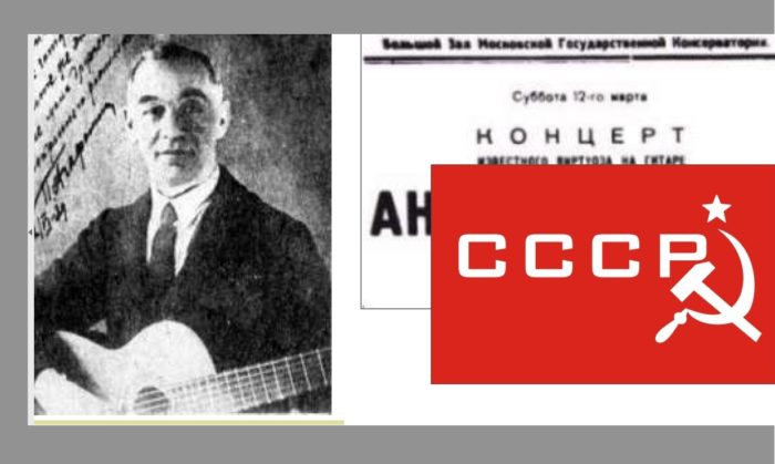
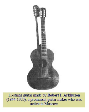 Russian music life in all periods, having very old origins. But only recently has this guitar world started opening to western Europe, and we still know far too little about Russian composers for guitar and Russian guitarists. It was quite difficult for me to get information about some Russian guitarists, due both to the ever-present difficulties in communication (it is still difficult just to send a fax to Moscow during the day time)and to the problems of language comprehension.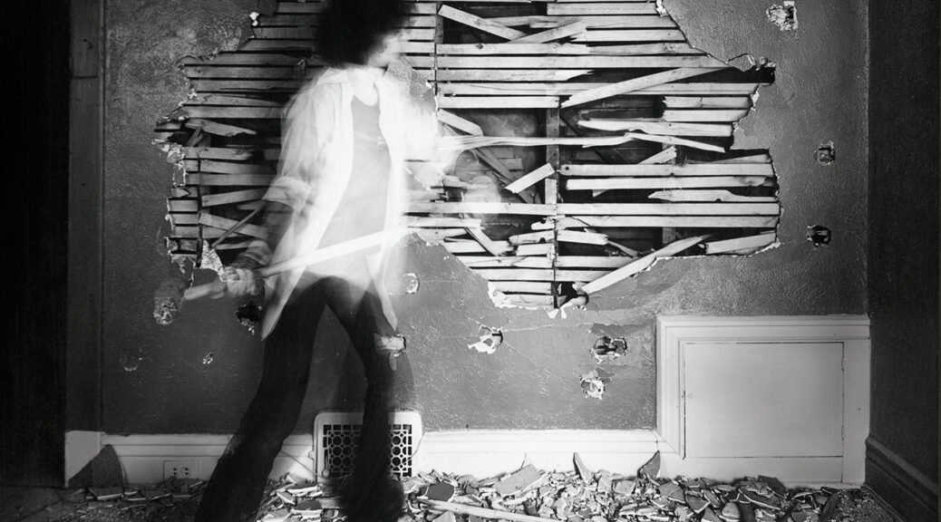
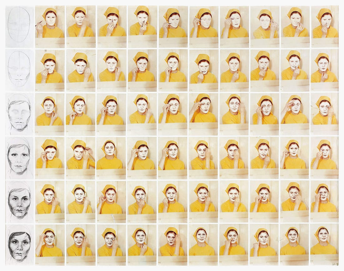
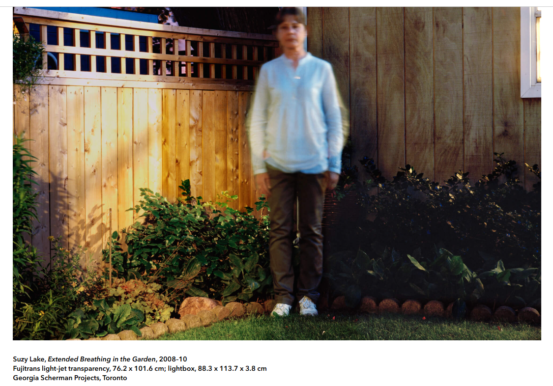
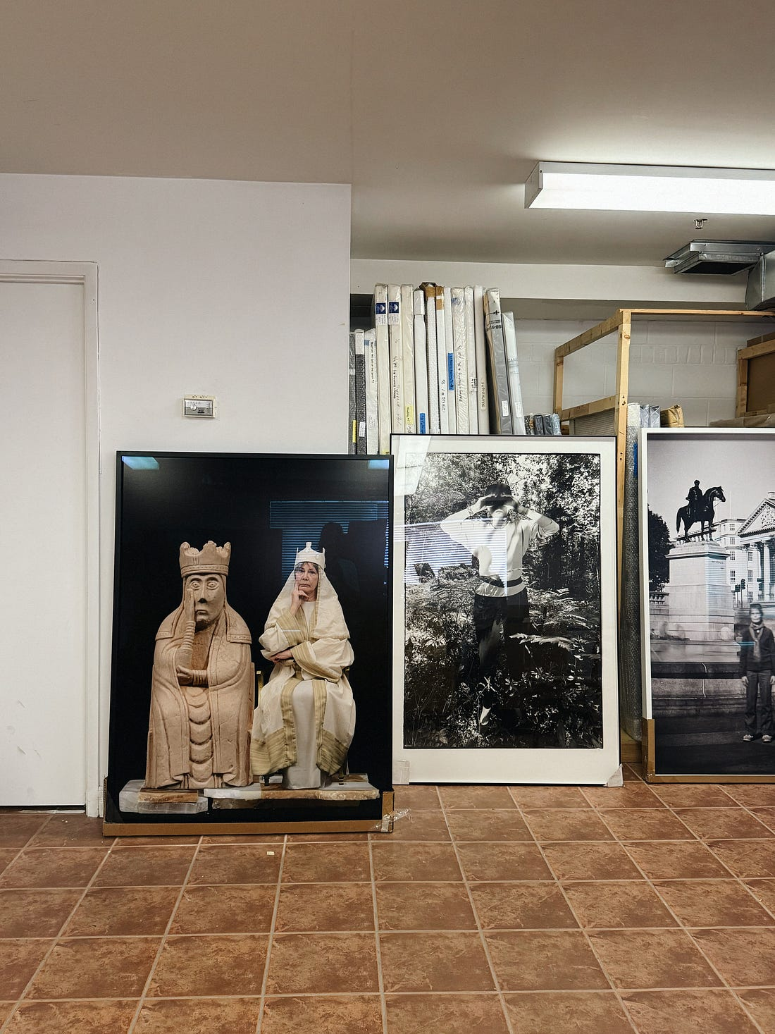
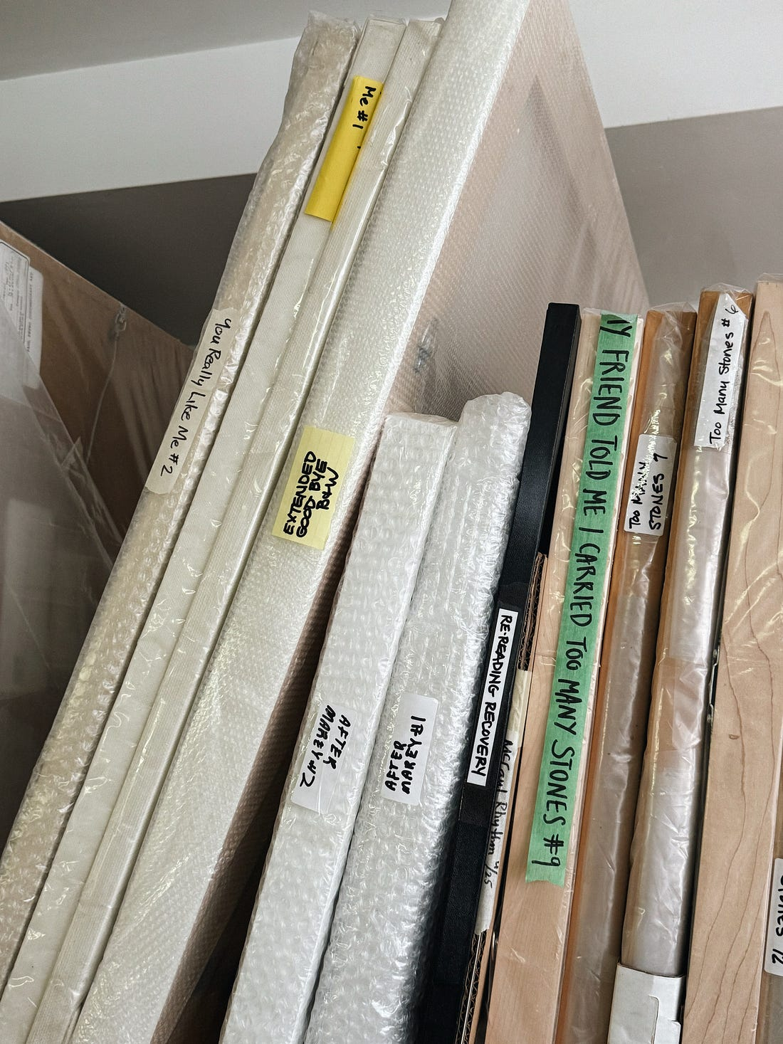
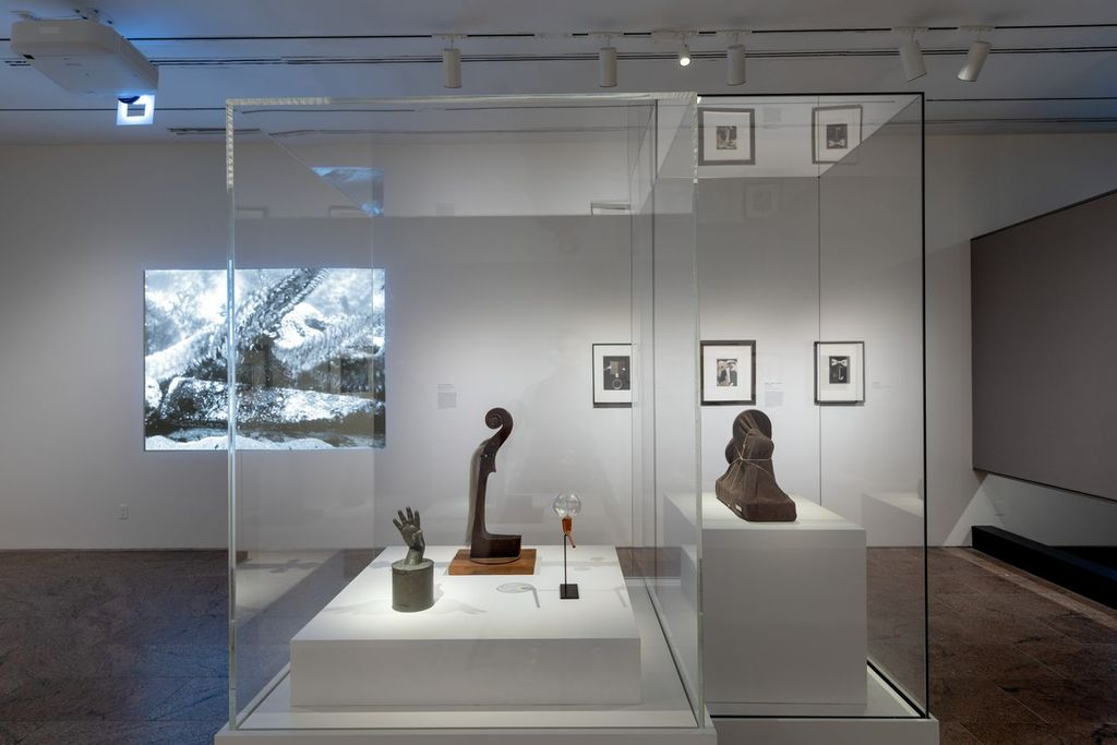
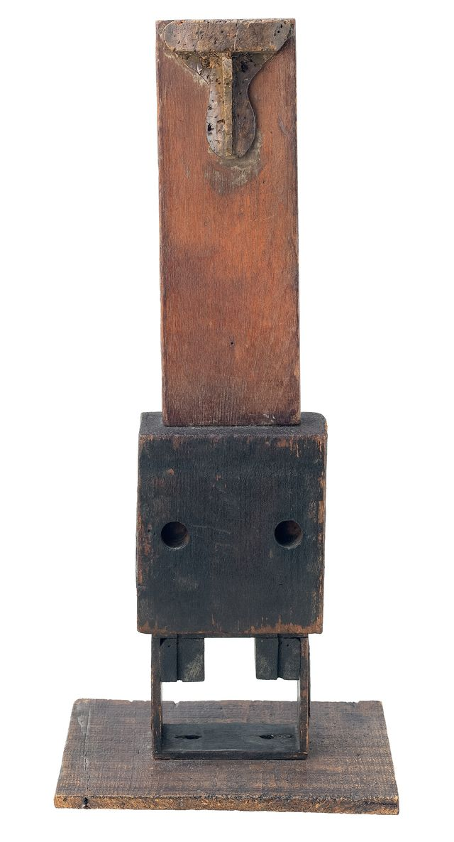
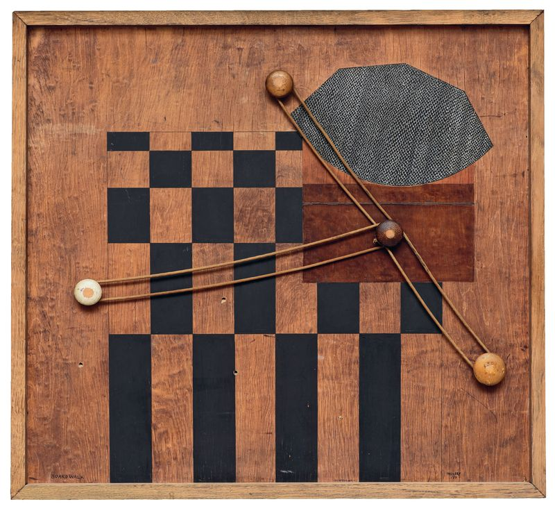
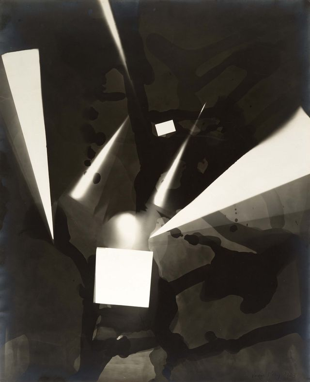
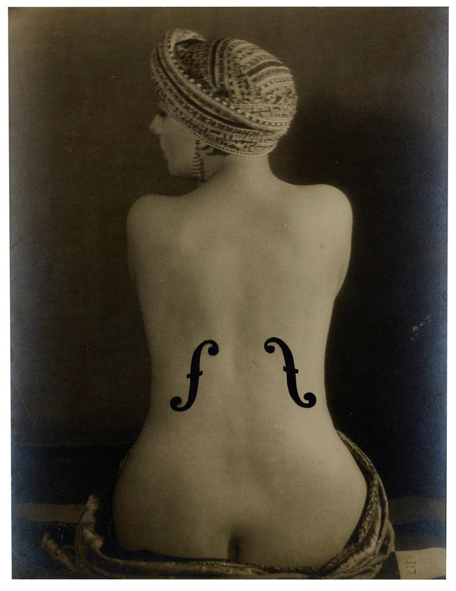
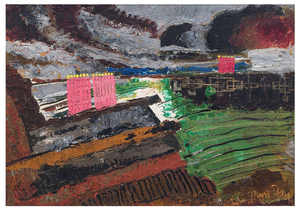
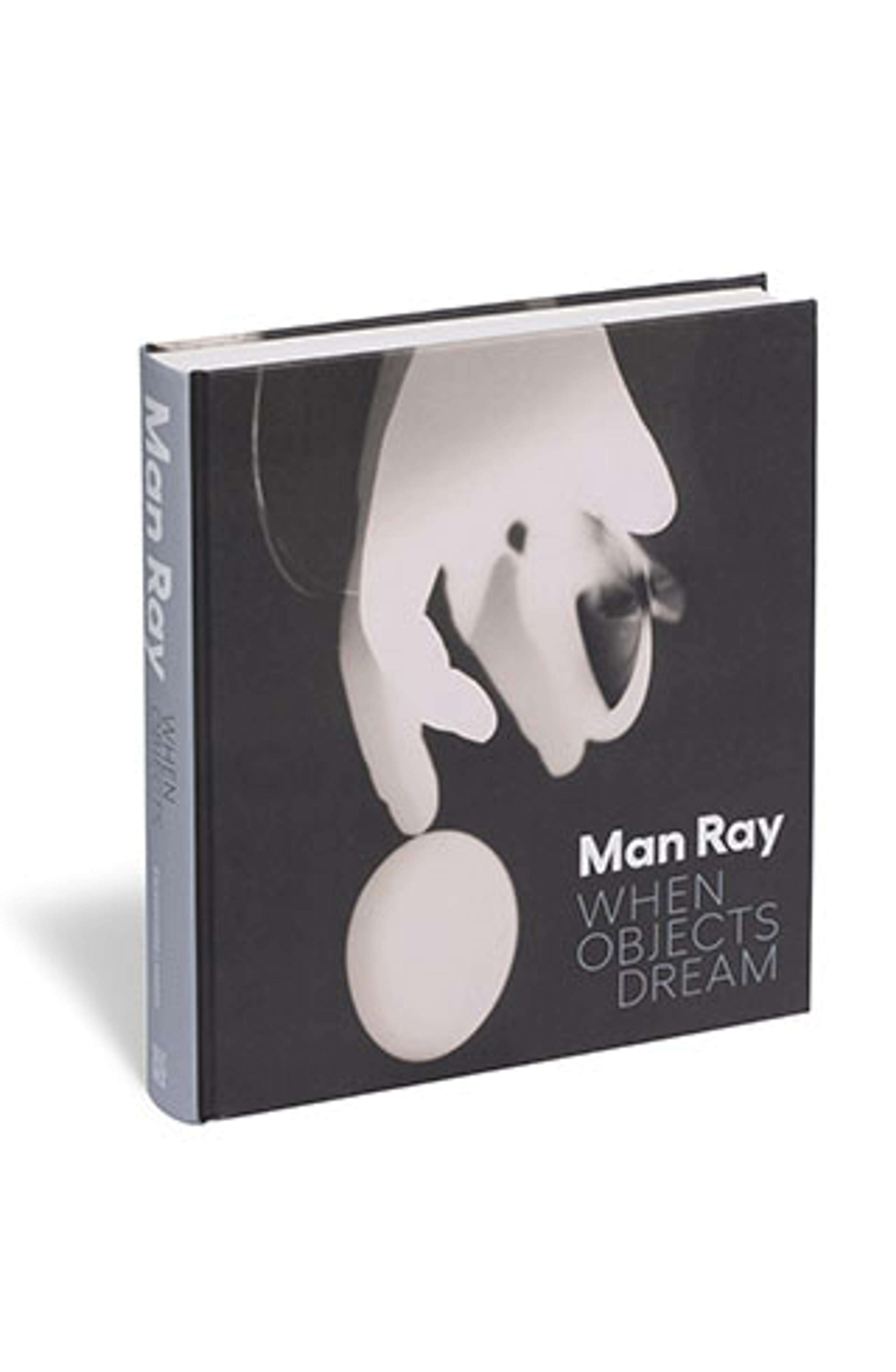
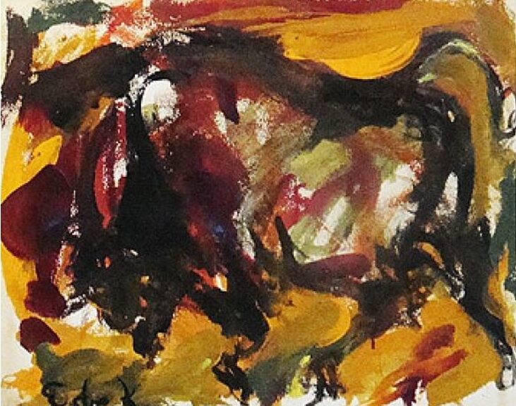

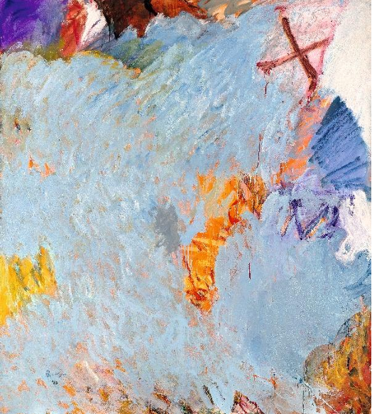
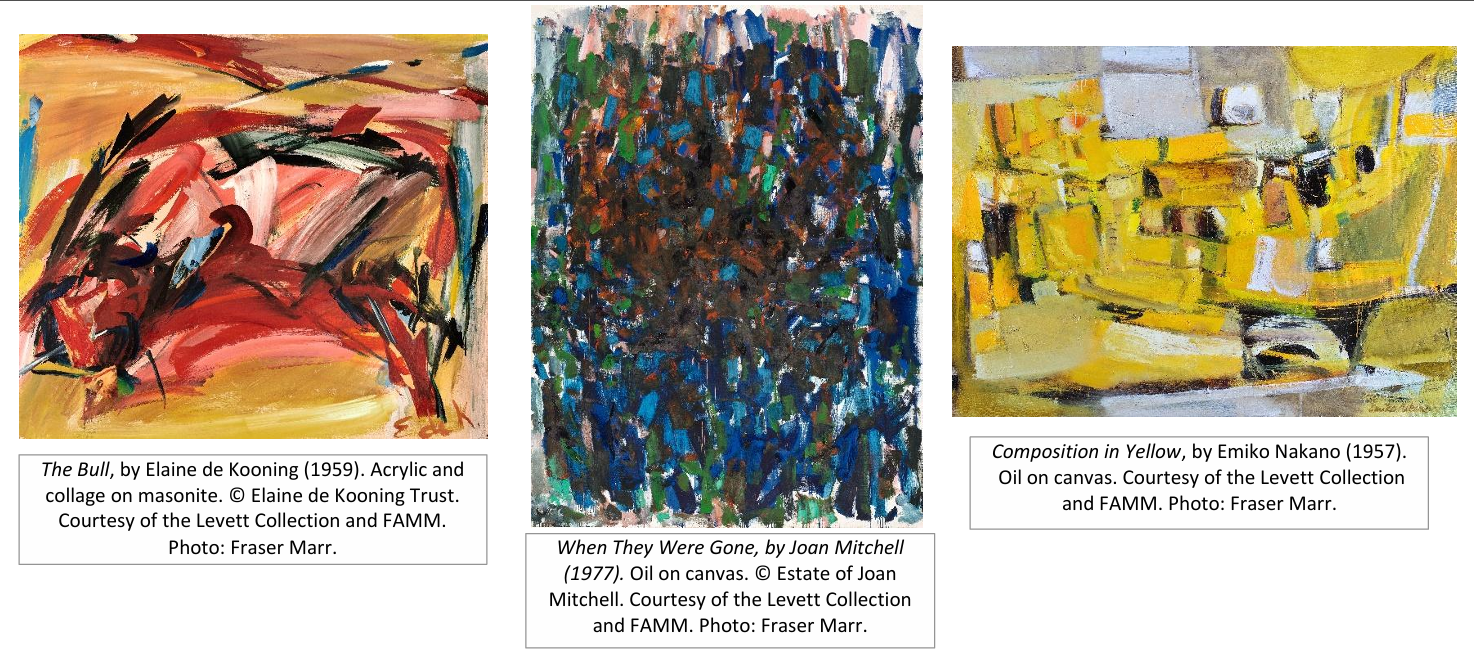
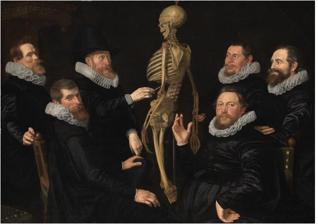
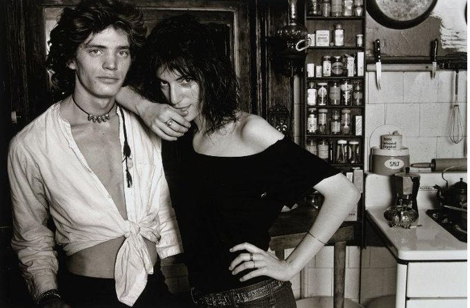
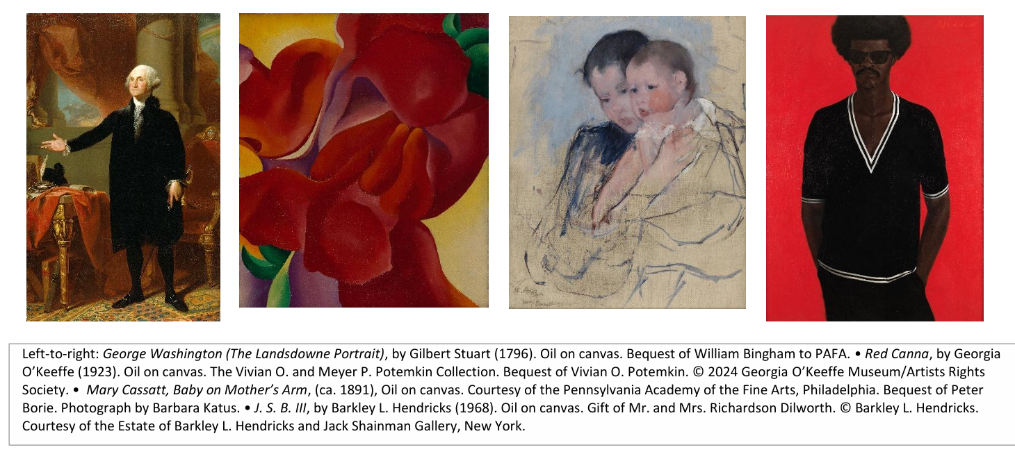
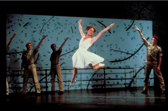
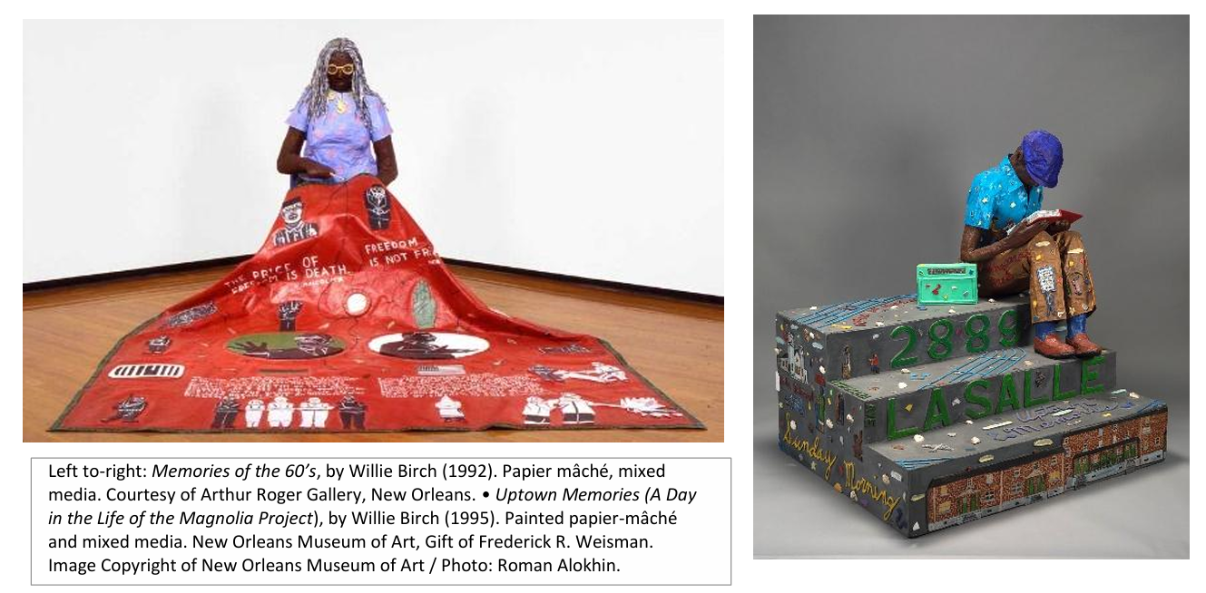
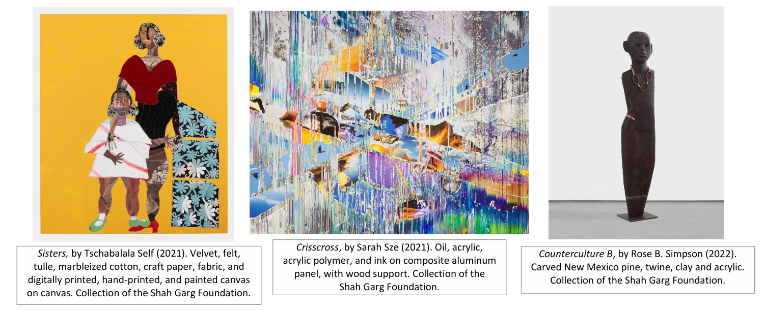
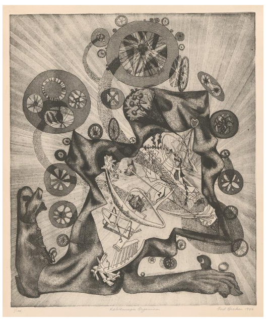
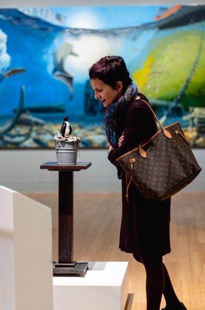
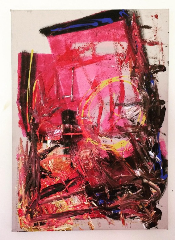
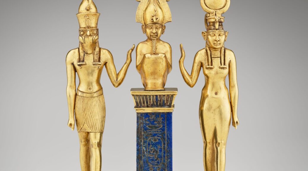

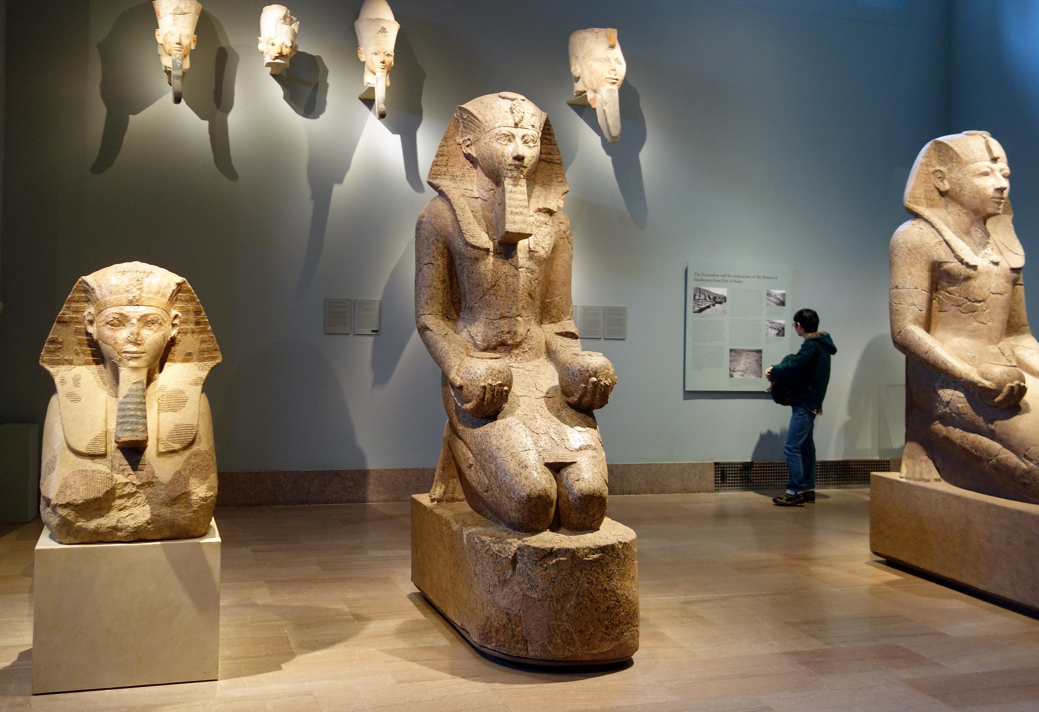
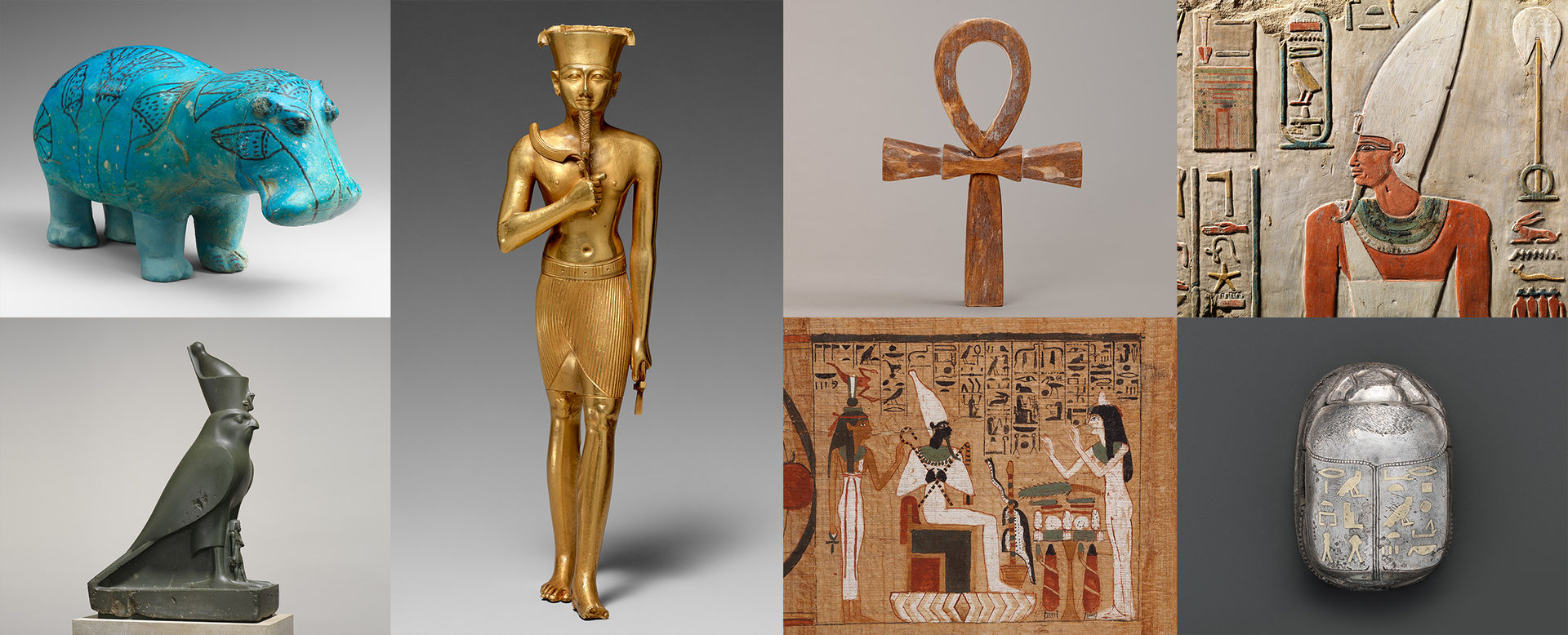
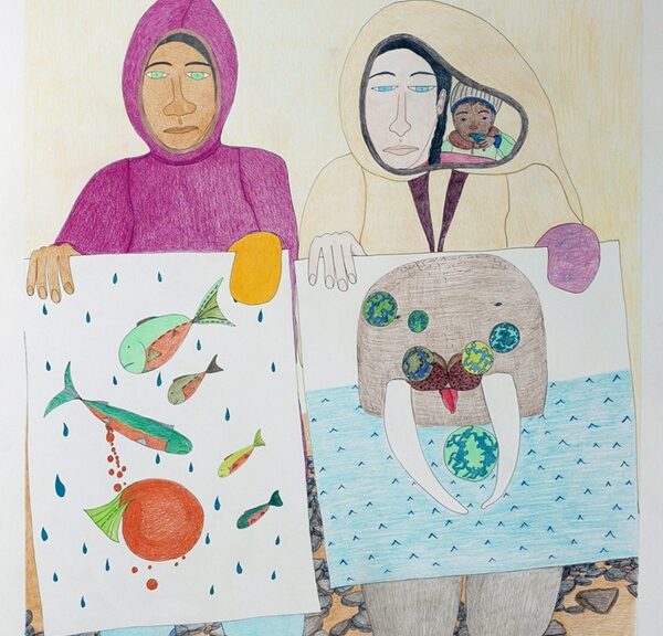


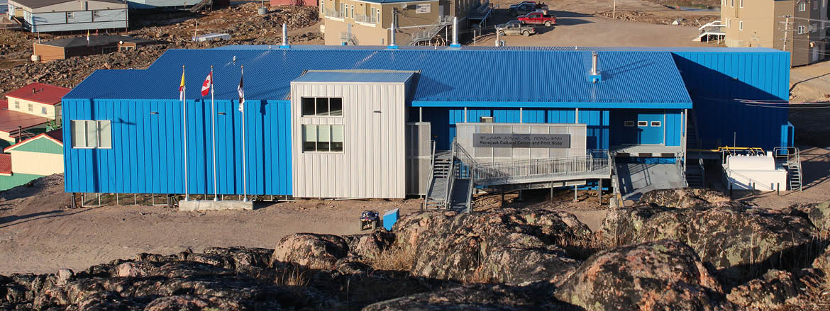
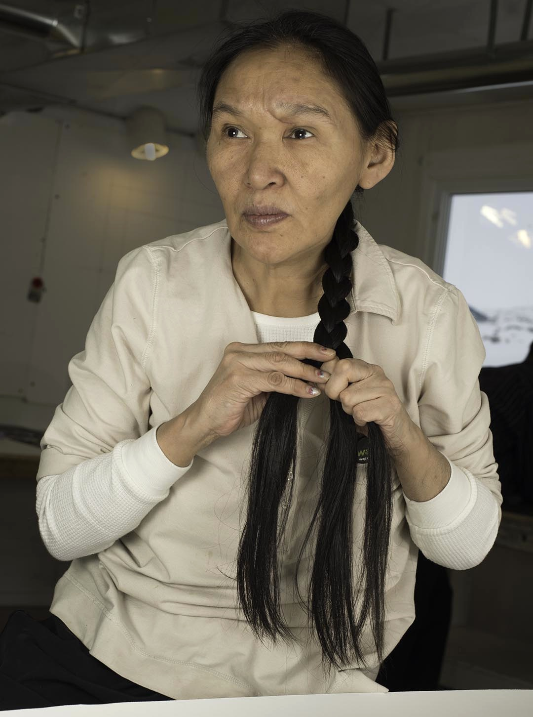
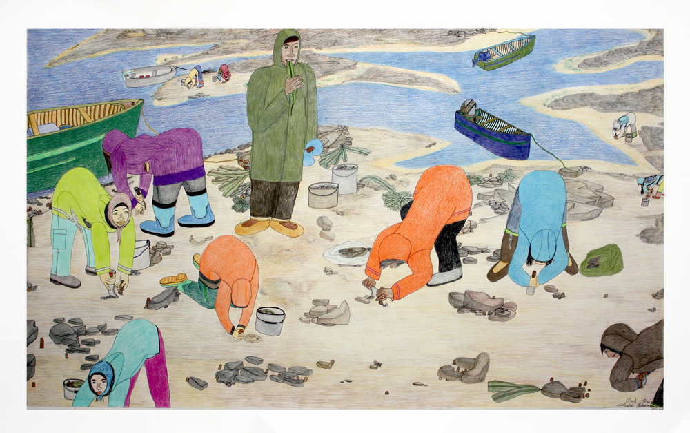
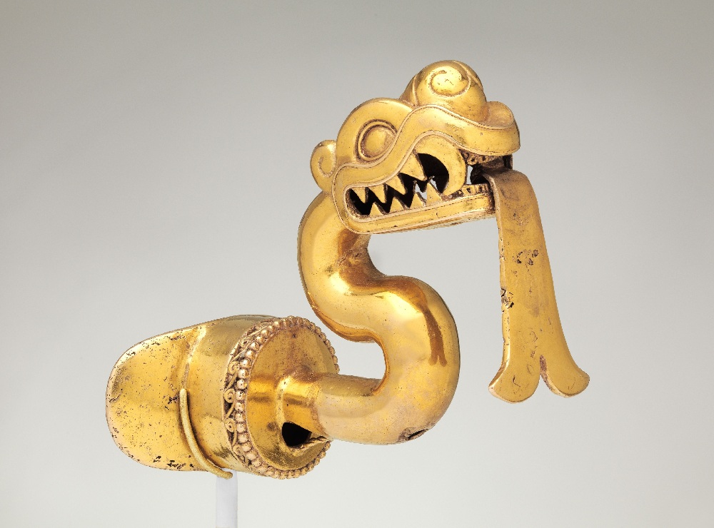
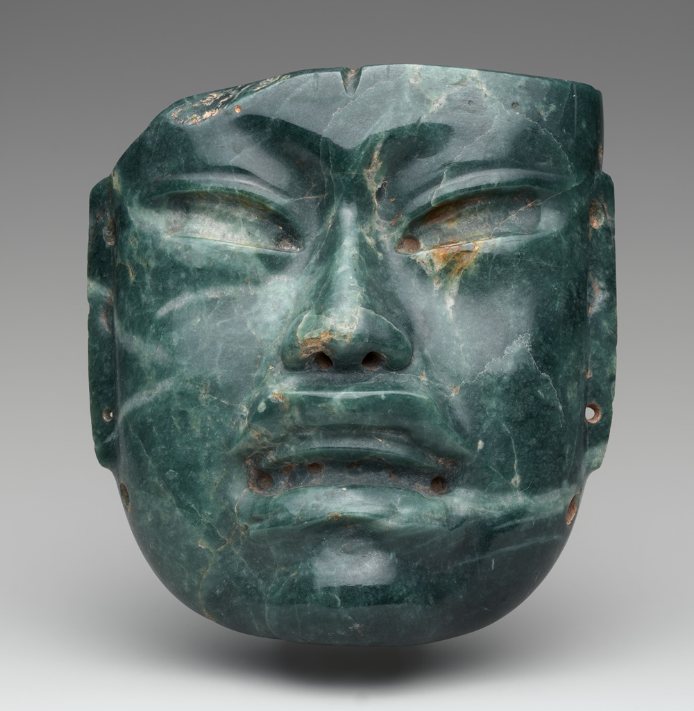
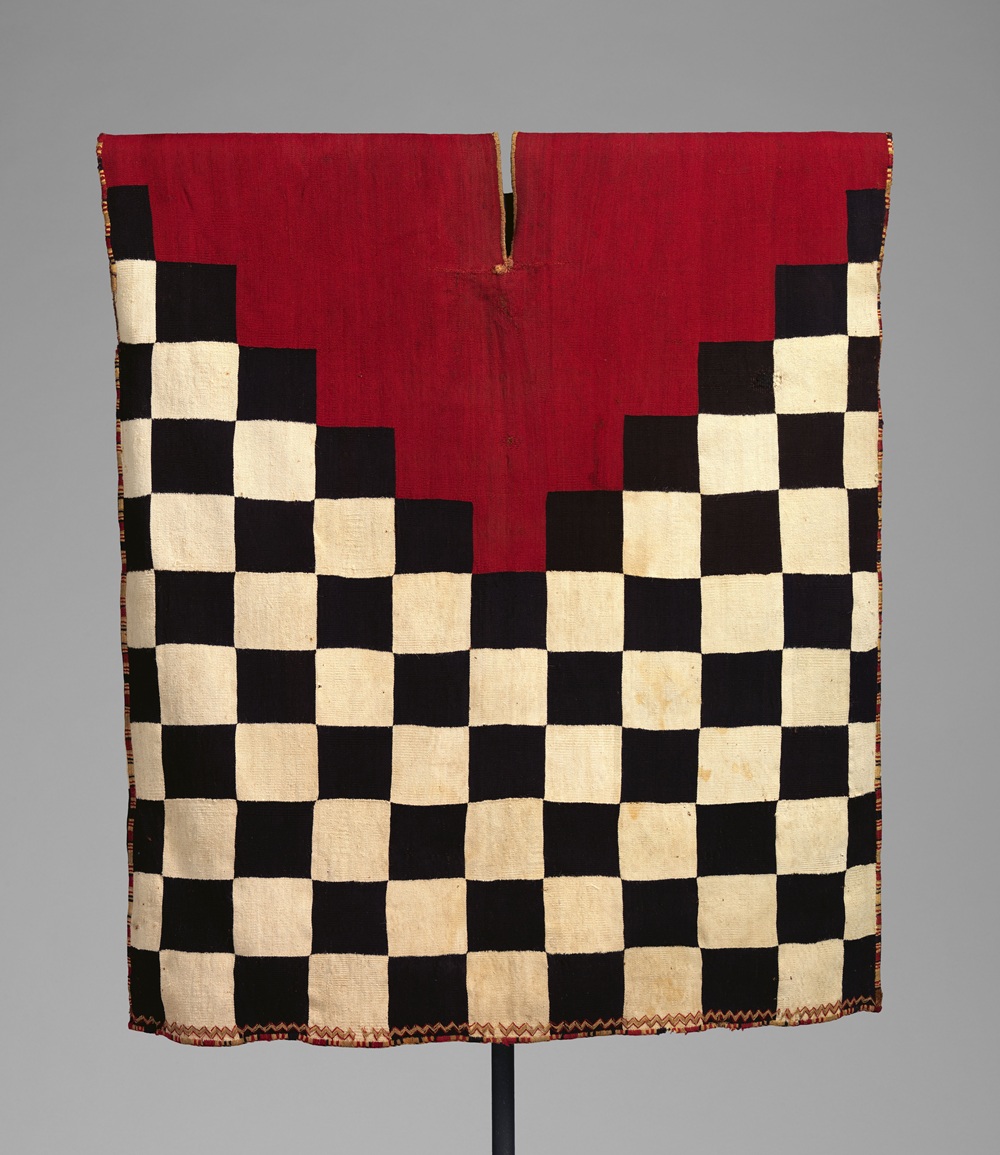
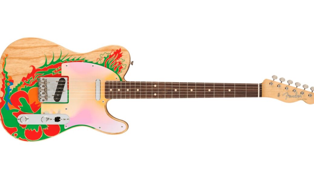

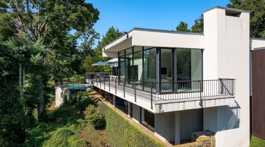
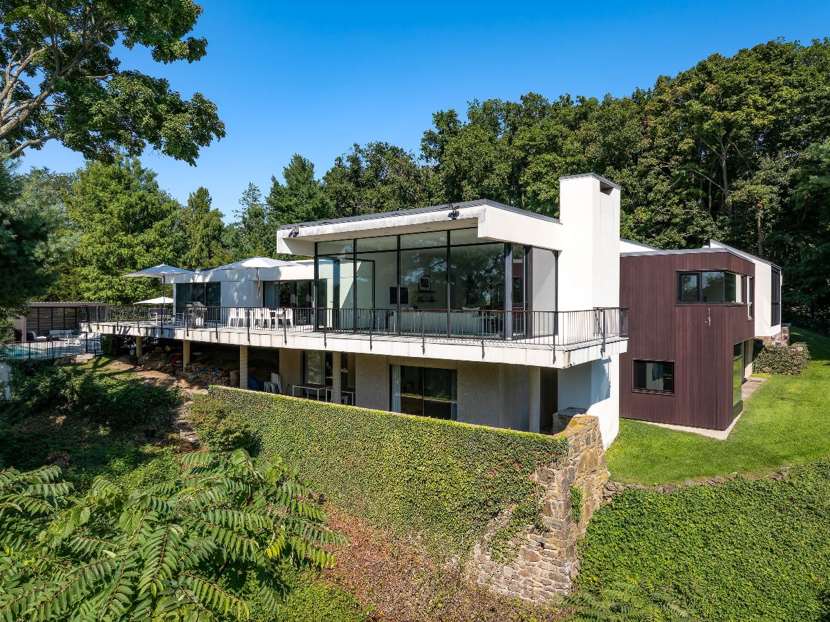


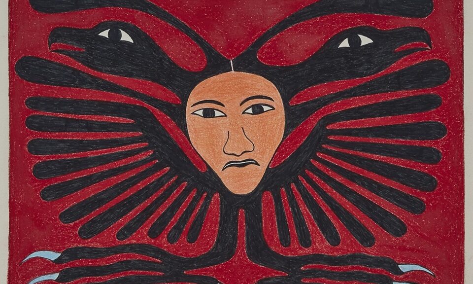

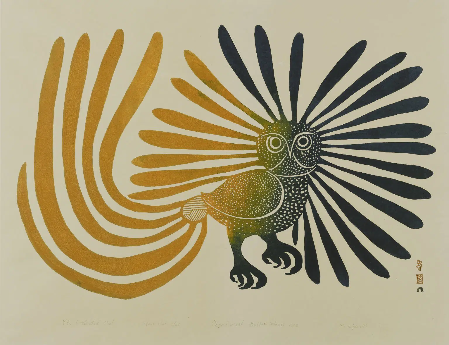
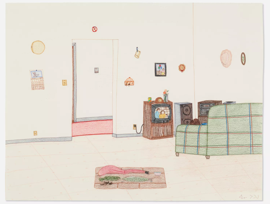
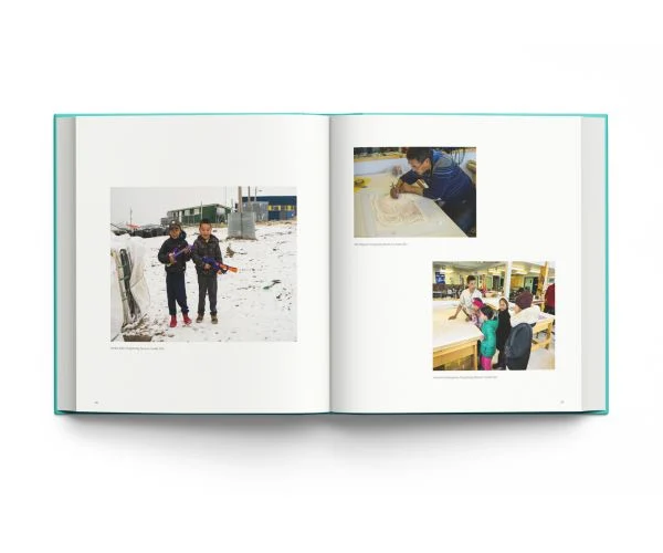
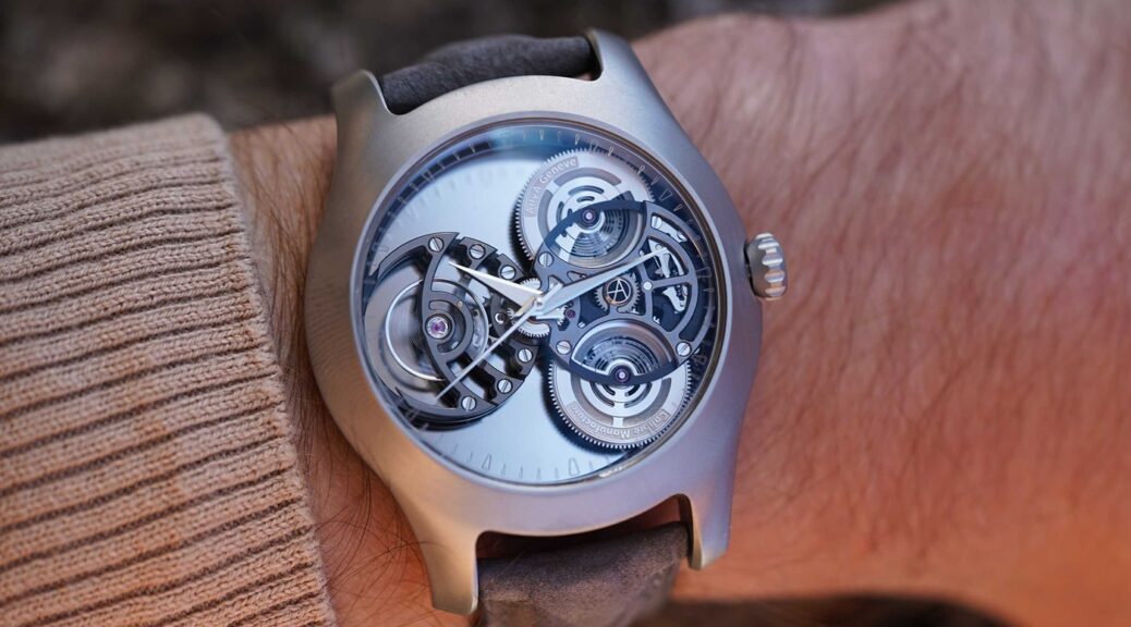

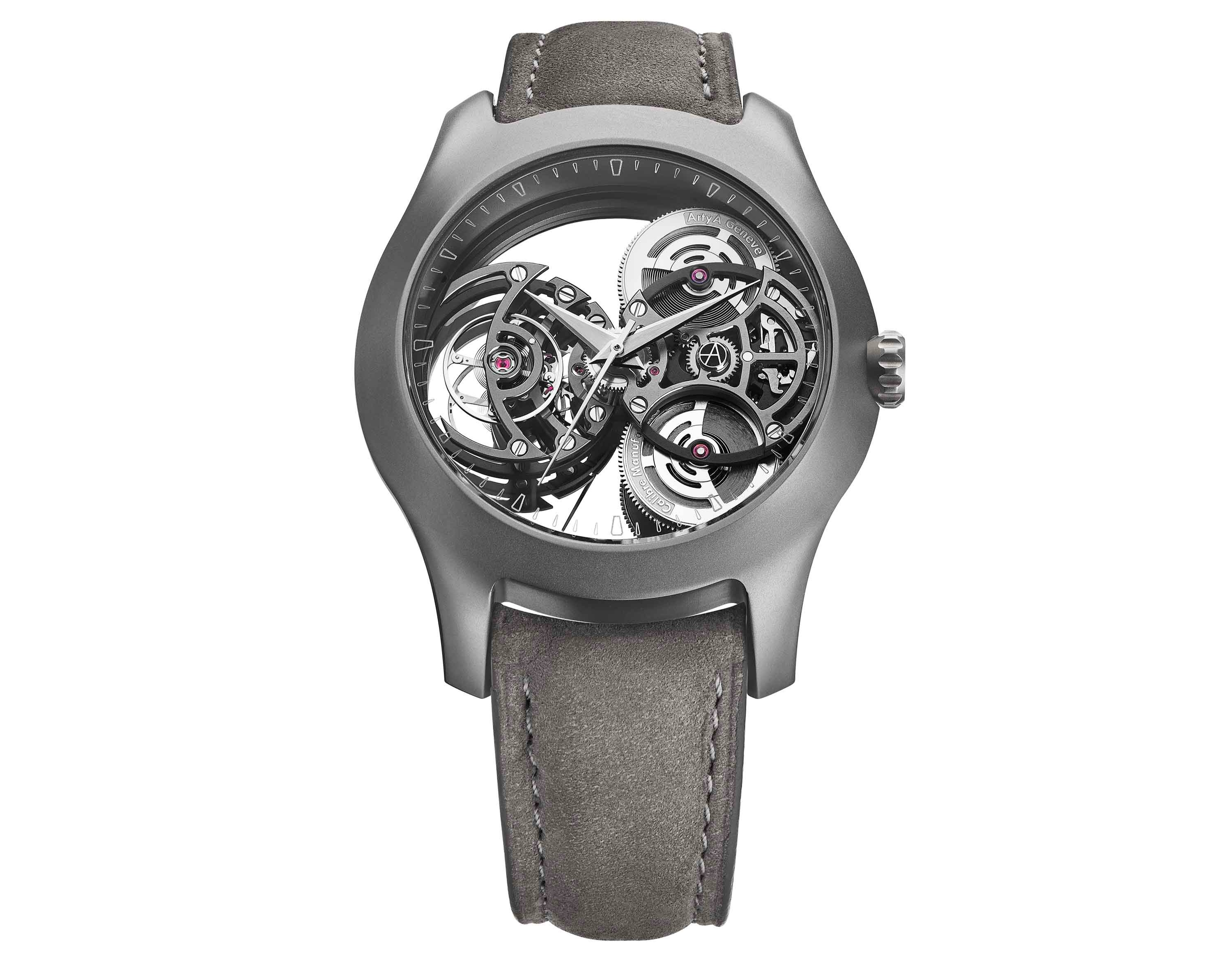
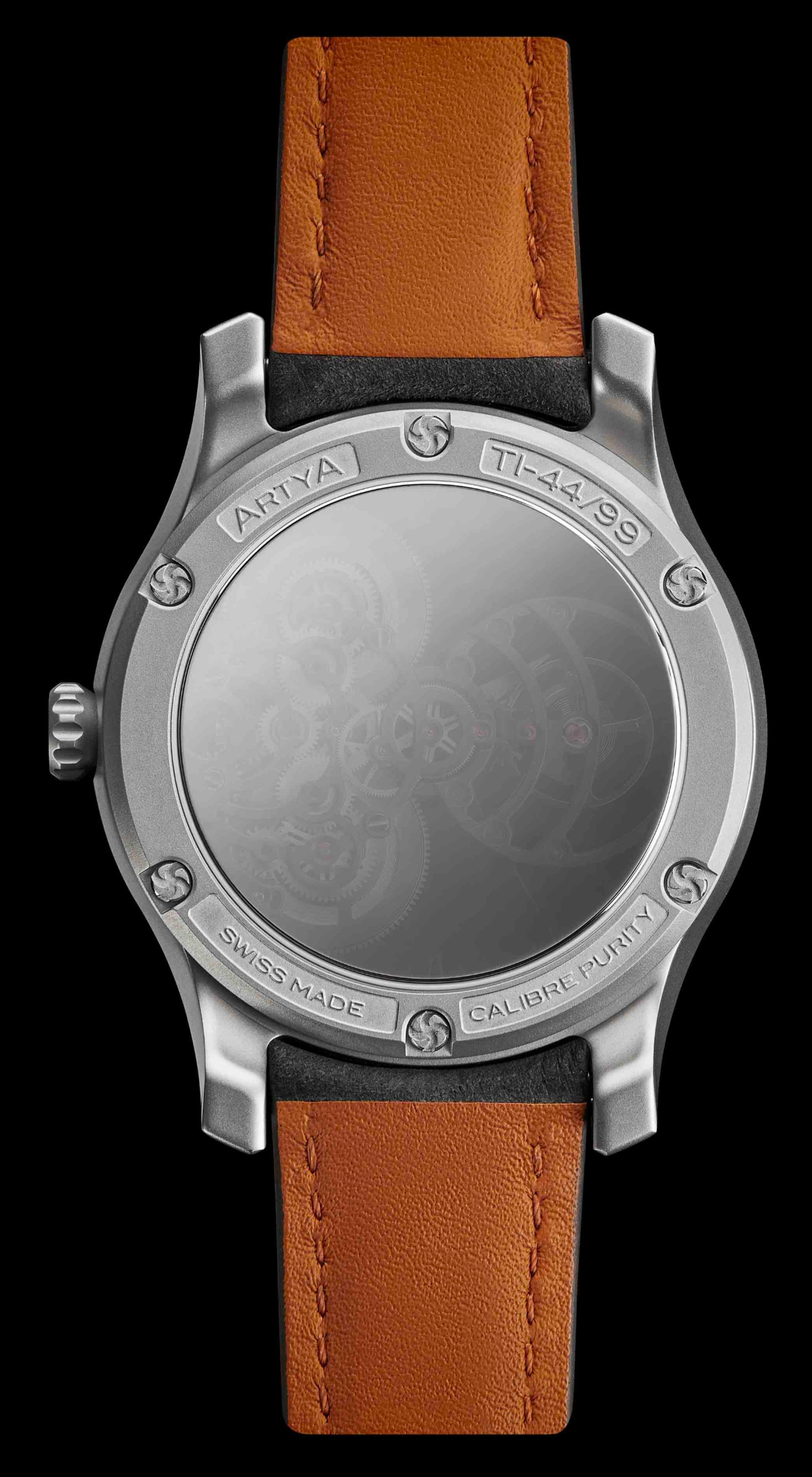
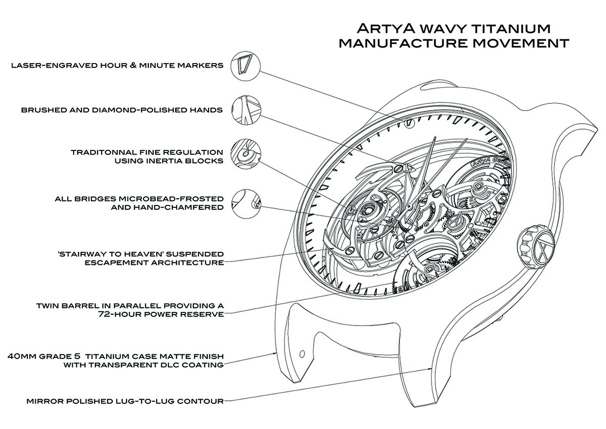

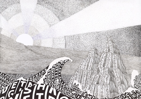
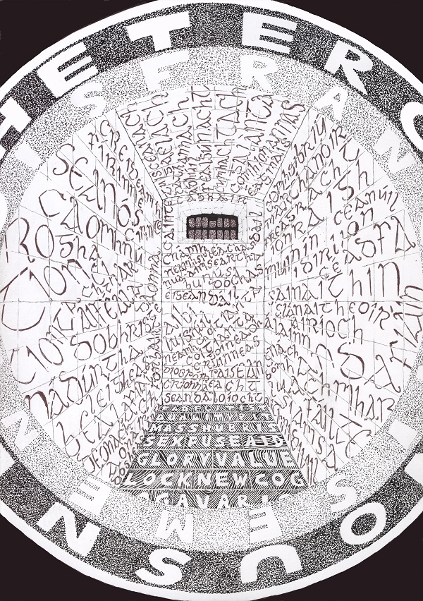
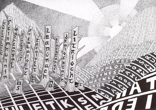




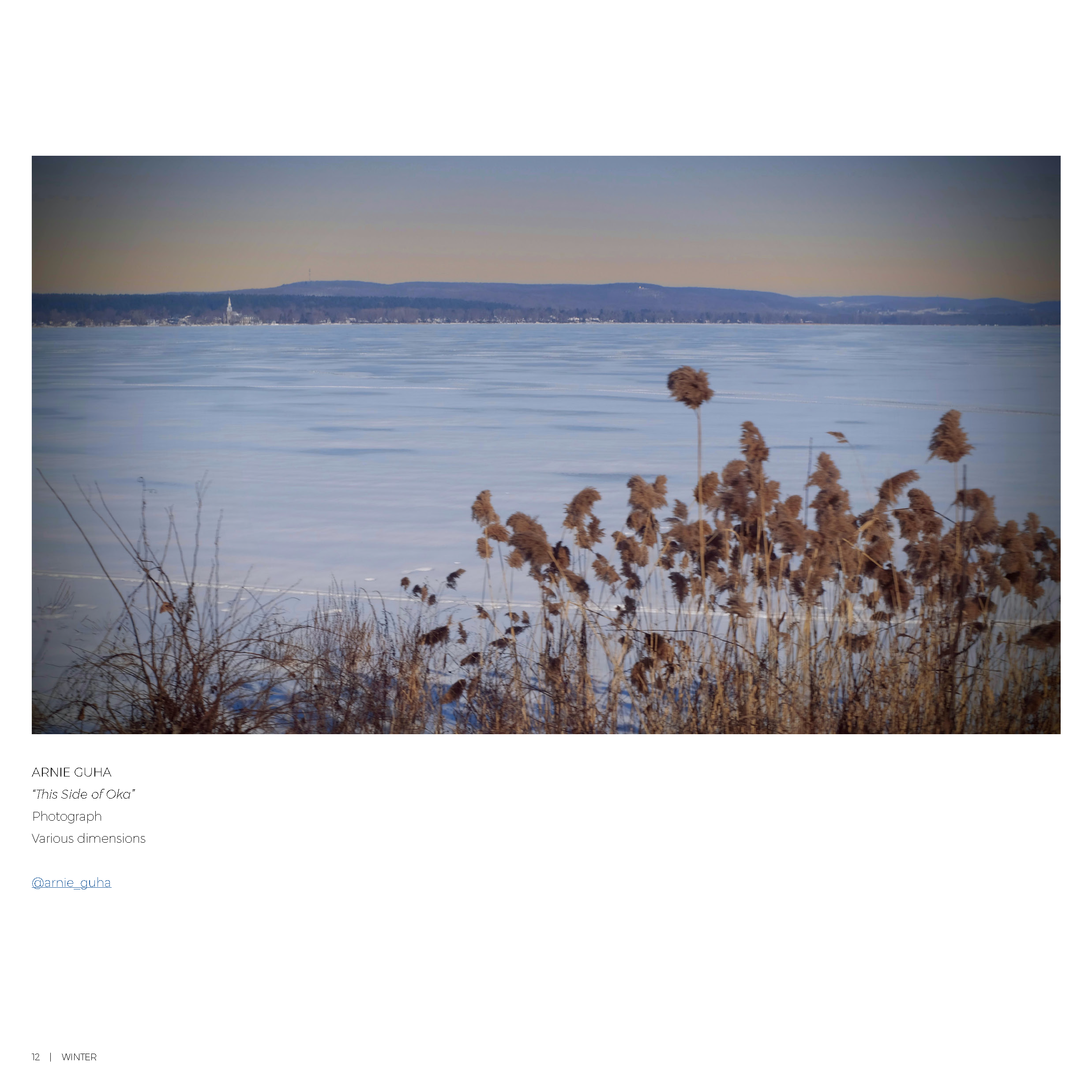


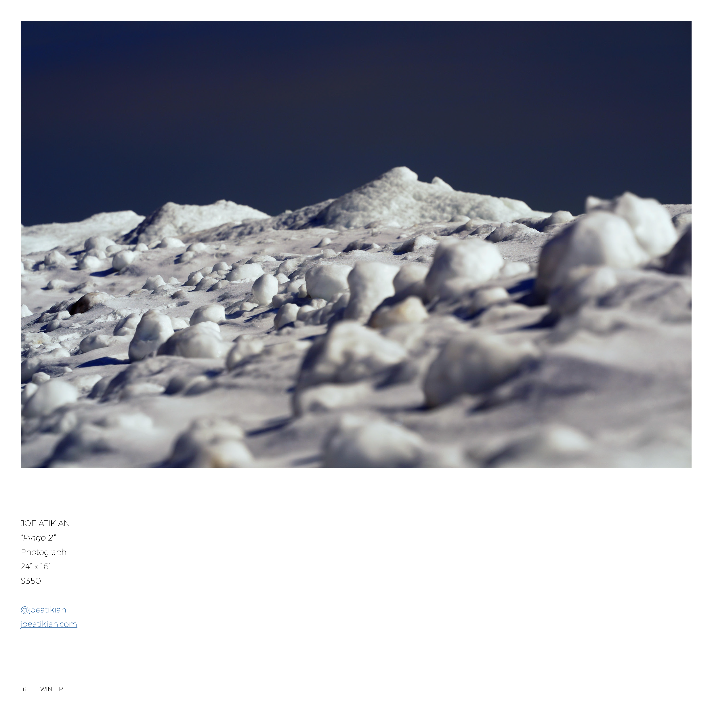


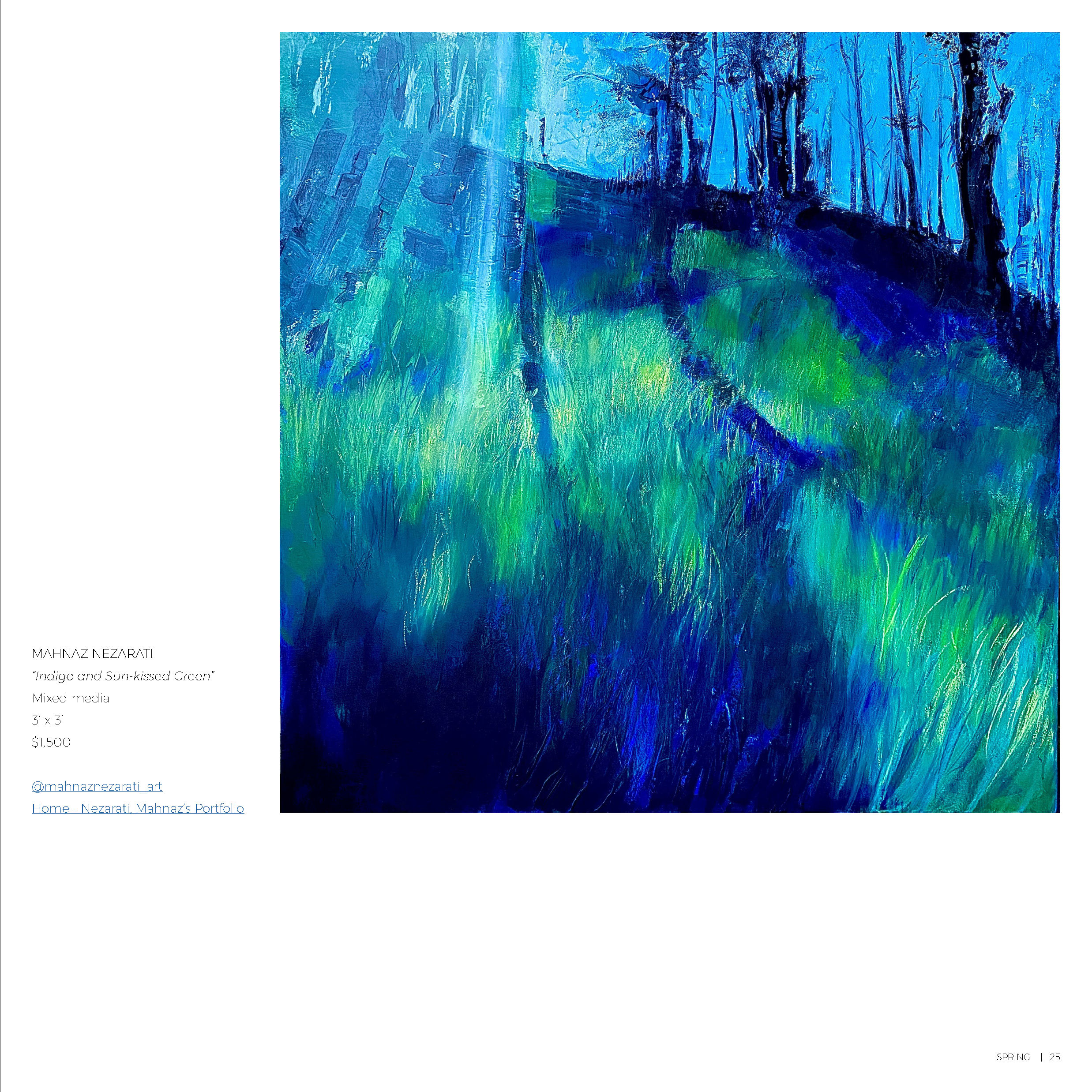


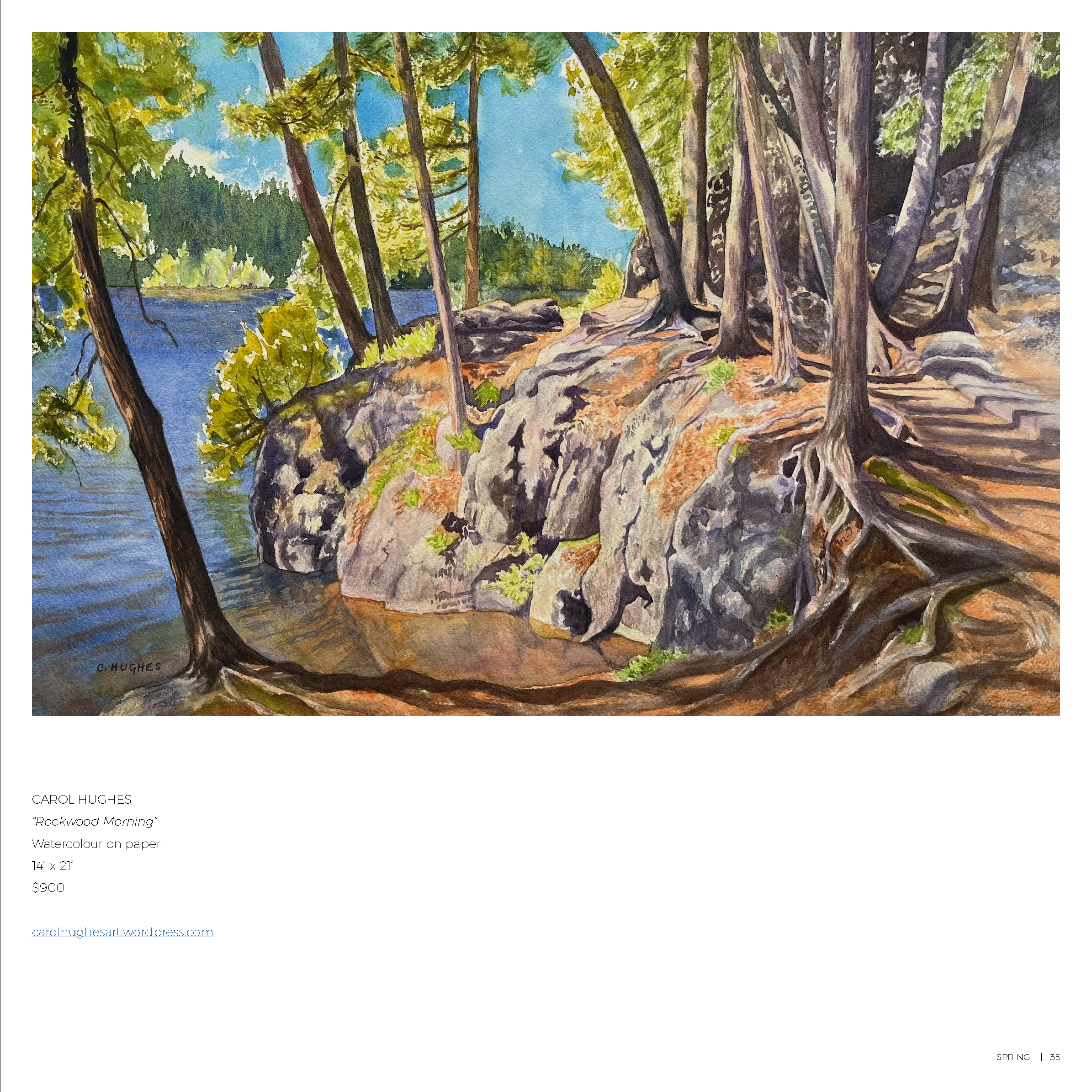


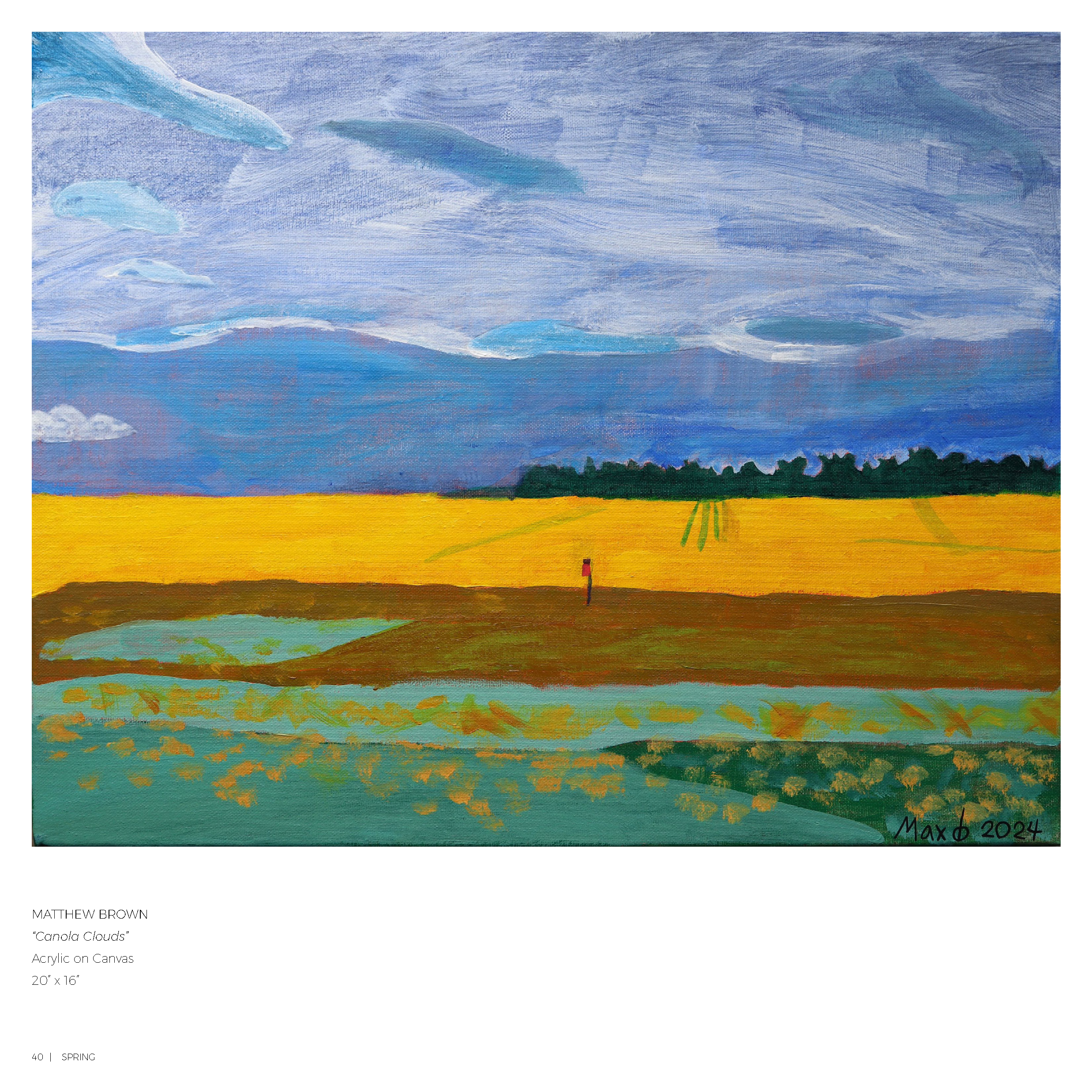
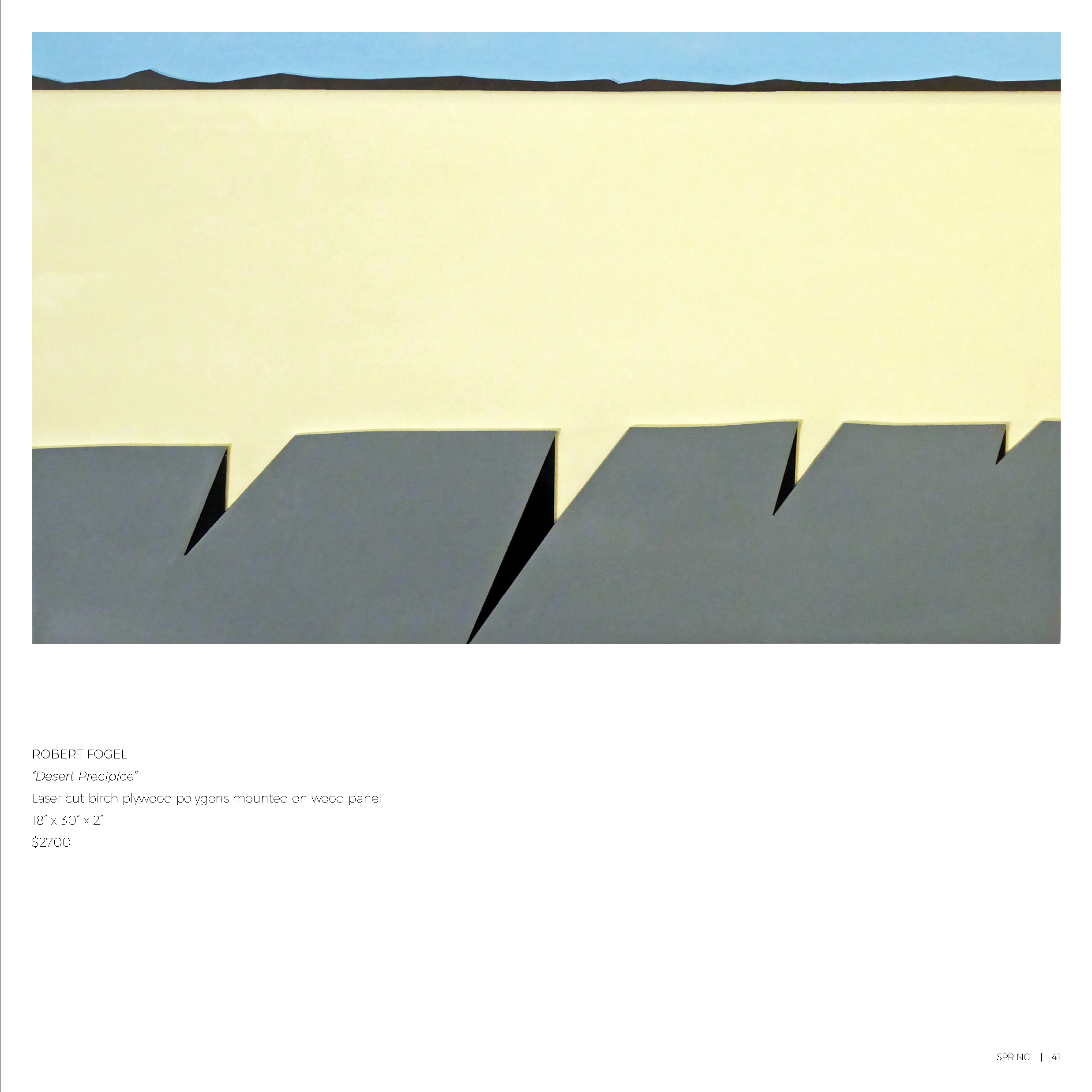

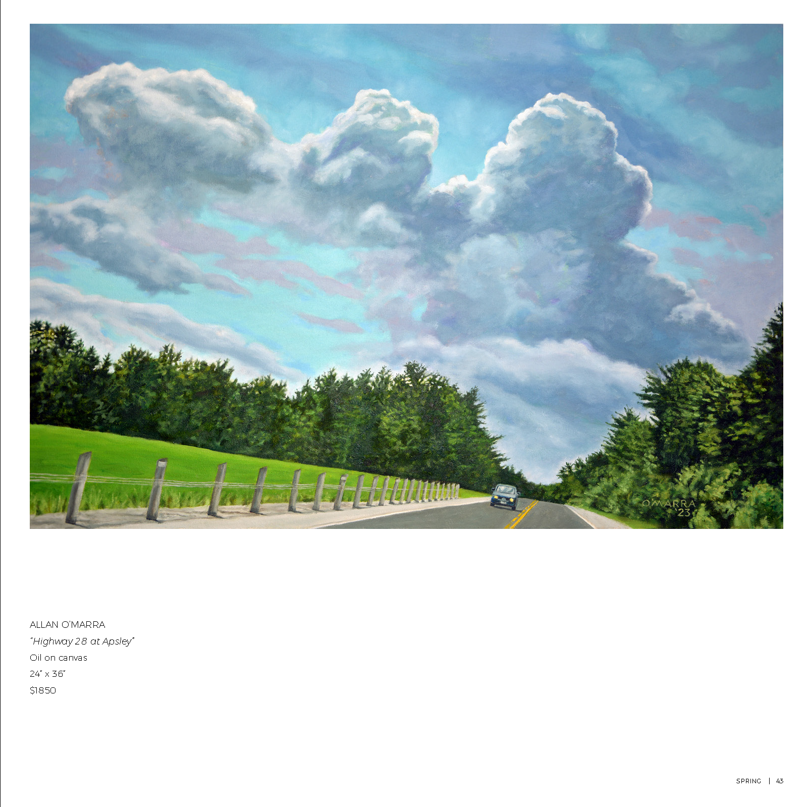
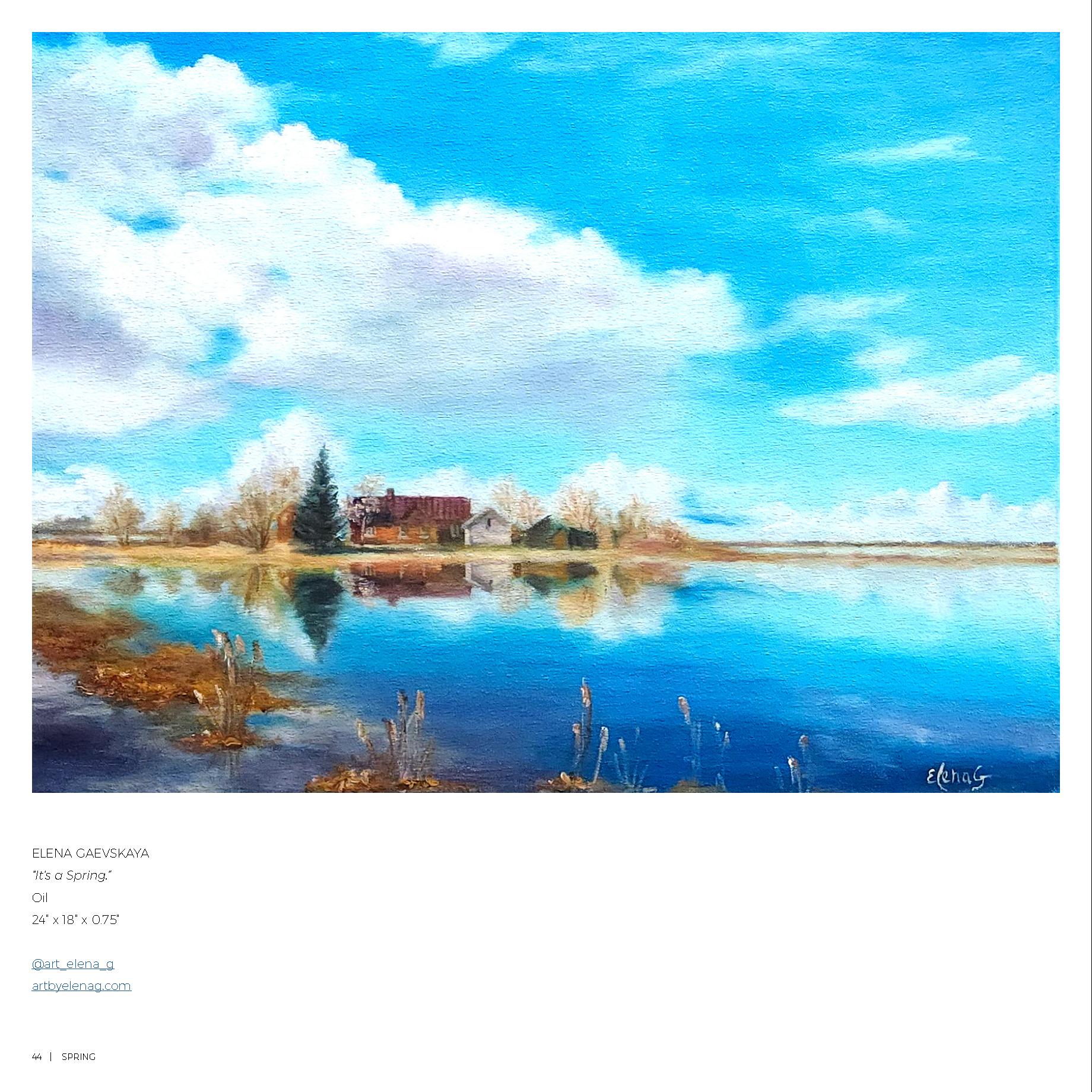


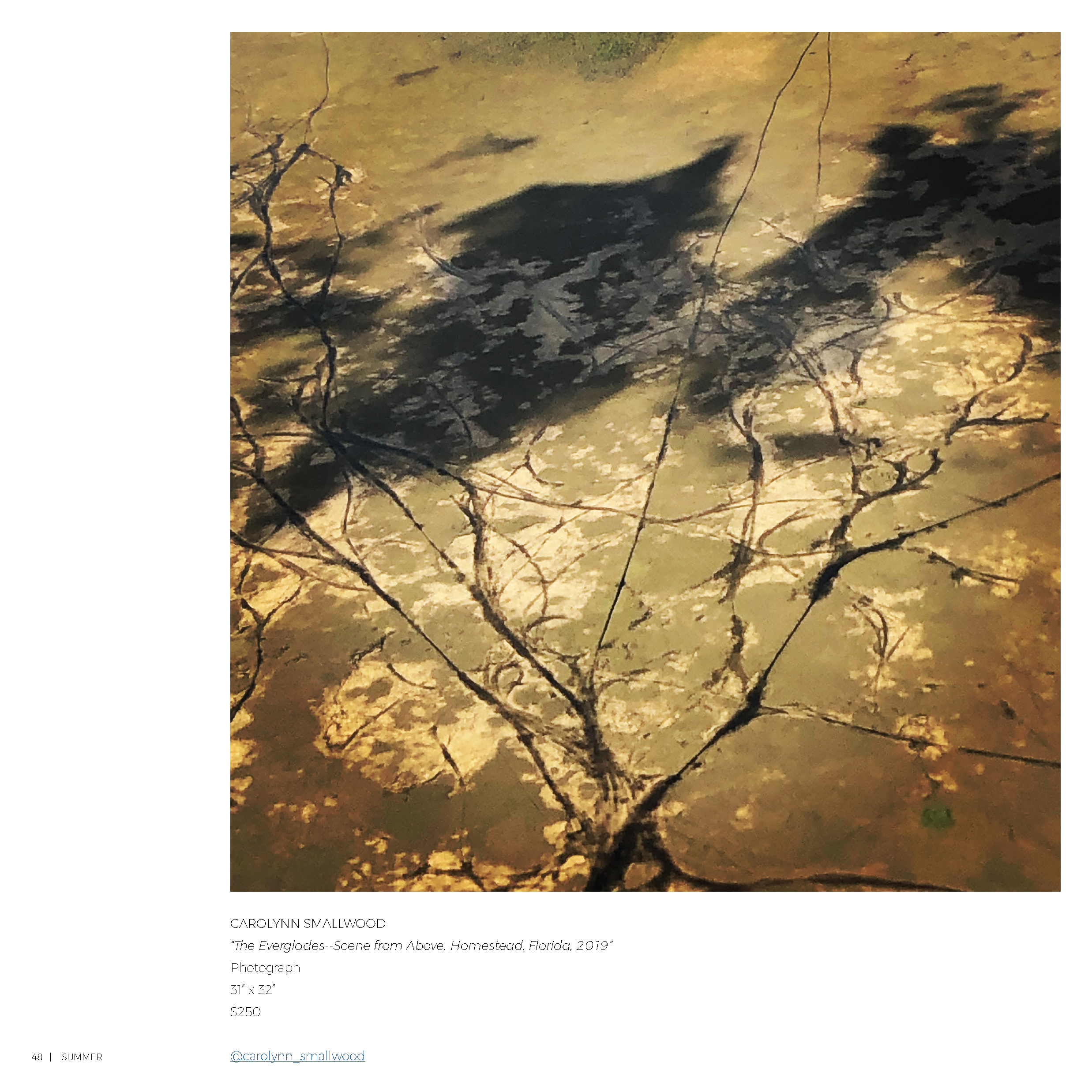


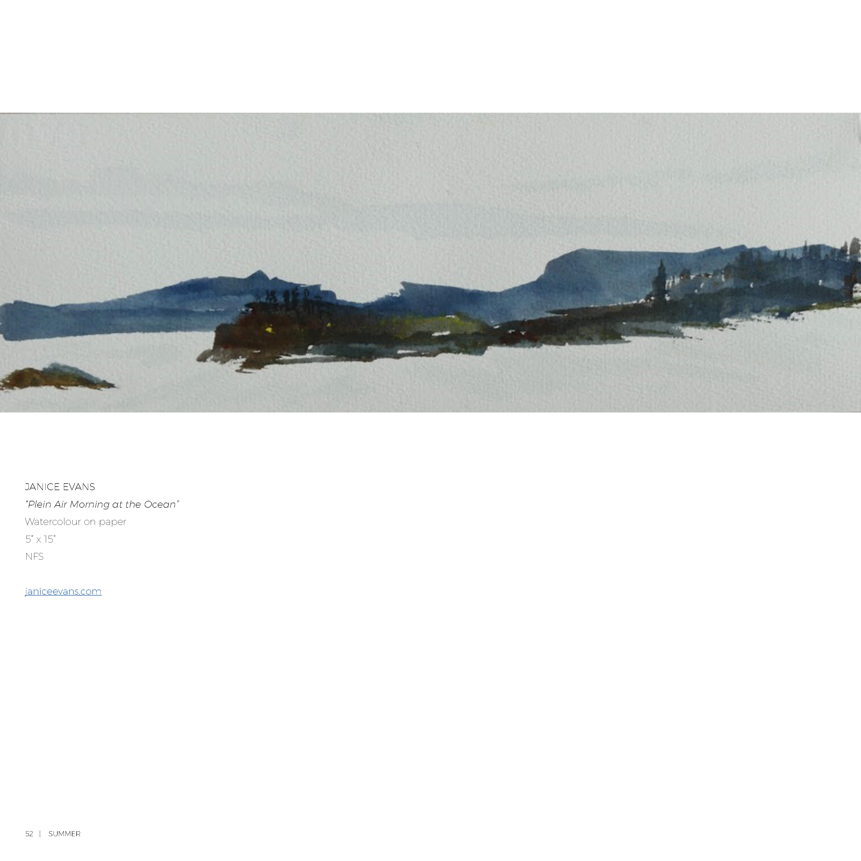


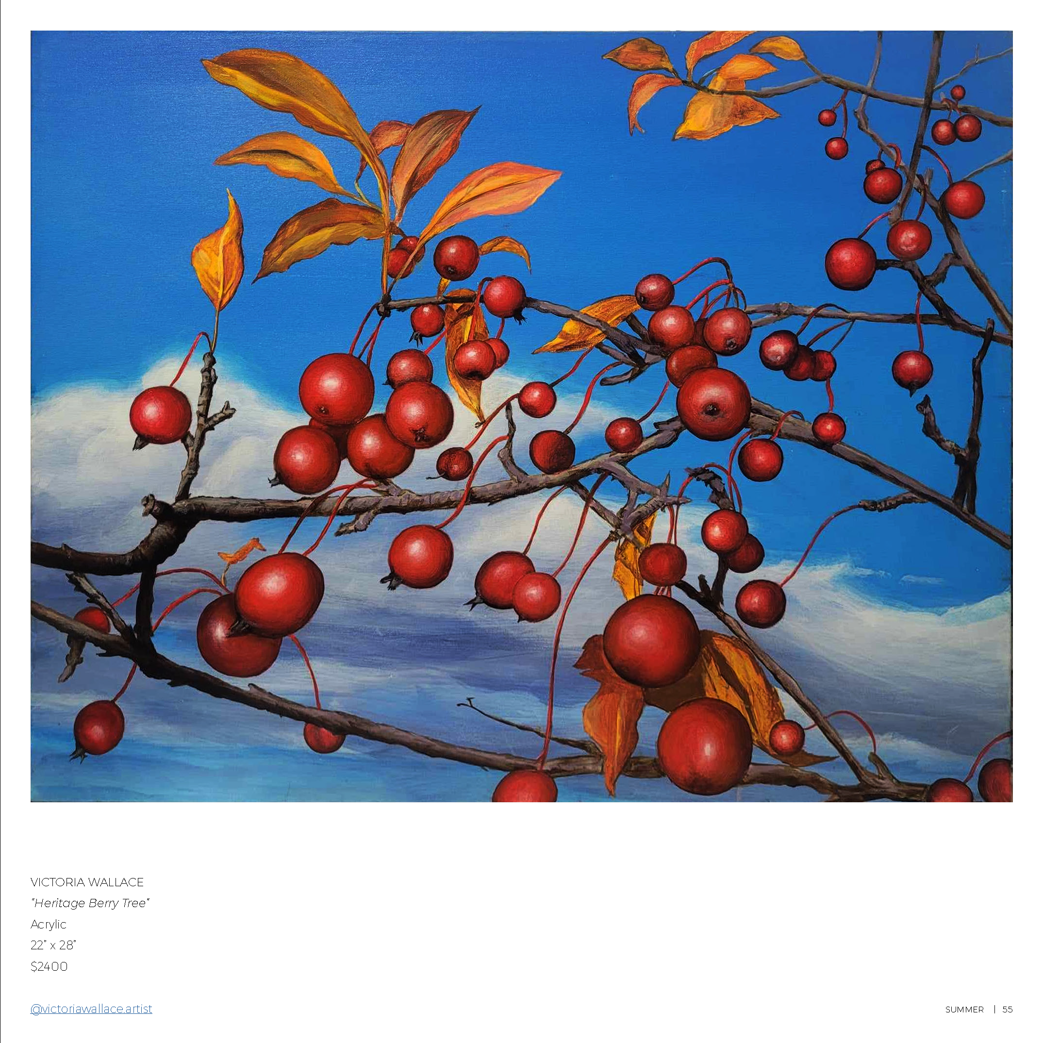
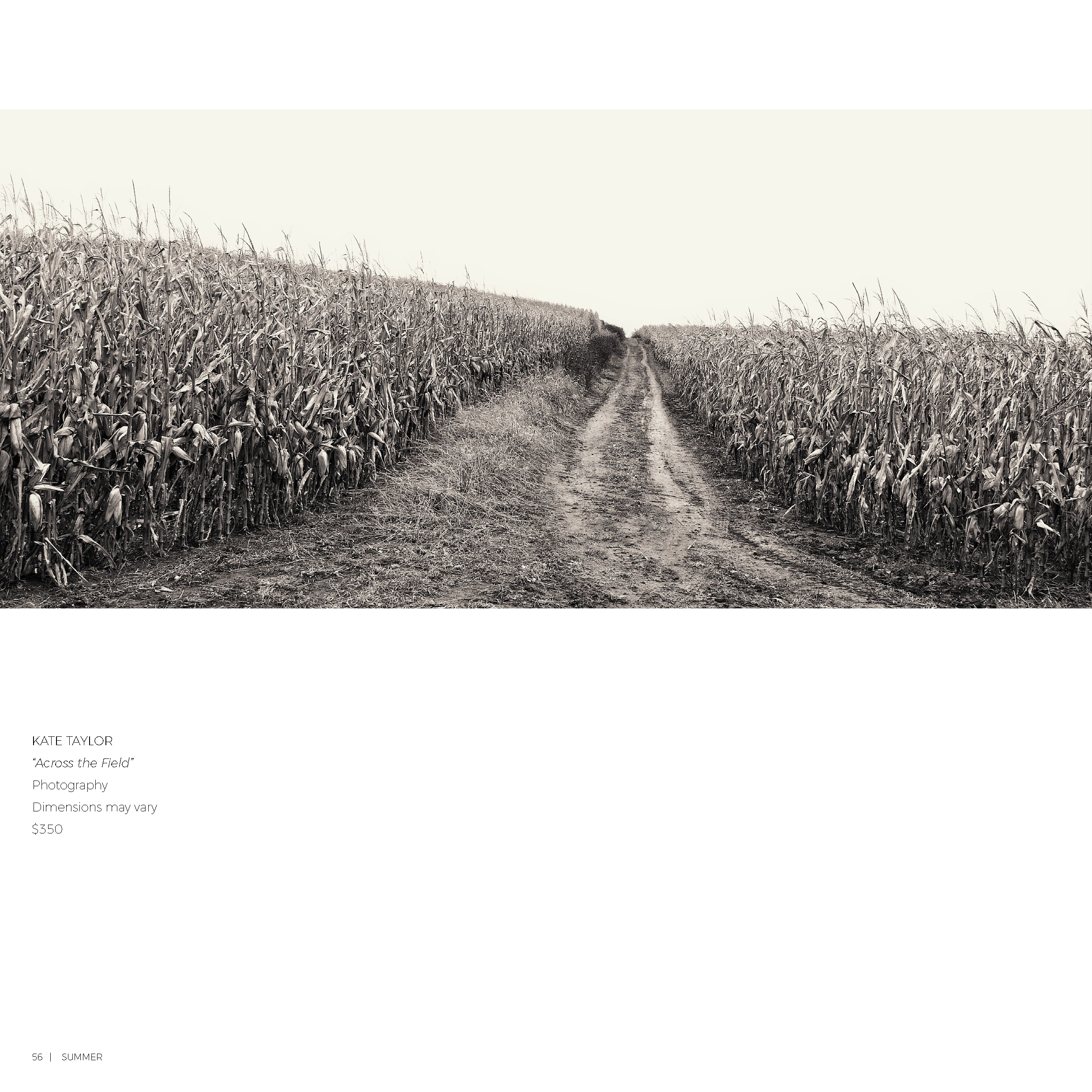



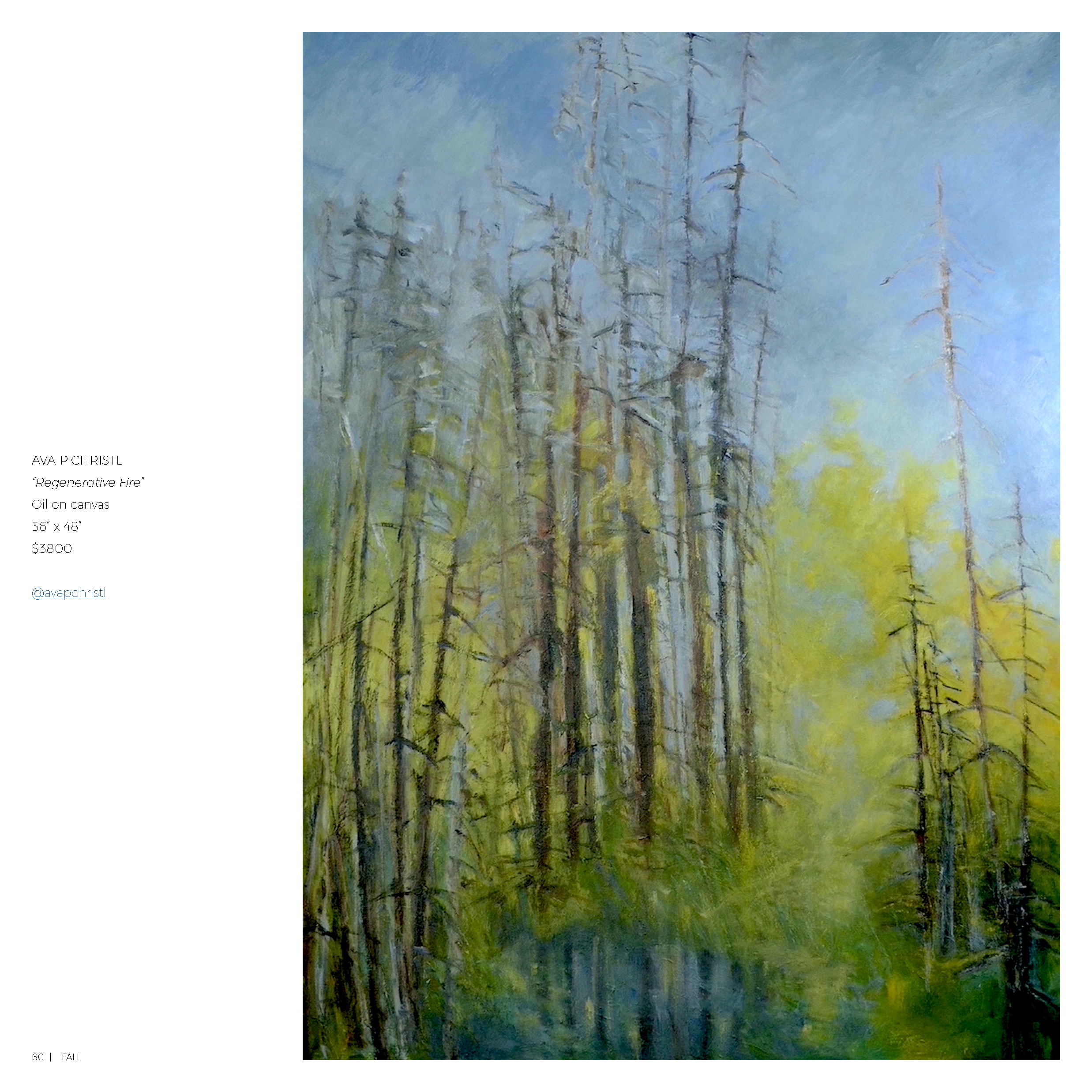

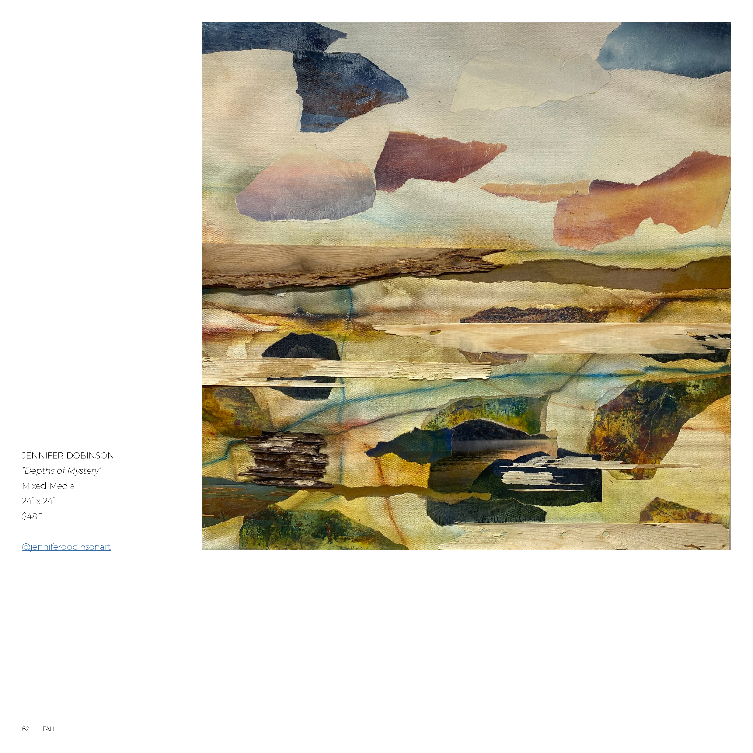


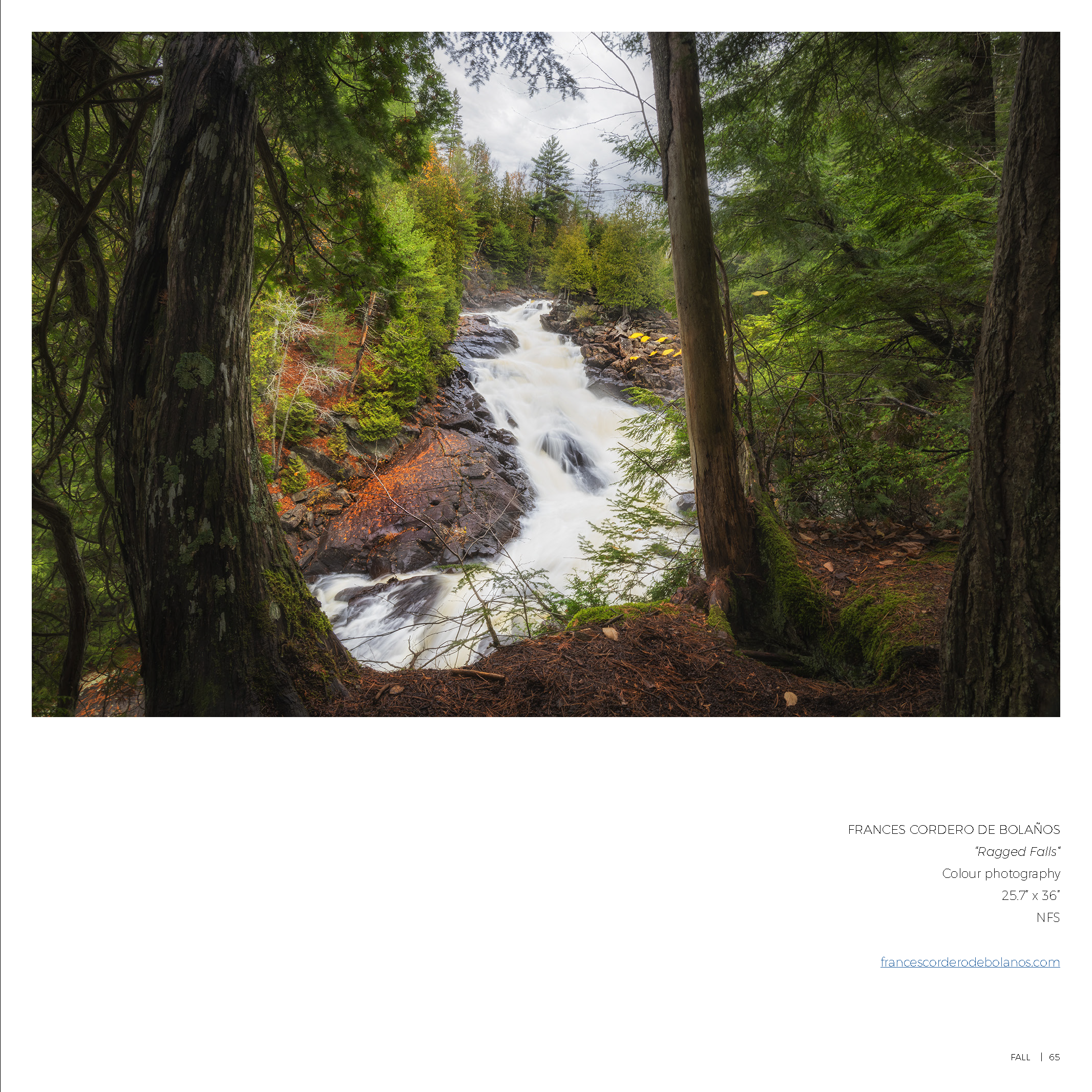


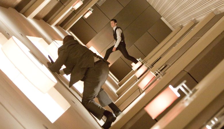
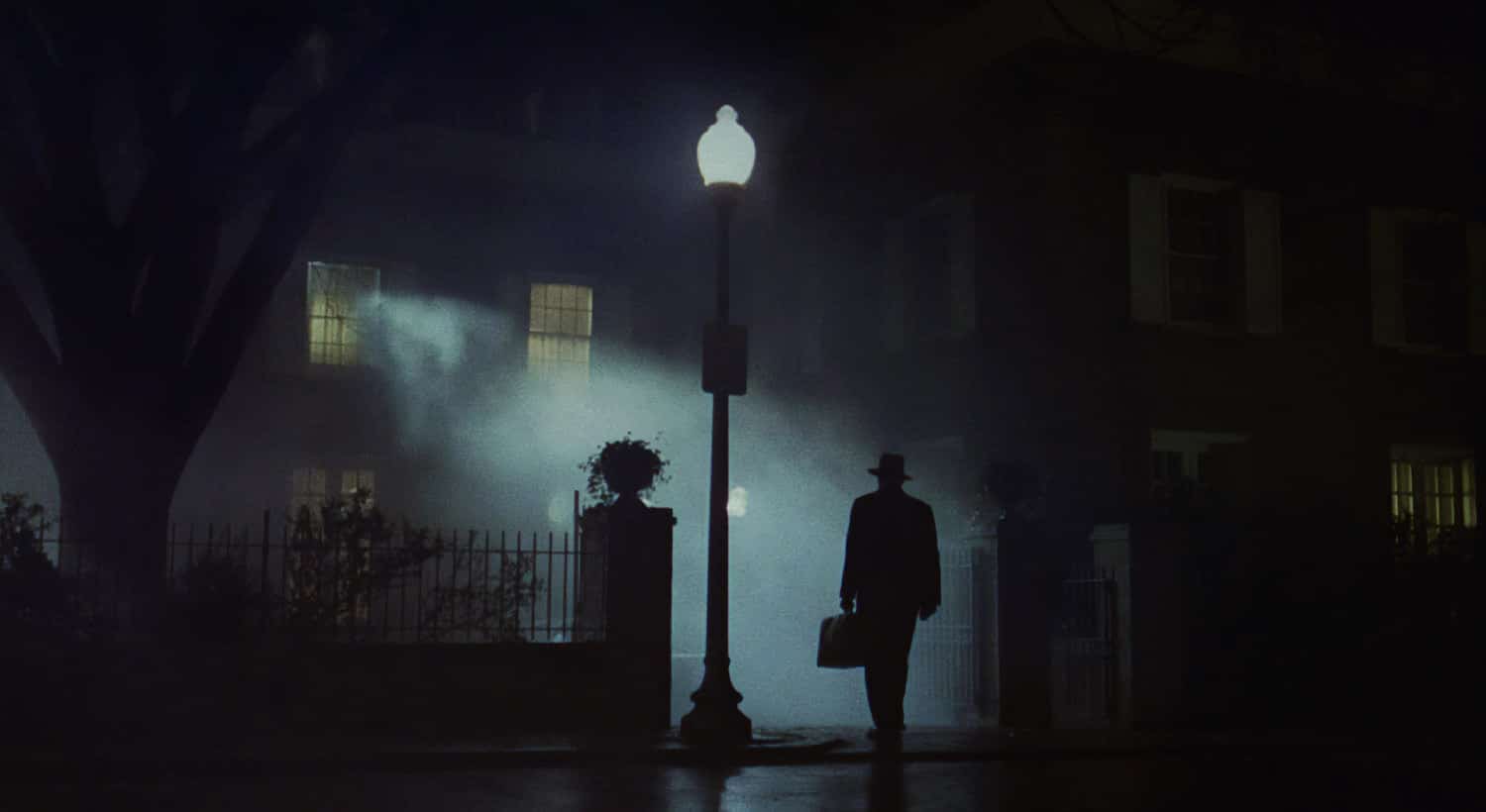
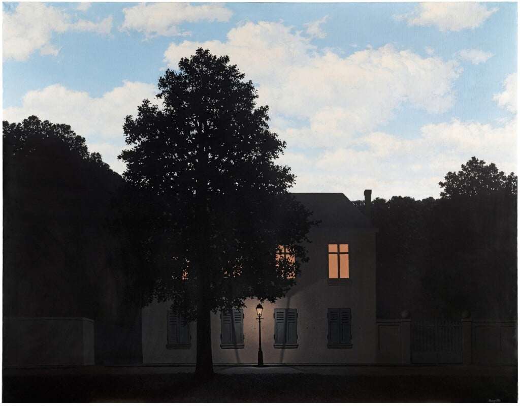
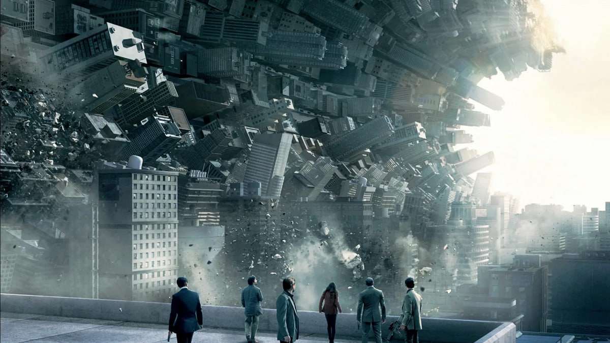
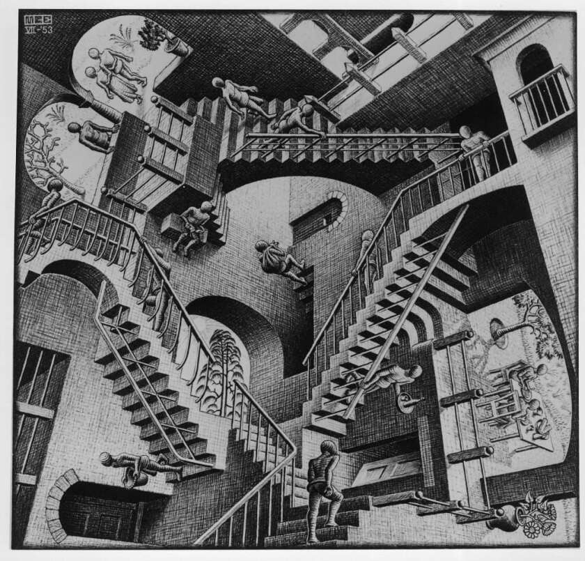
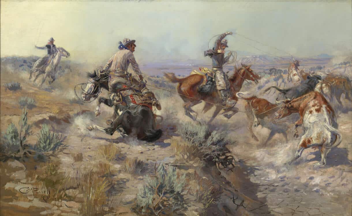
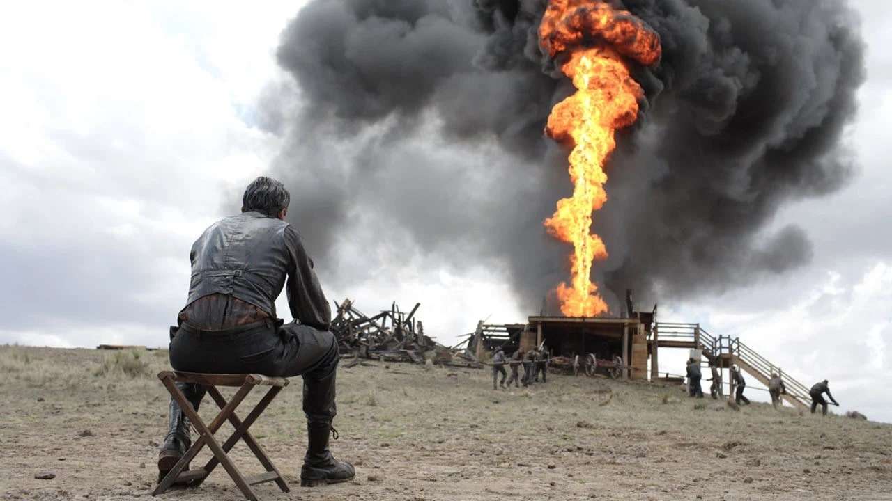
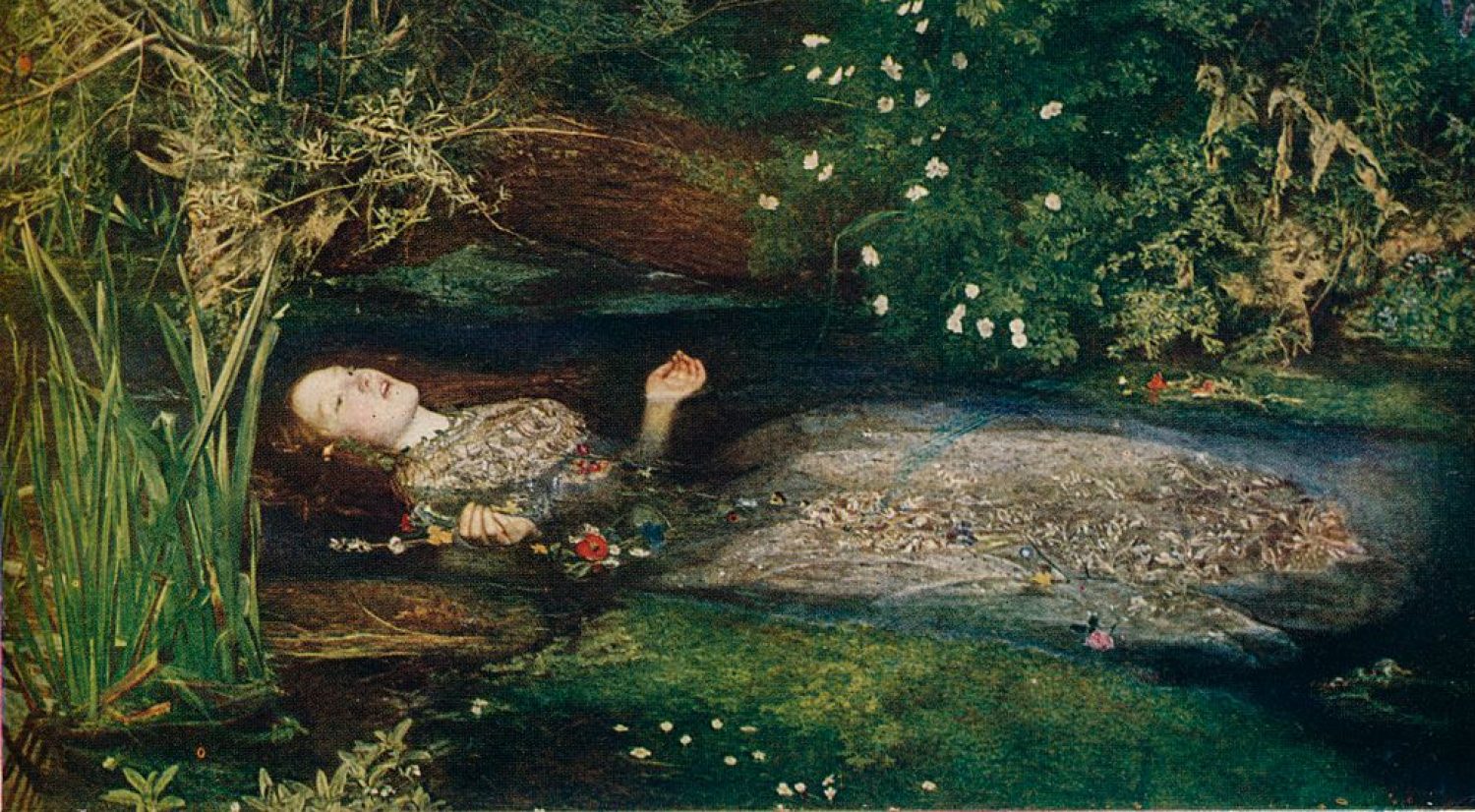
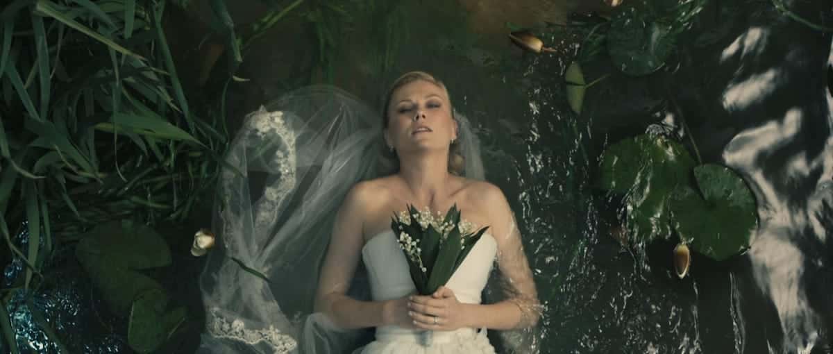
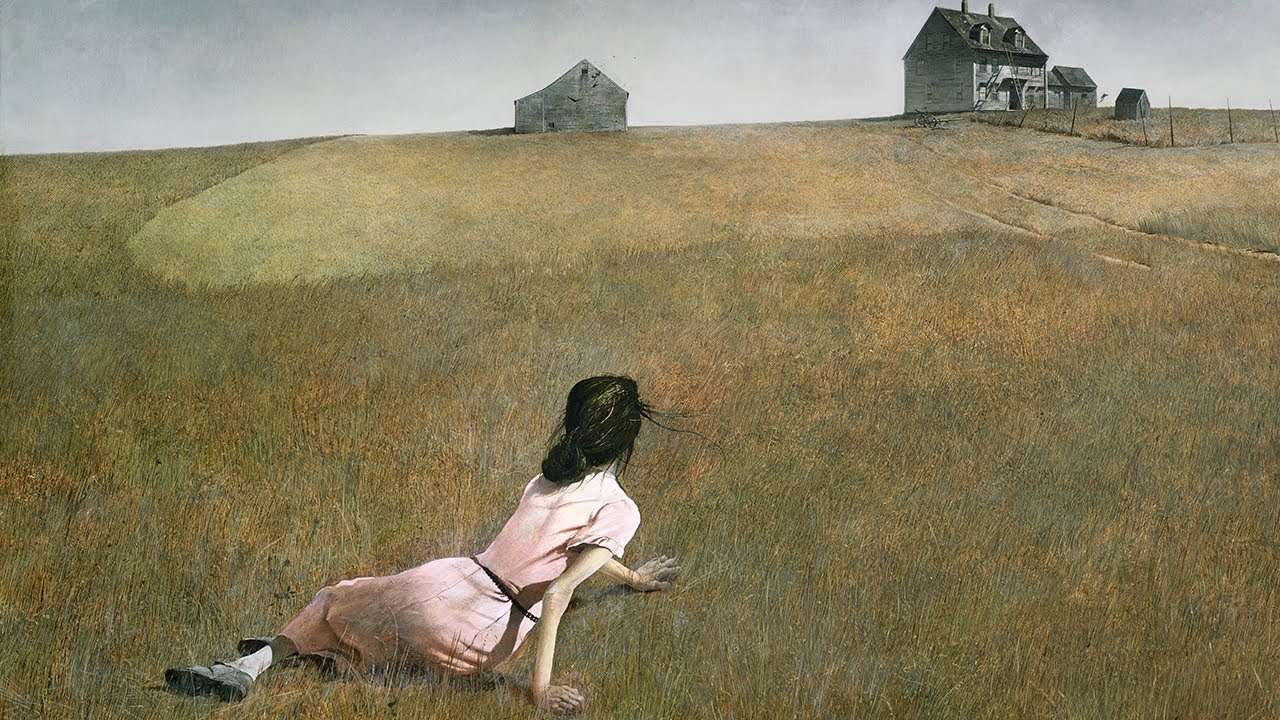
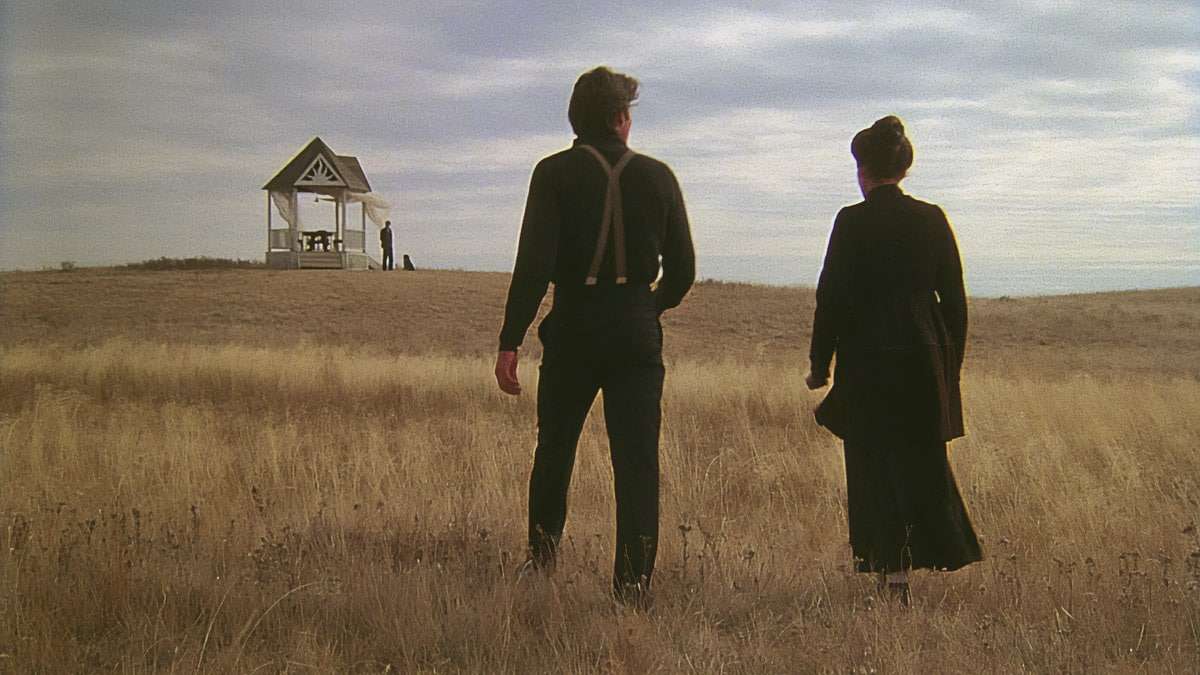
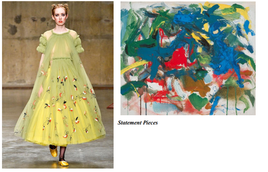
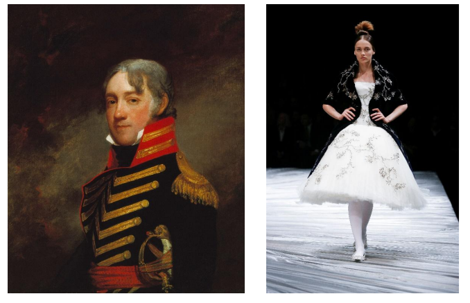
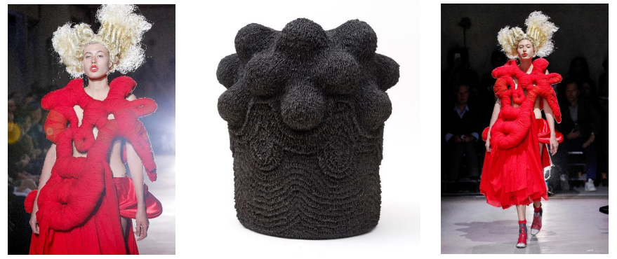
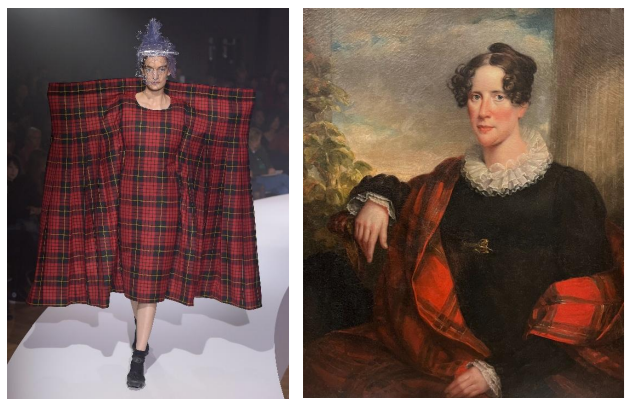
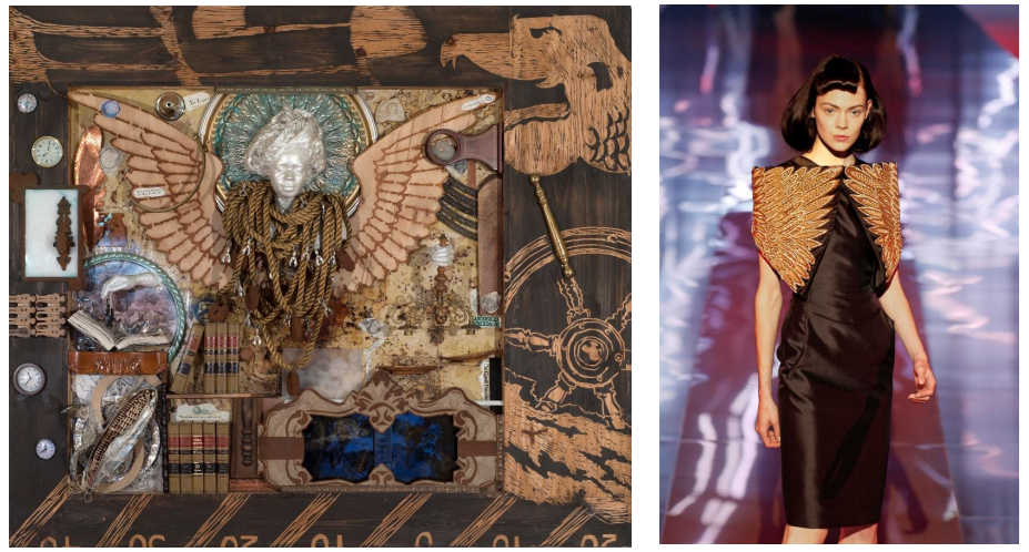
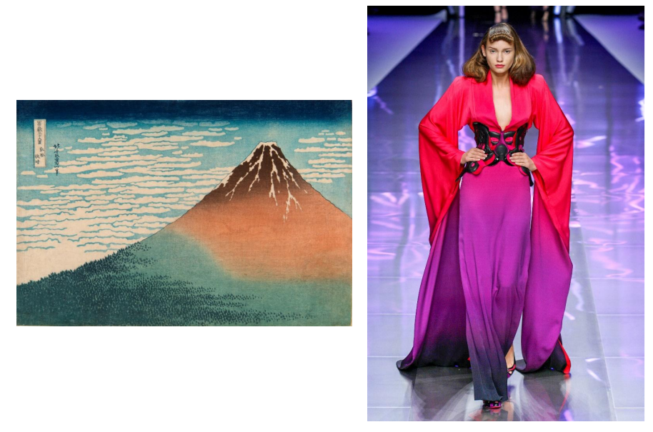
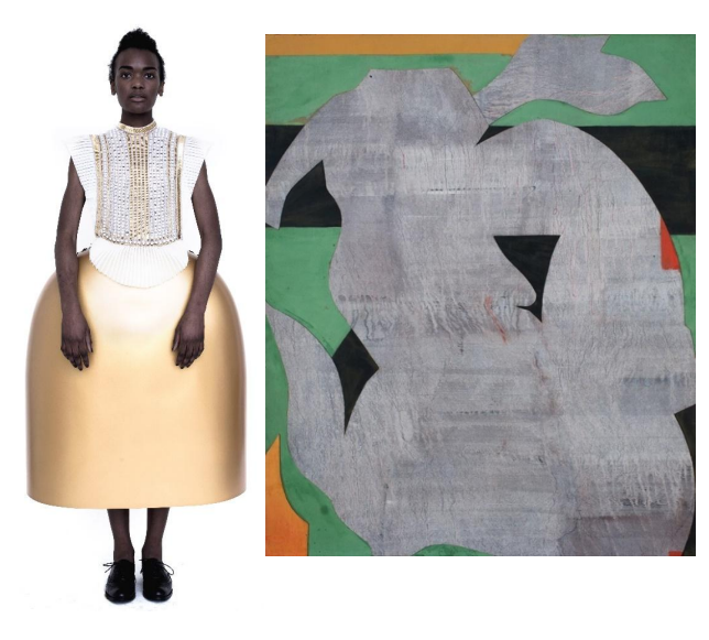
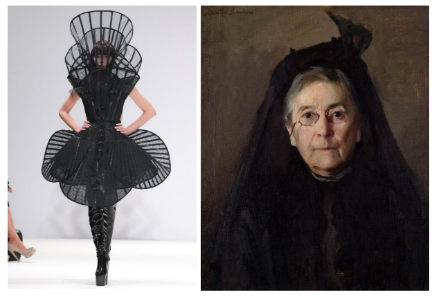
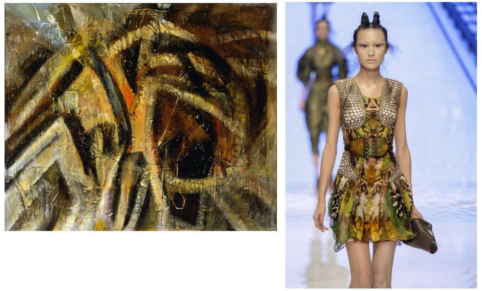



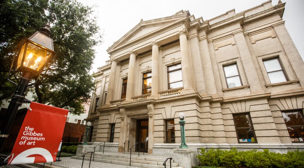
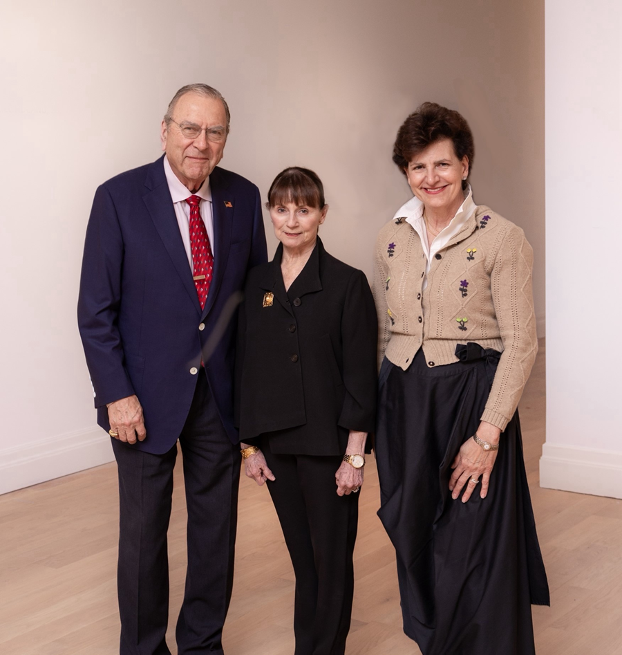
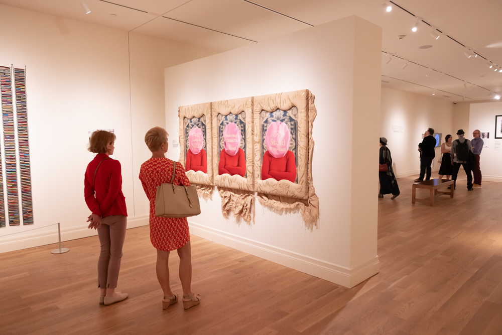
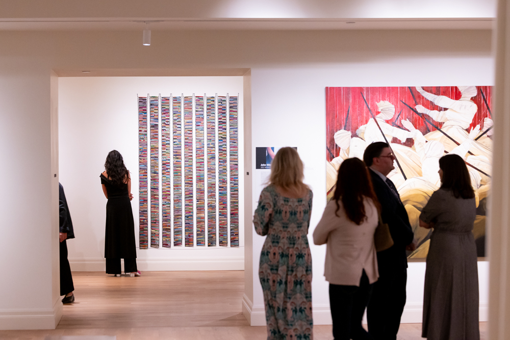
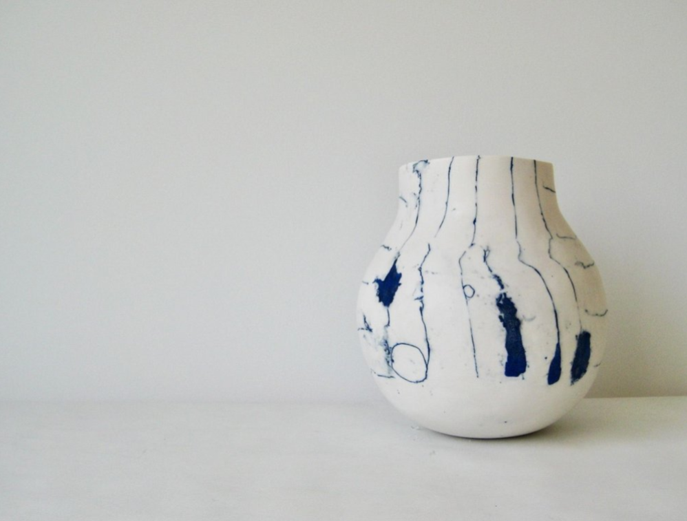
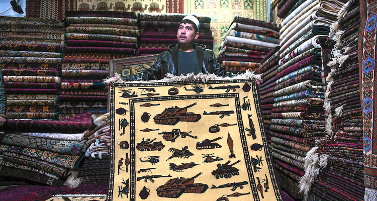
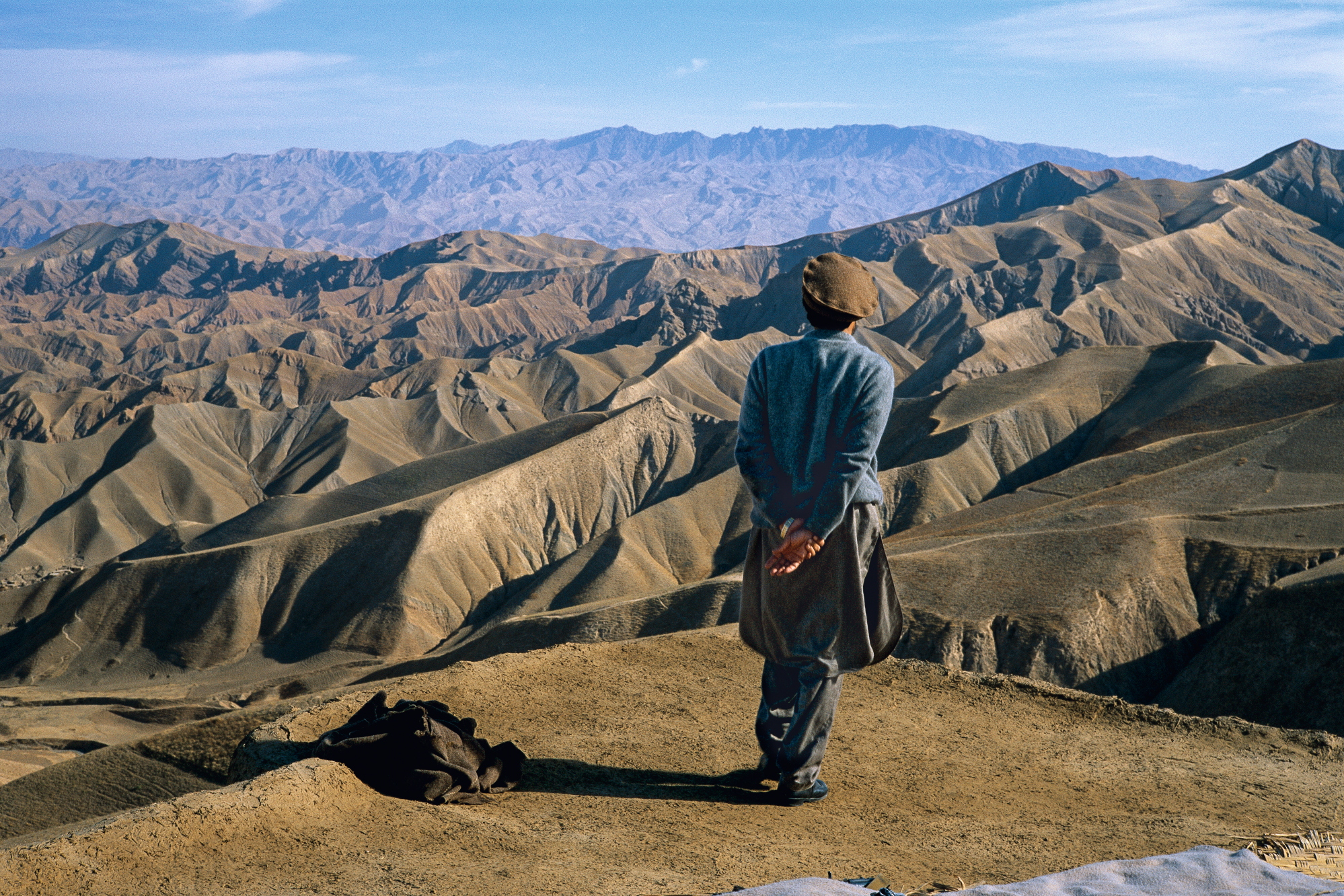
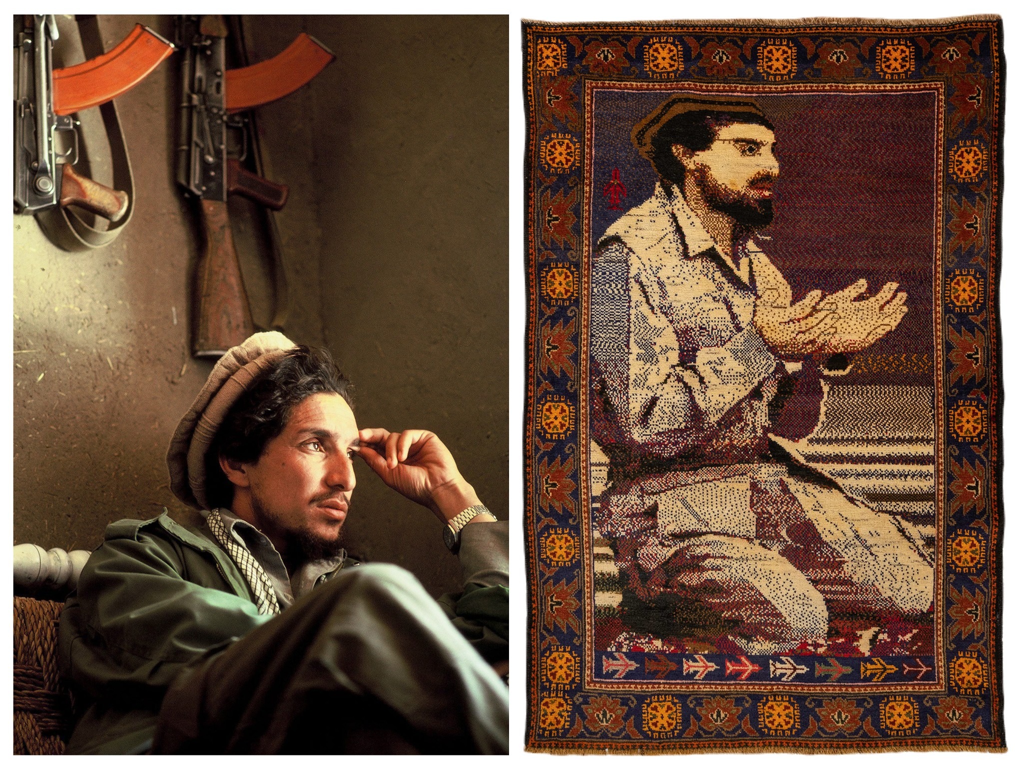





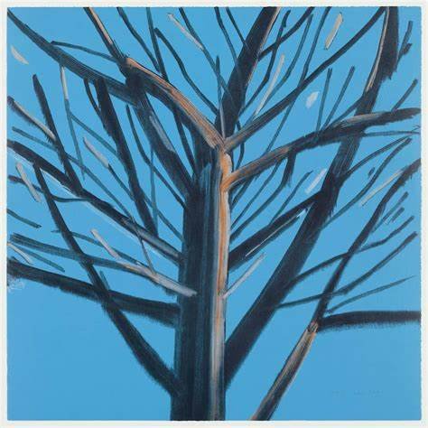
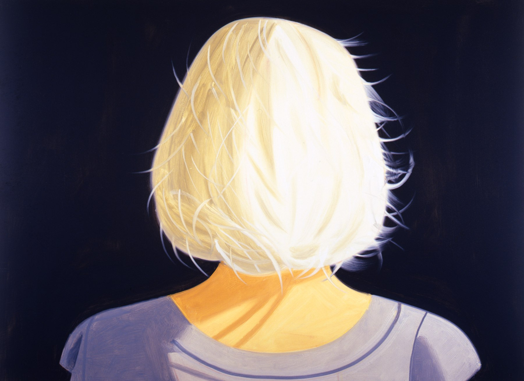

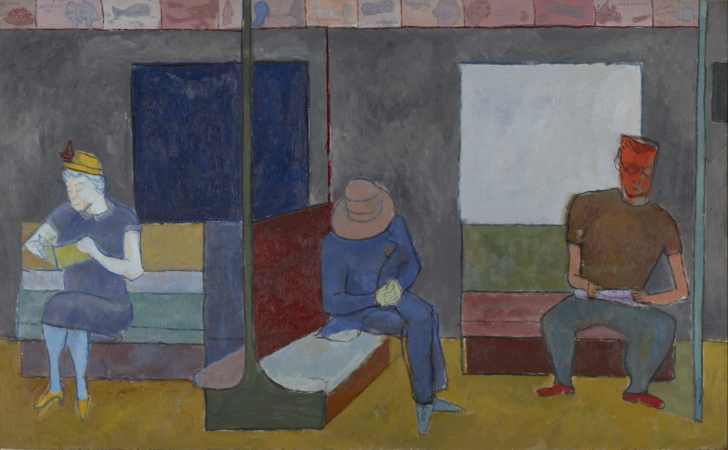

 Boston, MA. JEANNIE MOTHERWELL Profoundly Fun
  Existential Crisis, acrylic on cradeled panel, 40″ x 30″ x 2″
  Windward, acrylic on cradeled panel, 20″ x 60″ x 2″