Consider for a moment the nature of light and time. Fleeting, infinite, unknowable, and yet familiar as our own minds. We long for more time while cursing its slow progress. Temporal matters dictate every aspect of our human lives. We are beholden to the times in which we live. We cannot grasp light and yet we are surrounded by it. When we enter into the unknown, art is a light guiding us toward better days ahead.
Mary Temple’s “unsolved red white and blue”
Mary Temple has the ability to incorporate all of this into her artwork in the most surprising ways. She can capture a moment and freeze it for all eternity with the stroke of her brush. Her ethereal public art painted on existing architecture preserves the memory of a moment of light. Temple also focuses on the times in which we live, using her art to engage in global political discussion. Her series Currency depicted world leaders in such a way that ranked them according to their ability to achieve progress in matters of world peace. Temple uses time as a dimension in her work. Currency was an up to the minute newsfeed told through hand drawn portraiture, while her public artwork uses light to capture time and hold it still for all to see.
Susan Silton Billboard commission
Susan Silton lets our life and times inform her art. Through performance, installation, video, photography, text, audio, participation and print-based projects, Silton speaks to the turbulence around us. She fuses humor, unease, beauty with the intention of shining a light on the failures and triumphs of our moment on the planet. Her video work “Turn the Beat Around” was a direct response to the 2016 attack on an Orlando, Florida nightclub. Her art is a conduit to process grief, come to terms with the violence in our society, and seek common ground.
Writer Murong Xuecun once said, “Literature is not at the service of the government; on the contrary governments should do everything in their power to create a favorable climate for literature.” In these uncertain political times, what are you reading? Click here to contribute your books in the comments or use the comments feature at the end of this post. Tony Maslic, is reading “The Dispossessed” by Ursula Le Guin. Lian Brehm has turned to Suzi Gablick’s “The Reenchantment of Art” while artist Mary Temple cites the works of Chimamanda Ngozi Adichie, as well as her TEDx talk We Should all be Feminists as necessary fuel.
The Rome Glocal Brightness 2017 Light Festival has issued a call for artists. The Festival illuminates the sixth district of Rome allowing viewers to experience undiscovered corners of the city.
This bringing of light does not seek to diminish the dark, but to emphasize that the darkness can become a canvas in itself.
As we stand together at the edge of a new ravine, let us not fear what may be but embrace what is in each moment and never stop reaching toward the light. For the Silo, Brainard Carey.
Brainard Carey is an artist, author and educator. You can attend one of his free webinars for artists here. He also has an educational platform for artists called Praxis Center.
It’s no secret that luxury brands have thrived in China in recent years amid a population increasingly oriented toward high-end consumer goods like fashion, jewelry and automobiles—and the elevated social status such items confer. Today, the Chinese population is immersed in a new love affair: with grape-based wine! According to internationally-renowned sommelier, Noel Shu, China is about to be known producing quality wine bringing the region on par with other wine producing regions such as Napa Valley and Sonoma in California.
A self-made entrepreneur who serves as Managing Partner for ultra-luxe wine and spirits purveyor, Prodiguer Brands Shu recently launched his new book, China Through a Glass of Wine, to provide the most in-depth understanding of the wine marketplace to date and an extensive analysis of the modern Chinese wine industry, revealing a delicate interplay between commerce, the government and the consumer.
International-renowned sommelier, Noel Shu, provides in-depth look at the modern Chinese wine industry and guides us through the misty vineyards and crowded wineries of China.
Following the tradition of great traveling sommeliers, his no-holds-barred journey through China’s emerging wine culture is part ethnography, travel guide, tasting guide, cross-cultural examination and snapshot of the Chinese wine trade and consumer culture at large.
China Through a Glass of Wine also includes insightful interviews with key industry movers and shakers, including China’s largest wine importer and distribution company as well as boutique and unique chateaus across the region, revealing what wine making in present-day China is really like.
Casual wine enthusiasts and travelers as well as serious collectors and globally-minded investors will appreciate the accurate portrayal of China “through a glass of wine.” For the Silo, Trina Kaye.
About the Author
Internationally-regarded sommelier Noel Shu, Managing Partner for the ultra-luxe, award-winning wine and spirits purveyor Prodiguer Brands, is a 24-year-old self-made millionaire, entrepreneur and author of the newly released title, “China Through a Glass of Wine.” With impeccable panache and style, Shu, has already accomplished more than many do in an entire lifetime. He earned his undergraduate at West Point, completed the U.S. Army’s elite and grueling Combat Diver Qualification Course at the Special Forces Underwater Operations School (regarded by many Soldiers as the toughest military school to endure), and has personally designed and sold extraordinary multi-million dollar timepieces and necklaces to China’s elite through his ancillary, highly successful luxury jewelry business. Always striving to for growth and self-improvement and with a reverence for continuing education, despite his busy schedule Shu is currently pursuing an Ivy League Master’s degree at Columbia University. As a globally-minded business practitioner, Shu understands commerce on both sides of the Pacific and brings that expertise to bear with his various ventures, including the highly anticipated upcoming release of “Regale”—an exclusive wine brand expressly developed for the Chinese marketplace, which will be exported to the region in early 2016. For more information about Noel Shu, visit www.prodiguerbrands.com.
Emerging and established contemporary artists pay tribute in a new exhibit to SERGE GAINSBOURG, to his libertarian and rebel spirit. SERGE GAINSBOURG was very close to SALVADOR DALI, whom surrealist genius fascinated him.
Like Dali, Gainsbourg knew how to play with his image and how to manipulate the medias to communicate about him.
Author, composer, producer, actor and photographer, Gainsbourg is the Artist of the 80s.
On the occasion of the 25th birthday of his death, emerging and established contemporary artists revisit the famous portrait “Gainsbourg-Dali” immortalized in 1985 by the photographer ROBERTO BATTISTINI
Des artistes contemporains majeurs et de jeunes plasticiens rendent hommage à SERGE GAINSBOURG à son esprit libertaire et contestataire. SERGE GAINSBOURG était très proche de SALVADOR DALI qu’il avait côtoyé et dont le génie surréaliste le fascinait.
Comme lui, il savait jouer de son image et manipuler les médias pour communiquer. Auteur, compositeur, réalisateur, acteur et photographe, il est « l’Artiste » des années 80.
A l’occasion de la commémoration du 25e anniversaire de sa disparition, des artistes contemporains majeurs lui rendent hommage en revisitant le célèbre portrait « Gainsbourg-Dali » réalisé en 1985 par le photographe ROBERTO BATTISTINI.
Just for a moment, think about all of the many career fields in the world. Now think about those that require a personal emotional investment as a matter of course.
How many bankers make a regular practice of exposing their deepest insecurities to the world through their work? How many veterinarians routinely put on display the most precious and personal aspects of their hearts and minds? Probably not that many. As an artist, you are literally doing this all the time. Whether the emotional investment is major or minor, and whether you are exposing personal joys or defeats, the fact remains that careers in the arts by their very nature involve a whole lot of very personal investment. Unfortunately, some artists view this as a liability and allow the idea that they don’t possess the right self-esteem to affect their ability to work. It is important to find ways to lay these insecurities to rest and accept that by its very nature, art puts us in a vulnerable space. Embrace this rather than allowing it to overwhelm you, consider it an asset going forward.
Across the arts fields, vulnerability prevails. It is what often informs some of the most beautiful work. Whether we are talking about a performer or a visual artist, human nature dictates that when we put ourselves out into the world in the way that an artist does, there is a certain measure of vulnerability built in to the equation. It is a rare thing indeed to find a performer who doesn’t experience the butterflies of stage fright however subtly, no matter how seasoned he or she may be. And it is equally unlikely to find an artist who operates from a place of pure confidence free of the weight of uncertainty.
Jarrod Barker After the Rain 2016
The world of art, not to mention the world at large, would be a very different place if insecurity did not exist. If everyone walked around with stiff confidence all the time there would be no room for tenderness, bravery, courage, and the bonding commonality of vulnerability that we all experience which is often the key to connecting an audience to a work of art. Every human alive understands what it is like to feel overwhelmed and uncertain and it is often this understanding that leads people to seek out art as a means of connecting to others through this shared human emotion.
Self-esteem has become a buzz word without a strong definition to back it up. We allow it to inform us as though it is some sentient entity that can make or break our resolve as artists. The fact is, self-esteem is merely a label for the way we view ourselves. It is us, and us alone, who decide how we approach the world. Allowing a vague concept like self-esteem to stand in the way of creating something that speaks to the very soul of who you are makes as much sense as allowing a phobia of flying stop you from seeing the world. You must conquer these self-made fears and come out on the other side.
Jackson Pollock Number 1 1950 Lavender Mist
The fact is, there is no way around baring your very soul as an artist. Whether it is only a glimpse or whether you let it all hang out for the world to see, in every work you create there is, inherently, a very personal piece of you. Without this, your work would lack meaning and depth. People view art expecting the spectacle of human emotion. To deny this because of some feeling of low self-esteem is to deny an opportunity to yourself and your audience.
There are no guarantees in life, everything we do carries a risk. Every career has its risks and benefits, though these vary wildly across the spectrum depending on what field we look at. Art is no different. There are no guarantees. Sometimes you will expose your most private self and receive less than gentle feedback. Under no circumstances should this give you anything more than a moment’s pause. Brush off, stand up, and get back to it. Use these experiences to further inform your work. Explore the feeling of exposure and the insecurities of this concept of self-esteem. Look fear in the eye and let it look right back.
Ultimately it is up to you how you choose to face the very real challenges of so-called self-esteem in your work as an artist. Only you can know your own limits, and only you can be brave enough to step beyond them. No one ever achieved very much who didn’t expose their inner selves to total annihilation. While this may sound like a terrifying prospect, consider why you are sitting here reading this blog in the first place. If you’re an artist, by simply declaring to the world that you are an artist, you have already chosen the path of courage. You have willingly stepped into the ring with your heart on your sleeve. There’s no turning back now. For the Silo, Brainard Carey.
Dear Artist, Aristotle differentiated humans from their animal counterparts by dint of logos, the power of rational speech. Napoleon was attributed the quote, “four hostile newspapers are more to be feared than a thousand bayonets.” Human civilization was founded on the exercise of this divine faculty, and is destroyed by it in equal measure. Speech, in its complexity and weight, is the only world capable of rivaling nature.
This week, in view of two ponderous interviews, I ask you to summon to mind those rare and revelatory conversations that have left an indelible imprint on your life. What intimate discussion would you revisit and savor, if you were aware of the contents beforehand? What words of the past would be left unsaid or better spoken with the retrospective guidance of age?
Abstract acrylic painter Jeannie Motherwell refuses to grow cold in the artistic shadow of her father and stepmother, Robert Motherwell and Helen Frankenthaler. As a stable ecosystem quells its wrestling constituents, Motherwell’s refined intuition hushes the spontaneous boundaries of dilating paint on clay board and canvas. Over a soberly spoken interview, the New York artist now based in Boston, admits in her work the faint pursuit of a faded horizon: the shifting waters from the view of an old home, replaced, in time, by a windowless studio. The methodology of Motherwell’s art – to draw a structure from an uncertainty – eerily echoes a ritual from her upbringing: discerning, with the right words, to the joy of her guardians, the spiritual essences behind their cascades of paint.
Jeannie Motherwell in her Joy Street Studios, Somerville, MA Click image to visit her studio website.
Inexhaustible curator and researcher Ele Carpenter maintains that the lasting footprint of humanity will not be a monument or an idea, but a radioactive glare. Radioactive isotopes of a unique breed first entered the Earth’s atmosphere with the testing of the earliest nuclear bomb, signaling the beginning of a geological period known as the nuclear anthropocene. Dedicated to disseminating information about the irreversible changes to the environment caused by human hand, Carpenter organizes discourse and collaboration on a global scale, uniting scientists, activists, and visionaries in the depiction of a haunting reality that eludes the senses.
Looking for new additions to your reading list? Rachel Wolfe, one of our users, is deconstructing and rebuilding her fundamental conceptions of nature and mind. Sensitive Chaos, by Theodor Schwenk, vacillates between rigorous and metaphorical depictions of the underlying systems of movement that govern aeolian and liquid dynamics, from the furious dance of a hurricane to the soft aria of a developing child. Strange Tools, by Alva Noe, is a philosophical text that sees artmaking as a faculty for reflection, a primordial instinct that consciously and unconsciously takes stock of the external conditions that govern our identities and worldview.
Occupy Museums is seizing the means of cultural production with Debtfair, an exhibition dedicated to the overworked and underfunded. Creators, performers, and thinkers with financial weights on their shoulders have until December 9th to see their arduous narrative showcased in the 2017 Whitney Biennial. Debtfair serves to expose the aggressive business models that permeate leading art institutions, while encouraging solidarity amongst all encumbered populations of the economically segmented social landscape. Necessity may be the mother of invention, but no artist needs to bear the burden of Atlas.
The great American poet Wallace Stevens, envisioning life’s origins with a brain that thought without words, once instructed, “Begin, ephebe, by perceiving the idea / Of this invention, this invented world, / The inconceivable idea of the sun.”
LOS ANGELES – Bucky O’Hare – the original comic book series turned into a classic cartoon – made its debut in the digital domain with an 8-page exclusive Swipe Studio e-comic book written and illustrated by brand creators Larry Hama and Michael Golden together with Neal Adams and his Continuity Productions. Bucky O’Hare and the Toad Menace made its premiere appearance Day One of Stan Lee’s Los Angeles Comic Con recently held October 28-30 at the Los Angeles Convention Center.
Designed utilizing the tools available on the all-new Swipe Studio design app, the latest offering in the Bucky O’Hare legacy follows Bucky and his crew as they do battle with the Toad Armada. The special Los Angeles Comic Con presentation featured legendary artist Neal Adams together with Swipe Studio’s famed creator Satoshi Nakajima.
The 8-pager provided fans with a glimpse into the creative for the planned Bucky O’Hare theatrical motion picture now in the works with Neal Adams producing and directing.
The brainchild of software genius Satoshi Nakajima – the engineering architect responsible for Windows 95 and Windows 98 along with Internet Explorer versions 3 and 4 – Swipe empowers everyone from consumers to creators to easily animate everything from emails to digital comics with media-rich digital elements and make use of animation, video, vector graphics as well as full audio for voice, music and sound effects on tablets and smartphones. Created to take full advantage of today’s touch-enabled smartphone and tablet technology, Swipe eliminates the need for complex programming typically required to build animation or other forms of design content. As a result, creators, designers, animators and artists have the tools to create media-rich animated digital content for consumption via touch-enabled devices including smartphones, tablets and touch-enabled set-top-boxes, such as iPhone and Apple TV.
In addition to the Swipe Bucky O’Hare comic book, artist Neal Adams also worked with the Swipe team to load into the platform an impressive portfolio of Bucky art elements and animation that can be adapted by anyone for any digital purpose, including e-mails or presentations of any kind, including all main characters and several backgrounds.
Creators and artists can now experience the free Swipe app instantly by downloading Swipe Studio to their iPhone/iPad/iPod touch and begin to create media-rich animated digital content. To download the Swipe Studio, go to App Store https://appsto.re/us/hlcDeb.iNote- Swipe Studio is available only for iPhone/iPad/iPod touch users with version iOS9 or later.
“We are thrilled to unveil the newest Bucky O’Hare creative from the team responsible for this celebrated and enduring property at Stan Lee’s Los Angeles Comic con,” said Nakajima. “I [had] tremendous enthusiasm towards sharing a panel with the great Neal Adams whose brilliant use of the Swipe Studio design tools helps us usher in a new era in digital design.”
“It has been a lot of fun to work with Swipe Studio and I encourage artists to check it out for their own design projects. In fact, Swipie – which is Swipe’s platform for consumers – continues to offer a wealth of art and animation applications to enhance everything from emails to digital presentations. Mr. Nakajima has built an extraordinary platform and I am proud to contribute Bucky O’Hare as a way of underscoring its power as a design platform,” said Neal Adams.
About Swipe, Inc.
Headquartered in Tokyo, Swipe, Inc. is the parent company for Swipe™, an open source platform embedding the full range of visual and audio media into digital documents for smartphones, tablets and other touch-screen devices. Swipe, Inc. Founder-Chief Technology Officer Satoshi Nakajima is recognized industry-wide as the lead engineer and architect of Windows 95 and Windows 98 which he created during his tenure with Microsoft. Visit Swipe, Inc. online at http://www.Swipe.net/.
LOS ANGELES – Toei Animation Inc. will debut an English subtitle simulcast of Dragon Ball Super on multiple digital platforms on October 22nd. For the first time, fans in North and Latin America, South Africa, Australia and New Zealand will be able to view Dragon Ball Super simulcast. Since its debut in Japan in July 2015, the hit follow-up to one of the greatest anime series of all time has been eagerly awaited by followers around the world. Through non-exclusive streaming partnerships with Crunchyroll, Daisuki.net and Anime Lab, Dragon Ball Super will finally be available.
Kicking off on Saturday October 22 at 9:00pm EST, viewers of Crunchyroll, Daisuki and Anime Lab can log in for a non-exclusive English-subtitled simulcast of episode 63, “Don’t Define Saiyan Cells! The Curtain Rises on Vegeta’s Intense Battle!!” which leads into the thrilling conclusion of the “Future Trunks Arc.” Audiences will get to join Japan live during the broadcast, and then tune in weekly for future new episodes.
Crunchyroll: USA, Canada, Australia/New Zealand for subscription viewing on demand (SVOD) and advertising video on demand (AVOD). Latin America and South Africa can only be viewed on SVOD.
Daisuki.net: USA, Canada, Australia/New Zealand for SVOD & AVOD
Anime Lab: Australia and New Zealand for SVOD & AVOD
Dragon Ball Super’s fourth arc features the return of Future Trunks. Hunted by a mysterious being bent on destruction, Future Trunks is brought into a fight spanning time and space. Episode 63 follows Future Trunks’ epic battle against Goku Black, and Goku’s acquisition of the powerful “Evil Containment Wave” technique.
To prepare for episode 63’s debut, viewers will also be able to stream the entire Future Trunks arc (the arc begins at episode 47). Then, starting on October 30, the complete series will roll-out, with 10 episodes released a week at a time.
“Patience always pays off, and we’re delighted to finally share Dragon Ball Super with our fans around the world. And believe me when I say there’s more to come. Stay tuned for additional exciting news before the end of the year!” said Masayuki Endo, President of Toei Animation Inc.
About Toei Animation Inc.
Based in Los Angeles, Toei Animation Inc. manages the film distribution of Toei’s top properties, including Dragon Ball all series, Sailor Moon, One Piece, Saint Seiya, and many others to North America, Latin America, South Africa, Australia and New Zealand. Toei Animation Los Angeles office further handles all categories of consumer product licensing based on its film and television brands within these territories. For more information, please visit http:www.toei-animation-usa.com or contact [email protected].
Do you have Dragonball stuff to share with us? Send us your webcam/smartphone camera feed now (or uplink us with your media files) by clicking here- [vidrack align=”right”]
Toei Animation Co., Ltd
Toei Animation Co., Ltd. (Jasdaq:4816) ranks amongst the world’s most prolific animation production studios. The company’s operations include animation development and production, and worldwide marketing and program licensing with sales offices in Paris, Hong Kong and representative office in Shanghai. Since its founding in 1956, Toei Animation Co., Ltd. has produced more than 11,000 episodes of TV series (more than 200 titles) and more than 215 long feature films. For more information, please visit http://www.toei-anim.co.jp.
Last year’s indie best-selling graphic novel set to release the next installment in the breakthrough series. The second novel features an augmented reality app and introduces the character of actor Chad L. Coleman.
When TREADWATER Vol. 1 was released in comic book stores in July 2015, it was just another self-published indie title among many others. At the end of the month, this was no longer the case.
When the sales figures came in a month after its debut, TREADWATER found itself on equal footing with the likes of The Walking Dead when they first started out. According to Diamond Comic Distributors TREADWATER managed to achieve 90% of Walking Dead’s sales, while outperforming other popular franchises like Dark Matter in their respective opening months.
TREADWATER is best described as a dark and mature sci-fi action drama. It is a pre-apocalyptic story that takes place in a plausible dystopian future, where a global economic crisis splinters political alliances and plunges the world’s nations into crime and disorder. As the dual forces of anarchy and totalitarianism sweep over the world, six antiheroes are recruited into a privately funded special operative program in an attempt to keep the world from tearing itself apart.
Part of the ugly charm of TREADWATER lies within its ability to predict current events. The isolationist politics of the world’s leading nations, as exemplified by the rise of Trump in the US and BREXIT in the UK; the attempted coup in Turkey, along with its backlash in the form of a dictatorial powergrab; the increasing civil unrest in the US and the terrorist attacks in Europe – all these developments find their parallels in the world of TREADWATER.
Yet Morgan Rosenblum and Nat Prinzi, the creative minds behind the TREADWATER franchise, take no pride in the accuracy of their grim predictions. Their primary goal is to create an engaging and believable superhero story, which avoids the pitfalls of the genre, while staying true to its roots. This is why the story of Treadwater is driven by its larger-than-life, yet deeply imperfect characters, rather than merely a clever premise or unlikely plot twists.
The new installment of the graphic novel, TREADWATER Vol. 2, will be released in late 2016. Along with the novel, the TREADWATER team will debut its own augmented reality app for smartphones. When pointed at the comic book, the app will immerse the readers into the world of TREADWATER by bringing its characters to life in front of their eyes.
The AR app is not the first step that Rosenblum and Prinzi have taken in the direction of interactive storytelling. The TREADWATER franchise already consists of a motion comic, a video game and an interactive website, which lets its users “hack” into Treadwater’s secret database, allowing them to explore their coveted network.
The ability of the creative duo to inspire and impress their audience has led to the inclusion of TREADWATER Vol. 1 into the curriculum of West Aurora High School in IL. It is now being taught in their creative writing class alongside of Orson Welles.
The appeal of the TREADWATER franchise goes beyond high school students, as actor Chad L. Coleman has become a character and a partner in the TREADWATER franchise. Best known for his roles as Tyreese in The Walking Dead, Dennis “Cutty” Wise in The Wire and now Tobias Church in Arrow, Mr. Coleman’s character will see significant development in the second volume of the graphic novel. The new installment will also introduce the character of Holly Wolf, a celebrity cosplayer and 2015 Geek Fantasy Woman of the Year, who also joined the TREADWATER franchise as a supporting character.
Key Dates in 2016:
October 6-9: Come visit us at New York Comic Con. You’ll find us at booth 2314, where you’ll be able to interview the creators of TREADWATER, actor Chad L. Coleman and cosplayer Holly Wolf among others. You’ll also be able to experience the entirety of the TREADWATER franchise, including the Beta Version of our very own PS4 video game.
October 1-21: Special pre-order promo period for TREADWATER Vol 2. Each pre-order will come with a digital copy of the bestselling graphic novel TREADWATER Vol 1 to help the new readers get caught up to speed with the story. Additionally our readers will get a limited edition single issue, signed by its writers, creators and artist. Thirdly, they will also receive a digital collector’s edition of the “Treadwater Dossiers” Character Art Book.
October is National Disability Employment Awareness Month in Canada, and Amanda Orichefsky wants to celebrate the contributions of workers with disabilities and educate the able bodied about the value of a diverse workforce inclusive of their skills and talents.
Amanda Orichefsky of Toronto, now 27, was born with arthrogryposis, a condition that robbed her of the use of her arms. Despite her disability, Amanda has pursued her passion for art, attending George Brown College where she graduated in 2010 with a diploma in Fine Arts & Animation.
Today, Amanda earns a stipend to further her painting studies as a member of Mouth and Foot Painting Artists, an international association of 800 disabled artists around the world. She also sells reproductions of her work to support herself. A younger Amanda was also asked to give a demonstration of her mouth painting skills to Wayne Gretzky, which was filmed as part of the commercial for Ronald McDonald House Charities seen above.
Amanda is also a member of the MFPA which has been operating in Canada since 1961 and is a member of the International Association of Mouth and Foot Painting Artists. There are currently 13 disabled artists working in Canada and over 750 others around the world. For the Silo, Ginny Grimsley.
For more information about the MFPA, to purchase product, or to view a full list of products available, visit www.mfpacanada.com or email [email protected]
Frank Lloyd Wright designed over 1,000 structures (532 were completed) in his 70-years-plus career – mostly homes but also hotels, schools, churches, the Johnson Wax Headquarters and the Guggenheim Museum. This iconic American architect’s final design was the Norman Lykes House in Phoenix in the same year of his death in 1959. It is now for sale priced at USD$3.6 million and profiled at toptenrealestatedeals.com.
The Guggenheim cameo in Men In Black (1min 25secs)
Wright had been working with his apprentice, John Rattenbury, on the Lykes House sketches and had already chosen the building site for the home when he died. Having come full circle from his start in Prairie style, to textile block, to organic and, towards the end, the functional Usonian for the masses, his last designs showed a new interest in circles and curves as he created buildings in the round such as the Guggenheim and the house he built for his son, the David and Gladys Wright home also in Phoenix.
With a site on top of Palm Canyon with views of the valley, Wright began the Lykes design by replicating the curves of the mountainsides, making the home an integral part of its environment and providing big views for its owners and visitors. Though Wright passed away before finishing the working plans, the Lykes hired his apprentice, Rattenbury, to complete the plans according to the details set forth by Wright. The couple loved the completed plans, though it was another seven years before they started construction. When they did, Rattenbury oversaw the build and the home was completed in 1967. In addition to the structure itself, Wright also designed the furniture and built-ins for the home.
In 1994, new owners wanted some updating, so they called back Rattenbury to do the redesign by expanding the master bedroom, converting a workshop into a media room and combining two other bedrooms into a guest room – all without disrupting the overall design. Rather futuristic for its time, the circular and curvilinear design has become a timeless piece of architecture that continues to be copied by today’s designers and builders.
Now for sale and registered with the Frank Lloyd Wright Building Conservancy, the 2,849-square-foot home on one acre of desert plateau has three bedrooms, three bathrooms, the signature large living room fireplace intended to bring families and friends together, a lower-level media room, two home offices with built-ins of desk, cabinet storage and walls of shelving, a distinctive curved kitchen with Wright-designed island and unique under-cabinet windows and timeless stainless-steel counters, contemporary tiled large baths, and a privacy walled crescent pool patio viewed from inside through glass walls. There is also a separate large office in the round with all built-in furnishings encircled by half-moon windows. Views of valley and mountains can be seen from almost every room.
Classic last Wright design before his death, contemporary for today including lots of storage space with furniture and built-ins designed by the famous architect, the Lykes House is now for sale and priced at USD$3.6 million. For the Silo, Terry Walsh.
Dear Reader, it is difficult to deny that a side of art making is fatally concerned with the poetic grace of the gesture – it is expected that a work should exude a cosmic and ineffable air.
Regardless of your medium, I hope this glance into the minds of two established poets from very different walks of life can help dissipate the intimidating mist between process and product, as well as remind you that the transcendent and the familiar are often one in the same.
Global spectator Meena Alexander recognizes that even in the grand art of poetry is a desire to express what cannot be said through its own means. After eight books of poems and a lifetime of travel, Alexander continues to defend her craft as the most ordinary of entities, no more inexplicable than a child’s obvious and impossible sense of language or rhythm.
New York-based Eileen Myles approaches poetry from a reserved and humble perspective, with the intent of striking a tasteful balance between metaphysical grandeur and the habitual rhythm of the everyday.
Myles, a breathing artistic currency, treats poetry as an extension of the self with the potency of a movement and the collective memory of a civilization. Myles proves that common experience and abstract phenomena are synonymous when we step back to look.
If the weight of the world seems so immense that the few strands of creativity cannot unravel, the Mayer Foundation offers emergency funding for New York artists facing economic, residential or medical turbulence. Proposals may be submitted at any time, with over two thousand dollars granted to those with concrete objectives and a levelheaded art plan.
It is easy to forget that behind the polished mirror of history is a messy and cumulative reality. There is little difference between the intelligentsia of years past and the friends sitting at your dining room table. For the Silo, Brainard Carey.
I learned about the Hamilton Audio Visual Node (HAVN) a few years ago by doing the rounds during Art Crawl. Since then it’s become obvious they’re hosting some of the most innovative music and visual art in Hamilton. I sat down with Connor Bennett and Chris Ferguson at the beginning of July to learn more about the collective and discover yet another reason to move to Hamilton. Connor and Chris made it pretty clear you don’t need an invitation to join the party. Featured Title Image, The HAVN Storefront on Barton Street Credit: Ariel Bader-Shamai
Timothy: How did HAVN get started?
Connor: Um, a few of us started a band, and we were practising in the basement of a student house and when it came time to leave that house, we wanted a space where we could continue to play, and show art, and we just lucked out, our collaborator and co-founder Amy McIntosh was living above a storefront and…
Chris: …had a good relationship with the landlord and managed to get the downstairs space at a price we could afford.
Connor: That was May, 2012, we opened up just as most of us were graduating from McMaster University.
Timothy: What does it mean to be a node for the arts? Is the storefront a critical component?
Connor: It’s probably not critical, although it’s nice, it’s really nice. I wouldn’t say it’s critical because we don’t do regular gallery hours, where people can just pop in. It is nice to have the storefront space for things like art crawl. We’re off of James Street but it’s still easier to get people out as compared to a studio space.
Aubrey Wilson Quartet in February 2015, Photo Credit: Amy McIntosh
Chris: Back to your question, as to what it means to be a node. Nodes are intersection points, which denotes the collaborative nature, the interdisciplinary nature of what we’re trying to do. And it was chosen for the sake of the acronym [Laughter].
Timothy: So what are your activities?
Chris: You could put it into four categories. We do art shows every art crawl, and occasionally outside of art crawl. We do music shows two to five times a month. And then there’s HAVN Records, our cassette tape little label. There’s also some miscellaneous things that are harder to categorize. We’ve done craft nights where people come out. Or if people in the collective supply an idea and make it happen. For a little while we had a darkroom in the backroom where people could develop photos.
Timothy: What are some of the highlights from the past couple of years?
Chris: It wasn’t something that I was involved with personally but I thought the darkroom was a really cool idea. It’s not something that’s widely available and it was a DIY thing where they obtained all the equipment and brought it all together. Some of it was donated by a like-minded friend from Guelph.
Connor: One of the best concerts I’ve seen recently was hosted by Cem Zafir and his partner Donna Akrey at HAVN, and they had a percussionist by the name of Tatsuya Nakatani come in and everyone in the room was transported to a different world, it was a magical moment. Those happen a lot. We’ve been really lucky with a lot of good music.
Hagface and Zena in August 2015, Photo Credit: Tony Hoang
Chris: What was the name of the show, I think Ariel and Petra did it, with the yarn, it was kind of, performance stuff; would you consider it a successor to the Quanta_1 show, where you and Kearon…
Connor: Yeah, yeah, it’s kind of like that…
Chris: An extension of that idea. Petra and Ariel did it, how would you describe it?
Connor: It was kind of a poetic yarn installation, with figures…
Chris: …and quotations.
Connor: It was great.
Chris: Really well executed. Not something you see a lot of.
Connor: Yeah, there’s lots of highlights.
Chris: We could keep going.
Connor: Once you start thinking about it.
Chris: I really liked our show for Supercrawl last year, which ended up being themed around Cootes Paradise, the Cootes to Escarpment EcoPark System, which is a conservation effort beginning with Cootes Paradise all the way into Burlington to connect some critical natural lands. The show really nailed the peaceful nature of it. Supercrawl is very busy, there’s tonnes of people and then you come to HAVN and it’s peaceful, relaxed.
Connor: Serene.
Chris: Yeah, Judy Major-Girardin, a professor at McMaster that taught a lot of the HAVN crew, was very generous with her time and she’s a big supporter of that initiative, so she put up a gorgeous installation with sound recordings from Georgian Bay. Frogs. Printed cheesecloth. It was stunning.
Corridors, in Support of the Cootes to Escarpment EcoPark System, September 2015, Photo Credit: Ariel Bader-Shamai
Timothy: What are your objectives? What is the need or desire that you are addressing?
Connor: I’d say from the music side of things, it’s a space for outsider music, for music that doesn’t really fit in a club or a bar. It’s a small space, really intimate, so even if ten people come out it feels like a nice crowd.
Chris: Yeah, It could just be a touring band who might have trouble booking a show at a bigger venue, because they wouldn’t attract a bigger crowd.
Connor: We know a lot of people who are booking shows in Hamilton and we’re filling a bit of a void since they’re not booking these types of shows. Like free jazz, for example, there’s no venues that are booking free jazz but we will gladly and enthusiastically book a free-jazz show.
Boyhood and Holzkopf in July 2015, Photo Credit: Tony Hoang
Timothy: How did you determine the scope of your practice?
Connor: Time determined that. When I started out with HAVN I was working a lot more with Kearon on the visual arts and installation projects and with time my interests and time investments moved more towards the music. It’s a natural evolution within the group, that we’ve settled into our roles based on our interests.
Timothy: Were those interests present from the beginning, or have they been nurtured over time?
Connor: One of the reasons why this has worked out for so long is that everyone has been really passionate about creativity, and art in general, and open to all art forms. That’s been the crux of why we’ve been around for so long, and putting on shows that are successful.
Timothy: What is your current relationship with institutional structures like the university and the gallery?
Connor: Well, quite a few professors from McMaster have shown art in our space. Judy and Dr. McQueen had a show recently. Other galleries? We have good relationships with other galleries, in particular, the Factory Media Centre, because we’ve done a lot of media art, not only that, we’ve shown a lot of art there, and both Amy McIntosh and Aaron Hutchinson have been on the board there. Amy’s been involved since the beginning.
Timothy: You position yourself as an alternative, though.
Chris: It’s not an adversarial relationship, like ‘that stuff is no good.’
Connor: We just don’t want to replicate things that are being done elsewhere. I’m sure we do it all the time. But the intention is to fill a void, take a risk.
Timothy: What are the benefits and limitations associated with your present configuration?
Connor: We’ve had trouble finding grants that apply to us. That’s one challenge because we operate with no inflow of money, so it’s just tough to make it work sometimes. That’s one of the limitations.
Chris: Sometimes I wonder if we put more time into the grants whether we would begin to take a different path. Like, having gallery hours wouldn’t be a bad thing, but it would be different than what we do now, and it would mean that we would be travelling down a more traditional path.
Timothy: Can you speak of the benefits and effects of HAVN, for yourselves and the broader community?
Connor: It’s such a useful space for us as artists and musicians, that’s kind of priceless.
Chris: It’s great to have a spot that you’re part of.
The Celestial Offerings Show in December 2015, Photo Credit: Petra Matar
Connor: Ideally we’re providing a space that’s inclusive, and open, where people feel comfortable. But if I was new to Hamilton and I went to HAVN I could understand feeling intimidated because there’s all these people who know each other already.
Chris: I think it’s always hard, because you establish your audience, and your friends, and you want people to have a stake in the space, that they’re part of it, that they’re not just attending shows, but that they’re part of the community too. But you have to balance that with being open and having new people feel that they can be part of it.
Timothy: So do you have any words of advice to people who might want to start a collective?
Chris: If I had any advice it would be pretty cheesy.
Connor: I don’t know. [Laughter]
Chris: The real trick is having the right group of people.
Connor: Get lucky.
Chris: Yeah, we couldn’t have made this happen in a bigger city where the rents are more expensive.
I really like this album, there’s some great soundscapes but also a sparseness and edge of tension at times. The production is excellent allowing sounds to evolve and grow. Fact: you will find a variety of recorded sounds that combine with layers of noise and drone elements and this results in the expected elements of experimental but yet retains a solid coherence.
Ohms Per Swamp Cubed
This song uses field recordings and subtle noise / drone elements, it has a stripped back feel but this is done very effectively.
Melancholic Transistor
This also sounds like another field recording and has excellently layered noise / drone sounds and a subtle emerging lead which adds a great tension. My Role…
A great spoken recording, although I’m not sure where it was taken from. There’s effective layering of sounds again, and there are looping elements and bass and percussion sounds. Take note of the processing of the vocals towards the end because this is excellent too.
Laminated Numbers
The processed vocals have an ethereal, spooky feel. Again- more layering of sounds, butfor this time there’s an Eastern feel to the background sounds and the song captures the mood of a “half-heard” conversation. All of these different elements are combined really well. We Interrupt This Broadcast
The striking percussive sounds heard here are layered logically against a recording of a public news report that warns of an impending nuclear strike. There’s a effective tension to this song. Drone #4
Opens with a string type sound layered over a field recording and a warble like sound that serves to remind the listener of hand-tuning an old radio while searching for a clear station or trying to remove static caused by radio wave interference. Overall, a nice bit of tension to this song. Lo Fi Left Over Laminated Loops
This song has a big atmospheric opening, slowly evolving sounds and dense layering. Sophisticated Babble
A slowly revealed opening and then sounds panned really well create a broad stereo spectrum. This track has a sparse feel and yet the recorded vocals are richly layered. There is a sense and feel of being a removed outsider listening in from afar. Radio Waving
Strong combinations of radio recordings and noise, the layered percussive rhythm works especially well and provides a contrast to the harsher radio sounds.
There’s lots to consider here. For the Silo, Mike Fuchs. Yellow Salamand’r 4 on facebook
This article discusses an approach to teaching linear improvisation to beginning jazz guitarists through the function of voice leading in harmonic progressions. The guitar student may gain a clear understanding of improvising melodies by establishing clear visual and aural relationships between the chordal and melodic textures.
Three dominant 7th chord voicings are introduced and applied to a twelve bar blues progression in F major. After learning the rhythm guitar accompaniment, single note guide tones consisting of the flat 7th and 3rd chord tones of each dominant seventh chord are extracted from the chord voicings and applied in a melodic texture following chromatic voice leading principles within the harmonic progression.
Musicality within the exercises is increased by the addition of a series of rhythmic variations that are applied to the guide-tone lines. Continuing with the concept, full dominant seventh arpeggios are introduced in order to expand the available note choices as a way to build a solid foundation for improvising within harmonic progressions prior to using diatonic scales. By Daniel Andersen from the Journal: Revista de la Lista Electrónica Europea de Música en la Educación Click here to read the full article. *Picture: Jazz Guitar legend Herb Ellis
All Alcohol Paintings shown in this post by the Author- Dawn Bank
While searching for ways to expand “the oil painting experience” I came across tiny bottles of Alcohol Inks in all the basic colours, with an extender (strictly rubbing alcohol at 99%) as well as some clean-up solution.
Painting with oils has always been my favorite medium but on occasion I find it kind of rigid- you do this…then that and poof you have a beautiful tree. That’s why using alcohol inks as my new medium has become a new addiction. While doing so, I feel like I am being controlled without the ability to stop working. I have probably used up 3 sets so far.
I had never used inks before and I found myself in uncharted territory. Using inks changed everything. I discovered that they created many outcomes and endless possibilities which then opened up new means of expression to me.
Taking advantage of the translucent qualities of Alcohol Ink- lit (L) & unlit (R) candle holder by the Author
When I begin to ink, I sit down at my table the same way I would when using oils. I Toss little droplets of colour and rotate the tile. Next, I spray rubbing alcohol for a spatter effect and I add a sponging technique that forms a multitude of tiny blotches. I pick out a brush and paint with the alcohol itself paying attention to watching the delicate lines that form as the brush hits the nearly-dry ink. It’s a gentle process and I enjoy the thinning of colour effect from the alcohol spray . For more fun I sometimes go out and buy a can of compressed air. I blow the ink and watch as it begins to layer itself. This is almost magical. It’s so amazing how it all comes together. I think the greatest addiction with this technique is the fact that the results are unpredictable and will never be the same. This whole process takes about half an hour but to me it seems like mere seconds.
Even though the finished ink works are fully dry within a matter of minutes, extra time is required if you choose to work in more detailed designs.
Another view of the Author’s candle holder
Speaking of time….I am amazed that while I work with the inks I completely lose all track of time. I am in a completely different space. My house could be burning down and I’m not sure that I would notice because using this medium makes me extremely focused and relaxed. Peacefulness has added to my life and that is just amazing. I have become so “in tune” with the way that the inks move without totally blending together. It’s an exciting time. I have discovered a new way to express and share my world with the whole world. For The Silo, Dawn Bank of One Lady’s Art. To view more alcohol ink work please visit me at https://www.facebook.com/groups/OneLadysArt/.
LIFE SPORT (est. 2014) is both a sweatpants shop and an art space. Based in Athens, we aim to become a fully functioning shop with the intent to generate alternative arts funding in a time and place where there is none. Hosting presentations, spoken word and services, LIFE SPORT is invested in the experiment of the invention of life as sport, whilst encouraging collaborations with artists that share our ambition to reclaim independence and self-empowerment.
LIFE SPORT sweatpants are critical wearables made of 70% cotton and 30% polyester and are entirely produced in Athens. This product is the result of a year-long research and observation of Athenian lifestyles, taking sweatpants and their wearers as the starting point for a portrait of a city. Sweatpants are everywhere, they defy notions of social stratification, gender and age. Sweatpants unite contradiction, they are a symbol of defeat or paralysis for some, a statement of ultimate resistance and emancipation for others. At the very least, they are really comfortable, fit everyone and wash at 40 degrees.
The Jewish High Holidays are a time when family and friends come together to share a meal and celebrate the new year. Paris-trained pastry chef, Paula Shoyer created the essential baking book for that provides desserts and breads perfect for any Jewish holiday or dinner. THE HOLIDAY KOSHER BAKER has desserts that follow the latest trends but also recipes that remind us of those our grandmothers used to make – but with Paula’s distinctively modern and healthier twist.
Even modern Jewish bakers gravitate towards traditional Jewish recipes when they bake for Rosh Hashanah. Maybe it is because Rosh Hashanah, one of the most significant holidays of the Jewish calendar, deserves baked goods that are central to the rich Jewish culinary tradition. These classics include rugelach, strudel, babka, honey and apple cakes, and, of course, round challahs.
“I have always tried to honor tradition, because I want my children to grow up appreciating classic Jewish food, but I have tried to vary the recipes to make them more interesting to a modern audience,” Paula explains. Paula’s take on babka are mini babka bites, she turned honey cake into crunchy biscotti and below recipes for a strudel that combines fresh and dried fruit, and challah rolls filled with the classics: apples and honey.
This New Year, sweeten up your dinner table with two of Paula’s delicious recipes:
(Recipes from The Holiday Kosher Baker by Paula Shoyer Sterling / November 2013)
Apricot and Berry Strudel
Makes 2 rolls, serves 10
For this recipe, I took apple strudel, a delicious dessert that has been absent from holiday tables since my childhood, and instead substituted berries and dried fruit for the apples. You could also make this dessert with plums, or substitute dates or dried figs for the apricots. You will have enough filo to double the recipe and can easily double the filling to serve more people. I always thought the filo came in large boxes and needed trimming, but recently learned that it also comes in smaller, about 8 X 12-inch, sheets. They are easy to work with and were used to make the cute rolls pictured here.
1 cup dried apricots, chopped into 1/3- inch pieces
1 ½ cups (6 ounces) blackberries or blueberries
3 tablespoons sugar
1 tablespoon cornstarch
1 pound filo dough (8 X 12-inch sheets), thawed according to package directions
Spray oil
Preheat oven 350°F. Line a jelly roll pan with parchment. Set aside. Place the chopped apricots and berries into a medium bowl. Add the sugar and cornstarch and toss lightly. Set aside.
Have ready a clean, damp dish towel. Place a large piece of parchment paper on the counter. Take the filo out of its package and unroll. Separate one sheet and place on top of the parchment. Spray with the oil. Place a second sheet on top and spray again. Repeat with two more sheets. Cover the remaining filo with the damp towel.
Place ½ of the filling along the long end of the filo, two inches from the edge. Fold the right and left sides (the short sides) in one inch. Starting from the side with the filling, roll up tightly until you have a long log. Place on the baking sheet. Repeat to make another log.
Bake for 40 minutes, or until lightly browned on top. Let cool and cut into two-inch slices. Serve warm or at room temperature. Store covered at room temperature for up to two days. Reheat to serve.
Apple and Honey Challah Rolls
Makes 24 rolls
I filled these delicious rolls with cooked apples and honey, which we eat at the beginning of the meal and wish everyone a sweet new year. Almost every year on Rosh Hashanah I host at least 25 people in my home. I give each guest their own small plate with a challah roll, apple slices and small bowl of honey to save some of the time that slips away when passing these essential holiday elements around the table. Perhaps I invented these challah rolls that are filled with sautéed apples and honey to further streamline the entire beginning of the meal?
Dough
1/2 ounce (2 envelopes) dry yeast
1/2 cup warm water
1 cup boiling water
½ cup cold water
½ cup plus 1 teaspoon canola oil, divided
1 tablespoon salt
2/3 cup plus 1 teaspoon sugar, divided
3 large eggs
1 teaspoon pure vanilla extract
2 teaspoons cinnamon
6 ¼ to 6 ½ cups bread flour
Apples
5 Gala or Fuji apples
2 tablespoons oil
1/3 cup light brown sugar
1 tablespoon honey
2 teaspoons cinnamon, divided
2 pinches nutmeg
Glaze
Reserved egg plus 2 teaspoons water
1 tablespoon honey
Place 1/3 cup warm water into a liquid measuring cup. Add the yeast and teaspoon sugar and mix. Let sit five minutes, or until thick. Meanwhile, in a large mixing bowl, place 1/2 cup of the oil, salt and 2/3 cup sugar. Whisk well. Add the boiling water and whisk to dissolve the salt and sugar. Add the cold water and mix again.
Beat the eggs in a separate bowl and add to oil mixture, reserving one tablespoon to brush on the loaves. Cover the reserved egg and place in the fridge. Add the vanilla and cinnamon to the bowl and whisk in. Do not worry that the cinnamon does not dissolve; it will mix in later. When the yeast bubbles, add the yeast mixture to the bowl and stir.
Add 6 cups of the flour, one cup at a time, mixing the flour in completely after each addition. You can use the dough hook in a stand mixer. Place the dough on a floured surface and knead until smooth, adding flour a little at a time from the remaining ½ cup. The dough is done when you rub your palm across the dough and it feels soft. Shape the dough into a ball. Lift up the dough and add the remaining one teaspoon oil to the bowl and rub all around the bowl and on top of the dough. Place the dough into the oiled bowl and cover with plastic wrap. Let rise one hour.
Meanwhile, prepare the apples. Peel and core the apples and cut into 1/4-inch cubes. Heat the oil in a large frying pan over medium heat. When hot, add the brown sugar, 1 teaspoon cinnamon, nutmeg and apples. Cook for 5 to 10 minutes, stirring often, until fork tender. You do not want them to be too soft. Add the remaining teaspoon cinnamon and honey and stir. Scoop into another bowl and let cool. If any liquid remains in the bowl, strain out before filling the rolls.
Cover two cookie sheets with parchment paper or silicone baking mats.
When the dough has risen, divide into 24 pieces. Roll each piece into a ball and then roll between your hands into an 8-inch strand. Place horizontally in front of you and use a rolling pin to roll the dough until it is about 4 inches wide. Add one heaping tablespoon of apple filling and use your fingers to spread along the dough the long way. Fold one long side of dough over the filling and then roll up to close. Pinch the edges closed, tucking in any apples that try to escape. Tie each strand into a knot, pulling an end through the top to look like a button, or shape into a spiral by coiling the strand around and tucking in the end. Place on the prepared baking sheets and cover with plastic wrap. Let rise 30 minutes.
Preheat oven to 375°F. Take the reserved egg, add two teaspoons water and one tablespoon honey and stir. Brush the tops of the rolls.
Bake for 20 to 25 minutes, or until lightly browned. Store covered at room temperature for up to three days or freeze for up to three months.
ABOUT PAULA SHOYER
Paula Shoyer is the leading authority on Jewish baking. This busy mother of four believes that a healthy diet can include desserts . . . if they are homemade. A former attorney, she graduated from the Ritz Escoffier pastry program in Paris, and now teaches cooking and baking classes across the country and around the world. Paula is the author of the best-selling The Kosher Baker: Over 160 Dairy-Free Recipes from Traditional to Trendy, The Holiday Kosher Baker, and her first savory cookbook, The New Passover Menu released February 2015. Her books are carried in Williams Sonoma, Crate & Barrel and Costco. She is a contributing editor to several kosher websites such as kosherscoop.com and jewishfoodexperience.com, and magazines such as Joy of Kosher, Whisk, and Hadassah as well as the Washington Post. Paula has appeared on TV 22 times: Food Network’s Sweet Genius, twice on Home & Family on Hallmark Channel, Good Day New York on FOX, San Diego Living, Daytime, and is a frequent guest on several Washington DC news shows. Paula also serves as a consultant for kosher food companies and bakeries. Paula lives in Chevy Chase, MD.
This article focuses on the challenges for authors of dealing with an editor’s and reviewers’ comments within the manuscript publication process. The paper commences with an overview of the peer review process. The nature and style of comments from editors and reviewers is outlined and the inherent meaning demystified. Using a wide range of anonymised examples, sample comments are categorised according to their ease of being addressed and whether or not the author agrees with them and the need to respond highlighted. Advice is offered regarding the construction of a response document, outlining how editor and reviewer comments have been addressed in the revised manuscript and an example comprising both editor and reviewer comments and author responses provided.
The importance of this document in providing a clear audit trail of associated amendments to the manuscript and their justifications in response to the editor’s and reviewers’ comments is emphasised. Céline Rojon and Mark NK Saunders
Skulls & Bones: Skulling the heights of perfection
The skull motif made popular in watchmaking by ArtyA has long been copied, resulting in a whole range of derivatives. Now, the fully independent brand has taken the helm once again. The Skulls & Bones is an extreme timepiece that pushes the creative concept to the limit.
Word has it that if you really can’t compare a Swiss watch to any other, it really is original. By that standard the Skulls & Bones is one original watch.
ArtyA’s latest creation doesn’t do things by halves, and it certainly isn’t a mass-market kind of timepiece. Critics might say that it’s rather extreme – and they wouldn’t be entirely wrong. But more objective minds will first and foremost note its wholly coherent style.
Back in the day, the Skull universe, popularized many years ago by Yvan Arpa, was decried in the world of watchmaking as being in frightfully bad taste. Since then, it’s become trendy and fashionable, as people started wearing this style of timepiece to try and stand out from the crowd – with varying degrees of success. But in most cases, the relevant styling doesn’t go much further than a dial illustration, some sort of ‘skull’ motif on the hands, and little else. Until now, that is.
Skull-tural!
With the Skulls & Bones, ArtyA has embarked once again on the style trajectory it was the first to pioneer (with many following in its wake), as ArtyA’s CEO and designer Yvan Arpa guides the concept to what must surely be its ultimate destination. The skull is much more than a simple drawing: sculpted and engraved, it’s been released from the two-dimensional representations to which it’s been confined elsewhere. As is its wont, ArtyA has suffused the Skulls & Bones symbols with new meaning, taking concepts through to their logical conclusion, and once again placing the artistic dimension at the heart of its work. The dial is fully hand-made.
Crypt- price: 6,900 CHF
Every one of the new 47 mm models is unique, featuring hand-crafted engravings and sculptures. Each includes the brand’s own movement, frequently used in its Son of a Gun collections. This results in a reliable, high-performance caliber, the heart of which is incorporated within a small central space. Its surface is covered by a rough, seemingly unfinished steel plate surface, featuring a twitchy drawing of a skull, rather like a hastily spray-painted tag.
Full Skull- price: 19,000 CHF
This is surrounded by six hand-engraved skulls in polished steel outlined in black. The style is at once tribal and urban, modern and ancestral. ArtyA leaves the interpretation of this universal symbol to each individual’s imagination. By definition, each timepiece will be unique, with each person free to have their own take on the skull universe.
Gangs of skulls
The Skulls & Bones bezel sports another dazzling spectacle, exploring both “skulls” and “bones”. Here, ArtyA extends the core theme to encompass other graphic elements such as crosses, totems, barbed wire, guitars, and guns, expressing the whole gamut of the world of rock. Here too, ArtyA has not gone for simple cookie-cutter drawings, instead favouring genuine steel engravings. The shapes of the movement are seemingly drawn inexorably towards the bezel, each feature setting off the other.
Apocalypse, Timothy deVries (2015) Acrylic on Panel, 30 x 30 inchesClick to buy
What is a corner? The corner represents a symbolic value. Children are told to stand in the corner when they are disobedient. The corner is a place where one meditates on one’s shortcomings. One can be ‘backed into a corner’ and left with few options or one can retreat into a corner for safety. Animals corner their prey. Corners are places where things get lost and are found. Corners are neglected and swept in the spring. Unfortunate artists can paint themselves into a corner if they are not aware of the space around them and the area beneath their feet. Corners are forgotten with the bustle of activity in the centre of the room.
Gilles Deleuze’s book on Francis Bacon contains a short chapter in which he describes some of the possible reasons for why Bacon consistently displayed his figures against a “round area or ring.”1 Deleuze asserts that the main reason for utilizing this “simple technique” is to create a “place” and to isolate the Figure.2 There is a progression and fatefulness in assigning the Figure to this place. Deleuze claims that the round area or ring relates the Figure to the setting and, in so doing, posits the Figure or painting as a kind of fact or isolated reality.3
Bird on a Wire, Timothy deVries (2015) Acrylic on Panel, 18 x 18 inches
The horizon, ring, corner or wall is a painterly convention frequently revisited by contemporary artists. Although many painters have excluded these settings in favour of fields (e.g. a field of pure colour, or a field of refuse), such settings are useful constructs for displaying objects of value or inducing value within objects. Fields are distinct from settings in that they form a systematic or total (rather than operative or local) context for objects. Conversely, settings function by separating the object from its context so that the viewer can have an unmediated experience of that object. The setting recedes ‘into the background’ as a decorative relief or incidental support.
Corners are specific settings that feature the intersection of three planes (i.e. two walls and a floor). The intersection forms a point. The corner can function simply as the intersection of three planes or as a construct that creates depth and dimensionality. This bivalent nature hints at its duplicity as a setting. It creates a false depth. In this respect, the play of surfaces conspires to become a point of convergence or vanishing point. As a convergence of three surfaces it is a point of ‘agreement’, or perhaps a type of foreclosure; three colours and three lines converge to form a dimensional whole. The duplicity of the corner consists of its character as both a play of surfaces and as a convergence of three lines. The duplicity consists in the fact that the corner realizes both the idea of form and the Form itself through both a convergence (of surface and line) and a construction (of dimensionality).
Two of the most significant questions a painter may ask is, “What must I paint?” and “What is the painting about?” The idea of form contained in a painting is inevitably ‘about’ a sensation or perception. The painter’s nervous system is trained not only to recognize particular sensations and perceptions but to actualize them in the materiality of paint.4Painters practice their art as a way of learning to live with a given set of perceptions and sensations. The act of representation in painting is therefore second to the sensations and perceptions which inaugurate it.
Black Cat and the Jawbone of an Ass, Timothy deVries (2007) Acrylic on Canvas, 46 x 59 inches
The critic’s judgment (i.e. the critique) is the genesis of painterly sensations and perceptions. Critique is the limit of art and limits art to what it alone can do. It functions as a form of violence that is inflicted, observed or endured and occurs when one form overcomes another or when a form is ‘deformed’ by a superior consciousness. The deformation heralds a new and hitherto unappreciated beauty. It is the beauty of a projection or displacement of the painter’s subjective point of view into the materiality of paint. The transformation of sensations and perceptions through the pure and practical reason of the painter reflects the painter’s critique of power. What power? The power of judgment. The critique is therefore absorbed into the very colour of the picture.
Ludwig Wittgenstein’s picture theory holds great explanatory appeal in these cases because it contains propositions regarding the logic and structure of a picture. The painter labels the painting with a title because it represents a state of affairs. There is a close correspondence between the fact represented by the title and the pictorial content of the painting. It is in this sense that the picture functions as a relation between the physical or material world and the thoughts of the painter. Within this context, pictures are criticological constructs. Their titles are statements or propositions that are endowed with sense. As a function of these statements the painting’s pictorial components correspond almost identically with a set of defined elementary forces.
The corner can therefore play several conscious roles within a painting. They are the place of an encounter between a convergence and a defined space. These corners embody a perception. Moreover, corners function as a limit. As the limit of pictorial space they set up a picture plane that functions as a limit to logical thought. By using corners in this way, painters can represent unusual objects with a degree of normative ‘factuality’ – even if they are only representations. Finally, corners function as a place or setting. These corners are settings in which something can take place as well as a destination for various ideas. They instantiate and materialize Form in unanticipated ways. For the Silo, Timothy deVries http://www.timothydevries.ca/
Gilles Deleuze, Francis Bacon: The Logic of Sensation (New York: Continuum, 2003), 1
Garth Ennis: “Wayne Vansant has done a magnificent job with these first two volumes of Katusha.”
Wayne Vansant’s epic war story KATUSHA, GIRL SOLDIER OF THE GREAT PATRIOTIC WAR is being made available to read for free atwww.katushagirlsoldier.com. KATUSHA (according to babynology.com, Katusha is a dimunitive form of Russian Ekaterina and Yekaterina, meaning “little pure one”. Katusha is also a famed Russian war song written shortly before World War II) tells the story of a farm girl from Ukraine who becomes a Red Army tank commander during World War II.A coming-of-age story told against the backdrop of the bloodiest conflict in human history, the 1941-1945 Eastern Front between Nazi Germany and Soviet Russia, KATUSHA is created by writer/artist Wayne Vansant (Marvel’s THE NAM, Zenith’s Graphic Histories series). Inspired by the experiences of thousands of women who served in the Red Army as pilots, snipers, tank drivers, and other roles, it forms a sprawling epic that will total three volumes and over five-hundred pages upon completion.
The first two graphic novels in the series, KATUSHA BOOK ONE: EDGE OF DARKNESS and KATUSHA BOOK TWO: THE SHAKING OF THE EARTHare currently available in digital and print format from Grand Design Publishing. The webcomic version of KATUSHA will serialize both, adding a new page every day, with BOOK ONE completing in June and BOOK TWO completing at the end of 2015. The third and final volume, expected in print in mid-2015, will begin serialization in January 2016.
One of Vansant’s previous works, The ‘Nam was an innovative and truly seminal comic.
KATUSHA has received praise from critics and comics professionals. History magazine Armchair General Magazine included KATUSHA in its “Stuff We Like” column. PatMills, writer of the legendary British war comics series CHARLIE’S WAR has praised Katusha for dealing with a chapter in history that’s been overlooked in the West. Garth Ennis, writer of PREACHER and WAR STORIES (which includes THE NIGHT WITCHES, a story about Soviet women pilots) said of Katusha, “It’s great to see the story of the Soviet women tankers kept alive. Wayne Vansant has done a magnificent job with these first two volumes of Katusha; I look forward to reading more”. Print editions are now available from Amazon.com, Barnesandnoble.com and other online retailers. Ebook editions are available to consumers through ComicsPlus, Google Play, Kindle, and (soon) Comixology, and to libraries though Overdrive and iVerse.
Wayne Vansant and a blowup of his new work-in-progress: Katusha
KATUSHA BOOK ONE opens with young Katusha’s graduation from her tenth and final year of school. The next morning, Sunday June 22, 1941, Nazi Germany invades the Soviet Union. The young woman and her family escape to the forests to begin a partisan war against the German occupiers. In KATUSHA BOOK TWO, Katusha and her sister Milla join the Red Army and are sent to tank school. Trained to operate the mighty T-34, Katusha fights from countryside to cities and learns the steep price to pay for victory.
Vansant has chronicled history in comics format since 1986. He was the primary artist for Marvel’s acclaimed Vietnam War title, THE ‘NAM, and he has recently returned to historical fiction with his three-volume series KATUSHA, an epic of the eastern front of World War II. He has researched, written, and illustrated many non-fiction graphic novels on subjects including the Korean War, Abraham Lincoln and Frederick Douglas, and the Battle of Antietam. Since 2013 Vansant has released six non-fiction graphic novels through Zenith Publishing. Vansant is a native of Georgia and served in the United States Navy during the Vietnam War era.
John Buscema and the Crusty BunkersConan the Barbarian#45 Page 16 Original Art (Marvel, 1974). Wondrous and horrible things await in this page from “The Last Ballad of Laza-Lanti,” written by Roy Thomas. The ink on Bristol art has an image area of 10″ x 15″ and it is in Very Good condition. Let’s take a look at a single panel from the page on offer.
Fans of 1970’s/1980’s Conan the Barbarian graphic comics appreciate the moody almost expressionist pencil and inks.
Buscema, John:John Buscema (American 1927-2002): After the departure of Jack Kirby from Marvel in 1970, John Buscema became one of the company’s most influential artists [Often called the Michelangelo of comics CP]. Buscema is perhaps most celebrated for his Bronze Age work on the Avengers, the Silver Surfer, and Conan the Barbarian. Buscema’s work proved so in-demand in the mid-seventies, he launched the John Buscema Art School which advertised for students in the pages of many Marvel titles. Stan Lee made appearances as a guest lecturer at Buscema’s school and the two collaborated on the wildly popular book How to Draw Comics The Marvel Way, Simon and Schuster, 1978. Comic Art
The page was sold to the highest bid which reached $US 2,210.75
Inside Every Man Lives the Seed of a Flower (13.21)
Maestro Nick Storring- not afraid to integrate electronics into classical instrumentation
Gardens was composed, performed, recorded and mixed spring 2011-autumn 2013. All instruments performed by Nick Storring. The work was designed as an informal tribute to arranger/ producer/ composer Charles Stepney. Its titles refer to the Come To My Garden by Minnie Riperton which Stepney co-wrote, produced and arranged. No musical materials were borrowed, however.
The creative processes which birthed this album was funded by the 2011 Toronto Emerging Composer Award, which is administered by the Canadian Music Centre and generously supported by Michael Koerner and Roger D. Moore. No effects processing was employed aside from simple dynamics, equalization, mixing, and spatialization. Other ‘processing’ is strictly through acoustic or electromechanical means.
Instrumentation: violin, cello, electric mandola, electric bass, guitalele, Strumstick, banjo, harpsicle, autoharp, esraj, kemence, rebab, ananda lahari, Hohner Pianet-T, Yamaha CP60M stage piano, glockenspiel, steel pan, thumb pianos, toy pianos, roto-toms, snare drum, djembe, khol, bells, thunder tubes, rainstick, woodblocks, cymbals, other found/ homemade percussion, jaw harps, melodicas, harmonicas (diatonic and chromatic), tuning reeds, harmonium, khêne, mey, hulosi, xaphoon, concert flute, bansuris, sulings, recorders (alto, soprano, sopranino), various other flutes, mijwiz, been, pan pipes, kazoo, found wind instruments, voice.
Many thanks to those who offered listening, feedback, instruments, support and exposure (through various channels) during the creation of this work. There are many of you, and I truly value your contributions.
TRDWTR, pronounced ‘treadwater’, is a mature take on the superhero genre, set in a plausible geopolitical future. The franchise will kick off with a graphic novel on September 30th, 2014. A live-action series based on the novel is set to follow suit in 2015. A preview of the graphic novel will be staged in America’s largest comic book store today, September 10th. To commemorate the launch, a teaser trailer for the TRDWTR franchise has been made available to the general public. And here it is!
Be sure to ‘like’ Johnny’s Facebook “Jam Page” (link at the end of this article)- you can find live videos, recordings and other trivia and info about Johnny Mac Slater.
For those in the country music scene, talented Johnny Mac has a song for you. Known first to family and friends as John McIntosh, he added ‘Slater’ as a surname, hence his stage name is Johnny Mac Slater. It is a handle that fits his style well. He writes stories from the heart and magically transforms the words into beautiful songs which he sings and plays. Johnny Mac Slater spent some time in Nashville, writing songs and developing his craft. Now living in Hamilton, and happy to be close to his roots, he is working on a new project. Johnny says “I’ve recently been recording at Westmoreland Recording Studios in Hamilton for awhile now, and a CD release will happen soon.”You can bet he will stick with his life’s stories and experiences. Typically his lyrics are centered around girls and love, both lost or found, and then performed with passion and filled with emotion. He also appreciates a good party and quirky story. All of which are found in his songs. It is easy to see, he feels that “nothing makes a better song than a good story.”Some of his early influences you’ll find varied, including Glen Campbell, Keith Urban, Eric Church, Micheal Martin Murphy, Elton John, Kris Kristofferson, and even Boston, Pete Townsend and Motley Crue.The musicians he has teamed up with for his soon to be released CD have added some great sound. From a strong drum beat, clean bass lines and some very sweet guitar licks. There is no doubt it will be a hit CD. Watch his You Tube home page for a sneak preview of a song or two that will be on the new CD.
François Dallegret, L’IntroConversoMAtic, 1963. photo collage and drawing. Dimensions variable. Photo: François Dallegret
In 2014 McMaster Museum of Art presented GOD & CO: François Dallegret Beyond the Bubble. An exhibition organized by the Architectural Association, London UK
François Dallegret trained as an architect at the École des Beaux-Arts in Paris in the late 1950s. He moved to North America; first to New York and then Montreal in 1964. Dallegret has since and continues to slip between disciplines, working as an artist, entrepreneur, theoretical architect (before the term was in general use), industrial and graphic designer, writer and social commentator.
Although his work over the past fifty years has been firmly planted within the possibilities offered by contemporary technologies—his 1964 drawing of a personal, wrap-around electronic communicator l’intro conversomatic has become a commonplace reality in the current world of smart phones & “pads”—Dallegret can be seen been in the context of 19th century idealism; the engineer as artist, the inventor as philosopher and so on. And while his work carries the sense of wonder of the modern age, manifest in the pure beauty of the object, it is also tempered by the realities of social, economic and cultural issues, and often framed with a quixotic sense of humour and irony.
GOD & CO offers a unique view into Dallegret’s work and activities, a de facto retrospective that engages his active thoughts. Organized by the Architectural Association School of Architecture (UK), it opened in London in late 2011 and has subsequently been presented in Paris and Zurich. This was the first presentation In Canada.
The 2014 exhibition was accompanied by a 384-page illustrated publication with texts by Alessandra Ponte, Laurent Stalder and Thomas Weaver. For the Silo- RoseAnne Prevec.


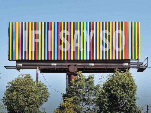

 International-renowned sommelier, Noel Shu, provides in-depth look at the modern Chinese wine industry and guides us through the misty vineyards and crowded wineries of China.
 About the Author
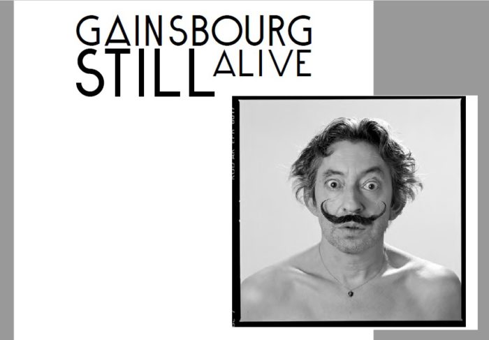

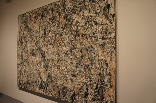

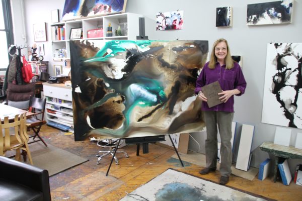

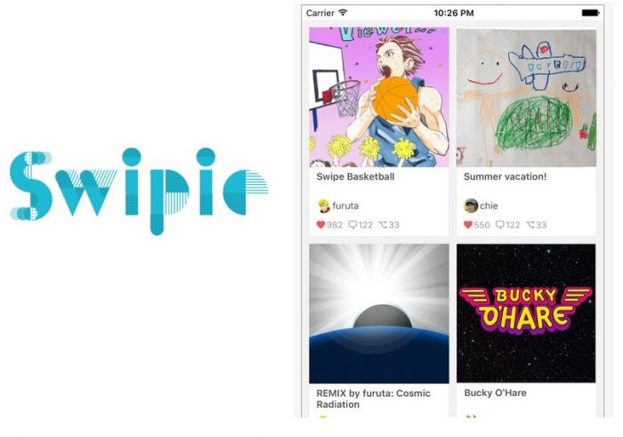
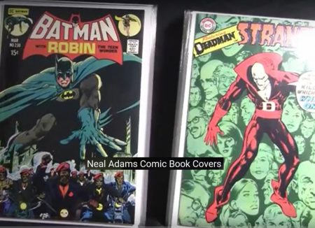 Designed utilizing the tools available on
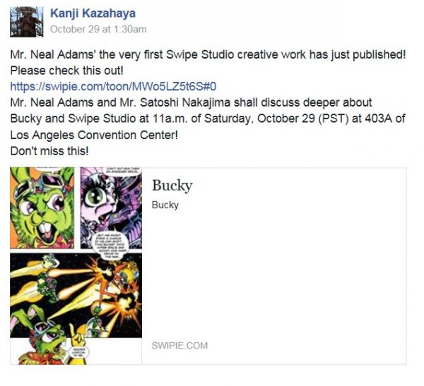


 To prepare for episode 63’s debut, viewers will also be able to stream the entire Future Trunks arc (the arc begins at episode 47). Then, starting on October 30, the complete series will roll-out, with 10 episodes released a week at a time.
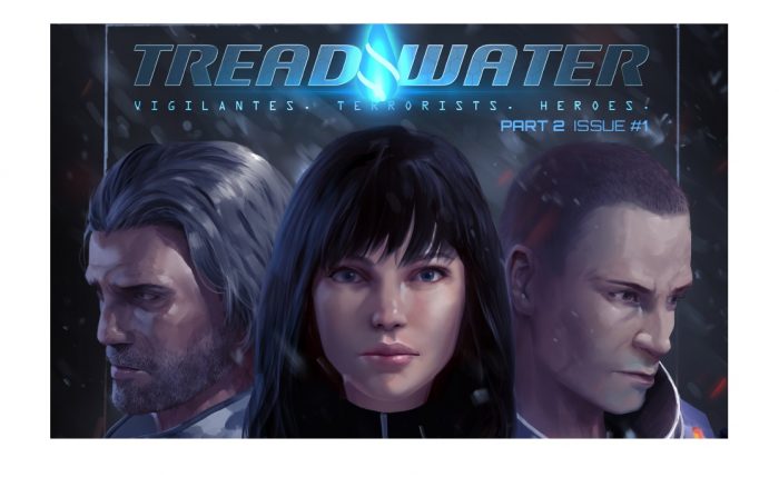
 Part of the ugly charm of TREADWATER lies within its ability to predict current events. The isolationist politics of the world’s leading nations, as exemplified by the rise of Trump in the US and BREXIT in the UK; the attempted coup in Turkey, along with its backlash in the form of a dictatorial powergrab; the increasing civil unrest in the US and the terrorist attacks in Europe – all these developments find their parallels in the world of TREADWATER.

 With a site on top of Palm Canyon with views of the valley, Wright began the Lykes design by replicating the curves of the mountainsides, making the home an integral part of its environment and providing big views for its owners and visitors. Though Wright passed away before finishing the working plans, the Lykes hired his apprentice, Rattenbury, to complete the plans according to the details set forth by Wright. The couple loved the completed plans, though it was another seven years before they started construction. When they did, Rattenbury oversaw the build and the home was completed in 1967. In addition to the structure itself, Wright also designed the furniture and built-ins for the home.
 Now for sale and registered with the Frank Lloyd Wright Building Conservancy, the 2,849-square-foot home on one acre of desert plateau has three bedrooms, three bathrooms, the signature large living room fireplace intended to bring families and friends together, a lower-level media room, two home offices with built-ins of desk, cabinet storage and walls of shelving, a distinctive curved kitchen with Wright-designed island and unique under-cabinet windows and timeless stainless-steel counters, contemporary tiled large baths, and a privacy walled crescent pool patio viewed from inside through glass walls. There is also a separate large office in the round with all built-in furnishings encircled by half-moon windows. Views of valley and mountains can be seen from almost every room.
  Classic last Wright design before his death, contemporary for today including lots of storage space with furniture and built-ins designed by the famous architect, the Lykes House is now for sale and priced at USD$3.6 million. For the Silo, Terry Walsh.
 Regardless of your medium, I hope this glance into the minds of two established poets from very different walks of life can help dissipate the intimidating mist between process and product, as well as remind you that the transcendent and the familiar are often one in the same.
 Global spectator
  Myles, a breathing artistic currency, treats poetry as an extension of the self with the potency of a movement and the collective memory of a civilization. Myles proves that common experience and abstract phenomena are synonymous when we step back to look.
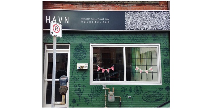

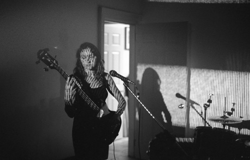

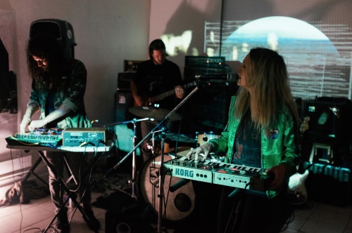
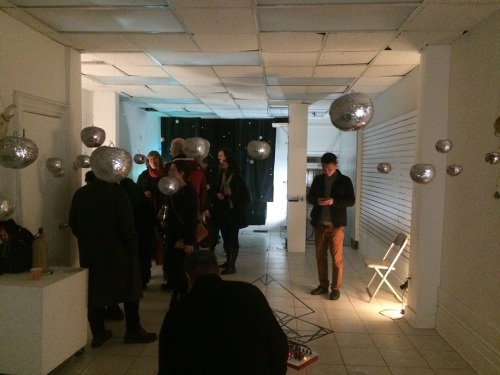

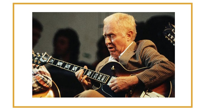
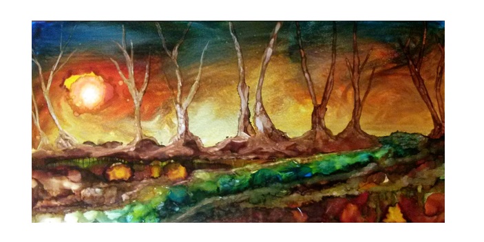
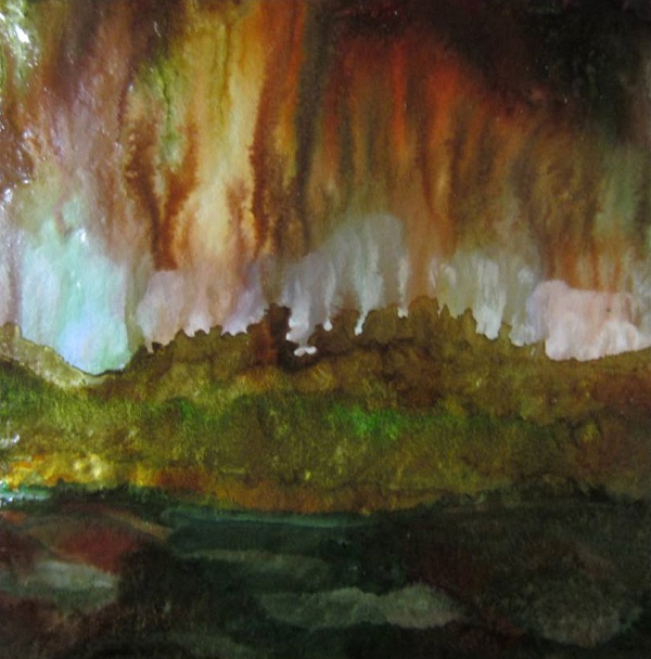


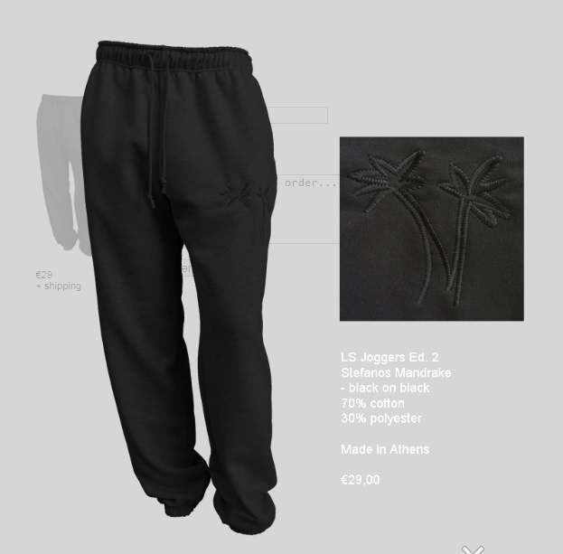
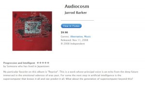
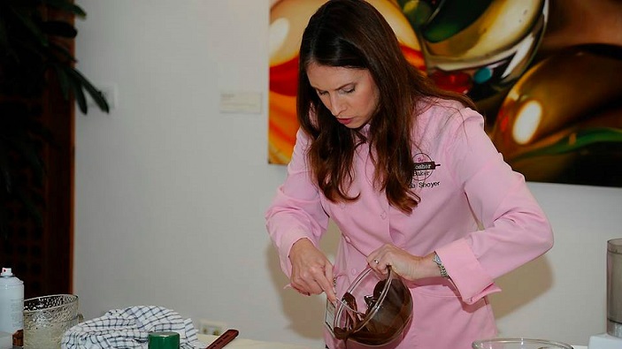


 ABOUT PAULA SHOYER


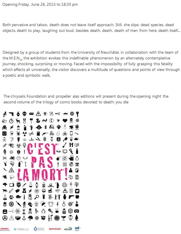


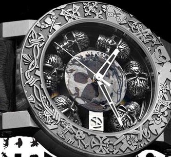
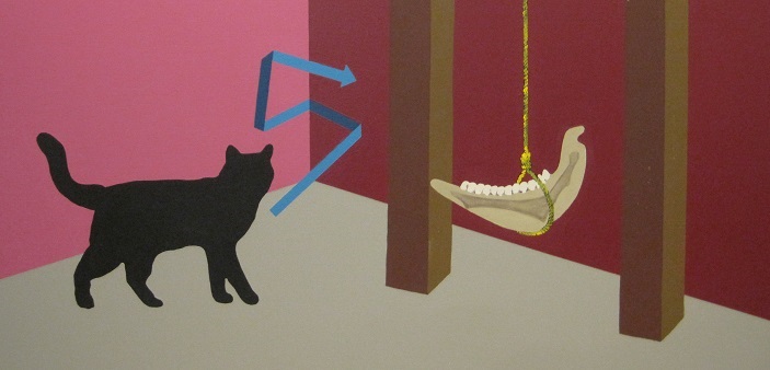


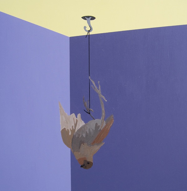
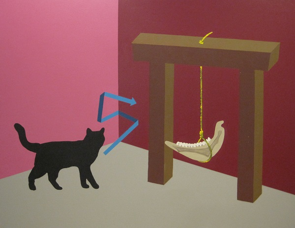
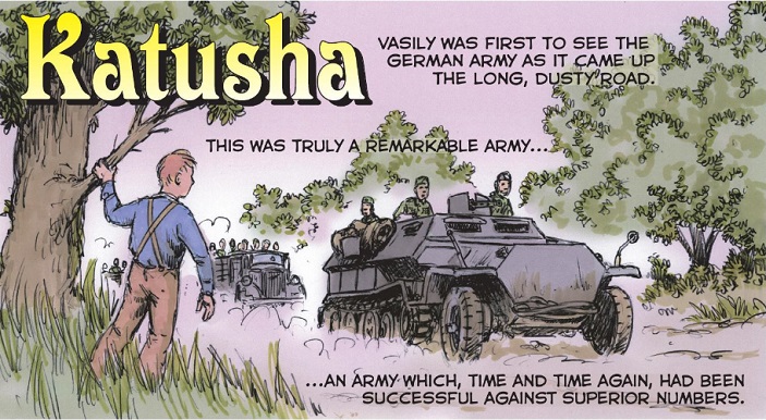
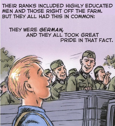
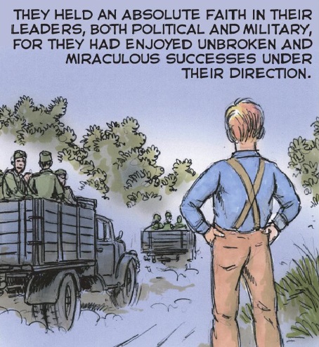


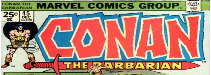
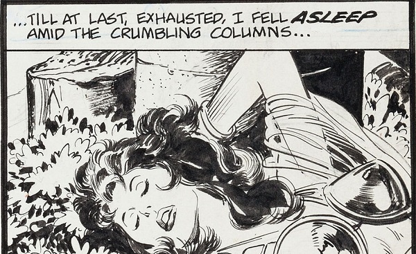
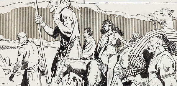
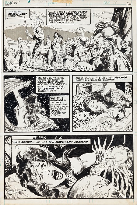
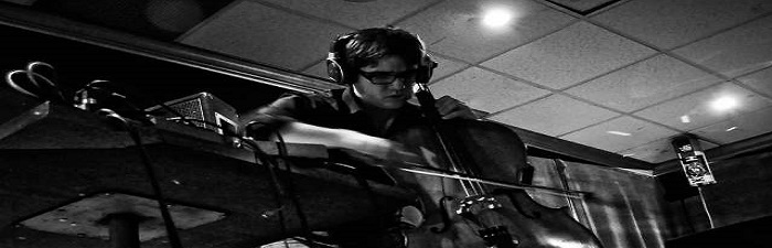


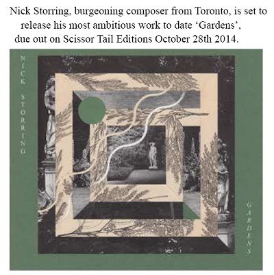