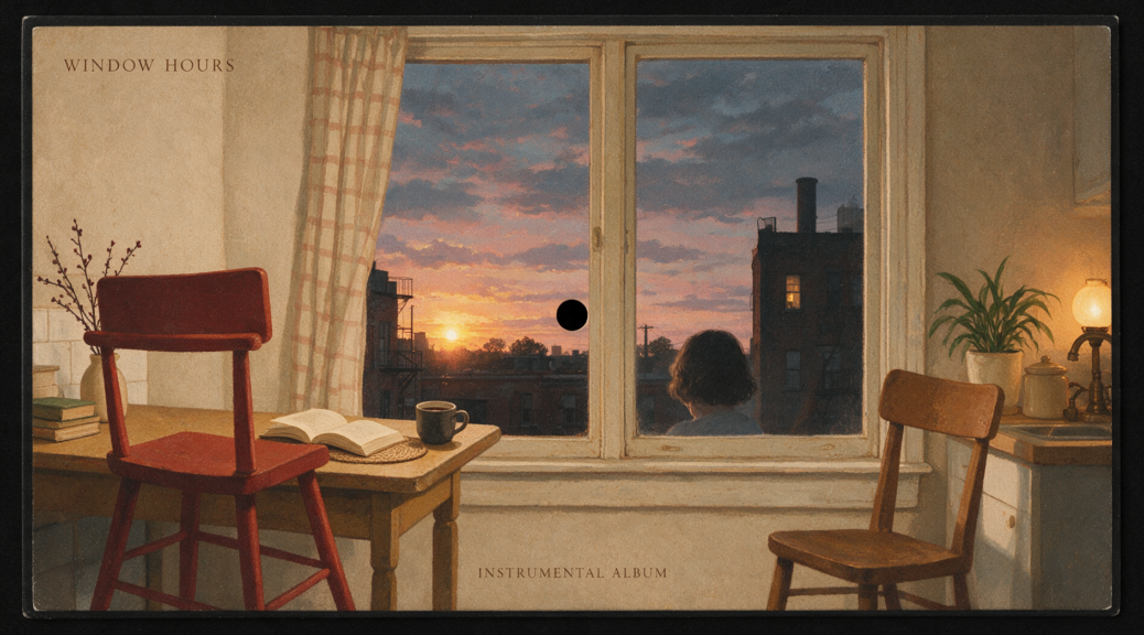
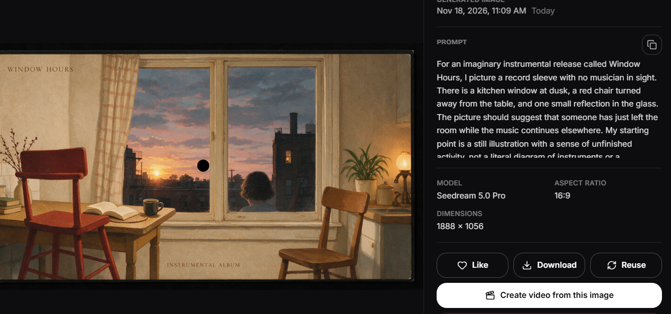
For an imaginary instrumental release called Window Hours, I picture a record sleeve with no musician in sight. There is a kitchen window at dusk, a red chair turned away from the table, and one small reflection in the glass. The picture should suggest that someone has just left the room while the music continues elsewhere. My starting point is a still illustration with a sense of unfinished activity, not a literal diagram of instruments or a photograph claiming to document a real recording session.
The palette would be narrow: blue outside, warm cream inside, and a red accent that survives when the sleeve shrinks to a tiny streaming thumbnail. That constraint gives the proposed cover a recognizable center. It also prevents the usual temptation to add every atmospheric detail at once. Rain, steam, plants, books, curtains, and a patterned floor could all fit the room, but together they would bury the chair.
I would sketch the proportions first on paper. The window belongs above the horizontal midpoint, while the chair crosses the lower third. The table only needs to enter from one side. That arrangement leaves a quiet patch of wall for the title and makes the chair feel like part of a lived space rather than an isolated object displayed in a showroom.
Translating this arrangement into an image is where Seedream 6.0 fits my proposed process. Its text-to-image and image-editing tools provide a way to explore the room, then revise particular visual decisions. I would begin with the written composition and use a simple reference sketch only if the spatial arrangement proved difficult to communicate. The model’s role here is making and editing still pictures; the soundtrack remains outside this workflow.
The room should feel inhabited, not decorated
My first brief for Seedream 6.0 would ask for a square editorial illustration of a modest kitchen at blue hour, an empty red wooden chair angled away from a cream table, and a large window showing a darkening sky. I would specify soft painted textures and restrained detail. A slightly worn chair leg and a shallow cup ring on the table would suggest ordinary use without requiring a person or a contrived narrative prop.
I would avoid naming a living artist as a shortcut for style. Instead, the prompt would describe broad visual properties: flat areas of color, imperfect edges, subtle grain, and a gentle separation between warm interior light and the cooler window. Those qualities offer something concrete to inspect. If the result looked like a glossy furniture advertisement, I could ask for less polish and more uneven surface texture without changing the underlying room.
The first Seedream 6.0 draft would need to answer a compositional question before a decorative one. Does my eye move from the red chair to the window and then return? If it stops on a bright lamp in the corner, that lamp is too important. I would darken or remove it. If the table fills half the picture, I would reduce its footprint so the chair remains the emotional center.
Try a brief for yourself- OpenGen — AI video, image and music generation
Making the reflection believable
A small reflection in the window could quietly connect the interior and exterior. I would place a warm rectangular patch near the glass edge rather than an elaborate mirrored room. Reflections are easy to overcomplicate, and an impossible duplicate chair would pull attention away from the atmosphere. The image needs enough optical logic to feel intentional, even though it is an illustration rather than a technical rendering.
For an edit in Seedream 6.0, I would describe the existing window and request a faint reflection of interior light while retaining the chair, table, and overall framing. Afterward, I would inspect the chair legs and window divisions again. A successful reflection is not useful if another edit has created a fifth leg or changed the window into a different shape. I would keep the earlier version available for comparison.
The sky would remain almost featureless. A city skyline might suggest a specific location, while stars and a moon could make the scene overly sentimental. A blue field with a barely visible neighboring roof gives the window depth without introducing a second subject. That choice also supports the sleeve’s small-scale readability: the red chair stays distinct against large, quiet areas of color.
Lettering belongs to the composition
I would reserve a modest strip of wall for Window Hours rather than asking the image to accommodate a title after every other decision is fixed. The text should feel like a label, not an announcement. A plain typeface with generous spacing could sit near the upper edge, and the artist credit could remain smaller beneath it. Neither line needs to cover the window or interrupt the chair’s silhouette.
If I explored lettering within Seedream 6.0, I would still proofread each character and compare the spacing at the intended display size. Alternatively, I could generate a clean image without text and add the final typography in a layout editor. Keeping an unlettered master would make later changes easier, especially if the release title changed or a distributor required different placement of credits.
Before expanding the artwork into several variants, I would check Seedream 6.0 pricing and set a practical limit for the image work. For this concept, the useful comparisons are specific: a lighter wall, a slightly closer chair, and a cooler exterior. Repeatedly regenerating the entire room without deciding what is wrong would create more pictures without necessarily producing a better sleeve.
A sleeve and a thumbnail are different views
At full size, I would examine the grain, table edge, and contact shadow beneath the chair. At thumbnail size, I would ignore those details and look for the three essential shapes: window, chair, and title. If the chair’s red became muddy against the floor, I would lighten the floor rather than simply increasing saturation everywhere. Local contrast would preserve the quiet mood better than an overall boost.
The finished Seedream 6.0 image would need comfortable margins around the lettering and no tiny meaningful objects against the trim edge. For a physical sleeve mockup, I would place the artwork into a separate layout with the printer’s actual dimensions and bleed requirements. The generated picture itself would remain the cover illustration, not a substitute for the production file or proof.
I would end this proposed project with one chosen square master, an unlettered version, and a small preview that honestly represents the final composition. The room should still feel slightly interrupted, as though the chair has just been pushed back. That single visual idea is enough to give the imaginary release a recognizable face without pretending that the artwork tells the listener exactly what the music must mean.
For the Silo, Joshua James.